
Creating an Animated Map of Oil and Gas Drilling Activity in Alberta, Canada with ArcGIS Pro
Introduction
As a Master of Science Student in Geography at the University of Calgary, I am required to take a specific number of courses throughout my graduate program in addition to completing my thesis research. Since I evaluate different technologies, work practices, and policies to reduce methane (CH4) emissions from the oil and gas (O&G) sector for my thesis work, I enrolled in Energy Economics to improve my understanding of energy systems and the role that markets can play in reducing energy-related greenhouse gas (GHG) emissions. For a course assignment, I prepared a presentation on a research paper investigating the inefficient regulation of natural gas flaring in the Bakken Shale in North Dakota, USA[1]. When I was searching for more background on the topic, I came across this animated map from the U.S. Energy Information Administration (EIA; Figure 1). Clicking on the image will open it in your browser and restart the animation from the beginning.
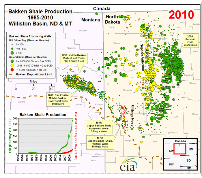
This map shows new O&G wells being drilled and their production volumes over time in the Bakken Shale; a geologic play that stretches across Montana and North Dakota, USA. It applies a categorical symbology based on a well’s Gas-Oil Ratio (GOR) and scales the size of each point according to a well’s production volumes. Natural gas and oil are often found together within geologic formations, and the GOR is a measure of the volumes of each in relation to one another. A high GOR indicates that a well is producing mostly gas, and a low GOR indicates that a well is producing mostly oil. From the map, it is clear that the Bakken is mainly an oil producing shale.
The animated time element of this map supports effective communication. The EIA could have created a static map by plotting the point locations of O&G wells and presented it as “Oil and Gas Wells in the Bakken.” However, not incorporating a time component would ignore important temporal trends in O&G drilling that should be communicated. Iterating through the data in an animation overcomes this challenge and creates a higher-value map for end-users. For example, the animation captures the effect that the new technologies and work practices of the Shale Revolution had on drilling rates and production volumes in the Bakken from ~2007 onwards[3,4]. Visualizing the time component of data can have a powerful effect on communication, and since this is one of my favorite maps, I wanted to try to recreate a similar version of it with my own workflow. While I use O&G well locations in Alberta, Canada to provide a demonstration in this blog post, the workflow is generalizable and can be applied to other point data with a time component.
Methodology
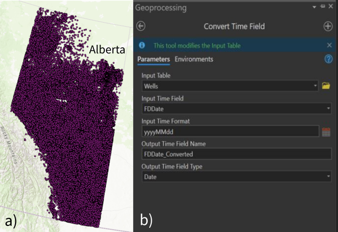
I began this project by downloading a shapefile of O&G well bottom-hole locations in Alberta, Canada from the Alberta Energy Regulator (AER)[5]. In the O&G sector, companies can drill one surface hole, but can have multiple entry points (bottom-holes) under the surface to extract hydrocarbons from a geologic formation. The shapefile contains the geospatial coordinates of each well (bottom-hole) drilled in Alberta from 1883, when natural gas was first discovered in a water well near Medicine Hat, Alberta[6], until present. The shapefile also lists several attributes for each well such as a description of the Well Fluid Type and the Final Drill Date. The Final Drill Date is defined by the AER as the “date the drilling rig was released…” after completing the well[7]. One limitation of the shapefile is that it is different than the data used in Figure 1; it does not include annual O&G production data as an attribute for each point, restricting potential options for visualization.
After opening a new project in ArcGIS Pro, I started by changing the coordinate system of the basemap since the data are provided in longitude/latitude geographic coordinates. This can be accomplished by right-clicking on Map in the Contents pane, selecting Coordinate Systems, and then Projected Coordinate System. There are several options that cater to different geographies. I prefer to use the North America Lambert Conformal Conic projected coordinate system, since most of the study areas I focus on are located in North America. Completing this step saves time later on in the project because any data that are imported are displayed using the same projected coordinate system as the basemap and do not require a separate projection.
Next, I imported the O&G well shapefile into the project geodatabase using the Feature Class to Feature Class tool and added the data to the map (Figure 2a). The challenge with this data, as I mentioned in an earlier blog post, is visualization. There are hundreds of thousands of wells (>600,000) that have been drilled throughout Alberta’s history, and it is ineffective to present all of the data up front to an end-user in this format. The Final Drill Date can be used to visualize drilling activity over time in Alberta, providing information to map users at a more acceptable rate, and improving communication. Before proceeding further, I had to clean the Final Drill Date so it could be used in ArcGIS Pro. In the Wells layer, the Final Drill Date is a string data type, which needs to be converted to date-time format. In ArcGIS Pro, this can be done by using the Convert Time Field geoprocessing tool in the Data Management toolbox (Figure 2b). This tool requires the time format of the input data, which for these data can be expressed as the string ‘yyyyMMdd’. I recommend that ArcGIS Pro users consult the Convert Time Field Tool Reference here to verify the time format of their input data before running the tool. The output of the Convert Time Field tool was a new column in the attribute table of the Wells layer populated with a date-time format that can be used in ArcGIS Pro.
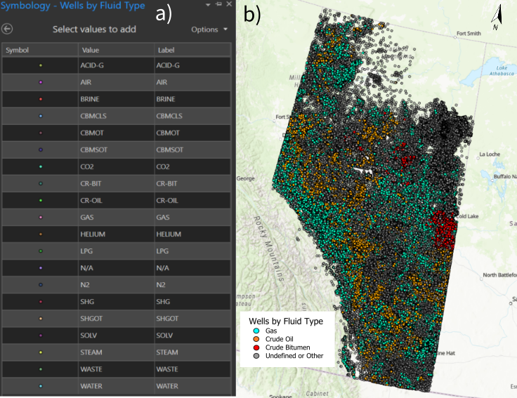
After converting the time format of the Wells layer, I started working with the layer’s symbology to display the wells by their Fluid Type and integrate a time component with the Final Drill Date. To start, I opened the symbology pane of the Wells layer and changed the default symbology from Single Symbol to Unique Values. This step allowed me to see the 20 different types of wells classified in the input data (Figure 3a). Initially, I decided to limit the map to gas (GAS), crude oil (CR-OIL), and crude bitumen (CR-BIT) wells since these can be explicitly linked to O&G production. However, doing so would have excluded the hundreds of thousands of wells that play a supporting role in O&G drilling and extraction activities or those with an unassigned Fluid Type (description of N/A) from the map. Examples of other wells in the feature layer are Water- or Brine-producing wells and wells used for injection/disposal purposes. My goal was to visualize all of these wells on a map in a meaningful way while focusing on gas, crude oil, and crude bitumen wells. To do so, I removed all symbol classes in the symbology pane, and then re-added the gas, crude oil, and crude bitumen Fluid Type categories. Then I selected the option to display all other values in the symbology pane, grouping the remaining wells – those with other Fluid Types or Fluid Types of N/A – together with the same symbology. Figure 3b shows the result after changing the colors and sizes of the points from ArcGIS Pro defaults and adding a few cartographic elements.
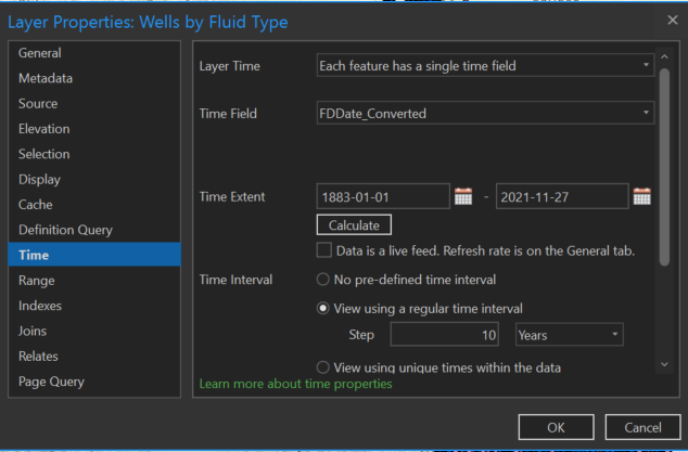
Integrating the time component of the data was the next step. To do this, I right-clicked on the Wells layer in the Contents pane and selected properties. Then I navigated to time, specified that each feature has a single time field in the Layer Time drop down menu, and verified that the correct attribute was being used in the Time Field. I allowed ArcGIS Pro to update the time extent of the data which showed that the input data have a range of January 1st, 1883 to November 27th, 2021 for a total of ~140 years. I also selected the “View using a regular time interval” box and set the time step to 10 years as shown in Figure 4. After applying these changes, I was able to select the Time tab at the top of the ArcGIS Pro interface. I then selected the Number of Steps bubble in the Step group, specified 14 steps of 10 years, and slowed the speed of the animation with the slider bar in the Playback group as these are the parameters I found optimal to present the data.
After completing these steps, I had a time enabled data set that could be used to produce an animated map. I selected Add Animation from the View tab in ArcGIS Pro, and following the advice from ESRI here, I created a smooth animation through time by appending two keyframes to the animation timeline; one with the time slider at the start of the animation and one at the end. Since the dataset I used for this demonstration is large (>600,000 points), the animated map needs time to render as it is continuously updated with data points. To support this, in the Playback group of the Animation tab, I changed the duration of the animation to one minute.
After I was satisfied with the animation length and speed, I added time enabled dynamic text to the map using the Overlay group in the Animation tab. Adding dynamic Map Time allows the date on the map to change as the animation steps through time. I also used the Overlay group to add authorship, a north arrow, and a legend to the map. Finally, I exported the animated map as a movie (.mp4 file format) to support video integration across different platforms. The large file size of the video when converted to a GIF format was too large for this blog post, so I chose to upload the animation to YouTube and embed the video in this blog post (see below).
Conclusion
This demonstration was my first attempt at creating an animated map in ArcGIS Pro. The result is a one-minute animated map of O&G wells in Alberta that differentiates wells by selected Fluid Types and steps through ~140 years of O&G development as new wells are drilled. The animated map takes over 600,000 well locations and communicates important temporal trends in Alberta’s O&G industry to map users. While most steps in my workflow were straightforward, I found some of the later steps challenging. Appending keyframes to the animation timeline and adding dynamic time and text to the animation were features of ArcGIS Pro that I had no prior experience with. I relied on scanning ESRI’s documentation and trying different practices in ArcGIS Pro until I was able to produce the result I wanted. I plan to write a follow up post – more of a deep dive into the animation functionality of the software – to support ArcGIS Pro users working with time enabled datasets. I am also motivated to build off of the workflow presented in this blog post, to continue to improve how I communicate data to people within and outside of my research area.
References
- Lade, G. E., & Rudik, I. (2020). Costs of inefficient regulation: Evidence from the Bakken. Journal of Environmental Economics and Management, 102, 102336.
- U.S. Energy Information Administration (EIA). (2011, November 2). Bakken formation oil and gas drilling activity mirrors development in the Barnett. https://www.eia.gov/todayinenergy/detail.php?id=3750. Accessed 22 December 2021.
- Sieminski, A. (2014, October 17). Implications of the U.S. Shale Revolution. U.S. Energy Information Administration (EIA). https://www.eia.gov/pressroom/presentations/sieminski_10172014.pdf. Accessed 22 December 2021.
- Raimi, D. (2018, January). The Shale Revolution and Climate Change. Resources For The Future. https://media.rff.org/documents/RFF-IB-18-01.pdf. Accessed 22 December 2021.
- Alberta Energy Regulator (AER). (2021). List of Wells in Alberta Shapefile [Date file]. Retrieved from https://www.aer.ca/providing-information/data-and-reports/maps-mapviewers-and-shapefiles.
- Gulless, M. (2021). Alberta’s First Natural Gas Discovery – 1883. Petroleum History Society. http://www.petroleumhistory.ca/history/firstgas.html. Accessed 22 December 2021.
- Alberta Energy Regulator (AER). (2018). ST37 List of Wells in Alberta: Layout Document. https://static.aer.ca/prd/documents/sts/St37-Listofwellslayout.pdf. Accessed 22 December 2021.