
ECCE App Challenge 2019 – Development and Design of a 3D Sustainability Web App
The App Challenge project discussed below can be viewed from the GISquad team’s profile on the ECCE GitHub website: https://esricanada-ce.github.io/appchallenge/2019/teams/mac/GISquad/
Congratulations to Matt, Tasos and Michele for ranking as the first runner-up in the competition!
This post is a collaboration between McMaster ECCE Student Associates Matt Brown and Anastassios Dardas.
A few weeks ago, our app challenge group member, Michele Tsang, made a post about her role as researcher for our 2019 app challenge entry, Sustainera. Our app provides users with statistics at the neighbourhood and building level for calculating things such as the Return on Investment time of switching to sustainable infrastructure. Wanting to take advantage of the advanced features available through Esri’s technology, our team decided to make an app that fully supports 3D, with buildings extruded to different heights depending on the statistic selected. In this post, we want to give some insight into the other aspects of the challenge – particularly development (Anastassios) and design (Matt).
Development
For the first time out of the four ECCE app challenges I have participated, I have extensively used Esri’s products from both, a backend and frontend perspective. The other ECCE app challenges we would use mainly the frontend components (i.e. StoryMaps and use of Esri Leaflet API). Certainly, all the app challenges we did used ArcGIS Desktop including ArcPy package to process the raw data. The development of Sustainera used a combination of ArcGIS JavaScript API, ArcGIS Online via McMaster’s Portal, ArcGIS API for Python, and a mix of Python packages for data processing. The figure below illustrates the app development pipeline.
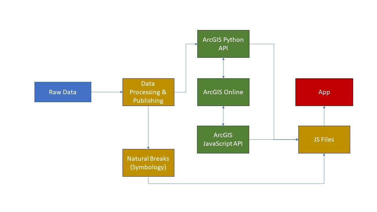
Data Processing & Publishing, ArcGIS API for Python, and ArcGIS Online
The original plan of the app was to showcase all 140 neighborhoods in Toronto. However, there was not enough time to complete due to the requirement in restructuring the entire app for it to be fully functional and bug-free. The “raw” neighborhood data included the following fields that our team member, Michele, calculated: LED Savings, LED CO2 reduction, Rooftop trees, and Rooftop trees CO2 absorbed. With these fields, we can proceed with dividing all the buildings and trees in Toronto into chunks by neighborhood. This was accomplished by using the ArcPy package to select all buildings (and trees) that are within each neighborhood and export it to a new shapefile. The entire processing time on a single core CPU took about 15 minutes. I realized later that ArcGIS Pro’s python 3.x has parallel geoprocessing capability, which could use all 8 cores and finish no later than 3 minutes. After exporting selected buildings per neighborhood, the next step was to acquire the Natural Breaks range information for each of them. Some neighborhoods will have more buildings than others; others will have substantially larger square footage. Therefore, the symbology variation will be different in each neighborhood and would take forever to manually type all 140 of them in order to render properly. A mix of Python packages including Geopandas (lightweight free and open source package to read and write shapefiles) and the Jenkspy package were used to automate this task. In particular, the Jenkspy package calculates the Natural Breaks range, which is then stored as a list and exported into a JS file as part of the data required for the app to function.
Next, the ArcGIS API for Python was used to publish all 140 shapefiles on ArcGIS Online via McMaster University’s Portal site. To learn how to do this, you can view one of the earlier posts or in the source code for this app. Once published, the ArcGIS Python API was then used to acquire all 140 hosted feature layer URLs automatically, which was then stored in a dataframe using the Pandas package. Additionally, it also accessed each hosted feature layer’s specific xmin, xmax, ymin, and ymax coordinates to set the appropriate boundaries when loading the selected feature layer. Both, the boundaries and hosted feature layer URLs would be stored in a JS file to support part of the app’s function whenever the client decides to select a different neighborhood. All data processing scripts can be viewed here.
In our WebGIS app, we used the following functions from the ArcGIS API for JavaScript:
- FeatureLayer – to load the hosted feature layer from ArcGIS Online including popup template and a renderer
- MapView and SceneView – to render app in 2D and 3D respectively
- Other Widgets
- Map – Display map
- Basemap
- Search – Typing in your address
- Extent – Customize boundaries
- WebStyleSymbol – Customize symbol with 3D online graphics
- Legend
For main web application interface, we used Calcite Maps – a Bootstrap framework developed by Esri.
Pros of using Esri’s WebGIS Framework
Although I am used to developing through open source channels, whether it is Leaflet API or Shiny in R, there are definitely pros of using Esri’s WebGIS products that should be weighted heavily. A few pros listed are as followed:
- Backend capabilities for your convenience: Virtually, there is almost no backend programming required when developing a WebGIS app through Esri’s framework. Simple. You just upload the shapefile (or other geospatial format) on your ArcGIS Online account, access the service URL through your ArcGIS REST API or Portal, and inject the URL in the FeatureLayer function. On top of that, you don’t need to worry about security patching because Esri has a dual web-adaptor setup in their Enterprise build. In the open source world, the options are endless and can lead to indecisiveness for “rookie” developers in terms of which is most suitable to their development needs without accumulating much time and technical debt. From my experience, I would develop a LAMP – Linux Apache MySQL Python (Flask or Django)/PHP – and LEMP – Linux Nginx MySQL Python (Flask or Django)/PHP – based app. For Windows lovers out there, there are WAMP and WISA. In general, these open source paths require a lot of patience and sheer will to be outside your comfort zone.
- Data Storage: Again, ArcGIS Online nails this. You can store your geospatial files in ArcGIS Online whether it is directly through the Portal site, ArcGIS Pro, or using the ArcGIS API for Python. Don’t want to store it in ArcGIS Online? No problem. Esri partners with Amazon and Microsoft for developers to store geospatial data and perform geoprocesses on the cloud via AWS and Azure, respectively.
- Extensive Documentation: Esri has extensive documentation in all of its products. Their JavaScript API has a lot of examples and sandbox environment for trial and error and stays up to date. Same goes for their Python API as well. In the open source realm, the more complex your app is the more likely you will have to find different sources and figure out how to stitch them together properly.
Design
An important part of the app challenge is playing to the strengths of your team. For the past two app challenges, a role I found myself drawn to was assisting with the design of the app and creating media elements (logos, icons, and videos). This year I tried my best to take advantage of professional design software to create polished media elements for our app. I have dabbled with video editing software in the past, but even a complete novice at graphic design/media production can create some attractive looking videos/images using the following: GIMP, Inkscape, DaVinci Resolve (all 3 of these have free-to-use options), and Adobe Suite for access to Photoshop, Illustrator, and Premiere Pro (free trial is available). Documentation from users of these apps are abundant online and communities exist on websites such as Reddit to help new users. After only a few hours of watching YouTube tutorials and a bit of research, anyone can make high-quality media using such tools. Something that has been echoed to me time and time again by both ECCE staff and our school’s ECCE Director is to keep things simple. Something I was most proud of last year was the video promo showing off our app. However, the video I had created had a few fatal flaws:
1) Length: Being succinct is key when it comes to keeping things simple. With a run-time of 6 minutes and 48 seconds, our previous video was simply too long. The intro alone takes nearly 3 minutes, which is frankly a bit boring to listen to. A secondary caveat to having a long video is that it takes longer to produce and stitch together. This year, I capped my intro preamble to just a minute and reserved the rest of the video for demonstration. Being succinct kept the video flowing and reduced a lot of unnecessary technical jargon. Even with the best intentions in the world, you can’t share everything.
2) Lack of script: Our previous video has a distinct drop in quality as soon as the demo starts. This is because it was done extremely last minute, and I didn’t have a script prepared. This time, I did, which made a massive difference. A useful strategy to avoid time crunch was to get copies of the prototype app after major features had been built and implemented, allowing significant portions of the demo to be recorded ahead of time instead of waiting for the entire thing to be complete.
Dealing with these two problems helped create a stronger final product for our submission and gave me more time to assist with other tasks, such as research/data acquisition, data processing, and QA testing/feedback.
As my master’s is wrapping up this year, this was my final time participating in the app challenge. Looking back, I have learned so much from it over the years and am glad to have been part of the unique experience that it offers. I look forward to seeing what teams come up with in the years to come!
Thanks for reading,
Matt & Tasos
Our App: https://esricanada-ce.github.io/appchallenge/2019/teams/mac/GISquad/
Our Video: https://www.youtube.com/watch?v=GwkxeYXvPrU