
Creating Customized Bar Graphs with Limits in ArcGIS Online Pop-Ups
Creating column and bar graphs in ArcGIS Online is an easy way to show numerical data to users in pop-ups, but what it lacks is the ability to customize colours, say which column/bar corresponds to which data, and set limits that correspond more appropriately to the data presented.
Why does this matter?
Lets say that you are trying to map quality of life data, and are comparing communities to provincial and national averages (all numerical data used in this article is fictional). We would want a bar to show the values for each of these values, as shown below.

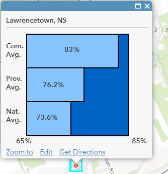
The first pop-up contains a bar graph created through Pop-up Media, and the second pop-up was customized using the method discussed below. In the first pop-up, we can’t tell which bar belongs to which category, and the associated value, unless we hover over it, and differences in data do not stand out. In the second pop-up, this is easy to view at a glance.
A Couple Words Before Trying to Replicate
In this article, I will show how to create a workaround that allows for a bar graph where you can control colours of bars, background, and text, identify bars to data, and set limits. Please note that like many workarounds, this is a fairly complicated solution, and will require knowledge of ArcGIS Online, HTML, CSS, and Arcade. I advise reading the entire article before attempting, including the notes at the end.
Another option would be to create a graph for each point, photograph, and include in each pop-up. Depending on the number of data points you have, that would be quite time consuming. This approach will create graphs “on the fly”, so that if a value changes, so will the graphs.
Essentially, how this is done is taking images of solid colours, stretching them appropriately to resemble a graph, and overlaying text. Why not use a graphics library? As explained here, there are only certain HTML tags that will work in ArcGIS Online. Graphics library are not on the list, but images are (I tried to use SVG anyway, and it did execute properly while editing a web map, but vanished after after I saved and refreshed).
This article is written as if you were comparing three numbers, and steps taken and code will have to be modified if you are using more. All required code can be found within this GitHub repository.
Step 1: Creating and Uploading Pictures
In a program such as Microsoft Paint, select a colour for the background, and each bar (or just one if you’re happy with one colour for all), and use the fill tool so the image is a solid colour. The size can be set to anything as they’ll be stretched later (I used 200 pixels by 200 pixels). Share this picture online using a public facing photo sharing service, such as Google Photos. I shared mine with a public “dummy” Story Map Shortlist, because I found it easy to organize photos. Save the links.
Step 2: Arcade Expressions 0-2 – Values as text
All Arcade expressions have been placed in the same JavaScript file in this GitHub link (please note that it is only a JavaScript file so that GitHub can colourize the code, as GitHub does not recognize Arcade).
View the first expression, Step 2 – Value Text. This one is fairly straightforward. All you are doing is converting converting numbers to text.
In ArcGIS Online web map, on your layer click the three dots for more options, click “Configure Pop-up”, and add an Attribute Expression by pressing “ADD”. Copy and paste the expression into the dialog, and replace the feature attribute name with your own. Repeat this two more times so you have a total of 3 expressions returning values as text for each field you want to display on a graph.
Step 3: Selecting Limits
In your web map, open the table for your data, and show the three columns you wish to make a graph out of. Click the header of each one, and then sort them. Find the minimum and maximum of each column, and then find the minimum and maximum of these columns. Take these numbers and change them to reflect the limits of the graph. You may wish to use the nearest “aesthetic” number. For example, my minimum was 68, so I set the lower limit to 65, and my maximum was 82, so I set the upper limit to 85. Remember your lower and upper limits.
Step 4: Arcade Expressions 3-5 – Width
View the second expression, Step 4 – Width. This controls the width of the bar. It maps the range of values from your limits to 0-200 (the size of the background of the graph in pixels). If you’re interested, the logic for how range mapping works can be found here.
In ArcGIS Online web map, on your layer click the three dots for more options, click “Configure Pop-up”, and add an Attribute Expression by pressing “ADD”. Copy and paste the expression into the dialog. Set the name of the expression at the top of the dialog, and set the ‘value’ variable equal to the appropriate feature attribute. Set ‘from1’ to your lower limit, and ‘to1’ to your upper limit. Repeat this two more times to create a total of 3 expressions returning widths for each field you want to display on a graph.
Step 5: Arcade Expressions 6-8 – Text Location
View the third expression, Step 5 – Text Location. It’s almost the same as the width expression from above, except for what it’s returning. This determines where the text will appear on the graph. We attempt to put it in the centre.
In ArcGIS Online web map, on your layer click the three dots for more options, click “Configure Pop-up”, and add an Attribute Expression by pressing “ADD”. Copy and paste the expression into the dialog. Set the ‘value’ variable equal to the appropriate feature attribute. Set ‘from1’ to your lower limit, and ‘to1’ to your upper limit. Repeat this two more times to create a total of 3 expressions returning text locations for each field you want to display on a graph.
Step 6: Dealing with text that can’t fit in the bar
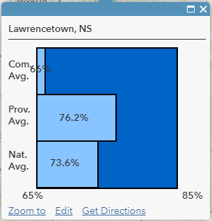
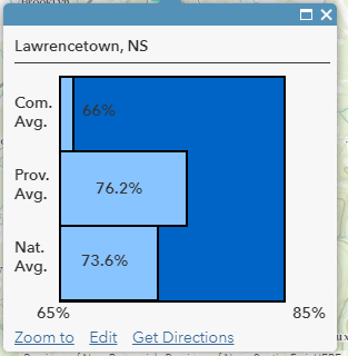
The issue here is that while 66% is within our range, the text is too small to fit in the bar. You can either change the lower limit to adjust for this and update all arcade expressions, or you can set the text to be outside the bar. If you choose to adjust the lower limit, do so and proceed to the next step, otherwise read on.
View the next expression, Step 6 (Expression 1) – Text Location Modification. This is the same as the previous expression, however it has been updated to determine if the width is “enough”. If it is, act normally, if it isn’t, set it to be outside the bar by adding extra pixels. Open the table in your web map, and determine what is enough by examining which points have text that does and doesn’t fit. Whatever the maximum width value that doesn’t allow for text to fit is, remember it.
In ArcGIS Online web map, on your layer click the three dots for more options, click “Configure Pop-up”. Select the first of the three text location expressions you created in Step 5, and press the ‘Configure expression’ button to the right of the list. Delete the previous expression, then copy and paste the new expression into the dialog. Set the ‘value’ variable equal to the appropriate feature attribute. Set ‘from1’ to your lower limit, and ‘to1’ to your upper limit. In the if statement, change ‘value <= 10’ to match your value from above. Repeat this two more for the remaining custom expressions you created for returning text locations for each of the fields you want to display on a graph.
The text is now in an appropriate position, however given the background colour it is difficult to read. View the next expression, Step 6 (Expression 2) – Text Colour. This is the same as the previous one, except that it’s returning either CSS as text that will make the text appear white, or nothing.
In the ArcGIS Online web map, on your layer click the three dots for more options, click “Configure Pop-up”, and add an Attribute Expression by pressing “ADD”. Copy and paste the expression into the dialog. Set the name of the expression at the top of the dialog, and set the ‘value’ variable equal to the appropriate feature attribute. Set ‘from1’ to your lower limit, and ‘to1’ to your upper limit. In the if statement, change ‘value <= 10’ to match your value from above. If white wouldn’t appear well with your background colour, then change it to something that would contrast well. Repeat this two more times so you have a total of 3 expressions returning text locations for each field you want to display on a graph.
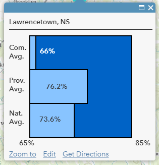
Now, the text appears white, and can easily be read.
Step 7: Setting up HTML
If you have chosen to just adjust the limits in step 6, use this HTML document. If you have chosen the second approach by adjusting the position of the text, use this HTML document.
You will have to modify this, copy and paste it to a text editor of your choosing. On lines 6, 16, 27, and 38 insert the links for your pictures. On lines 49-51, change the text to the titles of what each bar represents. Note that the amount of space is limited. On lines 54, 57, and 60, you may wish to remove the percent sign and replace it with a unit of your choice. On lines 62 and 63, replace the text with your own lower and upper limit, and change the unit if needed. You are now ready to add the HTML to your pop-up.
For your pop-up configuration, use a custom attribute display, click configure, and click the View HTML Source icon. Copy and paste the HTML into the editor. Click OK on the Custom Attribute Display dialog, and then OK on the Configure Pop-up dialog. Click a point to test it.
Depending on the length of characters in the your text (text on bars and limits), you may need to alter the CSS left and right styles throughout the HTML.
That’s it! You now have a custom bar graph on an ArcGIS Online pop-up.
Notes
- Why not just save the width value used in all of the width, text location, and text location scripts? Because that would require hard coding it for all values. If a value was later changed, then the width would not be updated. Having the expressions as they are now allows for all variables to be created on the fly.
- This approach could be modified to contain more or less bars, and could be adapted to a column graph.
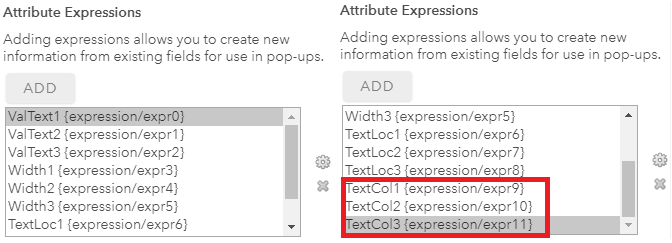
- This approach assumes that there are no currently existing attribute expressions. If you have preexisting attribute expressions, you will need to change the references to them from within the HTML to match yours. Please see the following picture.
Thank you for reading this article. I hope it was useful! – LG