
Integrating Space, Time and Geography with ArcGIS Insights: A Case Study of COVID-19 Infection Rates in Ontario Public Health Regions From 2020 to 2022
Introduction
Tobler’s First Law of Geography “Everything is related to everything else, but near things are more related to distant things” reminds us how geography plays an important role in the spatial pattern of things that we see everyday. However, when it comes to analysis involving human mobility, epidemiology, or any spatial data that contain a temporal component, it’s often necessary to incorporate “time” as the third dimension to the spatial data to get a full picture of the “Why“, “Where“, and “When“. My understanding of spatial analysis have changed after being introduced into time-space geography and time series analysis, in which I have learnt that future events are not mutually independent from recent events, therefore in addition to Tobler’s First Law of Geography, we should keep in mind that “near and recent things are more related to distant things” when dealing with complex geospatial data that changes over time.
COVID-19 is an excellent example to showcase how an epidemic disease can spread through space and accumulate through time, it’s therefore necessary to consider not only the spatial patterns of COVID-19 (e.g. identify regions with the highest amount of cases and infection rate) , but also the temporal trends of how the infection rates and number of cases change over time using statistical methods. By adding time as a third dimension into our traditional spatial analysis, we can explore the spatial-temporal autocorrelation patterns of COVID-19 infection rates, these will give us new insights on whether there were health regions with similar rates of infection over the past two years, and whether there were health regions with infection rates statistically different than their “spatial neighbourhoors”. The general hypothesis is that if a region experiences a surge of cases at the beginning of the pandemic (e.g. Mississauga), this region is more likely to have higher cases throughout the lifetime of the pandemic. However, it’s neither true or accurate to assume that this region is at a higher risk than others because the spread of virus is not stationary, it moves as people travel across cities (e.g. travelers arrive at Pearson International Airport and travel to Barrie), thus human mobility is an important factor in risk assessment.
What is Time-Space Geography?
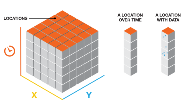
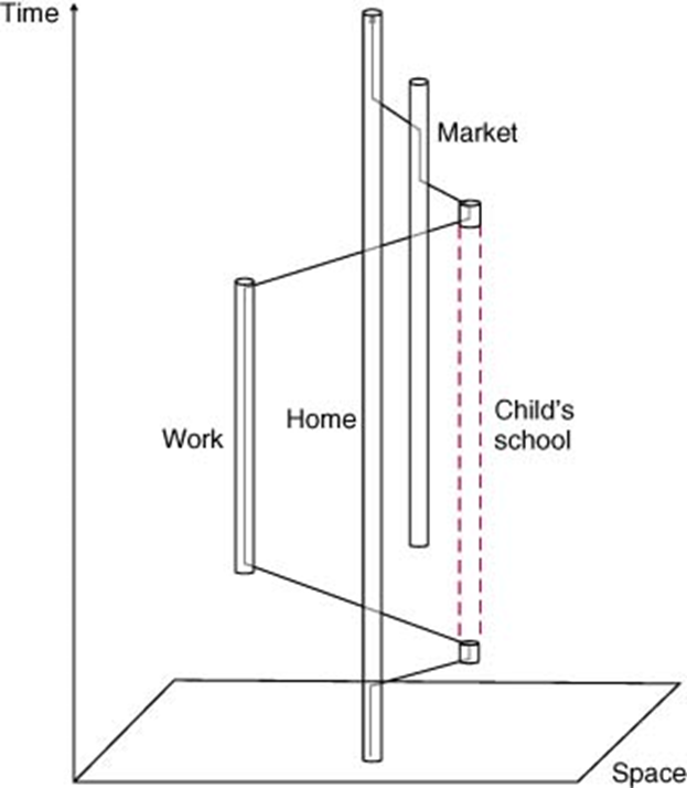
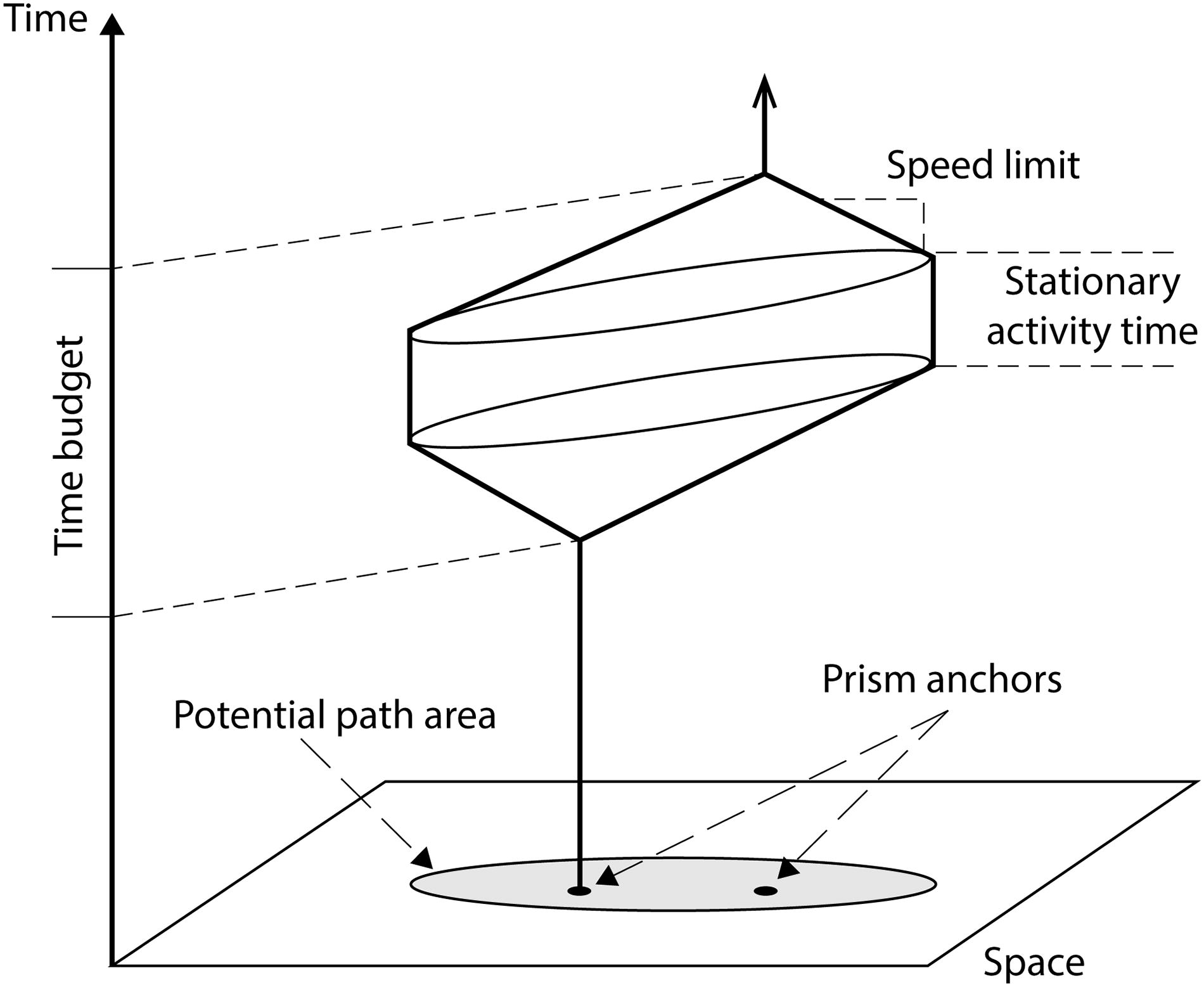
Time-space geography in short, is a framework that enables mapping spatial movements through time. “It recognizes that humans have fundamental spatial and temporal limitations: people can physically only be in one place at a time and activities occur at a sparse set of places for limited durations. Participating in an activity requires allocating scarce available time to access and conduct the activity [1]“. The mapping of human movement and activities can be visualized in three abstract forms:
- Space-Time Cubes (aggregation of spatial-temporal data in a defined geographic space as a cube)
- Space-Time Paths (a 3D visualization of a person’s daily movement in space and time)
- Space-Time Prism (a 3D visualization of one’s ability to travel and participate in activities at different locations between two anchor points)
Goals of the Project:
- To create geovisual analytics that reveal the temporal patterns of COVID-19 infection rates within the past two years.
- To provide statistical evidence and reasoning of “where” certain regions share similar infection rates.
- To explore how ArcGIS Insights can be used to present findings of a spatial-temporal analysis, and how data can be shared across ArcGIS Products (ArcGIS Pro, ArcGIS Online, Experience Builder, etc.).
- To gain new insights of the spatial-temporal patterns of COVID-19 in Ontario that aren’t addressed in existing data dashboards and geovisualizations.
Data Collection
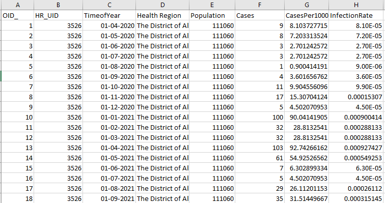
The data sources used for this project include the COVID-19 daily case counts by Public Health Region from the Ontario Government, and a shapefile containing the boundaries and geometries of public health regions. The non-spatial dataset (case counts) was merged with the spatial dataset (health region geometry) using the “Health Region ID” and “Names” as their common attribute field using a simple Attribute Join. The daily case counts were later aggregated in a monthly basis to reduce the complexity of data that would need to convert into space-time cubes (as a netCDF file). Population data from the second dataset was used to standardize the case counts in each health region by converting them into infection rates (number of infections per 100 people). After the intial joins and cleaning in ArcGIS Pro, the data was then exported to Excel to undergo extensive re-formatting, such as aggregating the individual entries into monthly intervals based on the time stamps, and extracting the names of the health regions to be individual rows. These steps were necessary to standardize the data format in order to use the space-time pattern mining tools in ArcGIS Pro.

Setting the start time, end time, and time intervals can be challenging because they do produce bias in how often the data are aggregated, and the results can be misleading if this initial step has not been given enough consideration.
Data Preparation & Processing
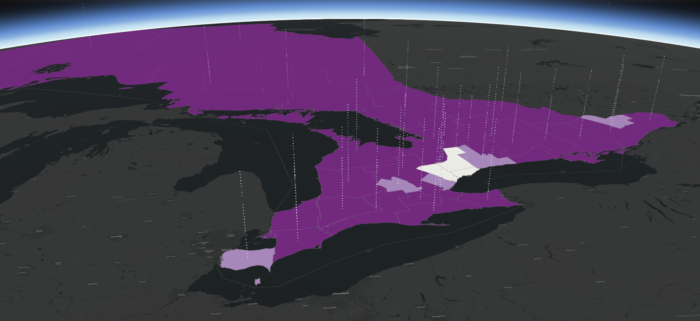
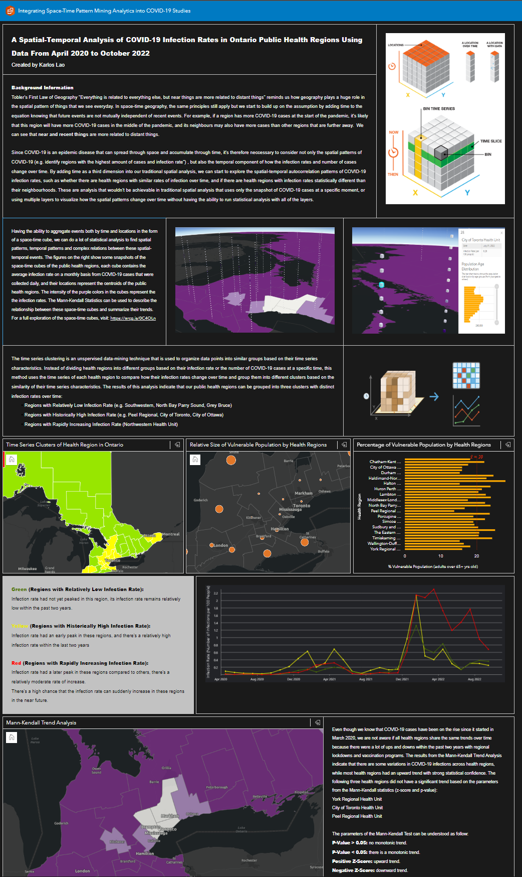
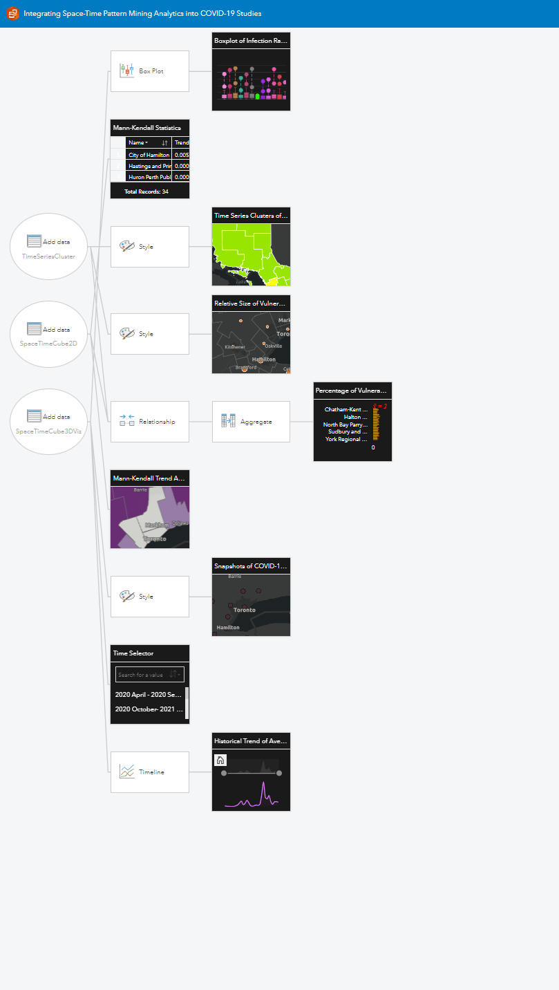
Within ArcGIS Pro, the data was converted into space-time cubes using the “Create Space Time Cube From Defined Locations” tool, some visualizations can be generated from the space-time cubes using infection rate as the primary variable, such as the local outlier analysis, emerging hot spot analysis, and time-series clustering. After the data was processed with various tools within the “space-time pattern mining toolbox“, they were uploaded to ArcGIS Online and imported into ArcGIS Insights for visualization. The three main datasets that were visualized include the 2D space-time cube, the 3D space-time cube, and the results from the time series clustering.
The visualization of the space-time cubes in 2D shows the results of the Mann-Kendall trend analysis (z-score, p-value, and the types of trends). While the visualization of the space-time cubes in 3D shows the variations of infection rate in 31 of the time bins (April 2020 to Oct 2022). There were no significant trend or clusters being identified in the emerging hotspot analysis or the local outlier analysis so those results were removed.
Results and Analysis
Time-Cluster Analysis
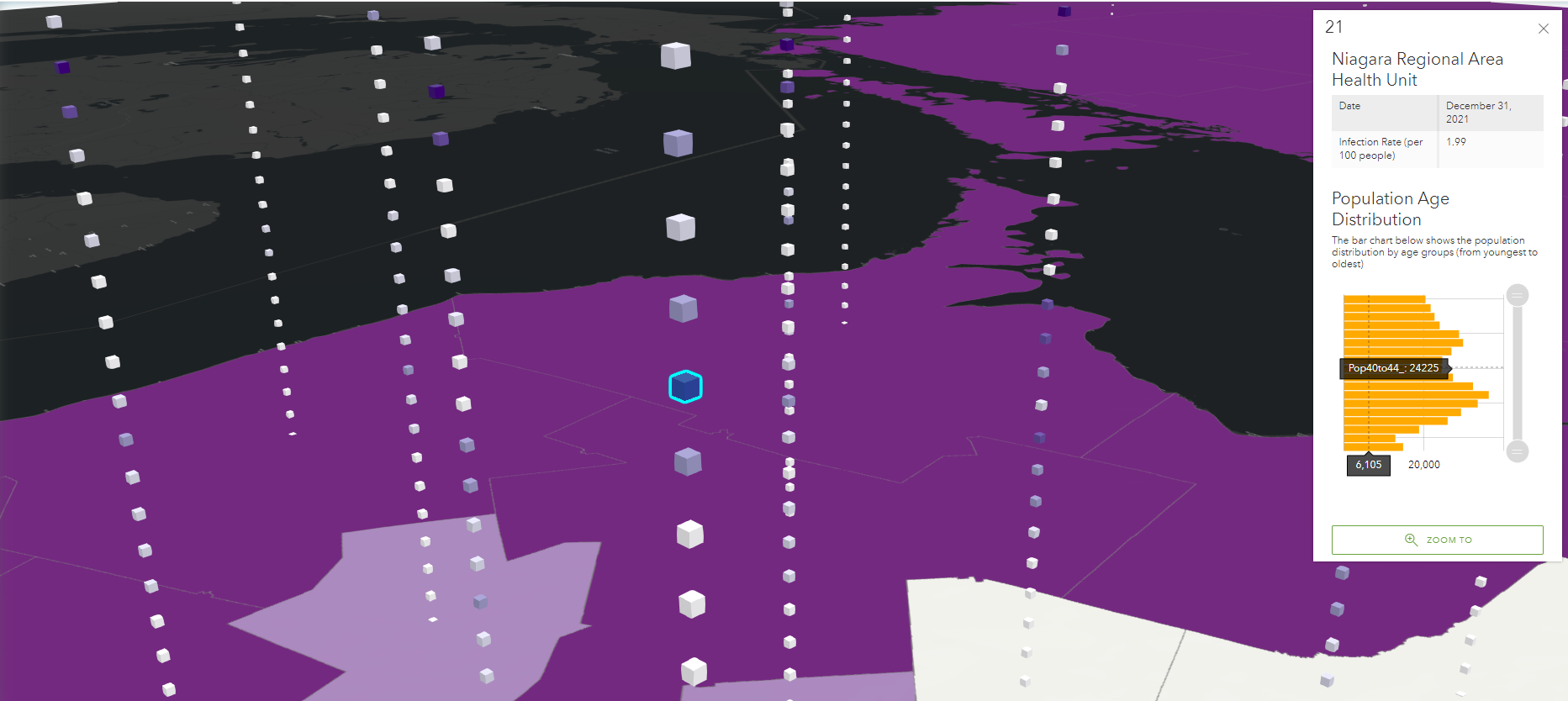
- The results from the time series clustering show that all of Ontario’s public health regions can be grouped into three main clusters given the similarity in their time-series of infection rates.
- We can see that health regions within the GTA can be grouped into one cluster that share similar characteristics, such as when their infection rates peaked in the past, and how it has been changing recently. It’s interesting to learn that these regions are not seeing significant increase recently, while there are rapidly increasing infections at the Northwestern Health Unit (cities such as Kenora, Sioux Lookout and Pickle Lake).
- The time-series cluster may help our provincial government to rank health regions into three different priorities when they are implementing COVID-19 measures.
- The variation about the number of vulnerable population (adults aged 65+) in each health region can also be used to support the government in deciding which health regions should receive additional funding for healthcare given limited financial resources.
Mann-Kendall Trend Analysis

- The Mann-Kendall trend analysis was generated from the 2D space-time cube, this information can be difficult to understand for people without a background in statistics. However, it could be potentially useful for researchers who have experience in doing space-time analysis.
- The statistics (z-score, p-value) on the right address why one region is seeing significant upward trend while some regions have no significant trend. The map on the left visualizes these textual data (through the use of colours) for the general audience, and it illustrates that not all health regions were experiencing the same spatial pattern of infection rates within the past two years.
Overview of the Historical Trends
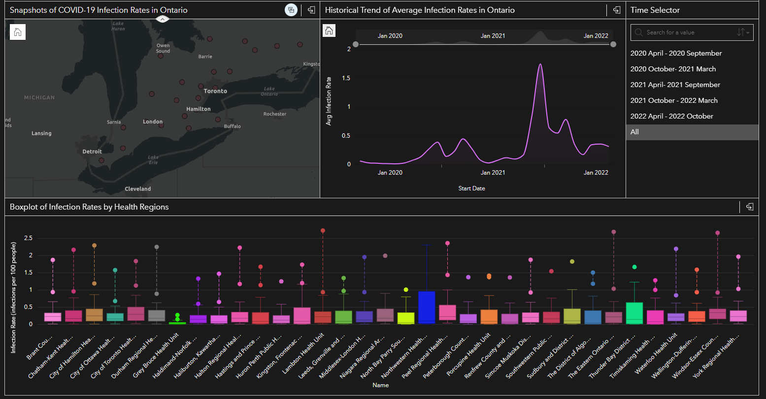
- The map shows the relative size of infection rates using the intensity of colours (darker red equals to higher number of infections), in a given time period (triggered by the “Time Selector” on the right of the panel).
- The boxplot shows various statistics about the infection rate in the dataset, include min, max, average and outliers in the upper range, in a given time period.
- Together, with the use of the map, the time series line graph, the time filter and the boxplot, we can customize the range of the data to a specific time, see when the outliers were from, and compare the infection rates across health regions.
- All of the data layers in this ArcGIS Insights Model are linked together, meaning that using the time selector will trigger actions in all of the visualizations presented above.
- They also have the option to switch the display into “Analysis View” to see how the model was built and replicate the process for further research on the same topic.
In addition to having all of the geovisual analytics displayed in one seamless transition, ArcGIS Insights also offers an “Analysis View” that illustrates how the model was built from scratch, the types of relationships, the design choices, and the initial datasets.
Reflection on Strengths and Limitations
The geovisualization in ArcGIS Insights was something new to explore, although my original intention was to show the data on ArcGIS Storymaps so that the audience can interact with the 3D space-time cubes while also seeing other data that are associated with the cubes. Compare to other ArcGIS Products, Insights has the advantages of visualizing 2D data in various visualizations that aren’t available on Storymaps, it offers a similar user interface as creating a dashboard from Web AppBuilder or Experience Builder, and creating visualizations from the hosted datasets on ArcGIS Online wouldn’t interfere with other existing projects. Perhaps the biggest advantage of Insights is the ease of sharing because it’s built as a spatial model that allows you to pull data directly from your server, and this model can be shared and replicated by other co-workers in the near future if there’s new data coming in.
However, despite the various benefits of using Insights, I have also observed some significant drawbacks, such as not being able to embed the individual elements (map, bar chart, boxplot) from other platforms. The amount of visualizations and renderings can also be troublesome for users without high-speed internet access, and the difference in computer screen sizes may affect how the final visualization is displayed, even though this is something that has been addressed in both Web App Builder and Experience Builder. In using Insights for spatio-temporal analysis, the biggest disadvantage I found was that not being able to display 3D space-time visualizations while showing other supplementary information, this would have been easier if pop-ups were allowed or if contents could be embeded as multimedia.
Future Improvements
- If I had more resources and time, I would pay closer attention to how the data was aggregated and processed. Given my limited knowledge in space-time analysis, I wasn’t able to fully understand all the factors that can contribute to bias and errors in the creation of space-time cubes, such as knowing how the number of spatial neighbours may affect final outcomes, how the various settings on the “Conceptualization of Spatial Relationships” (e.g. fixed distance, k-nearest neighbours and contiguity edges only) can affect calculations in the cluster and hotspot analysis.
- I also noticed that the boundaries of the public health regions aren’t necessary true because the coronavirus is not constrained within a specific boundary, thus having cases aggregated by a public health region would indeed creates a “Modifiable Unit Areal Problem“.
- A closer study that looks at the effects of movement between these health regions will be required to help us understand if we should study COVID-19 with boundaries. These resources and further studies will ensure effective communication of the data outcomes in the most accurate way possible.
Link to the full app in ArcGIS Insights (click here)
Reference:
[1] Miller, Harvey (2017). Time Geography and Space–Time Prism.The International Encyclopedia of Geography. DOI:10.1002/9781118786352.wbieg0431
[2] Miller, Jaegal, Y., & Raubal, M. (2019). Measuring the Geometric and Semantic Similarity of Space-Time Prisms Using Temporal Signatures. Annals of the American Association of Geographers, 109(3), 730–753. https://doi.org/10.1080/24694452.2018.1484686
[3] Miller, Jaegal, Y., & Raubal, M. (2019)