Visualizing Climate Model Data using Simple Query Tools from ArcGIS Pro and Web-Based Geovisualization Features
In my recent summer project as a NSERC-USRA student under the supervision of Dr. James Voogt, I was able to gain access to several datasets from Environment Canada that were not yet publicly avalilable, such as the “GEM-SURF (Global Environmental Multiscale Surface)” data. Our project focuses on using both the air temperature and surface temperature to conduct a heat assessment for the City of London, in contrary to the common method of using only land surface temperature to visualize urban heat islands. While it’s relatively easy to obtain Land Surface Temperature (LST) directly from Landsat’s Collection 2 Level-2 Science Products on USGS, it was difficult to acquire enough weather data for our study area given that there’s usually only one weather station located at the local airport for every city.
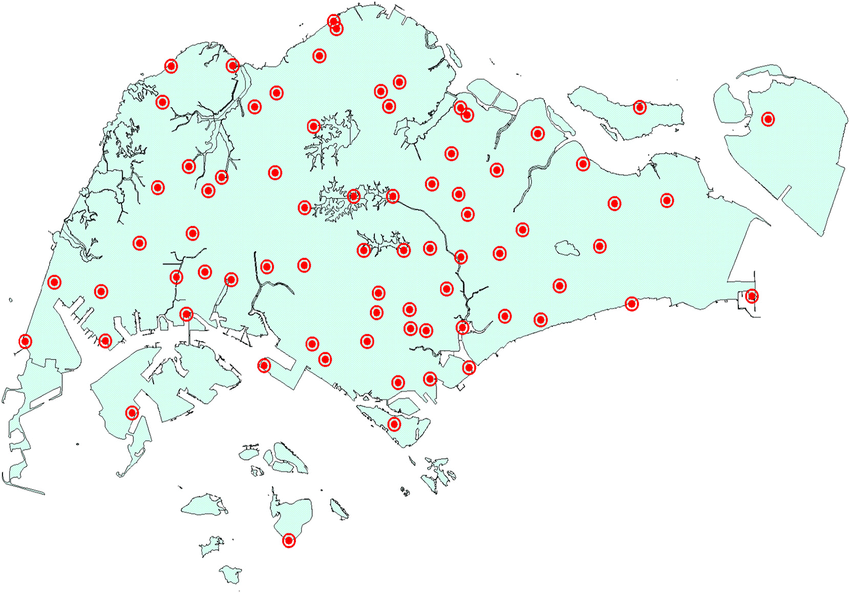
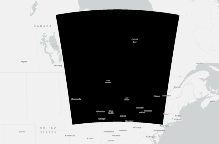
To correctly represent air temperature and account for temperature variations due to variables such as terrain features and source areas, we would either need to have data from weather stations that are evenly distributed in the city (see Singapore’s weather stations as an example), or using high-resolution modelled data that are computed from satellite data. For our project, we were able to retrieve some historical datasets that were generated from the Toronto 2015 Panamerican Games (PanAm) Science Project based on the GEM-SURF model.
While I was glad that we were able to retrieve the data in its original grid format, handling such a large dataset was not a pleasant experience for my laptop with limited performance. Having said that, I wasn’t able to load the data in Excel since each csv file was about 400 MB in size, let alone using Excel’s power query to extract data from each of the 24 datasets in total. It was a truly a rare scenario for me dealing with dataset of this size, as an alternative, I turned to using ArcGIS Pro as my processing engine because csv files can be imported directly into the software, and I was able to see a preview of the data without actually loading the data that might crashed my laptop like Excel.
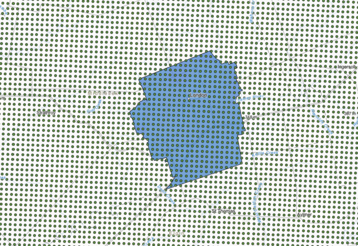
An added advantage of using ArcGIS Pro for this task was that I was able to use my existing data from ArcGIS Online to determine the spatial extent of my study area, so that I knew where to extract the data and which data entries should be removed. Having these data plotted to a map also allowed me to visually inspect the spatial coordinates (lat,long) in the original dataset, and decide whether I need to convert the coordinates from a GCS (angular units) into PCS (linear units). I didn’t recognize the importance of checking their spatial reference in my early trials, it turns out that the original data records were stored in a GCS where 1km in fact refers to 1km geodesic distance, not 1km planar distance on a PCS. This was important because a lot of geoprocessing tools in ArcGIS Pro such as Create Fishnet, and Generate Tessellation have planar distance by default without offering the customization options like the “Buffer” tool.
At first sight it seems to be possible to clip these point data directly using my polygon representing the city, or use the spatial query function to select features where they both intersect. In fact, it would take hours or even days to process a single file because the data records in the csv file would need to be loaded and mapped into the software first, before it can initiate the process of identifying where both features intersect. Either of these processes would consume an enormous amount of computing power in the background thus making it impractial for my specific tasks dealing with such a big dataset. I needed to find an alternative method that can extract my needed information through a temporary connection instead of phsyically loading the file.
After a couple of tests and trials, I had success in using the “Add Join” or “Join Field” functions in querying data directly from my csv files. Using “Add Join” allowed me to explore whether data from different dates can be combined into a single attribute table by creating a temporary connection, unlike “Join Field” where every operation would modify the original features permanently. Knowing the differences of these two tools, I used “Add Join” mainly for exploratory analysis and “Join Field” to permanently attaching attributes from one table to another.
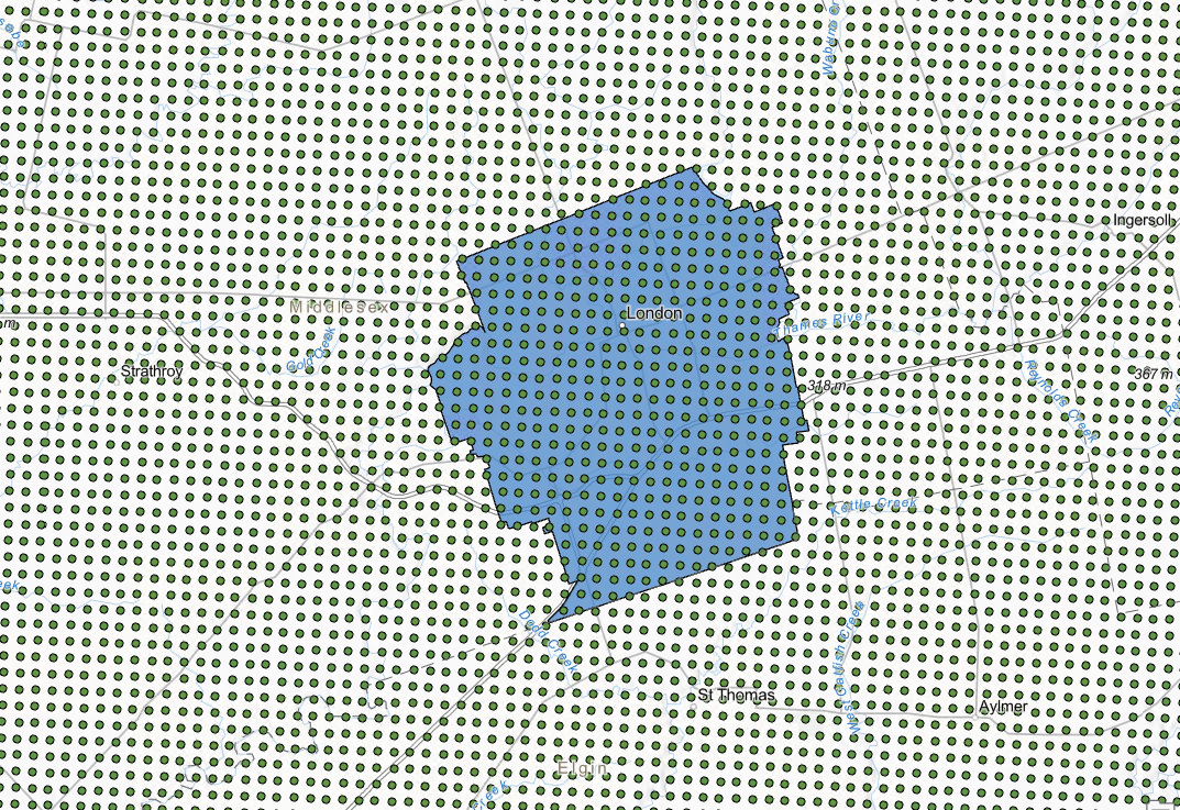
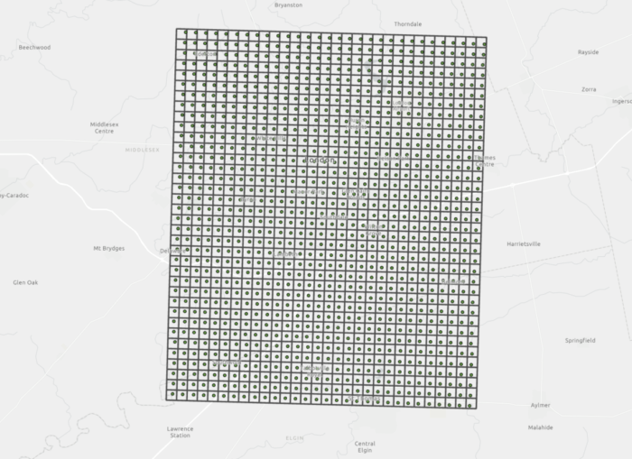
Before proceeding to using “Add Join”/”Join Field” to extract the data, I created a grid composed of many 1km x 1km squares with the goal of using these polygons to store what’s originally a point containing lat/long coordinates with weather data representing 1km of its surrounding. To do this, I used the “Create Fishnet”/ “Generate Tessellation” tools, both tools can generate the same output though I found that “Create Fishnet” was faster while “Generate Tessellation” may indicate error messages if there are unsaved edits. After the grid of cells was created, I used my existing city boundary polygon to clip the grid and ensure that the coverage was only for London. A final “Spatial Join (one-to-one relationship)” can be performed to transfer the attribute data from the points to the grid cells since the points were completely contained in each individual cell.

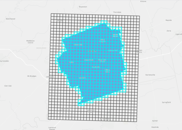
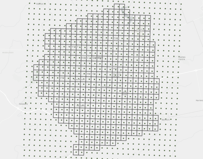
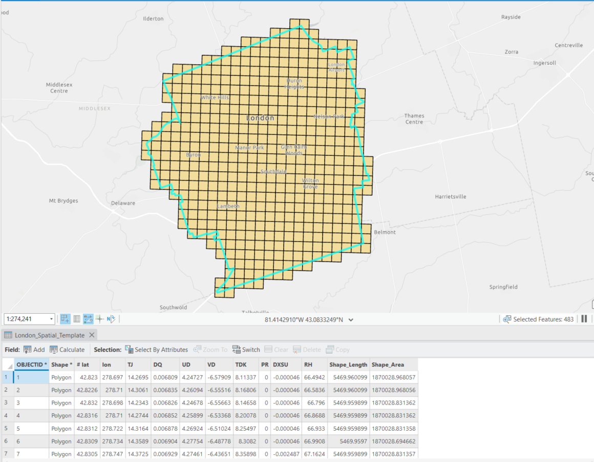
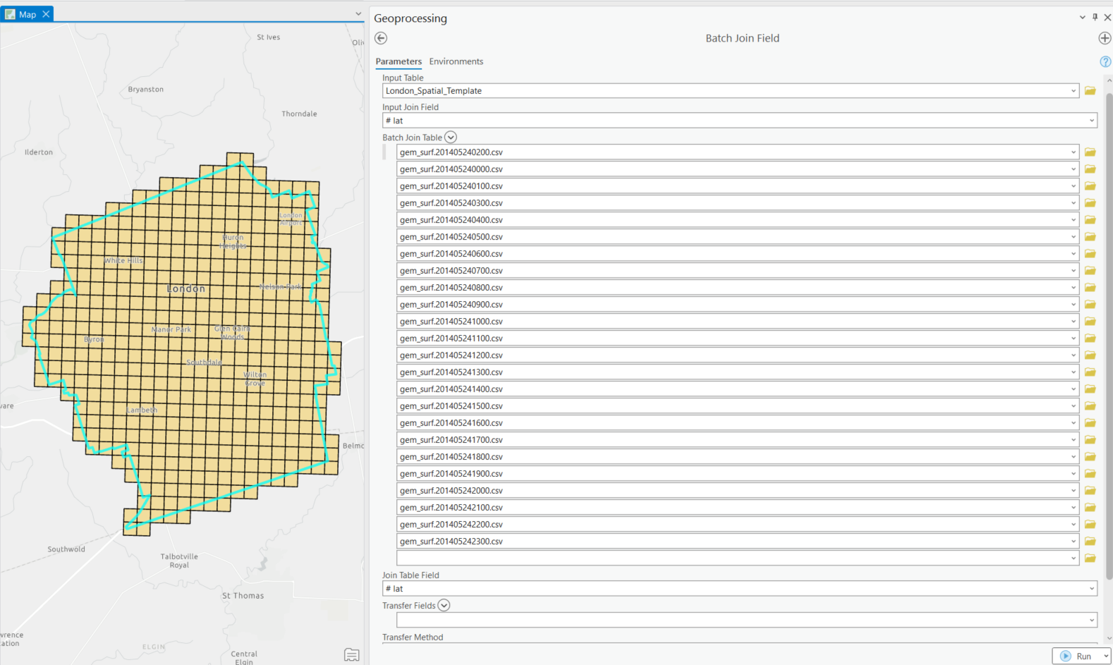
I called this polygon a “Template” because this polygon would decide how my final outputs would look like, and to what extent I would extract from the original data. Looking at the attribute table, I decided to use the latitude field as my “unique identifier” or “join field” to relate to other datasets because these spatial coordinates were consistent in all of my data. Having this “Template” on hand, I was able to use the “Batch Join Field” and set the “Join Table” as my batch parameter to automate joining data from the twenty-four csv files into the cells in this 1km grid. This method allowed ArcGIS Pro to query data directly from the csv files that matched my search criteria (latitude as my unique identifier) and import these results into my exisiting attribute table directly instead of having me to load each csv file separately. This process took about 2.5 hrs while I was able to free my hands to work on something else.
After changing the field names of the newly joined fields and ensuring that all technical works were performed correctly in ArcGIS Pro, I uploaded this feature class into ArcGIS Online to proceed with visualization. For the purpose of my project, I needed an interactive web map that can be shared easily to my audience, thus it’s better to run all of the primary analysis on ArcGIS Pro and take advanatge of the smart mapping features of ArcGIS Online to ensure compatibility and ease of sharing across different platforms.
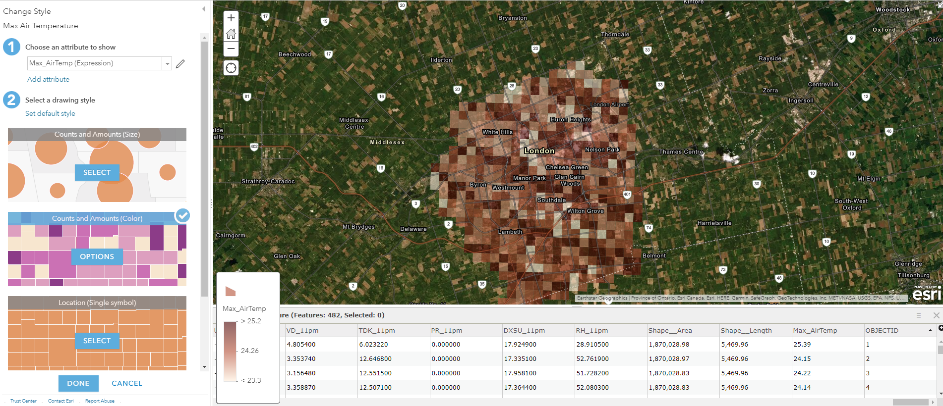
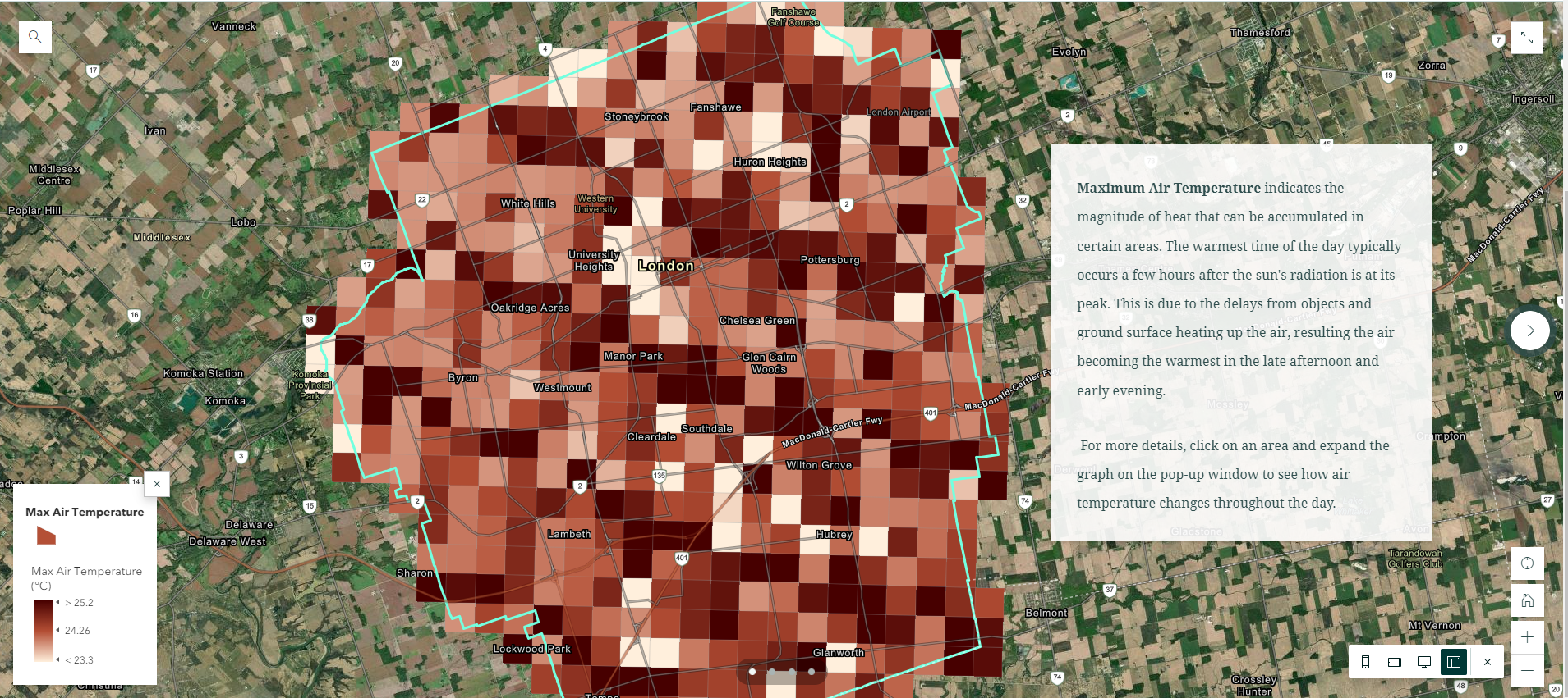
At this step, I realized that I didn’t have an attribute field to correctly represent the data values (maximum air temperature within the 24hrs) in a graduated colour scheme, so I added a new field to calculate the maximum value from all of the time periods using a quick Arcade Expression. Having the opportunity to continue adding new fields with values from exisiting fields means I didn’t have to go back and forth to enter new data in ArcGIS Pro. In addition, I was able to do some basic analysis using either Arcade or SQL. For example, I can create a temporary attribute field to normalize my weather data in order to compare data from different dates without making permanent modification to my attribute table.
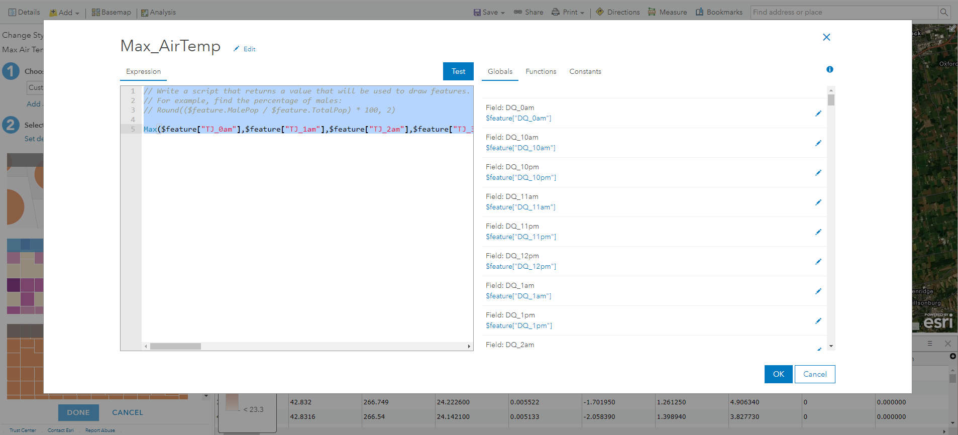
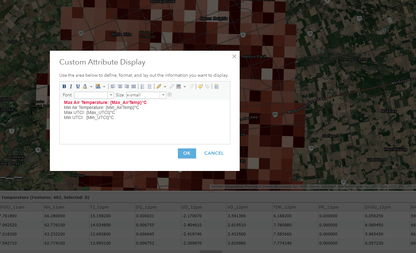
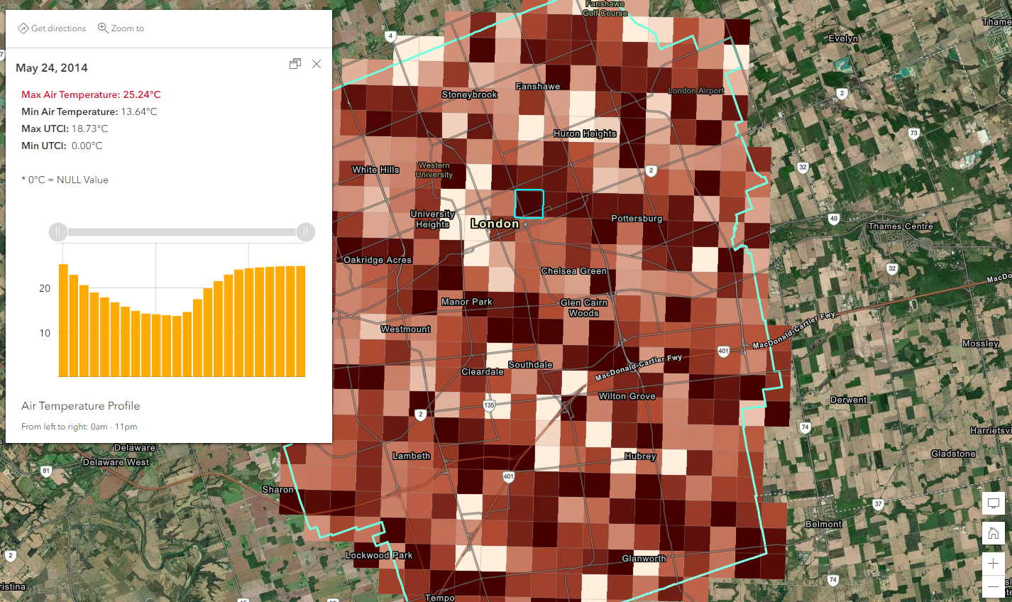
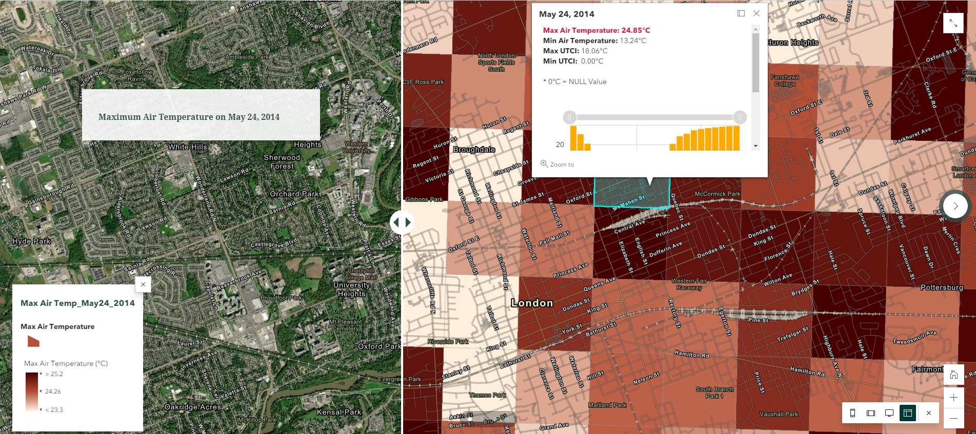
I used a similar expression to calculate values of my other fields (Min & Max air temperature, Min & Max UTCI), and used these fields to summarize the values of each 1km cell within their 24 hours period. The precise values were included through a custom attribute display so that only the necessary data were presented to the audience while the rest were hidden instead of being deleted. Showing the 24 hrs of data all at once can be challenging as it may leads to information overload and confusion, thus I decided to include the hourly weather data as a separate column chart to show the variation of air temperature throughout the day/night to replace what were originally texts. From here, the map legend can tell the audience what these colours mean, the pop-up window provides a neat and precise value of these important attributes, and the column chart can illustrate the hourly difference of air temperature, how it transition from the afternoon into the evening and where the maximum/maximum value was derived from.
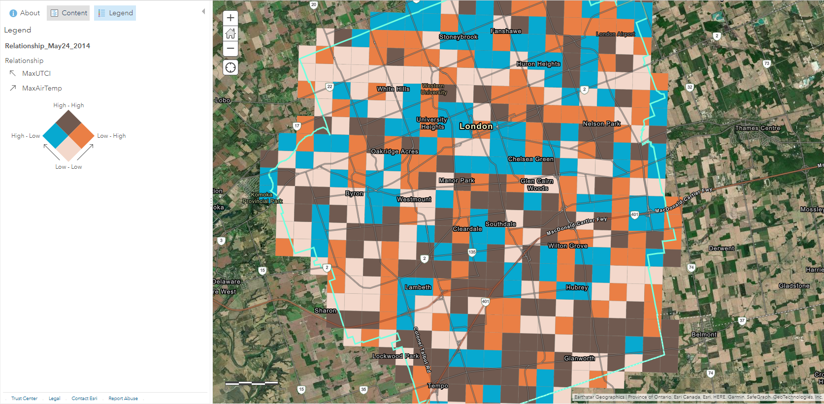
There were other visualization tools avaliable to enhance my web map, such as creating a relationship map to compare and demonstrate where both of my attributes (Maximum Air Temperature and Maximum UTCI) could be high, this indicator can mean that these particular regions could be of critical concern because pedestrians and bikers would experience the highest risk of heat stress in there. In areas where air temperature is high while UTCI is low, it can be a positive sign that there are other surface parameters in place in keeping this region relatively cool for the residents despite having high air temperature, such as having close proximity to water and abundance of tree shades.
Alternatively, if the analysis is to focus on the spatial pattern of these temperature data in relation to surface roughness or urban morphology, we can take advantage of adding a swipe block via ArcGIS StoryMap or Web App Builder so that one side provides spatial reference while the other retains the critical information. This is another web-mapping advantage that I often relied on over traditional paper maps because it allows me to add additional information without overcrowding the space on one map, or having to add in a third dimension to create a 3D scene. In this case, I didn’t have to increase the transparency of the colour ramp to retain the visibility of the satellite imagery in the background.
Conclusion
I’m happy with how the final outcomes turn out to be, as well as the ease of sharing these individual maps on a slide panel via ArcGIS StoryMaps. I’ll continue to finalize the rest of the dataset from other dates using the same approach, and hopefully there will be an opportunity to combine these data layers into a single product where I can communicate the analysis to the City of London. I’m hopeful that these results can contribute to a more in-depth analysis in identifying the most vulnerable neighbourhoods in the context of heat inequalities and the impacts of urban heat island.