
Using ArcGIS to Explore Suitable Housing Areas for Students in London
In my previous project in the third year GIS course with Dr. Jed Long, I completed a housing map using ArcMap, ArcGIS Online, and Story Map that aims to locate all the most accessible housing areas for Western students to live off-campus. Since the basic version of ArcGIS Online doesn’t provide access to the Spatial Analyst tools, ArcMap was primarily used for the processing of data, using tools such as raster calculator, the buffer function, and georeferencing.
Despite knowing that the basic version doesn’t provide a lot of tools, ArcGIS Online is still very useful for data visualization and keeping the data safe and organized across all platforms. I find it very enjoyable that ArcGIS Online was able to import my existing shapefiles in a zipped folder (instead of selecting one by one), and I can switch to work on a Chromebook without worrying my laptop crashing down from the overwhelming tasks (this is a huge advantage from ArcGIS Online). Some cool features that I also really like about ArcGIS Online are its wide selection of base maps, its “Bookmarks Tool” to jot down some quick notes, and its ability to link Open Source Data directly into the map to create a real-time interactive layer via an API link.
ArcGIS StoryMaps is similar to an online PowerPoint presentation, but it combines the ability to build a visually appealing website and provide an interactive interface in which a static PowerPoint slides couldn’t provide. The interactive map allows the users to zoom in very close to see the details of the map we made using ArcGIS Online, any changes to the map will be synced immediately with the Story Maps, therefore it’s very time efficient to be using Story Maps to present our findings.
The resulted map from ArcGIS Online provides a very thorough visualization of the city and shows a wide range of residential areas in which students might not expect they could live that far from the main campus.

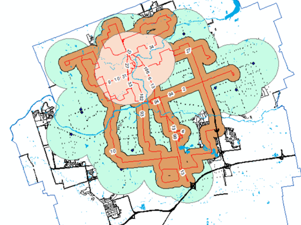
Because what’s a good fit for me might not be a good for everyone, thus the definitions of “accessible” and “suitable” are highly subjective. This map was created with evaluation criteria which I think are important for students to be living off-campus:
- Best Location: Within 2KM of Walking Distance to Campus or Nearby Shopping mall + Within 500m to bus routes that go to campus directly + within the residential zone
- Good Location: Within 2KM of Walking Distance to Campus or Nearby Shopping Mall + within the residential zone + BUT No direct bus to school
- Fair Location: Within 2KM of Nearby Shopping Mall + Within 500m to Bus Routes that go to campus directly
At the end, the results would need to answer the question “Where can off-campus students live most comfortably for being close to everything?”
In my first stage of gathering data, the most difficult task was to determine which bus route goes into the main campus. It was fortunate that the local bus operator (London Transit Commission) provided an updated shapefile (polylines) for its newest bus routes, all I need to do was to inspect all the bus stations within the campus on Google Maps. I wrote down the bus routes and export them from the attribute table into a separate shapefile and performed some analysis on them using the buffer and intersect tools. This approach was very time consuming and wouldn’t be practical for universities that have high urban densities such as University of Toronto, but it was a doable solution at the time of the project. To improve on this, I should be able to use the “Extract by Mask” function to clip the bus route shapefile using the “main campus” polygon as the mask, then use the “Identify” tool to investigate which bus routes depart/originate from the campus.
Overall I think this study was a good learning experience in understanding how ArcGIS can be used in our real-life scenarios to solve a geographic issue (in this case, house hunting for students), the capability of ArcGIS Online and various benefits of using the Web Version, as well as how to use the Story Maps to present findings conducted using Esri software.