
Doing Spatial Analysis with ArcGIS Online: A Reflection on Esri’s Going Places with Spatial Analysis MOOC
In the past two months with the majority of my school works being completed, I was able to dedicate myself to one of Esri’s ongoing MOOCs (Massive Open Online Course), and attend their weekly exercises and webinars that talk about the different tools and concepts for conducting spatial analysis using ArcGIS Online. This six-weeks course was definitely an enjoyable learning experience, and to my surprise, I learned a lot of new tools and operations that could be completed fully on ArcGIS Online. Based on the concepts and skills I acquired from the MOOC exercises, I decided to re-create several projects that are similar to the MOOC exercises, because I find that hands-on practice is the best way to acquire new GIS skills and motivate geographical thinking. On the other hand, I’m also hoping to use these new spatial analysis techniques to find new trends and geographic features that aren’t viewable on other mapping platforms.
Project #1: The Underground Sewer System of London
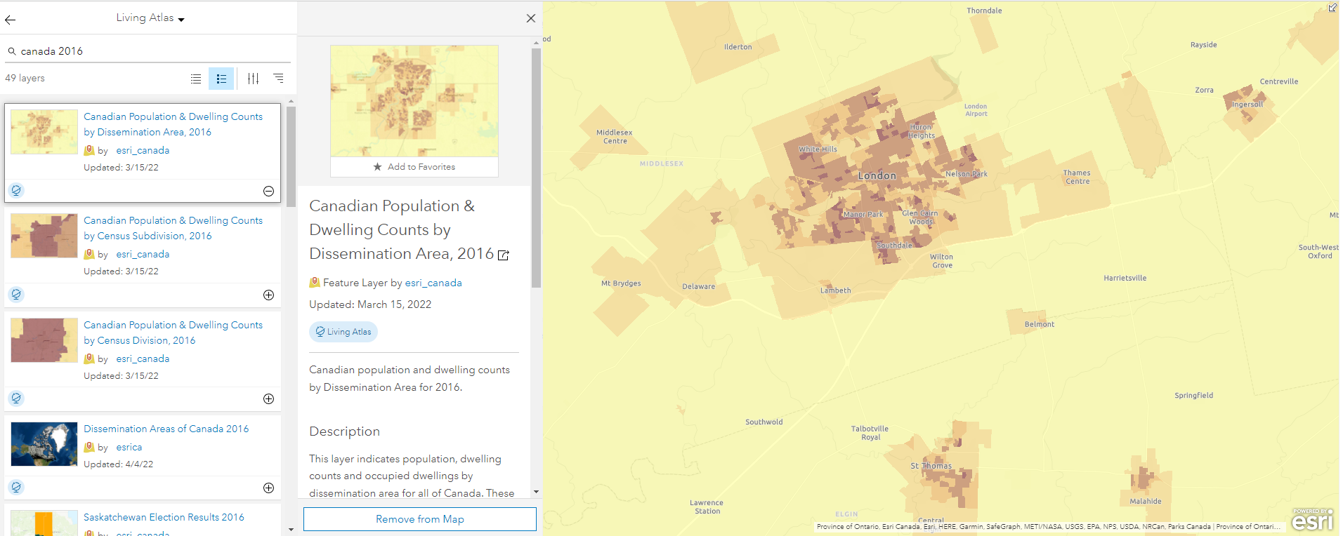
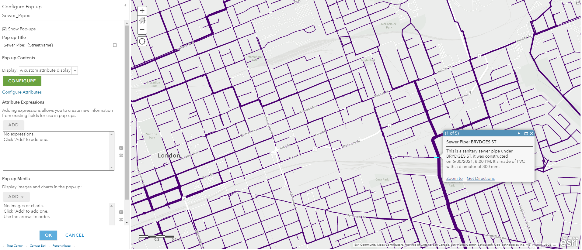
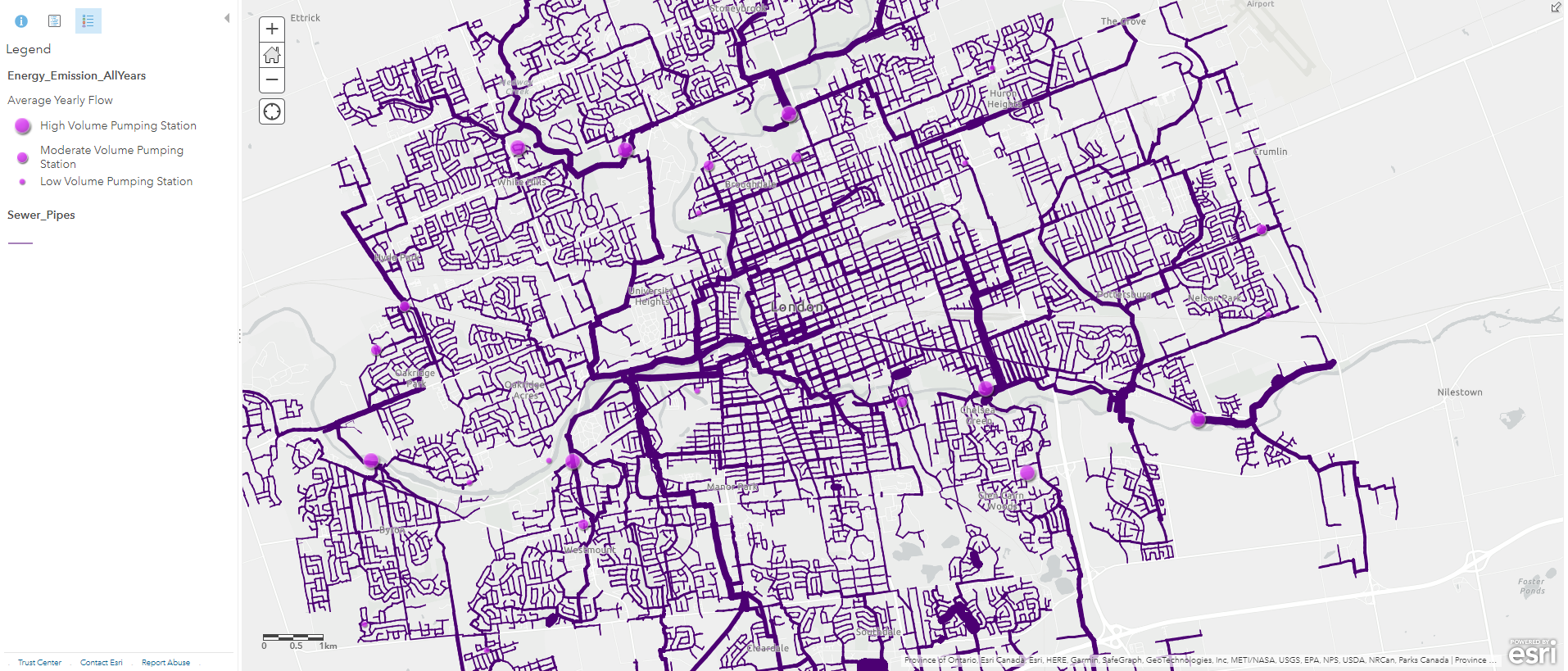
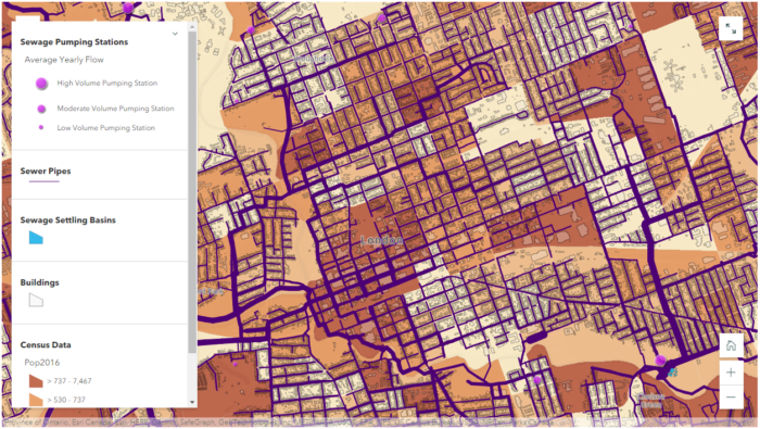
My first project is about visualizing the underground sewer system in London, Ontario and enriching it with the newest population data (2021 Census). The outcome of this project is an interactive web map that displays multiple layers that wouldn’t be appropriate for a conventional paper map. These layers include a polyline file of all known sewer pipes in the city, e standalone tables of pumping stations with emission and electricity consumption data, a polygon file of sewage settling basins, and lastly, two online layers from Esri’s Living Atlas: Canadian Population and Dwelling Counts 2021, and Canadian Population & Dwelling Counts by Dissemination Area 2016.
Some data cleaning and formatting were required for the csv files using Excel because they were prepared by different authors for different years. After this data cleaning step, the process can be switched completely to ArcGIS Online. Using the geocoding function, we can upload these individual tables and map the pumping stations with their address fields. To clean up these clusters of points, I used the “Find Existing Locations” tool (alternatively known as “Select Features by Location” in ArcGIS Pro), to generate a layer where points from different years all intersect. This process is also known as “Spatial Query“, because I want to determine all the stations that have data from 2012 to 2019. The stations’ address fields won’t change, so I can simply use their locations as their intersection points.
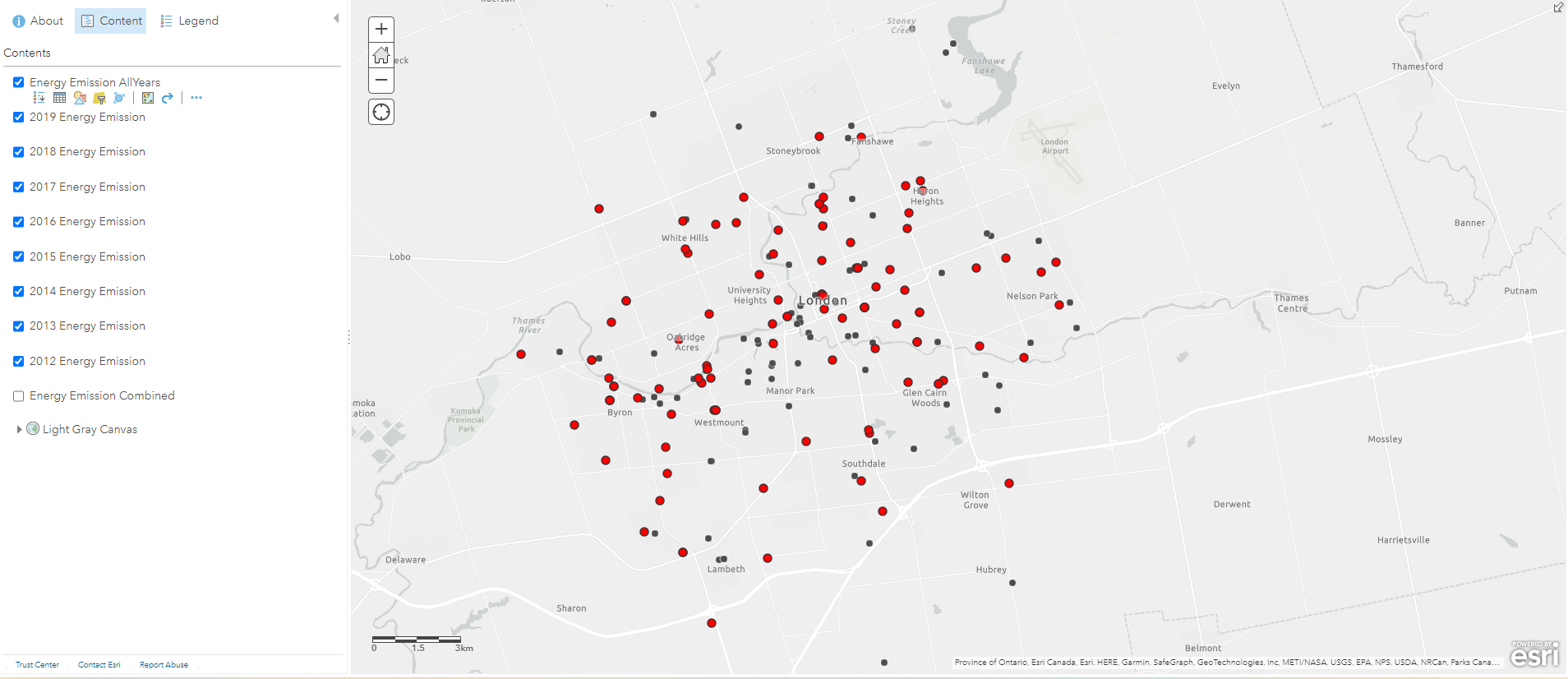
(these dots include recreational facilities, sewage pumping stations, water pumping stations, etc.)
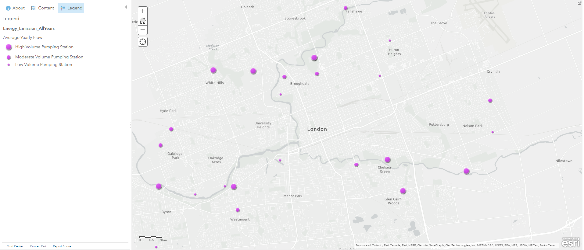
Another process called “Attribute Query” was also required because I only wanted the sewage pumping stations from these data points. To do this, I used the “Filter” tool to display only the sewage pumping stations I needed, this is similar to using “Definition Query” on ArcGIS Pro. With the filtered pumping stations, I changed their symbology to purple graduated symbols, with the size of the symbol corresponding to their annual pumping volumes. While doing this, I also classified their data into three categories to allow human eyes to detect size differences without nearby references. From this layer we can preliminarily predict where sewage will flow based on the pumping volumes. My intial prediction is that a lot of sewage will be pumped into the stations near the Thames River, where they will be treated and released into the river. To confirm this hypothesis, we need a couple more layers.
I found that we had a map of sewage pipes avaliable in the open data portal and I decided to use this to help visualize the flow of sewage. Simply looking at the attribute table, I determined that I can create a custom attribute display on the pop-up window, this includes which street the pipe is under, when it was constructed, what material the pipe was made of, and the diameter of the pipe. The diameter information of the pipes is very useful because I can also use it to classify the “line width” of these polyline features. A thicker pipe typically means it processes more sewage and collects sewage from nearby thinner pipes.
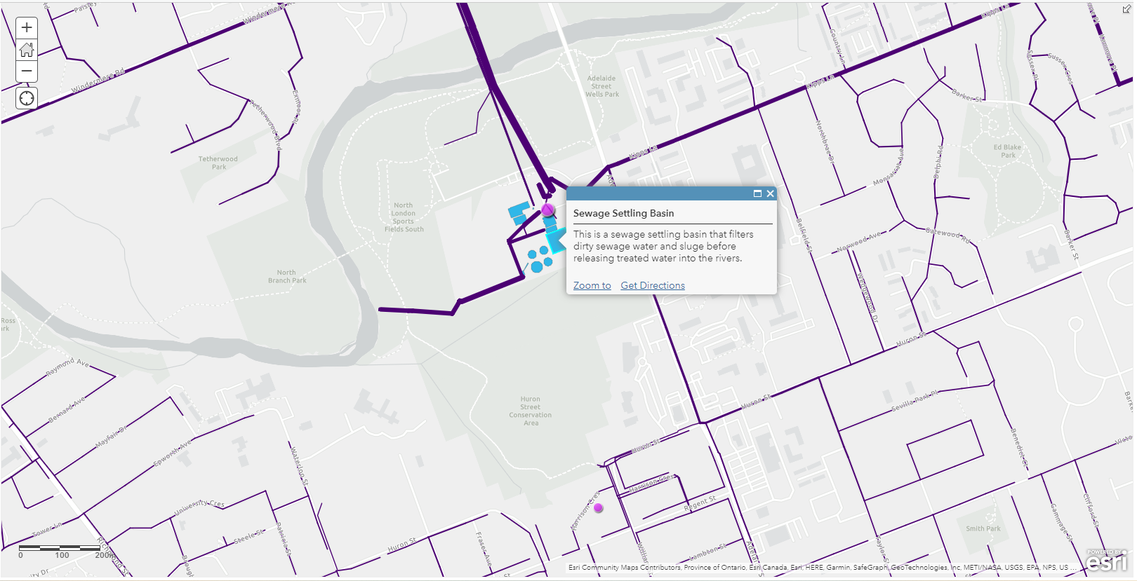
Using the pumping station and sewage pipe layers, we can now be more confident in our prediction of household wastewater, and how it gets pumped into the sewage settling basins, as well as where it is discharged at the end.
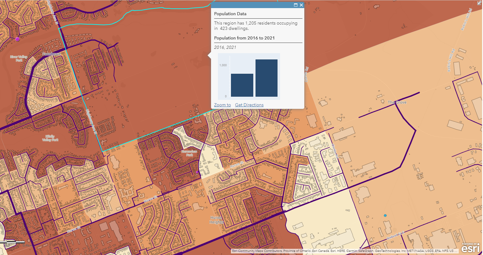
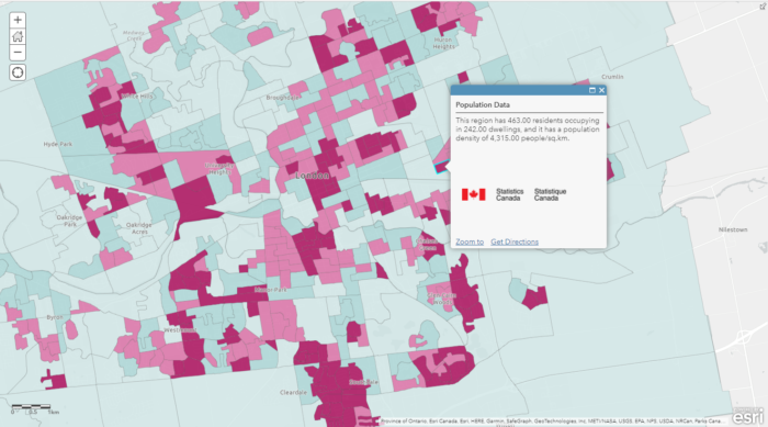
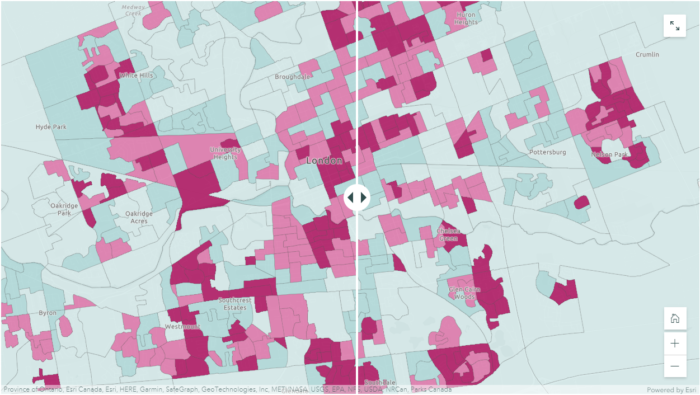
To help answer more questions, such as helping the city to determine which neighbourhood may require future sewage pipe replacements due to a rapid increase in population, we can enrich our basemap with population data from Statistics Canada’s Census Data. In order to display the relevant information (2021 population, 2016 population, population increase/decrease), I decided to display the 2021 population as a choropleth map and put other information on the pop-up window (a major perk of digital mapping!).
However, according to the Spatial Analysis MOOC, this is a common mistake where a lot of people use choropleth maps to display non-normalized data. In other words, choropleth maps should only be used to display normalized/standardized data such as population density, crime rate, fertility rate. To display counts, the best symbology to use is graduated symbols. In my case, I decided to use the choropleth map because I already have another layer using graduated symbols, and the choropleth map helps me achieve what I want to display, that is, showing population data as a background for other data layers.
(the selected region is a new development neighbourhood with lots of new buildings)
Combing all these data layers together, we now have a complete web map that we can use to answer many different questions such as:
- Where does our household wastewater go?
- What is under our street, what is the thickness of the pipes, and what is it made of?
- Where are the major sewer systems located in our city?
(link: https://storymaps.arcgis.com/stories/f4d5442efa3e4c8891c43a2ddaf2a18e)
Project #2: Population Density Map
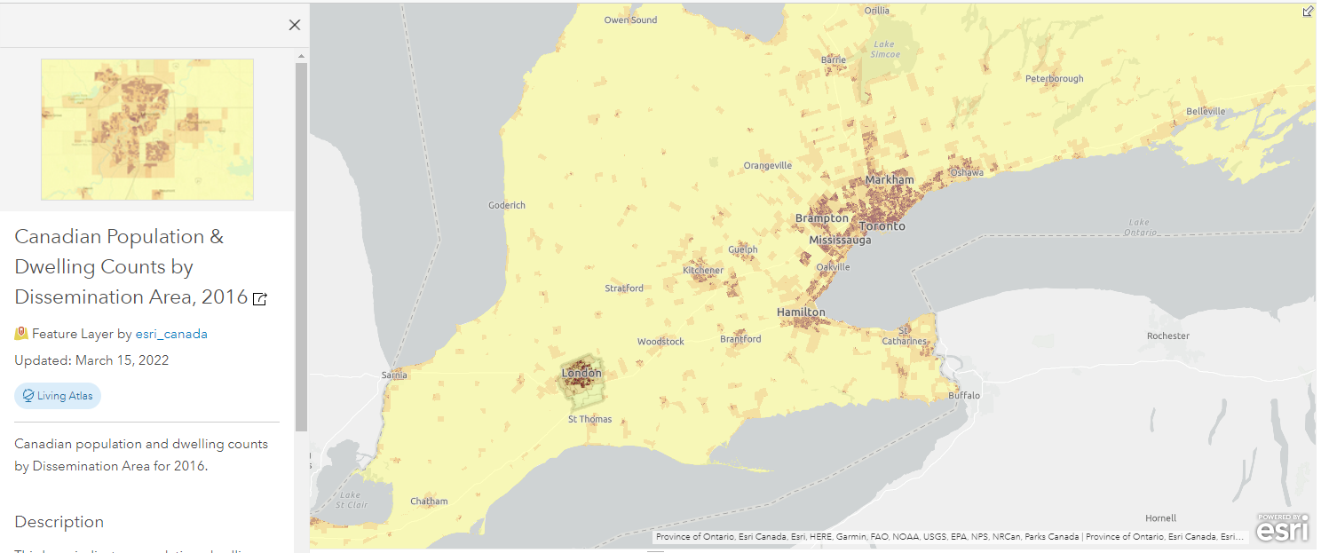
The second project I completed was a continuation of using the population data from Esri’s Living Atlas. There were still a lot of other fields in the attribute table which I wasn’t able to use in the sewage mapping example, such as the population density (people/sq.km), change in the number of dwellings, and difference in population from 2016 to 2021. One thing to note before using the Esri’s population data layers is that they contain data for every single dissemination area in Canada, so we have to select only those locations that we need for our study area. In my case, I used the London City Boundary polygon to clip out the areas I needed. If our study area is Middlesex, we can quickly apply a filter to select those data records where “Census Division” = Middlesex. This step limits the amount of data to be displayed so our map can load much faster without the unnecessary data outside our study area.
The 2016 population dataset doesn’t have population density, but it does have the population, and the land size of the dissemination areas, so I added my own population density field by adding a new field with a simple SQL formula (population density = population / land size in square kilometers).
To better visualize and compare the difference in population density from 2016 to 2021, I decided to take advantage of the “Swipe” function in ArcGIS StoryMaps. The Swipe Block allows me to put two different web maps side by side, I found that this was the perfect tool for me to show the change in population density in the past five years. On the other hand, the “Swipe” function still retains the pop-up window with my custom message, so it allows users to quantify differences in the number of residents and the number of dwellings at the same time as knowing where population density has increased.
https://storymaps.arcgis.com/stories/f4d5442efa3e4c8891c43a2ddaf2a18e
Project #3: Population Change (%) Map
The population density maps provided quick insights into where people live within a particular community, but what if our concern is about the total population change instead of density? For real estate applications and city planning, knowing which regions are seeing population growth or loss is often more important than knowing population density. For example, high population density can indicate more multifamily buildings in an area and it’s often used as an indicator for lower income households. Whereas population change over a five-year period can provide other information, such as which neighbourhoods are becoming more or less attractive, and which neighbourhoods have a relatively stable population throughout the years. These are all topics of concern for realtors and homebuyers who are interested in knowing where they should settle in the city. Will a family of three buy a home in a highly populated area? Well, it depends on a lot of factors such as the price of the home, the number of nearby recreational facilities, the quality of schools, etc. Will the same family consider buying a home in a region where we are seeing a lot of residents leaving (e.g. London East), the answer is more likely to be no if they have this information at hand, and they found out that the reason is a high crime rate.
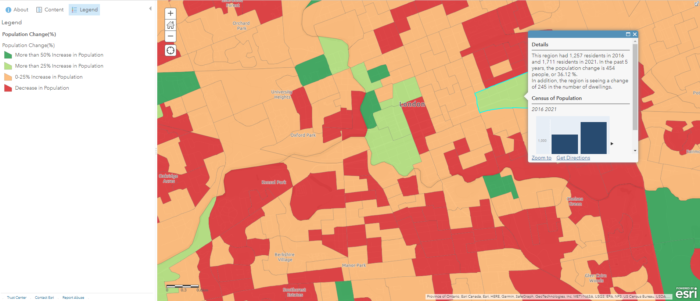
where shades of green represents population increase and shades of orange represents population decline
All of these data come from the same dataset with almost the same inputs, but they portray a very different message. While one map shows that a specific neighbourhood has higher population density, another map shows that there has been a significant population decline in the past five years. Therefore it’s important to know your audience, and rephrase the question you try to address to be as specific as possible. Different ways of processing and representing the data can lead to significantly different outcomes that might mislead users.
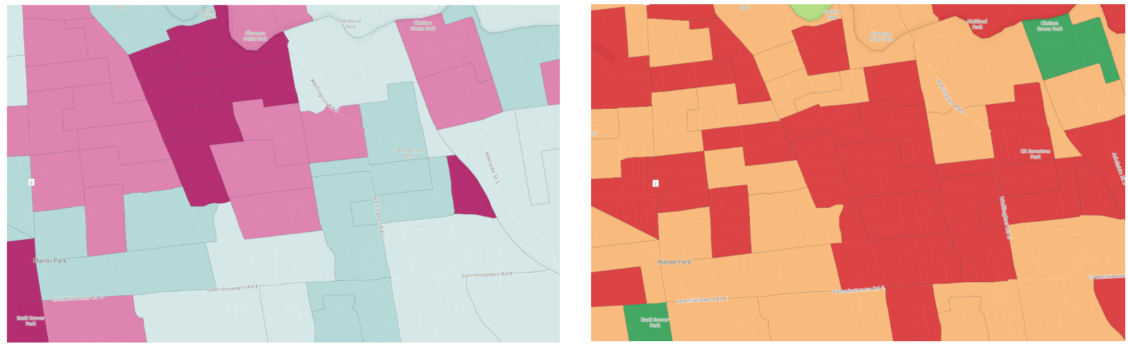
vs. Population Change Map indicates decrease in residents (right)
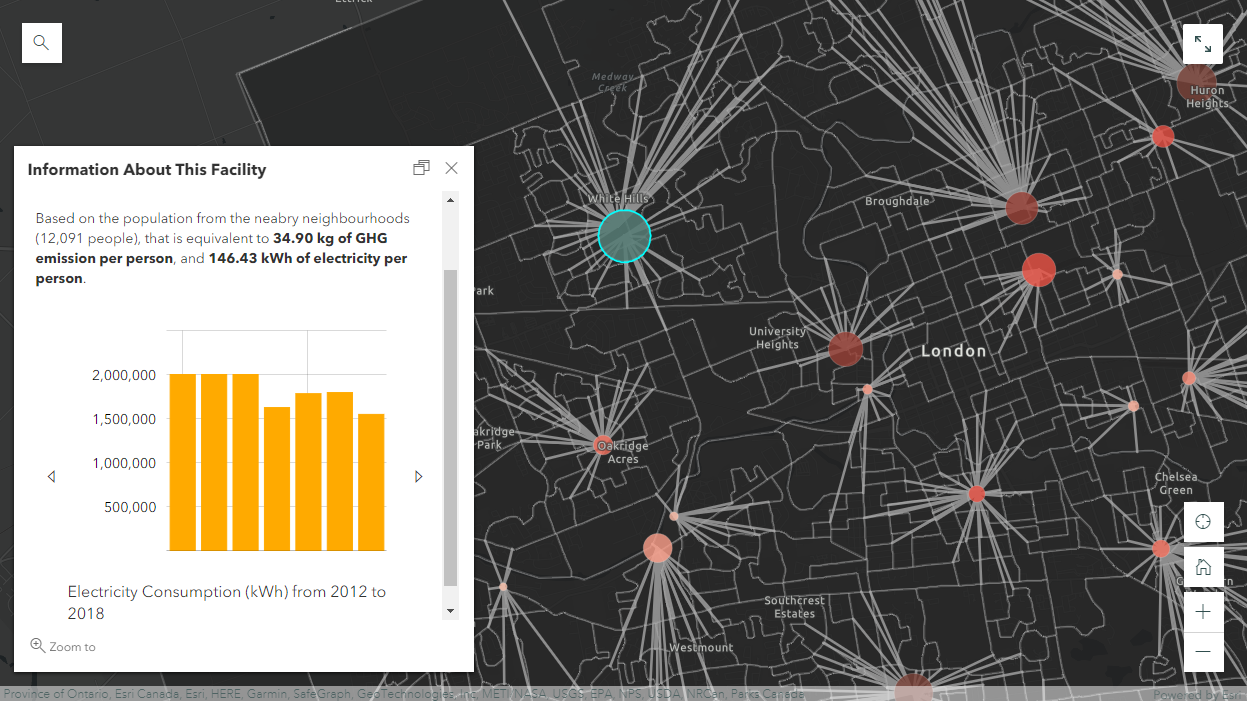
Project #4: Electricity Consumption and Greenhouse Gases Emissions at Recreational Facilities
The last project I completed with the same dataset is a map of electricity consumption and greenhouse gas emissions for all of the recreational facilities in London, Ontario. These facilities include community centres, indoor swimming pools, ice rinks, and senior centres. This project is similar to the mapping of “Particulate Matter” from the MOOC exercises that mapped the dispersion of PM2.5 using monitoring stations in California determining where children and seniors are at risk, and how many people are at risk of exposure to a high level of PM 2.5.
Using a similar approach, I used the tool “Find Nearest” to identify the number of people from nearby neighbourhoods who are most likely to use the facilities. At first I was thinking about using a simple overlay analysis with 10km buffer zones, but this method wouldn’t work because. Firstly the results would contain overlaps where one neighbourhood can be situated within 10km of both facilities. Secondly there might be neighbourhoods that are located beyond 10km of any facility. The “Find Nearest” tool was used instead because it performs an “One-to-One” operation where one neighbourhood can only match to one facility (i.e. the nearest). Therefore, results wouldn’t contain any overlaps or missing neighbourhoods.
The new layer produced from this step contains polygon line features connecting the facility to its nearest neighbourhoods, indicating whered population would be drawn from. Since each feature now contains a common attribute field with the facilities, we can perform an attribute join to transfer the population data from the neighbourhoods into the facility polygons. I found that the easiest way to do this step was by downloading the table into a csv file and editing it in Excel using the SUMIFs function, and then re-joining the layers after. Alternatively in ArcGIS Online, we can add a new field on the attribute table of “Recreational Facilities” and calculate using an Arcade Expression (this method would require some basic programming).
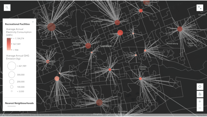
The reason for adding the population data into the recreation facility polygons is to normalize the data into smaller data figures so that they are comparable between facilities. It can be difficult to get a sense of what the some of the numbers mean. For example, is 1,770,507.98 kWh/yr a lot for a swimming pool of that size? 421,989.81 kg of GHG sounds like a lot, is there something we should do to reduce the emission? Without knowing the context and having something to compare side by side, it is difficult to judge whether one facility is more efficient than another. After we normalize the data, we have much smaller data figures that we can compare easily. If we compare two indoor swimming pools together, it’s much easier to determine which is more energy efficient and environmentally friendly. This is not a perfect technique to normalize data because one might travels a long way to use another swimming pool, or a facility might release more GHGs because of higher maintenance standards. However, the overall trends from this analysis are encouraging, we are seeing a steady decrease in both greenhouse gases and electricity consumption in the past 7 years.

South London Community Pool (right): 4.57 kg/person, 11.53 kWh/person
Conclusion
It’s fascinating to me how many maps we can create starting with only a couple of datasets, and ArcGIS Online’s spatial analysis capabilities exceeded my expectations. Beside the major mapping skills I acquired from the MOOC, I also liked some of the ideas from professional cartographer Dr. Kenneth Field who says “All maps lie, making a map that doesn’t lie is what we aim for”, and “Always go beyond the system default, the chances of a default being exactly what you need to make your map is actually very low”. His wise words reminded me of the importance of cartographic design and principles, because a successful map will not only requires proficient mapping skills and GIS knowledge, but also demands the mapmakers be familiar with human cognition to avoid the common ‘cartofails’. ArcGIS Online provides a dynamic solution to the new era of digital mapping where we are able to quickly re-design our maps and share our products seamlessly across different users We should all be taking advantages of this cloud-based data analytics platform.