
Using an ArcGIS Pro Python Noteboook to display results of a GWR model
The Built-in Python notebooks feature in ArcGIS Pro is very useful for creating an automated and reproducible workflow for complex analysis. Personally though, my best use of the ArcPy library in ArcGIS Pro has been for a fairly simple purpose – to create multiple maps iterating over a categorical variable’s values.
I often find myself with more information than I can fit on one map. My most recent example of this was from running a Geographically Weighted Regression (GWR) model – essentially a linear regression model for when your observations are geographic units. If a regular linear model exhibits spatial autocorrelation, a GWR can be used to account for this pattern of spatial variability. To put it simply, a separate regression is run for each geographic unit, where only nearby observations are included in each unit’s regression. Units that are very far from each other will have little to no impact on one another’s individual regression model.
While this is a very useful way to account for spatial variability in a regression model, you end up with a lot of information that is difficult to summarize on a single map. Essentially, you have a separate coefficient and p-value for each covariate and for each observation unit. I generally try to simplify information as much as possible when I make a map so that only the most important information is included, but when I am running a GWR model with five covariates, and running this model multiple times for different response variables, the best way to visualize the model coefficients is to create multiple maps.
After loading the GWR model results into ArcGIS, all I have to do is run my Python Notebook that creates a map of the model coefficients with consistent formatting, and I can easily do this for each iteration of the model that I run so that I can quickly visualize the results.
If it’s your first time using ArcPy, the main challenges are setting up the Python code with variable references to the project, map, and layout, and learning the common ArcPy function names. But if you need to perform any iterative task, it is worth setting up a notebook for when you will (inevitably) need to re-run your analysis and re-create your maps. Below are the results of one version of the GWR model that I ran looking at how several socio-demographic variables affected mobility patterns in April 2020 at the start of the COVID-19 pandemic. These three maps show the sign of the coefficient (positive in green, negative in purple) for geographic units where the coefficient is significant, for three of the five covariates that I used in the model. The response variable is change in the time that people spend moving for the week of April 6, 2020 relative to pre-pandemic.
In my script, I start by setting up the variable references to different parts of the map, starting with the project (aprx = arcpy.mp.ArcGISProject(“CURRENT”)), then to the map (m = listMaps(“Map”)[0]) and layout (l = listLayouts(“Layout”)[0]), as well as the different elements on the layout: title, subtitle, text, legend, and layers. Then, I create list variables representing the five covariates and the three time periods that I am running a model for.
After this, I use a simple nested for loop that cycles through each covariate/time period combination and filters the rows in the results table to these values using the definitionQuery attribute of the layer, and exporting it with exportToPNG(). I could also specify the symbology in the script, but since all the maps have the same symbology that never changes, I chose to do this manually. Here is the main part of the code that runs through the loop printing the maps:
covariates = ["Average Age",
              "Median Income",
              "% Visible Minority",
              "% Post-Secondary Educated",
              "% Detached House"]
times = ["Apr","Aug","Sep"]

# MOVEMENT TIME
export_folder = "\model_MT"
t = 0
lyr_GWR_MT.visible = True
text.text = "Movement Time"

# Loop through each time period
for time in times:
    i = 0
    subtitle.text = times_full[t]

    # Loop through each covariate
    for c in covariates:
        # Set Definition Query
        lyr_GWR_MT.definitionQuery = "\"covariate\" = '" + c + "\'" + " AND " + "\"per\" = '" + time + "\'"

        # Set title text
        title.text = c + " Co-Efficient"

        # Export layout to PDF
        export_path = path + export_folder
        l.exportToPDF(export_path + r"\MT_coeff_map_" + cov_short[i] + "_" + time)

        # Export layout to PNG
        export_path = path + export_folder
        l.exportToPNG(export_path + r"\MT_coeff_map_" + cov_short[i] + "_" + time)

        # Reset Definition Query
        lyr_GWR_MT.definitionQuery = ""

        i = i + 1
    t = t + 1

# Make layers invisible
lyr_GWR_MT.visible = False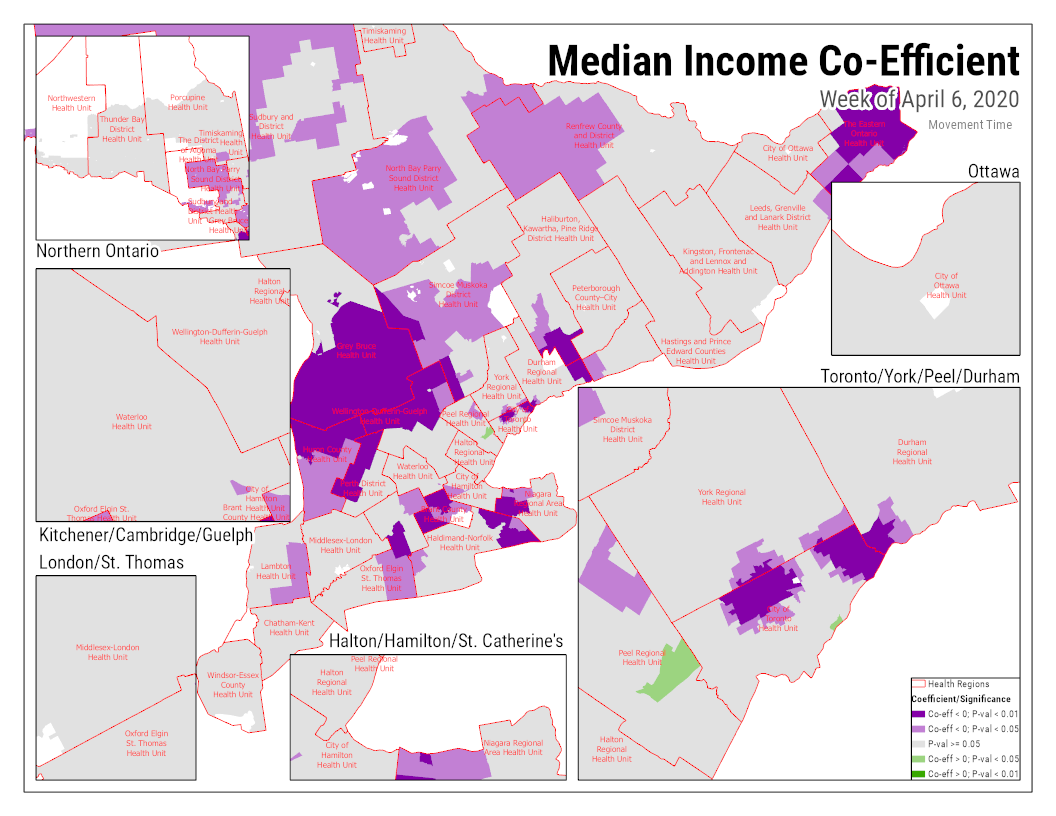
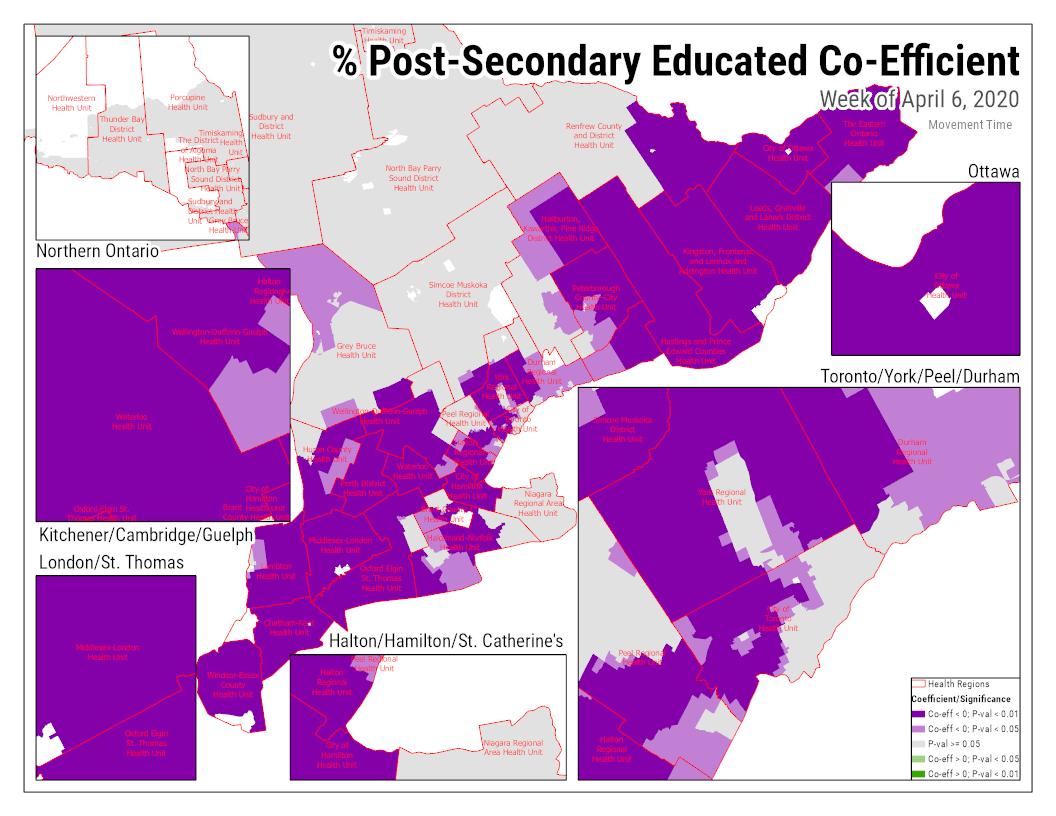

As we might expect, we generally see that these three variables had a negative relationship with movement time, but the GWR shows us that this was not the case across all of Ontario, and there were even some specific areas with the reverse relationship.
Though I won’t show all the results here, ArcGIS notebooks helped me visualize the results for 6 different versions of the model. As you can see above, I was also able to take advantage of ArcGIS Pro’s ability to create multiple insets to be able to see the results for urban areas in Ontario on the same map.