
Mobility Patterns During COVID-19 with ArcGIS Insights
I’m sure we’re all well aware of the many impacts that COVID-19 has had on our typical lives. Working from home, attending school from home, and limits on social gatherings have significantly reduced our mobility.
The Geospatial Lab at Western University has been working on a project to look at how mobility has changed over the course of the pandemic, and how patterns of mobility vary across different parts of Ontario. We have been working with TELUS communications Inc. to use network mobility data get an idea of mobility patterns from a very large sample – approximately 3.5 million Ontarians.
After calculating and aggregating some key mobility metrics from this dataset, we chose to display our results using ArcGIS Insights to offer an interactive way for people to view the mobility indicators. We wanted to offer an interactive dashboard that displays the data, and allows users to look at the specific regions and variables they are interested in, and to zoom in and out of a choropleth map where there are big discrepancies in zone sizes.
Insights also has some other benefits for interactive data visualization. You can choose from a number of different types of plots, graphs, maps, and tables to find the best way to display your data, add filtering options for the user to choose from, and easily modify the layout of the panels for your dashboard.
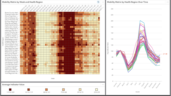
We used a map to show the spatial aspect of the mobility indicators we calculated, and a heat chart with a time series plot to show temporal patterns. User can choose which of the three mobility indicators that want to look at, and filter which week(s) they want to display. We were also able to embed the dashboard on our lab’s website when we were finished.
You can see from the dashboard how mobility dramatically decreased in March and April, gradually started increasing again from May to September to a point where it was even higher than pre-COVID, and then started declining again in October, generally corresponding with the levels of restrictions at different times. The heat chart and time series plot shows these temporal patterns and how they vary by health region in Ontario.
The map shows the value for the mobility metrics by Aggregated Dissemination Area (ADA) across Ontario. Depending on which week(s) you filter for, you can see some interesting patterns. On this map for a specific week in July, there is a very wide range of mobility levels across different neighbourhoods in the Greater Toronto Area. Green represents a decrease in range of mobility from the pre-COVID baseline, and blue represents an increase.

One challenge that we ran into using Insights was that size and structure of our data was an issue for interactive display, since we were working with three mobility indicators for every day in 2020, for each ADA in Ontario. We ended up averaging by week to make the dataset more manageable. Weekly averages proved better regardless since the daily level of granularity was a bit too much detail. I will be keeping in mind for the future that interactive displays like Insights are best used with simplified or aggregated data.
The other challenge I faced was actually being able to use the interface to set up the dashboard. It took some time to figure out how it works. However, once I did, I actually found it quite intuitive. It’s a good idea to keep in mind that if it’s your first time using a new application like ArcGIS Insights, it’s worth taking some time to become familiar with the interface and all the options you have available to find the best way to show your data.
Overall, we think using Insights was a useful way to display our data in an interactive format. You may want to consider using Insights to building interactive dashboards for small or medium sized datasets, or analysis outputs/aggregate results from big datasets. The interactive interface provided by Insights enables users to easily explore and filter many different variables displayed musing a combination of different maps, plots and charts, and providing insight into patterns and trends within the data.
You can see our COVID-19 Mobility Dashboard at https://geospatial.uwo.ca/mobility.html and have fun looking at the mobility patterns in Ontario in 2020!