
Going from ArcMap to ArcGIS Online
Hi everyone!
My name is Nicole Moguilevskaia and I go to the University of Toronto. I am studying GIS and computer science in my undergrad.
For the past year, I have been using ArcMap in all of my courses – from map design to data science. It has become a software I trust for data manipulation and data communication. Recently, however, I have become interested in web maps and their increasing involvement in media. This and the blog post by Scarlett Rakowska motivated me to try my hand at making one of my own web maps!
During this ongoing crisis, I have become increasingly concerned with how COVID-19 may be affecting people differently. Since many jobs do not provide the option of working remotely, some Canadian residents must continue going outside and thus, risk their health. Often this is because they cannot afford to stop working. For this reason, I chose to research how income may provide advantages to access to healthcare.
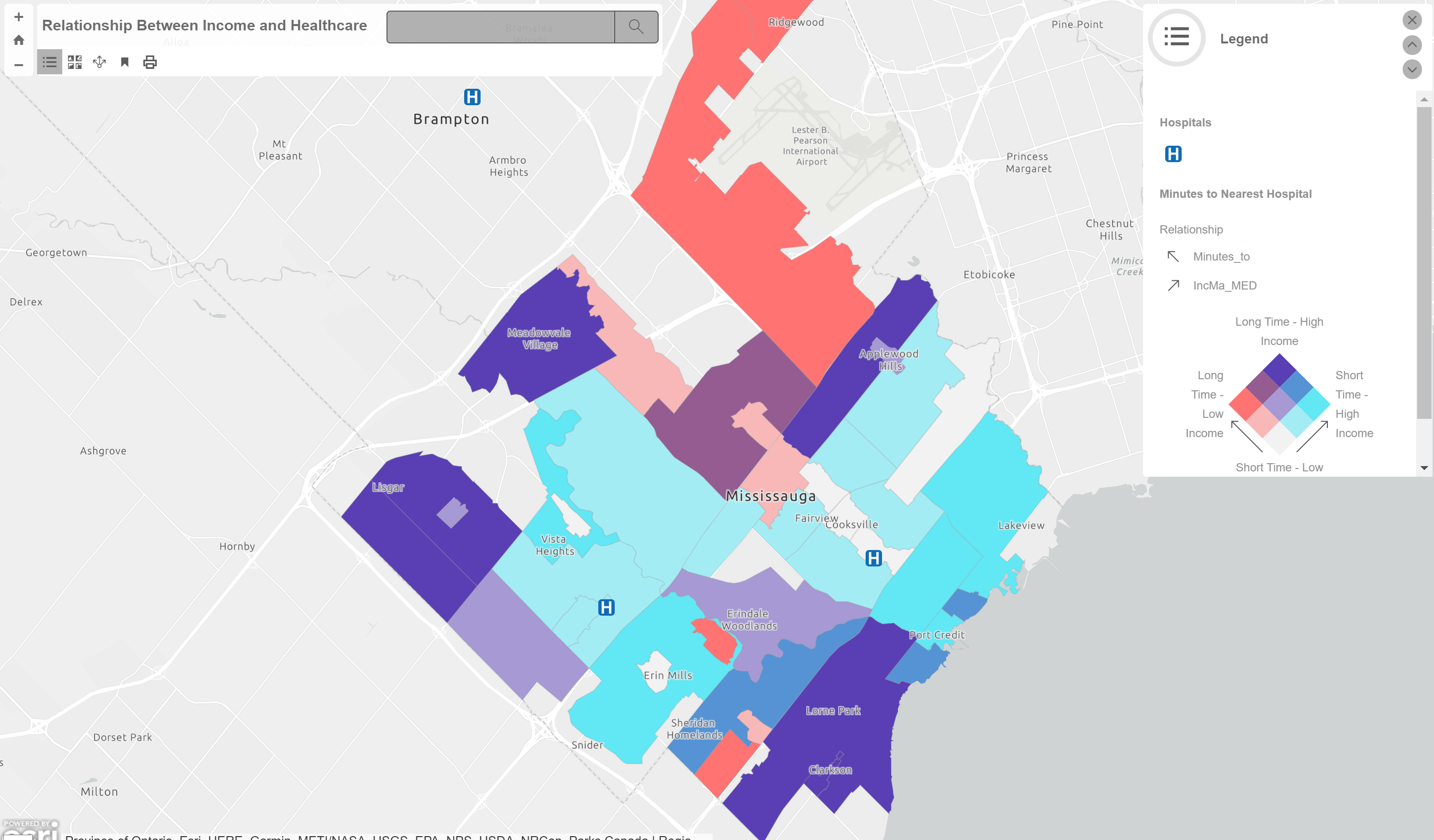
I chose the city of Mississauga (a Toronto suburb) for my study area. Seeing as Toronto is quite a densely populated area with lots of variabilities, I opted to use one of its suburbs for my first web map. I had two main variables I worked with: minutes to the nearest hospital and median income by neighbourhood.
I ran into a few hiccups while making my first web map. I was at a loss without my regular ArcMap tools and familiar user interface! However, once I had some trial and error under my belt, I grew an appreciation for many of these provided tools. ArcGIS Online allowed me to use the “Directions” tool to average out distances from each neighbourhood to the nearest hospital. Instead of having to manually compute it, I was able to use one of the built-in features! Though I still have ways to go before I will understand all of the “Analysis” tab, I am in awe of the way data can be so easily worked with.
I have created an oversimplified map for such a complex issue. However, I know I will be able to continue my research and refine the map as my practice with ArcGIS Online continues. To me, this map is more of a result of practice than a genuine result of my research. I definitely cannot make any conclusions based on the map I have created so far. I plan to include all forms of health services (dental, clinics, etc.), public transit commute times, and possibly use wards instead of neighbourhoods for the data collection. Additionally, since this is a web map, users are no longer limited to my static layers. I will definitely continue my work with the idea in mind that users of my maps can navigate and change layer visibility within my maps!
Hope you are staying healthy and happy!
P.S. Alexander Tabascio posted about a similar idea and created beautiful, informative maps on the issue using Toronto as the study area.