Winning this year’s ECCE app challenge on reducing the unequal exposure to air pollution in Canada
The ECCE annual app challenge started in 2015 and continued earlier this year (2021). This year was my second time participating. Like last year, we spent the entire week working virtually, which helped reduce commute time but was instead spent waiting for the other person’s screen to unfreeze. I am proud of our team for being the first at McMaster University to win the competition.
One of the first and most important obstacles was how to approach the theme. The theme this year, based on one of the UN sustainable development goals, was reducing inequality in Canada, and we had to brainstorm significant issues that disproportionately affect communities, such as food insecurity, green space, or the looming wealth gap. There are countless issues that can and should be addressed in Canada, but given our expertise and the amount of geospatial data available, we decided to use geospatial web applications to elucidate the unequal exposure of air pollution on disadvantaged groups of people in Canada.
Our team, Raj, Emma, and I, with the guidance of Pat DeLuca, brainstormed, designed, and created a website using ArcGIS Hub with the aim to reveal the unequal exposure of air pollution across Canada. We set each other’s responsibilities early on with modifications along the way, and this was a crucial part of our great teamwork. Raj researched the information included on the website and the 4 Web Apps we included on the website. Emma was involved in finding and manipulating the data and creating the video. My main priority was to create the website. I added all the photos, information, text, and instructions on how to use the Web Apps. Teamwork was important because many of the applications were only accessible to our own accounts so the work was not shareable. There were countless times when we had to ask Raj to change one word or colour in each of the four Web Apps. We all spent a lot of effort on our own responsibilities and thankfully it all fell into place.
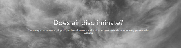
Does air discriminate? I chose this opening title for our website because it conveys the message that there is something nefarious acting on the air conditions for different people. This situation is also an example of environmental racism. Of course, air does not discriminate, yet we find a disproportionate burden of poor air quality in certain areas. These areas are typically populated by people who have low-income, or who are members of indigenous communities and/or other visible minorities. Thus, we decided to group the vulnerable groups into 2 major groups: Black, Indigenous, and other People of Colour (BIPOC), and those in unstable financial situations (income and employment status). These groups are very strong indicators of poor air conditions.
Often, the problem is a positive feedback loop. As I mentioned on the home page, visible minorities may be predisposed to cheaper housing in disadvantaged areas with more pollution sources. With unstable financial situations, it may be harder to get medical help, thus perpetuating poorer health and decreased productivity at work which ties with financial insecurity. I think it is important to help people in disadvantaged situations since we do not get to choose where we are born, and helping each other builds stronger communities.
We wanted to produce a website that could be used to show the unequal exposure to air pollution in Canada depending on the two main vulnerable groups. The dataset we used to represent the vulnerable demographic groups was from the 2016 census aggregated at the census tract level for all census metropolitan areas. From my research, I found that the major sources of air pollution in Canada are major facilities (such as metal plants, mines, power plants, airports) and transportation. We used the National Pollutant Release Inventory for the emissions quantity of pollutants from major facilities. Acquiring the transportation/vehicle data we needed was a bit more challenging. Since cars are mobile, vehicular emissions cannot be reported as a static value in a dataset. Thus, I decided that we should use roads as a proxy for vehicle emissions. However, not all roads are used at the same rate by vehicles at every hour, and highways are much more densely used than local roads. While could be something that could be improved with additional data, in general areas with more roads tend to have more vehicles travelling. Thus we calculated the road density by census tract so that it may be compared with the demographic data. More explanation of our datasets is on our Geographic & Demographic Data page.
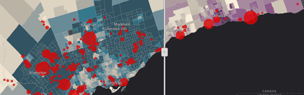
The two BIPOC Web Apps compared census tracts based on the 2 vulnerable groups, visible minorities, and indigenous people with (1) industrial facilities and (2) motor vehicle emissions. Our first Web App included the emissions from the industrial facilities as graduated dots and the census tracts coloured by the density of the visible minority group (blue) or indigenous peoples (purple). We generally saw bigger dots and/or more dots in areas with deeper colours, implying that more visible minorities and indigenous communities live by air-polluting facilities.
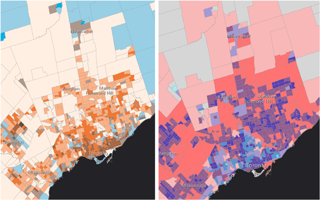
For our second Web App, it was a bit more challenging to display the relationship. We wanted to show the demographic groups (blue – indigenous peoples; pink – visible minorities) with the road density by census tract. We used the relationship style to show areas that have both relatively higher indigenous communities and higher road density (brown; left), and areas with higher visible minority populations and higher road density (purple; right). This could be used to identify areas of concern. However, we used the default settings for the cut-offs (Natural Breaks). I think an improvement is being intentional with what we use as the cut off such as for “high” road density or “high” visible minority population density. This would require more research on how much vehicle emissions are considered dangerous and tie that back to road density. For now, this Web App is mainly useful to reveal the possible geospatial relationships and primary zones that are disproportionately exposed to poor air quality from vehicle emissions.
Our Web Apps for Income and Employment were practically identical to the BIPOC Web Apps in terms of usage and interpretations.
Overall, the website was incredibly easy to learn and use and had more than enough features for us to display geospatial data and analyses efficiently and aesthetically. One thing that I hope to see introduced to the ArcGIS Hub website customization would be the ability to include background pictures in the contents of the Gallery layout. We used it at the bottom of the home page, and it would be nice to be able to apply the same theme throughout.
In the end, I am incredibly happy with what my team and I created, including our name, Mac n Cheese, which credits our origin (McMaster = Mac) and our victory (cheese ✌️). I am thankful for this opportunity, through which I was able to further develop my teamwork skills, creativity, time management, and problem solving.
The original photo to the cover photos on each page was edited from the photo shown below which I took at Georgian Bay on a bright summer day. Clean air should not be taken for granted.