
How food secure/insecure are Hamilton’s neighbourhoods? Using Python and ArcGIS’s Network Analyst Module to map Hamiltonians’ access to healthy food
My name is Daniel Van Veghel, and I am a fourth year Arts & Science student at Mac. I am working to complete my Minor in GIS, and this semester I am taking “GIS Programming” through Mac’s School of Earth, Environment and Society. The course aims to show how Python can be a useful tool for analyzing spatial data by automating repetitive tasks and creating custom Script Tools, and it is definitely one of my favourite courses thus far in my degree.
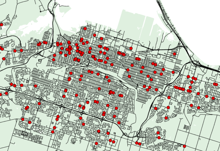
This semester our class was given a capstone assignment dealing with food security within the City of Hamilton. Reisig and Hobbis (2000) describe food deserts as areas where residents “experience physical and economic barriers to accessing healthy food,” and this is often attributed to the development of superstore consumption and/or residents’ limited access to personal automobiles (p. 2). As such, it is important to determine residents’ ease of access to healthy food options via multiple modes of transportation. In the assignment, we were given a Network Dataset for the City of Hamilton, as well as a municipal boundary Feature Class and a Feature Class of Residential land use polygons within the City — these polygons had been intersected and dissolved by Census Dissemination Area. Our task was to compute several measures of proximity and cumulative opportunity for two modes of transportation (walking and driving), for residents in each of these Census DAs — exporting the final table as an Excel Spreadsheet for easy readability. The measures of proximity included the closest Supermarket and closest Convenience store via both modes of transportation available in the Network Dataset, and the cumulative opportunity measures included the tabulation of Supermarkets and Convenience Stores within 5 minute travel Service Areas. As these measures were somewhat repetitive, emphasis was placed on the need for efficiency within the Python Script.
Using Python to efficiently determine these accessibility measures:
First, a new Feature Dataset was created within the assignment Geodatabase where all layers created in the Network Analysis would be saved. From there, the analysis itself could begin. There were essentially two main variables to account for in each section of the problem: type of store, and type of travel mode. As such, to maximize the efficiency of the process, several Python “For” loops were created to iterate through store types and travel modes. These loops created Closest Facility and Service Area Objects, relating them to the pertinent Incident and Facility objects in Hamilton. Important in both of the main loops of the solution I created, was the proper labelling of each Attribute Field, in order to reflect the travel modes and destination types. Finally, my code joined the important attribute columns into one single shapefile that could be eventually exported as a final Excel Spreadsheet solution.
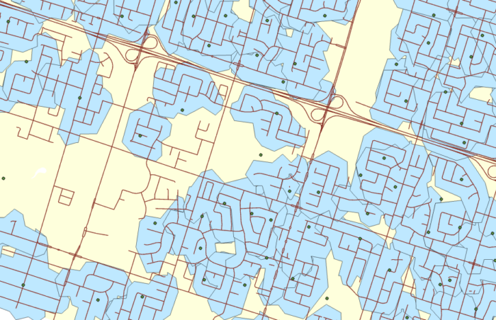
The Python code made use of several powerful ArcGIS analysis tools, including Tabulate Intersection to sum point features within polygons, and the Select tool to create store-specific point files. Additionally, the script made use of multiple instances of the Add Message option within ArcPy. This was so that the script was able to keep the user up to date on the steps the code was taking and what layers/aspects of the analysis had successfully run. The final Excel Spreadsheet showed each Census DA with relevant Census information — such as Population and Number of Households — and many columns detailing travel times to different types of stores for a given mode. Subsequently, the final spreadsheet details the number of stores — by store type — within the Service Areas. This spreadsheet could be an important component in analyzing Census DA residents’ ability to easily get to stores by walking or car, and thus determining which neighbourhoods would benefit from a greater number of stores supplying healthy foods.
What made Python so important in this Analysis?
Could this assignment been done without the use of ArcPy and a Python Interpreter? Yes, it could have been done using the Network Analyst Geoprocessing Tools available in ArcGIS. However, Python’s ability to allow for looping, iterating through lists of data, allowed for the repetitive portions of this assignment to be trimmed down to a couple dozen lines of code. Rather than writing over a hundred lines of code creating each individual Closest Facility and Service Area objects for each travel mode and store type, or using the ArcGIS tools repetitively for each step in the process, using Python allowed for multiple iterations of the process and created all of the necessary layers and Attribute Fields for the needed Excel Spreadsheet without the monotonous task of repeating one’s actions over and over. The ArcPy package is a powerful asset to use in GIS analysis, and in conjunction with the Network Analyst Module, proved to be very useful for computing Hamiltonian’s access to healthy food options.
Referenced in this post:
Reisig, V., & Hobbiss, A. (2000). Food deserts and how to tackle them: A study of one city’s approach. Health Education Journal, 59(2), 137-149. doi:10.1177/001789690005900203