
Esri MOOC Review: “Cartography.” – A Great Free Resource
Education nowadays is extremely expensive. The average Canadian tuition cost for the 2017-18 school year was $6,571 – a 3.1% increase from the previous year (Statistics Canada, 2017). E-Learning platforms like Udemy, SkillShare, and Teachable are on the rise as more cost-effective ways of learning new skills or subjects. My university education has been extremely valuable in teaching me GIS and I’ve also managed to pick up some new skills using my University’s subscription to Lynda.com. However, neither of those options were free. You may be wondering what cost-free alternative resources are available to learn a technology like GIS. In this post, I am going to talk about one of the best free resources I’ve come across so far – Esri’s MOOCs.
A few months ago, one of my instructors told me about a highly rated online course released by Esri called “Cartography.”. This course is offered through Esri’s MOOC program. MOOCs (Massive Open Online Courses) are free 4-6 week classes that anyone can take and complete at their own pace. Having recently completed the course, I wanted to share my experience so that those on the fence about doing the next offering (April 10 – May 23, 2019) can see what it’s all about.
Cartography, as the name suggests, is a course all about how to improve the aesthetics of your maps. This course in particular stood out to me because my formal GIS training at school did not focus on cartographic techniques, but was rather more focused on how to perform analysis. First and foremost, this course makes use of ArcGIS Pro. If you are new to Pro like me, I would highly recommend this course as a jumping in point because it starts you off nice and slow with step-by-step instructions. The course itself is broken into weekly segments. Each segment features a ~20 minute video of the instructors talking about a specific topic in cartography, 1 or 2 exercises, and a quiz. There is also a discussion board for you to talk with others taking the course, and you can win prizes if you are an active poster. I was really surprised to see that thousands of people from around the world were enrolled, so participating in the discussion board can give you insights into how GIS professionals around the globe are using the course material. Each week’s material takes approximately 3 hours to complete fully, so overall there is about 18 hours of content to explore.
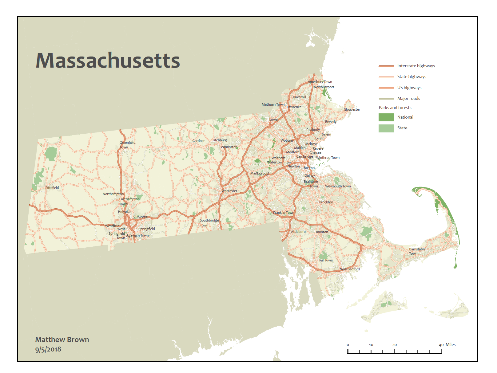
The first section of the course is all about setting up your software and then using it to create a map of Massachusetts’s road network. I thought this was an excellent introduction because it shows you how to symbolize and clean up several different cartographic elements (e.g. labels, roads, map elements, etc.). I particularly enjoyed seeing the in-depth road drawing order tools. These tools let you control how different tiers of roads overlap and connect so that you can convert you can transform your symbology from this:

…to this…

This type of control was especially interesting to me because my graduate work involves working with road networks, so I will definitely be paying close attention these options for the maps in my thesis. At the end of this session, students get to create the following map:
Not too shabby!
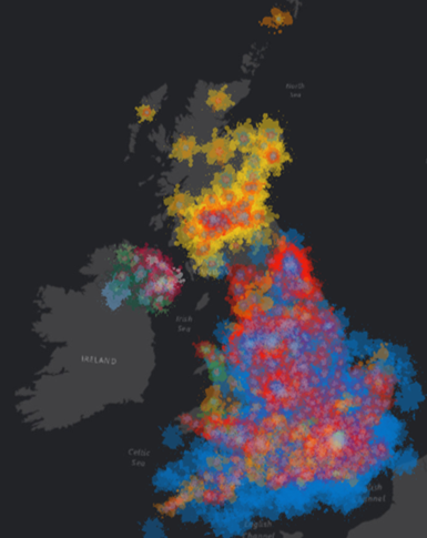
The second segment dives into working with map projections and different types of data classification. I found this part useful because this type of work is extremely common in GIS workflows. The third segment is all about controlling scale and generalizing your data. In other words, controlling how different labels and features display depending on your zoom level. It also gets into how to control symbology using Arcade, which is significantly more powerful than manual symbology control. In the exercise, you use it to create a Jackson Pollock-inspired map of UK election data using paint splats. This exercise was cool because it shows how you can make maps with very unique custom symbology. The end result looks something like this:
The fourth section takes a deep dive into advanced label control. In one of the exercises, you use labels as symbols to depict the percentage of voters who voted a certain way by county for the 2016 US Presidential election. This exercise makes heavy use of Arcade to control the density of labels depending on your map scale. The end result looks like this:

The fifth section is all about 3D data. The exercises give you some Lidar data to play around with to model surfaces. You also learn how to extrude 3D buildings, configure 3D tree features and benches from 2D feature classes.
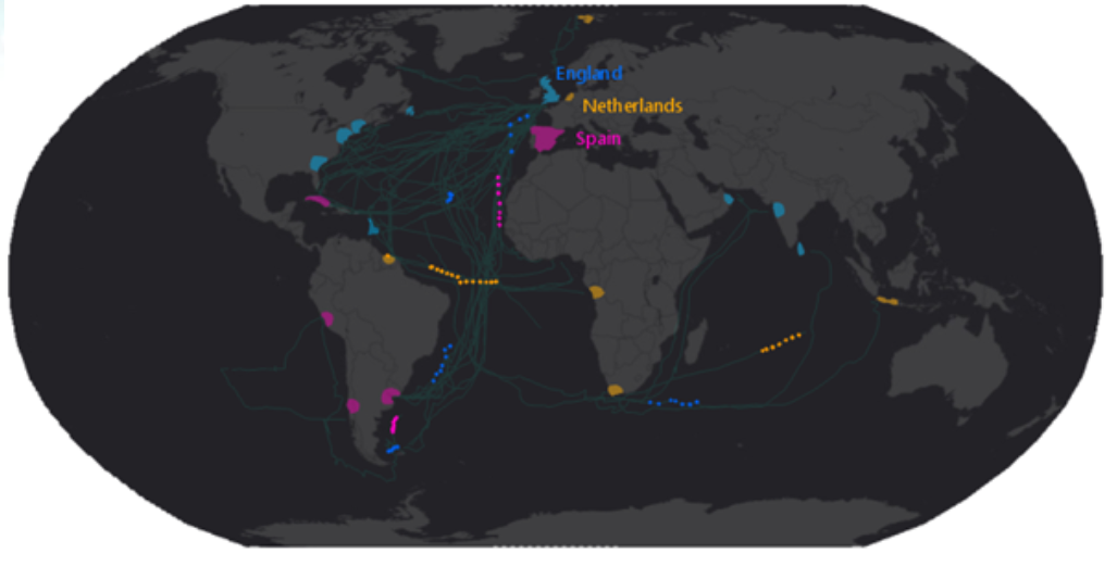
The sixth and final section is all about creating animated maps. This section goes through multiple examples of how you could animate your map layers, including:
- a fly-through animation of the 2014 Oso mudslide in Washington showing the before and after states of the topography
- animating historical ship trade routes over time and exporting it as a video
- a stop motion animation of different country’s historical trade routes racing across the ocean
In conclusion, I would recommend this course for the following people:
- Those who have little to no ArcGIS Pro experience and want to learn how use it
- Those who have limited cartography training and want to improve the aesthetics of their maps
- Those who want to dip their toes into more advanced workflows such as 3D and animation work
After having a positive experience with this MOOC, I am definitely interested in taking more. If anyone reading this has suggestions for MOOCs that they found particularly useful, please comment below!
If you want to take this course, it is offered next from April 10 – May 23, 2019. Here is a link to the MOOC website: https://www.esri.com/en-us/support/training/moocs
Until next time,
Matt Brown
Sources:
https://www150.statcan.gc.ca/n1/daily-quotidien/170906/dq170906b-eng.htm