
Swooning Over Ocean Maps: Studying Mahia, by the New Zealand Oceanographic Institute
In the 1940s, the New Zealand Oceanographic Institute commissioned a survey to the country’s east. Over the course of the next fifteen years, the Institute mapped the ocean floor, and charted many of the species living in the largely-unknown waters of the South Pacific Ocean surrounding the island nation. Ultimately, the project was responsible for a collection of oceanographic maps, used to inform decisions regarding New Zealand’s coastal waters for decades forth. They called the cartographic product of their surveys the Coastal Series.
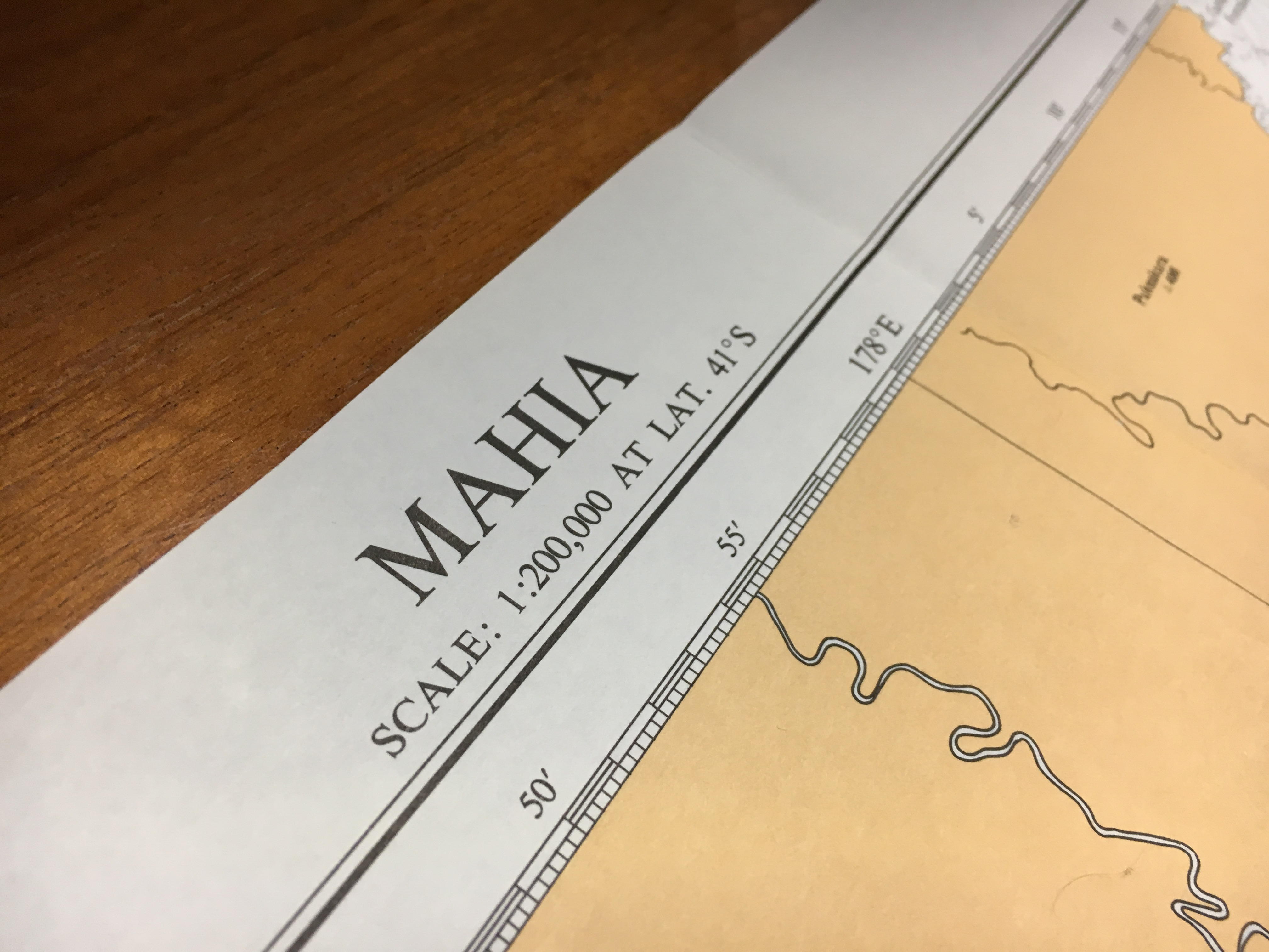
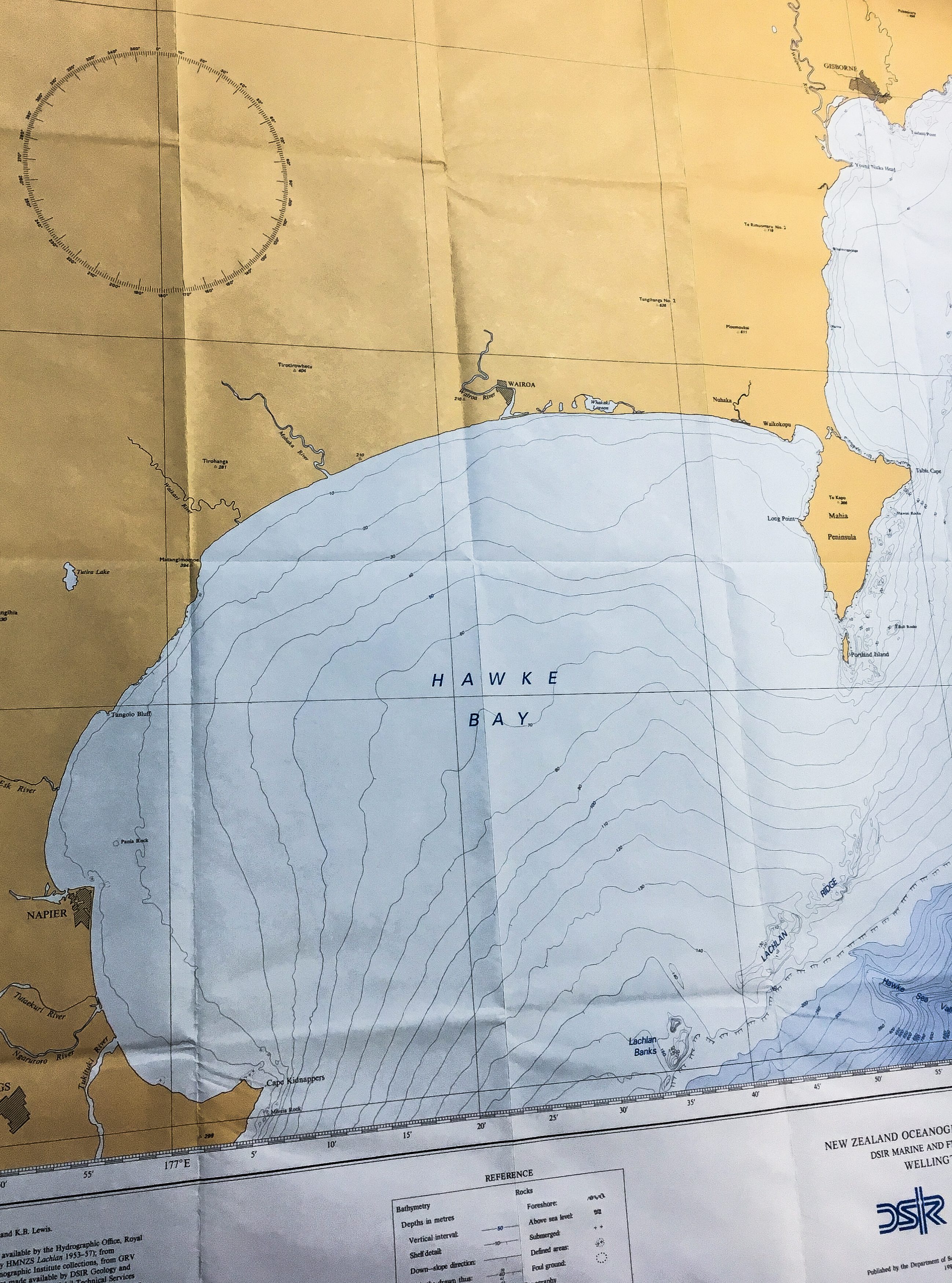
One of many maps associated with the Coastal Series is Mahia. Mahia is a bathymetry map, representing a large swath of ocean space off the east coast of New Zealand’s North Island, outside of a region known as Hawke Bay (Figure 1). Mahia, like others in the Coastal Series, shows “underwater ridges, basins and knolls,” and relief by “bathymetric tints, isobars and spot depths”. These terms must mean something to somebody, right? So, what exactly is a bathymetry map? Who are they for, and what makes them distinct from the kind of maps know and use on land?
Bathymetry Maps: Who, What, and Why?
Bathymetry maps are used primarily by oceanographers, geologists, biologists, surveyors, and others with an interest in understanding the topographic makeup of the seabed, or the depth of the ocean at various locations. On Mahia, certain aspects of the map suggest who it was intended for. Perhaps the most obvious is the notable lack of landmarks. There are very few reference points given on the terrestrial part of the map. This immediately leads the user’s eyes to the sections at which more information is given. In this case, those sections depict ocean spaces. With this style, there’s little to be gleaned from examining the land-based portion of the map, but much to learn about the sea.
Oceanography is very data-intensive field of study. With the vast, unknown spaces that characterize marine environments, still we have explored less than five-percent of the sea. In the oceans of today, thousands of research vessels, submarines, and underwater autonomous vehicles circle the globe, collecting data on topography, chemical composition, biological inhabitants, temperature, depth, and more. Much of this data now lives online, where it can be manipulated at extremely fine scales, and with incredible geographic accuracy, to meet the needs of its user. For that reason, a map like this, in its analog form, would rarely be used today. However, in its online form oceanographers use bathymetry maps to make a variety of inferences about coastal areas, including species and sediment groupings that they are likely to find at respective depths. Bathymetry maps also help surveyors in extractive industries like oil and gas determine the feasibility for drilling developments.
Perhaps most importantly, bathymetry maps can help international legislators determine the extent of continental shelves. In some respects, the continental shelf delineates the boundaries of coastal nations. According to Article 76 of the United Nations Convention on the Law of the Sea (UNCLOS), each coastal nation has exclusive economic rights to “territorial seas” extending 200 nautical miles from land, or less, if ocean borders shared between countries split this distance. However, if a continental shelf extends past 200 nautical miles from land (about 370 kilometres), the country to which this continental shelf “belongs” can extend jurisdiction and territory defining exclusive economic rights to match that boundary. These exclusive rights include resources within the water column, like fish, and those beneath the seabed, like oil or minerals. Thus, determining continental margins can be of critical importance to maritiming nations. These boundaries are often key in arbitrating sea-based disputes between neighbouring countries.
On Bathymetry Map Design
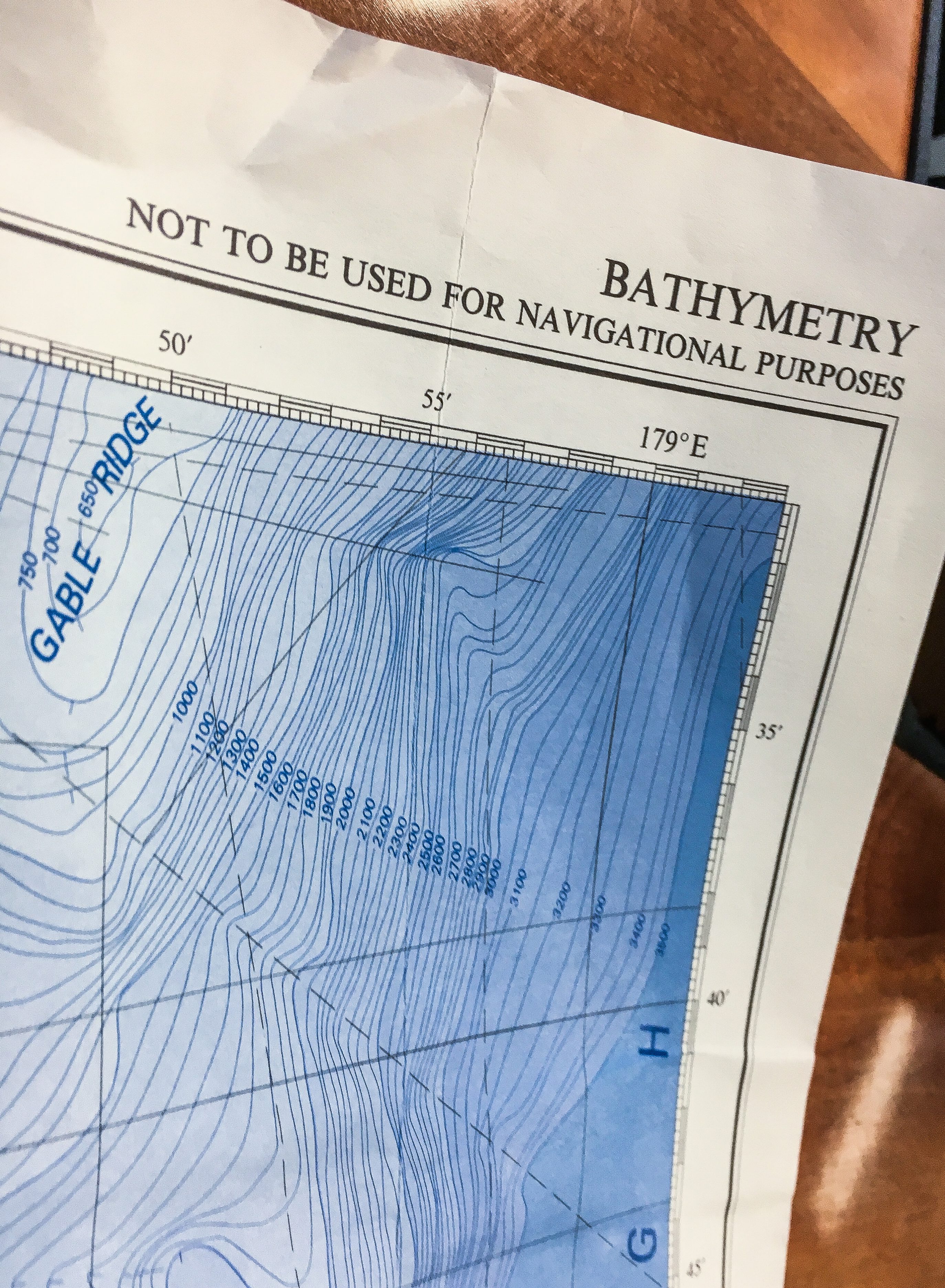
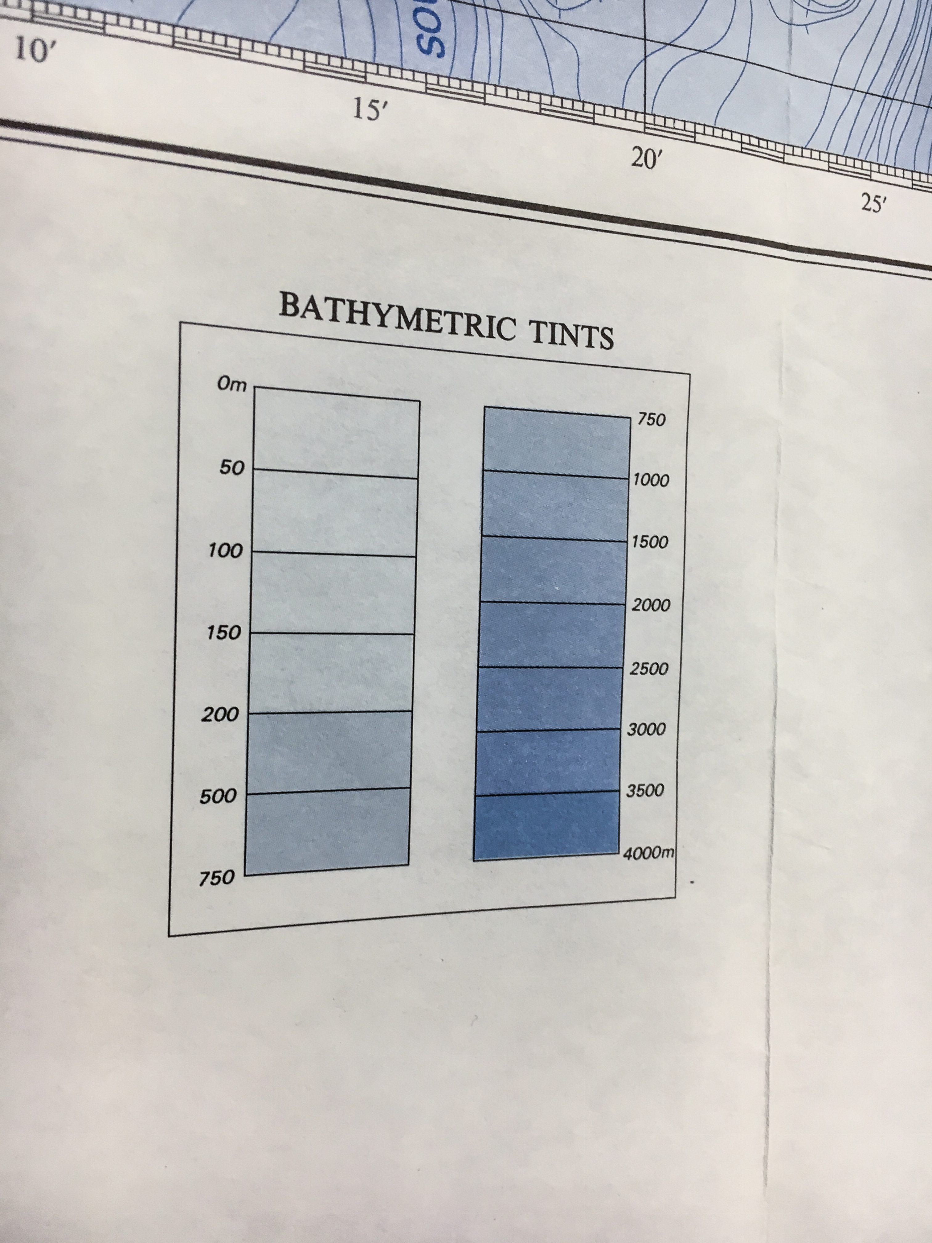
Like most bathymetry maps, Mahia is organized to conform to generally accepted marine geospatial principles shared amongst the international oceanographic community. Usually this tends to take on a standardized format. Much like the use of Latin species names used for taxonomic purposes, this helps users and cartographers from different areas of the world share bathymetric information across cultures and technologies to understand one another’s work. Common features used for oceanographic maps include the sand-yellow colour, often void of typical features, depicting land, bordered by shifting blues, depicting ocean spaces. The colours are subtly contrasted, so that the border between land and sea is obvious, but without making the single-coloured land features the focal point of the map. The blues become darker with descending ocean depth (Figure 2). This is a classic method of representing three-dimensional information on a two-dimensional plane without too much variation to “overcomplicate the plot”.
So, why do bathymetry maps look the way they do? Why all the blank space on land? Additional information might have allowed the map a greater measure of versatility and adaptability, also reducing “wasted space”, right? Bathymetry maps are often incorporated into marine spatial planning (MSP) processes; MSP is a collaborative activity requiring the input of many coastal users. If non-expert coastal stakeholders hoped to use this map for planning purposes, they might first need the assistance of an oceanographer to help explain the functionality of the map. Given that surveying and cartography can be a resource-intensive endeavour, modern marine scientists have an vested interest in collecting as much ocean data anytime funding for survey becomes available. Here we see a map that leaves out a lot of information about the space, and that can be used only for a few very specific purposes.
Perhaps unsurprisingly, there is a reason for this. More land features would draw attention away from the ocean spaces that the cartographers wished to highlight in this scenario. While this style can be jarring to readers unfamiliar with bathymetry at first – as we generally expect to see land spaces full of information and oceans with much less – for the oceanographer this Bizzaro World is not unusual. Here, function takes precedent over form, and the authors have included enough topographic information to portray an accurate representation of ocean depth, while still retaining a readable product. There is also a legend, describing how to read the topographic information as well as a “Bathymetric Units” reference, explaining how to match colour to depth (Figure 3). Credit also to the authors for alluding to margin of error with the “Reliability Diagram”. This small box at the top of the map allows the reader to know exactly how far at what spatial frequency data was collected – a range between 0.2-kilometres and 1-kilometre at location A, to between 2-kilometres and 10-kilometres at location C. Data collection at the more-distanced intervals of location C cannot claim the same spatial certainty as those shorter intervals at location A.
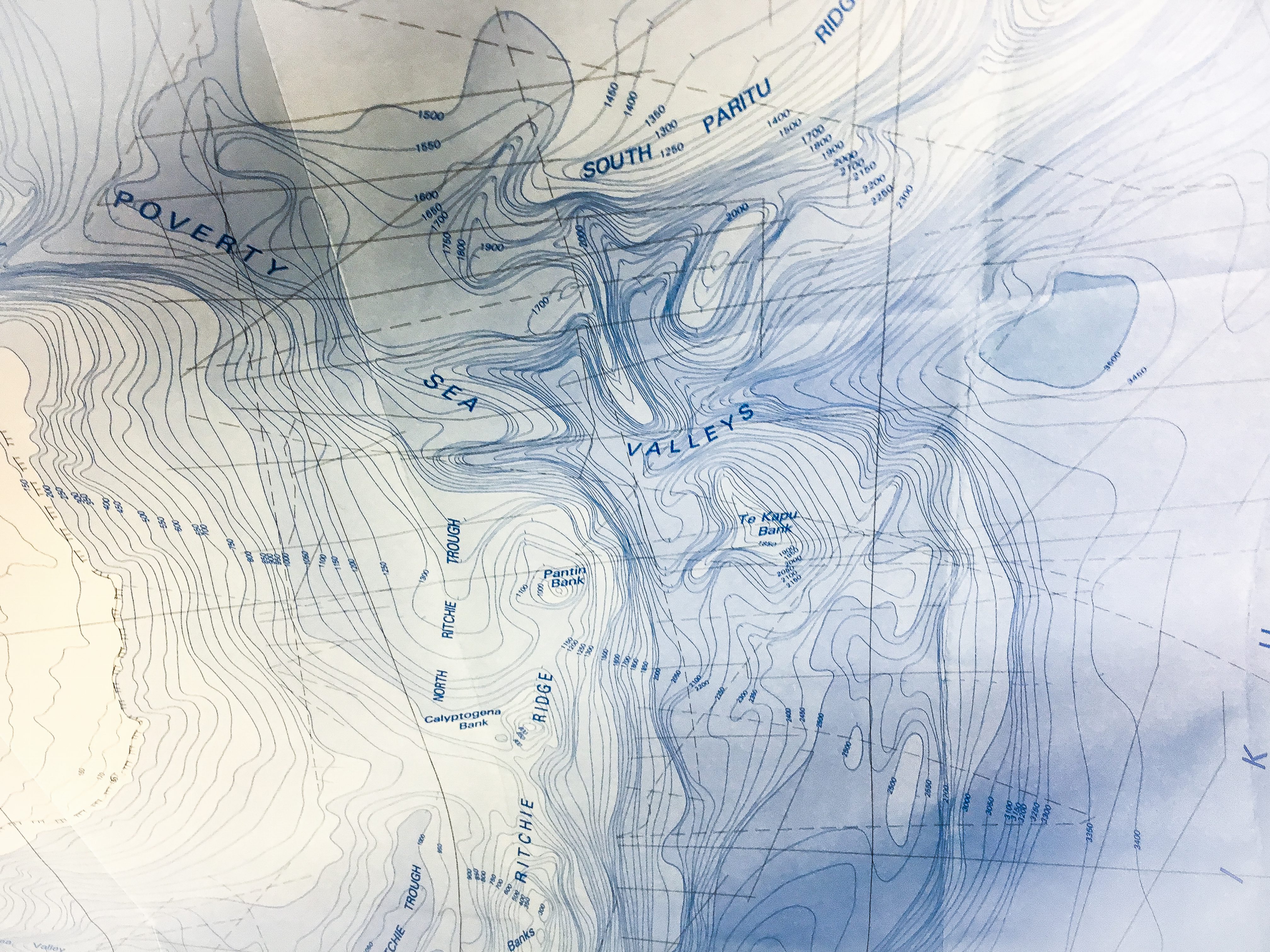
Mahia’s cartographic features are adherent to the map’s intended use. The scale here captures both the extent of Hawke Bay, which appears to be the locational focal point of the map (relative to “places people might know”), as well as the significant drop-off occurring at the Poverty Canyons, and into the Poverty Sea Valleys (Figure 4) – this the most striking topographic feature on the map. In short, the authors intended to show the swiftly declining depth to the east of Hawke Bay. The scale and layout depict that information sufficiently.
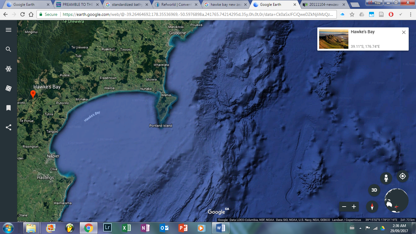
In general, the relative depth of the ocean at different locations beneath the surface is of little interest to most people. As such, bathymetry maps tend to be made for specialists. That means the authors could reasonably assume that those who might use this map would have some level of familiarity with bathymetry, or other ocean-related research. Thus, for its intended purpose and “target audience”, Mahia makes sense. Other, more common depictions of oceans typically leave out much of which is found on a bathymetry map. Comparing Mahia to the same space using Google Earth, for instance (Figure 5), we see no numerical information here about how deep each ridge descends, nor do colour patterns assist the user in determining depth. Nor are there place names to aid in referencing locations. That Google leaves these features off its general-use map likely speaks to the frequency at which users are typically looking to access this kind of marine geospatial data.
Alas.
Hence the efficacy of the oceanography map for use by the oceanographer.
Swooning Over Ocean Maps
Personally, my favourite features of the bathymetry map are the darkening blues used to depict increasing depth. It well-emulates the loss of light that accompanies descent below the surface. This representation can help map users to conceptualize the setting of a declining-trajectory seabed, with greater depth and distance-from-shore plunging users further into the dark, and further into the unknown; toward the boundaries of discovery and human ingenuity. Figurative, literal, and representational darkness, in a neat and attractive pattern of faded blue.
Ultimately, you need not be an oceanographer to enjoy a bathymetry map. Non-scientists, like myself, might use a paper bathymetry map as a tool for creative inspiration, or a reminder of all that we have yet to know; perhaps best placed upon the bedroom wall or above the office water cooler. Less a map than a work of art – and what a more-perfect function for “art” than to free the imagination to run wild with the secret spaces of the Earth? Those spaces that we have “mapped”, but never actually seen.
On Mahia, we see an ocean location called the Hikurangi Trough (just outside far right extent, Figure 4), essentially delineating the boundaries of the area surveyed. Past the final topographic line at 3,500-metres of depth, we finally meet the “floor”, or the continental shelf, and then vastness of the ocean. For context, the average depth of the sea globally is approximately 4,000-metres, with the deepest-known point just over at just 11,000-metres. At the margins of this map, we come to see the limitations of our ability to understand marine environments, and the challenges they pose to modern science. Big, dark, and inaccessible, a.k.a., expensive, difficult, and dangerous. Truly one of the planet’s final frontiers.