
Ideas for Displaying Categorical and Time-Based Data
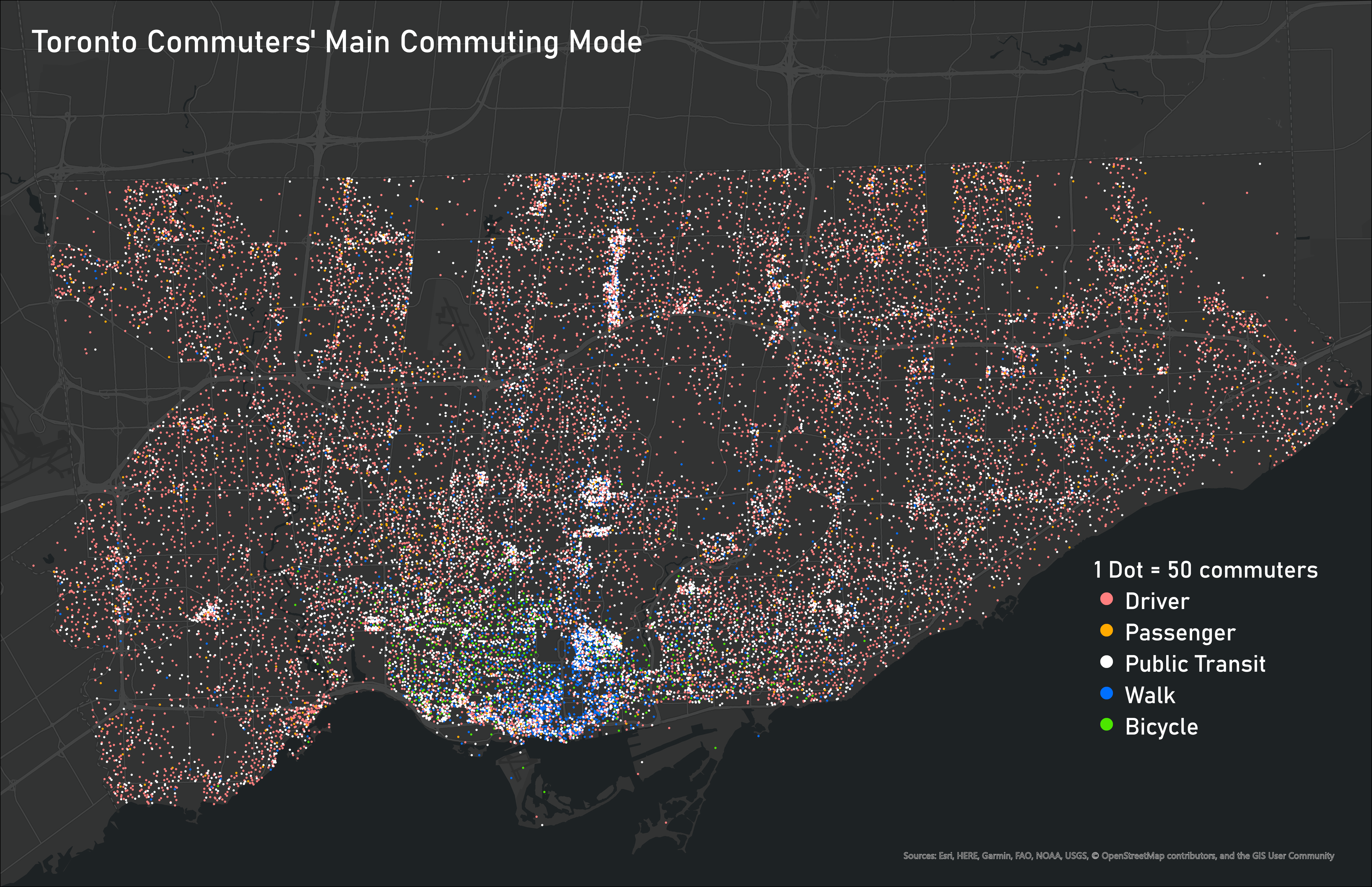
Deciding the best way to visualize your data is one of the most important steps in making sure that message is clear and understood by the reader. But when you are working with many different variables, it can be challenging to display them all together on one map to show the connections between different categorical variables. For example, how could I show the connection main commuting mode in Toronto and other social variables on the same map?
I think my new favourite, and I would say slightly underused, method of displaying categorical data in ArcGIS Pro is using dot density with colours indicating factors of the variable. This method has a few benefits from my experience:
- It lets you show counts of categorical variables for multiple factors in a single map to look for patterns, rather than a choropleth map showing the densities of each of the factors on independent maps
- It has the useful side-effect of also showing overall density of observations rather than just normalizing counts by area or population
- It leaves the base layer available to display another variable on the same map, as long as the dots aren’t made to be too dense
- As a bonus, I find that it generally looks nice
Here is the map I made showing the main commuting method of people in Toronto using dot density. This lets us visualize both the location and densities of different commuting methods. Using other symbology options, such as graduated colours to make a choropleth map, would require a separate map for each commuting mode, and it would not illustrate density in the same way.
It is also very useful to display the change in a variable over time. Doing this with a typical static map, you would have to create a map for every interval of time that you choose, and you must then compare these separate maps to identify how the variable changes over time. My new favourite way of displaying changes over time is with a map animation. For example, here is a map animation of COVID-19 cases in Toronto over time.
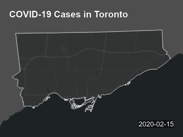
This lets you easily see where new cases are showing up at different points in time. The animations can be exported as MP4 files or as a GIF, among other options, and can be shown online as easily as a static map. And again, since the COVID data is being shown with dot density, I could show another layer underneath for social factors such as median income or visible minority percentage. This would help to understand geographic relations between COVID cases and other social variables.
Displaying how different datasets interact with each other over space and time is one of the most useful things that GIS can do. Displaying counts of a categorical variable with a geographic and time component can be difficult to do in a simple and understandable way. With my experimentation in ArcGIS Pro, I have found that dot densities are generally the best way of achieving this, with the use of an animation if there is a time component. I know there are other methods as well that have their own benefits. How would you decide to display this type of data?