Story Map – Exploring Crime in Canada’s Most Populous City
Hello again everyone! I hope everyone’s November hasn’t been too stressful. In this post, I’d like to discuss a recent story map I made.
In my current GIS course, our final assignment was due a week ago. Our instructor decided to make our final project something that could have tangible rewards beyond the classroom. Each member of the class was given the task of creating an entry to the Esri Global Content Challenge. This assignment had us creating unique story map journals using Esri’s premium content available through the Living Atlas. We had to choose to focus on one of 3 themes: land, oceans, or populations. The top 3 entries in each category will be rewarded a cash prize of up to $10,000. Not too shabby!
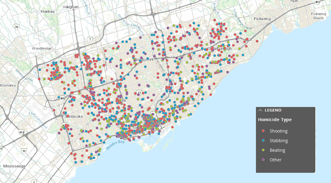
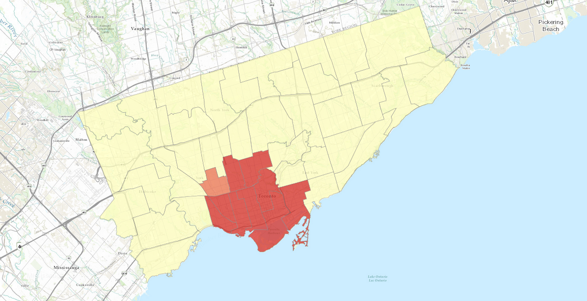
Choosing a topic was really difficult, as there was so much data available to use. I eventually decided to examine crime trends in Toronto, Ontario. My journal started with heat maps showing the populations of Canadian cities. This map clearly demonstrated that southern Ontario, particularly Toronto, has the largest population. Next, I mapped homicide trends in Toronto using hot spot analysis. The idea behind this section was that you can’t always trust your eyes when examining data patterns. Finally, I used some demographic data to locate at-risk areas for crime in Toronto. My description doesn’t really do it justice, so check it out here!
Cheers,
Matt


