
Quantitatively and Objectively Defining “Purposeful” Spaces
My, how time flies when embedded deep within the academic sphere of influence. One such as myself, pursuing the status – and the skills needed to attain that status – is constantly bombarded with fruitful distractions. But at heart, I am a passionate GIS lad, one who indulges in GIS software courses to an almost addictive degree. As a GIS lad, my thesis research will naturally utilize the tools of the spatial trade.
With Western University participating in the ECCE program, the tools are neatly packaged and ready for analytical consumption. We university students are inevitably trained on ArcGIS, with the latest lineup of products driven by ArcPro. Every week, I find something on the front or the back end of the software suite that enhances efficiency or broadens horizons of analysis.
Generally speaking, the GIS horizon I gaze upon involves many facets of data, spaces, and blocks of time, yet is all contained within the realm of quantitative, empirically-observed location data derived from GPS tracking of research subjects. Upon recruitment of study participants willing to have their quotidian lives recorded via a GPS logger, my job is to subsequently identify locations and places frequented by said participants.
Points recorded by GPS have no context attached to them, thus it is up to spatial analysts and researchers to provide that context. Having participants provide such context blurs into qualitative research, which is not my forte. The contexts, absent from participant input, becomes a kind of spatial pseudo-context driven by the categorization of spaces into a typology. Spaces can be delineated/segmented in many ways: census tracts, community neighbourhoods, postal codes. Yet in my research, hexagon spatial bins were the order of the day, bins that contain categories of dominant land use measured per square meters.
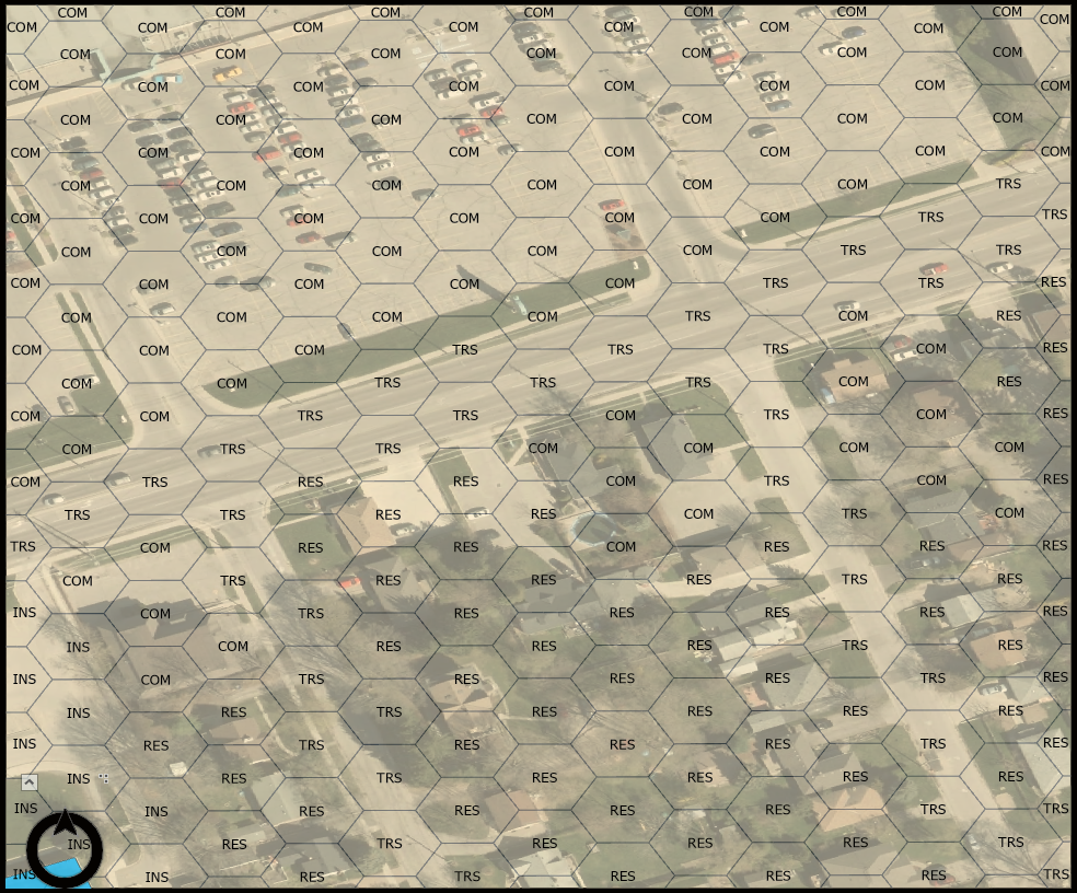 Hexagon bins labelled by dominant landuse type. Underlying imagery doesn’t reflect development changes.
Routes equal exposure, but Stops equal engagement
GPS points generated from tracking participants are messy, especially during device warm up, when near tall buildings and rocky outcrops, and due to the whims of distracted & forgetful carriers. They are also host to an innate set of variables that rely on perfect geometry, something that does not come built into our planet or our cities.
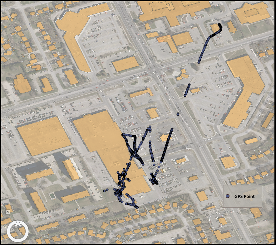 Capture of map showing tracked GPS points. Scatter of signal during warm up of logger device can be seen in line of points starting in the northeast.
Therefore, to define spaces that participants interact with, a good GIS researcher needs to incorporate methods to impute missing points (i.e. from signal loss, from device quirks) , to remove low-quality points (i.e. from scattering, low DOP values), and to aggregate consecutive points into spatiotemporal bins. Scanning through the GPS literature, you would find a particular tried-and-true method for accomplishing the latter: kernel density mapping. Kernel density mapping of consecutive GPS points can easily be accomplished in ArcGIS software, and involves a few key parameters: choose size (i.e. diameter) of spatial bin, and choose temporal threshold (i.e. minimum time staying within spatial bin).
Regarding the population of interest in my research – school aged children, the literature has ironed out solid values for those parameters: spatial bin size = 75m, and temporal threshold > 2 minutes. Sensitivity analyses were key in uncovering the appropriate values for spatial bin size and temporal threshold, serving to cut out phenomena like distracted loitering and waiting at intersections. Kernel density mapping performs a moving spatiotemporal window on every point and compares to consecutive points in time. Any points not contained within the 75m spatial bins, but still consecutive to one another, were treated as linear routes and rendered as polylines within the mapping regime.
But the real meat and potatoes are indeed the points contained within the 75m spatial bins. As long as the points were consecutive in time and didn’t breach the 75m barrier created from the first point, the aggregate becomes a stop. These stops come with generated centroids and duration values. In essence to the applicable research, routes are treated as merely exposure to intersecting hexagons and their associated spatial types, whereas stops are treated as purposeful engagement within intersecting hexagons and their associated spatial types.
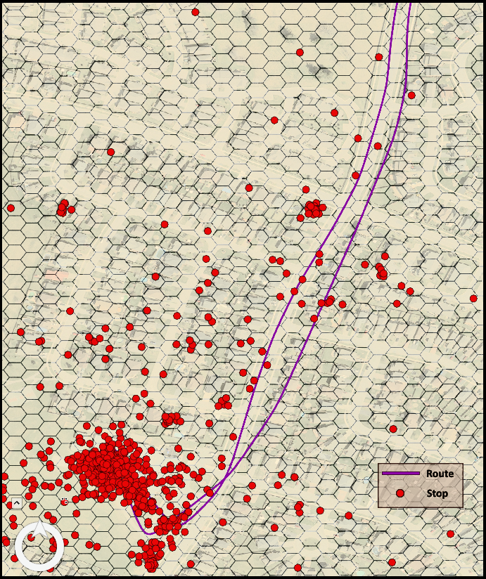 Capture showing hypothetical example of both Routes (exposure) and Stops (engagement) of research participants
No Man, Woman, or Child is an island
Analyzing one or two participants via the aforementioned methods would be akin to case study or focus group, which is more qualitative and, as mentioned, not my forte. I need quantitative results, and such results must delve into the aggregated results of large groups of people. Groups for analysis can be broken down into demographic (Boys, Girls, 9-11 year olds, 12-14 year olds), or temporal (Weekdays, Weekends). For each group, spatial aggregation methods are necessary, to find those proverbial hot and cold spots that can ultimately inform the geographic components of policies and programs.
 Popup window showing how sixty-five convex hulls overlap a particular hexagon
In my case, the chosen aggregation methods include minimum convex hull polygons (i.e. minimum bounding geometry), and standard deviation ellipses (i.e. directional distribution). ArcGIS provides easy-to-use tools for such analyses; the results of running the analyses in ArcGIS Pro are polygons that contain the centroids of participants’ stops. When overlapping these polygons with our hexagon bins, which contain dominate land use categories from an established spatial typology (AGR, COM, IND, INS, REC, RES, TRS), a participant’s frequency and duration within certain land uses is discovered and quantified.
These are the spaces…
For each of the aforementioned groups, the resultant set of feature classes are inputs into final analyses. We can do simple counts of overlapping polygons, or more in-depth spatial joins that calculate the sum of all stop duration values. Thus, each group’s frequency and duration within spatial types is determined, both [aspatially] within a container such as a city, and [spatially] within that city. Aspatial statistical tests such as T-tests can check for significant group differences, and spatial clustering tests such as Cluster & Outlier Analysis can check for localized intensity of engagement. Ultimately, we discover the types of spaces purposefully engaged in by specific groups of people, and where in a particular city such specific spaces are intensely utilized [or not].
With such spatiotemporally-centric findings, local policies can be altered towards specific groups AND neighbourhoods, both likely to be in need of spaces for engagement that benefit their health and well-being, and by proxy benefit local economies.