
Using Geoenrichment to analyze socioeconomic factors affecting the spread of COVID-19 in Toronto, Ontario.
Here at Western University, in the third year GIS course each student is tasked with an exploratory GIS project of their choosing. I chose to do a project on the socioeconomic factors affecting the spread of COVID-19 in Toronto Neighborhoods. This topic was of particular interest to me after looking at the distribution of cases over Toronto, because it seems like higher rates are clustered in a few specific areas. My neighbourhood was one of these areas, and I wanted to know why. In order to get to the bottom of why the cases were occurring more frequently in some areas, I started with some raw data and used geoenrichment to add additional data for some key socioeconomic factors.
In this blog I will outline the basic steps I took to get the data, my experience using geoenrichment and ArcGIS online, as well as some issues I had and what I would do differently if I were to start again.
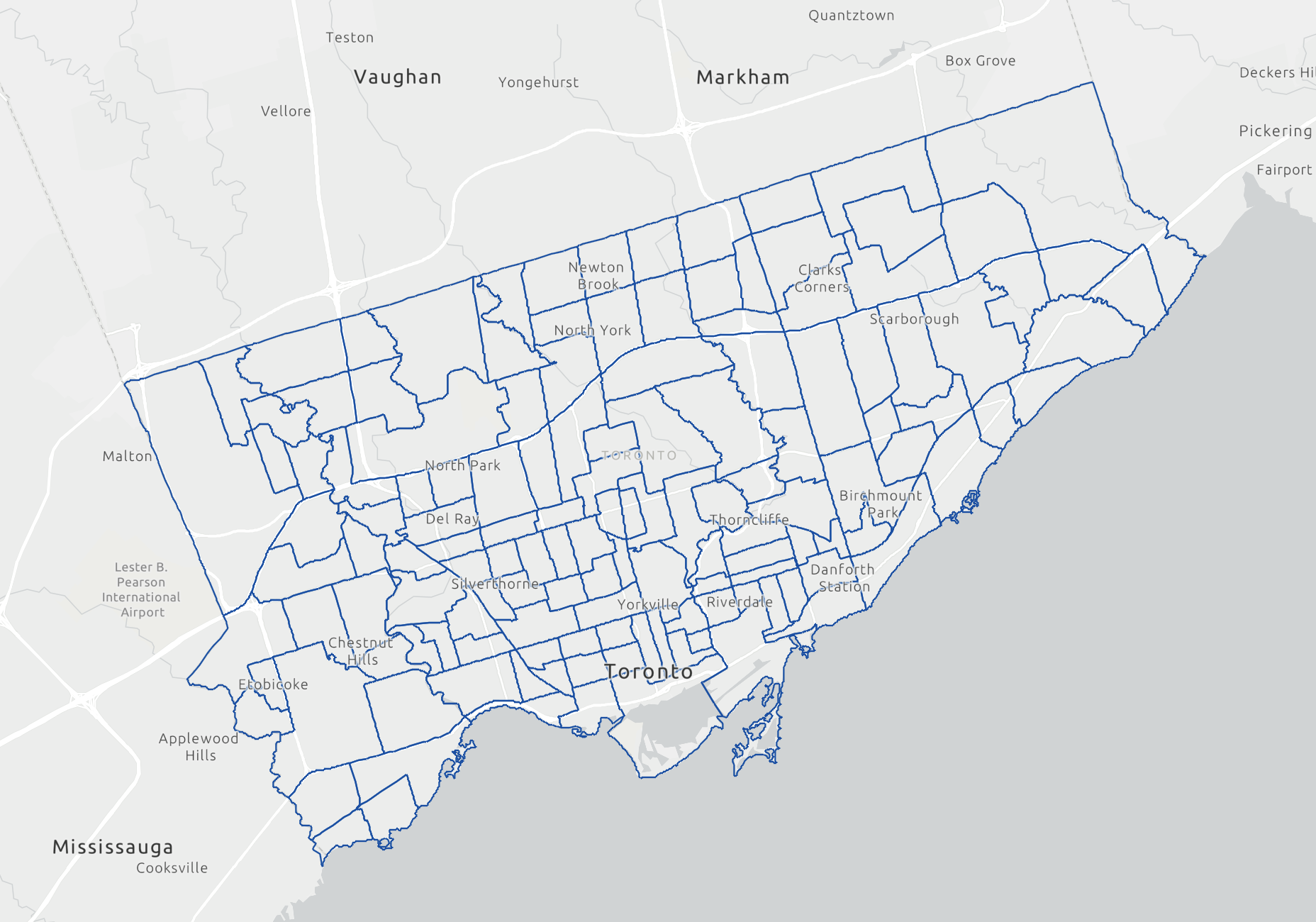
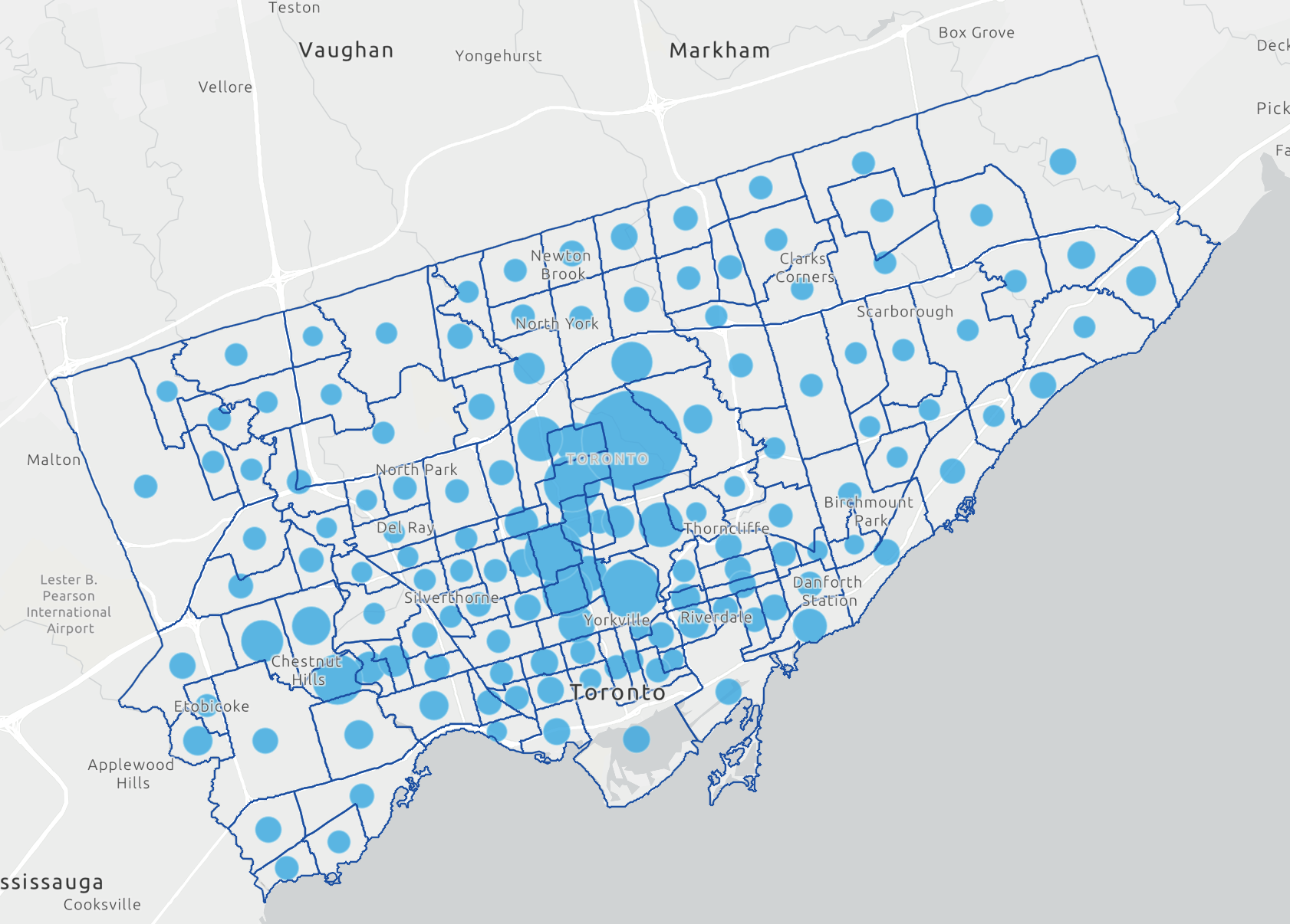
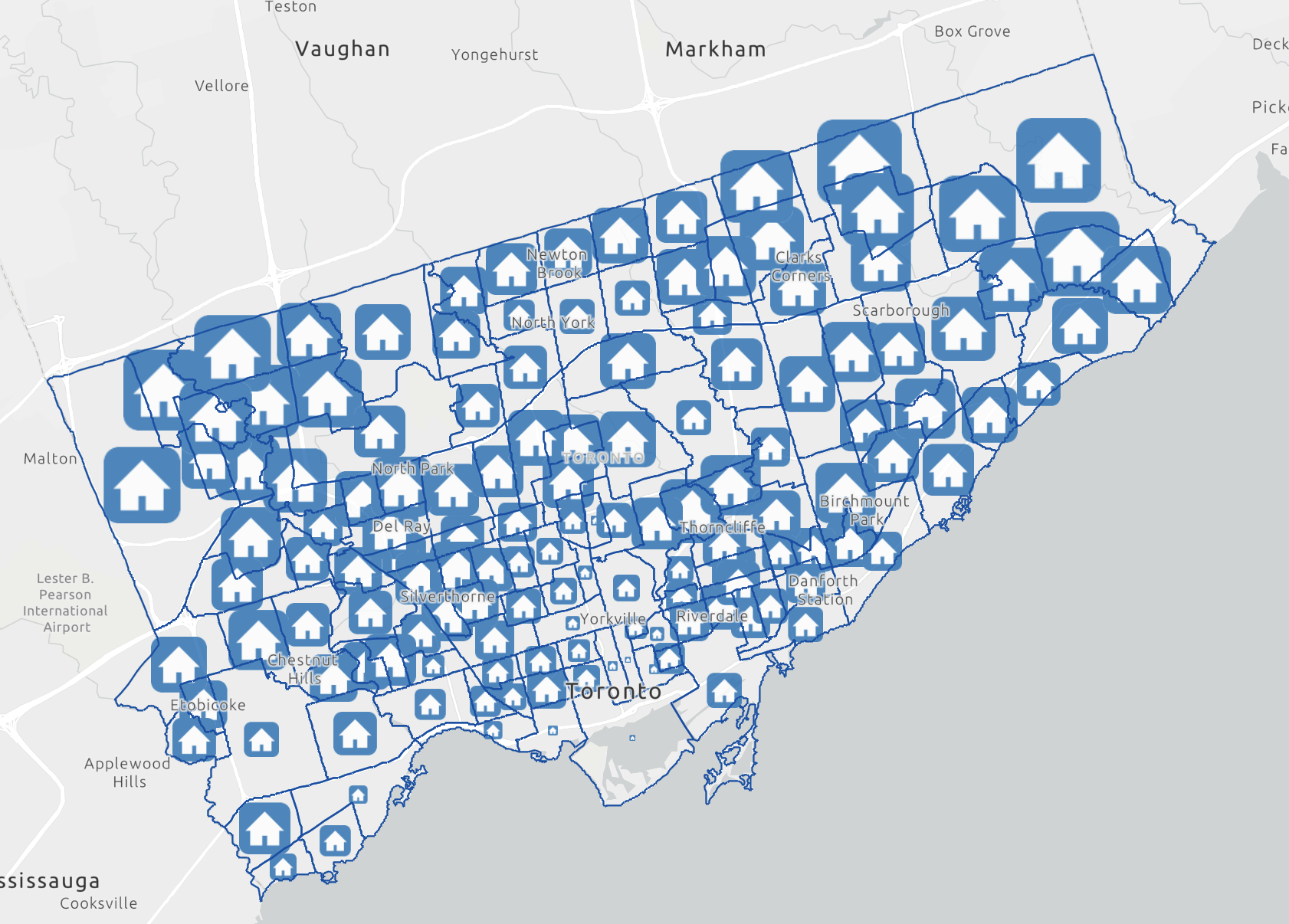
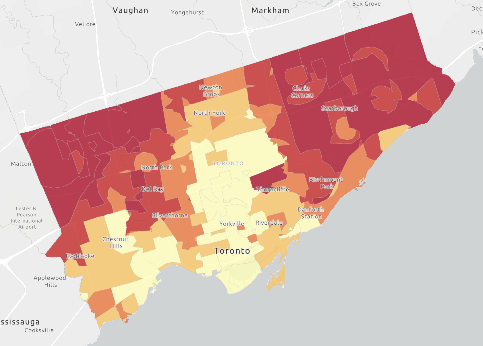
I started this journey by visiting the City Of Toronto Open Data site to get the boundaries for the COVID-19 cases by neighborhoods. This data on its own is useful for describing the state of COVID-19 infections in the city of Toronto. However, the purpose of the project was to investigate the ‘why’ – essentially to examine the relationships between rates of infection and socioeconomic factors. That’s where the ArcGIS GeoEnrichment tools came in handy. Using geoenrichment, I was able to use some of the ArcGIS Online credits available with my school account (I was allocated an extra budget for this project) to extract the average number of persons per household as well as average household income data for each neighbourhood. These two factors became the basis for my analysis.
To learn more about using the ArcGIS GeoEnrichment service to add new attributes to features in a layer in ArcGIS Online, visit: https://doc.arcgis.com/en/arcgis-online/analyze/enrich-layer.htm
Basically, the ArcGIS GeoEnrichment service works by apportioning and aggregating data variables from Environics Analytics to user-provided or custom geometries. It allowed me to get selected socioeconomic factors aggregated up to the same neighborhood boundaries for which I had COVID-19 case information. This was my first experience using geoenrichment and I was pleasantly surprised with how user friendly and easy to navigate it was.
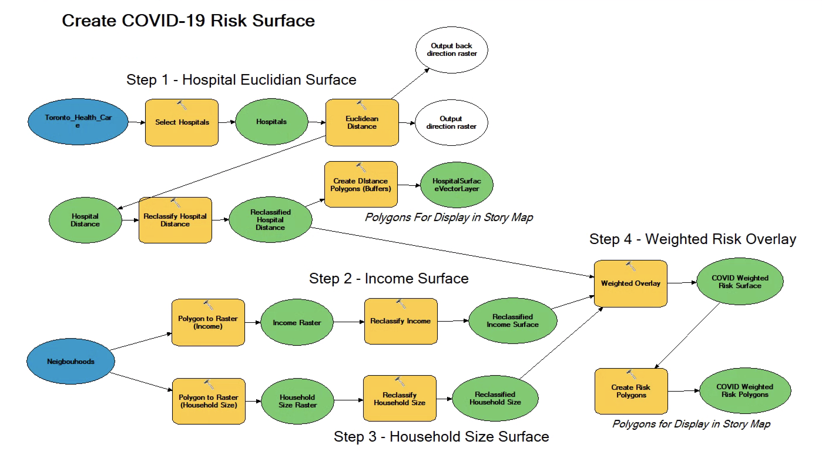
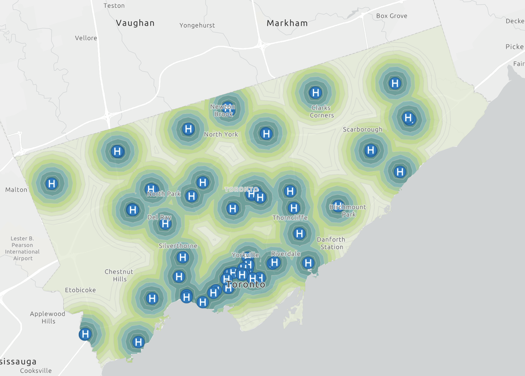
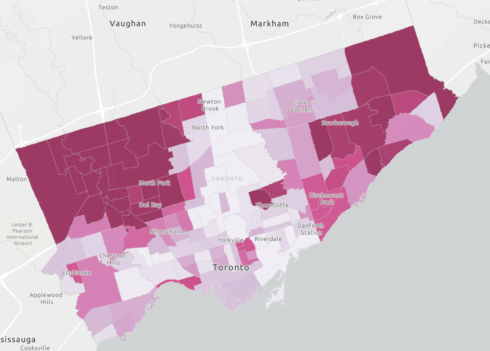
I then leveraged desktop GIS to actually calculate a raster risk surface. This helped quantify the impact the socioeconomic factors in COVID-19 infection rates, and allowed me to go beyond descriptive analysis and venture into predictive analysis. In other words, desktop GIS allowed me to fairly accurately predict the patterns of COVID-19 infections strictly by Income, household size, and proximity to healthcare facilities. I did all of this using the model builder in ArcMap which I found to be very useful for building my analysis workflow. The following images present my workflow, and the resulting COVID-19 risk surface that I produced.
One of the challenges I ran into was with the boundary data from the City of Toronto open data. Specifically, the field names were cryptic, and I had to do some digging to discover what field 1, field 2, etc. actually meant. I had to cross reference with my other data and manually type in the field names, which once I had done made life much easier.
Something I would consider doing differently with my analysis would be to use network distance rather than Euclidean distance. With more time, I could obtained road network data and used the network distance when determining distance from healthcare facilities. Euclidean distance (visualized in the following image) does not capture the differences in travel time to reach facilities that result from having to travel along a transportation network. Using network distance would allow the time it takes to drive or walk to a facility to be considered instead of simple straight-line distances.
Overall, I found that the areas of lower average household income and higher average household size had a greater case rate as well as a greater likelihood of being infected by the COVID-19 virus. The direct correlation of these areas leads me to believe that although there are many other factors at play. These factors could include: immigration, language, culture, religion, gender, race, etc. But the ones I analyzed appear to play a large role in the distribution of COVID-19 cases amongst Toronto, Ontario Neighborhoods.
A full story map that details all of my work for this project and presents the results can be accessed in ArcGIS Online: https://arcg.is/mX4ff