Analyzing the Changes in the Atlantic Ocean’s Sea Surface Temperature from 1900 to 2014 using ArcGIS
This blog post showcases part of my analysis for a school assignment. I was given a CSV file that modeled the sea surface temperature of the Atlantic Ocean for every three years from 1900 to 2014 in degrees Celsius. The data were collected from the COBE SST dataset from the Japanese Meteorological Agency. Using the data file, I analyzed the mean, standard deviation, and slope of the Atlantic Ocean’s Sea Surface Temperature from 1900 to 2014 using ArcGIS Pro.
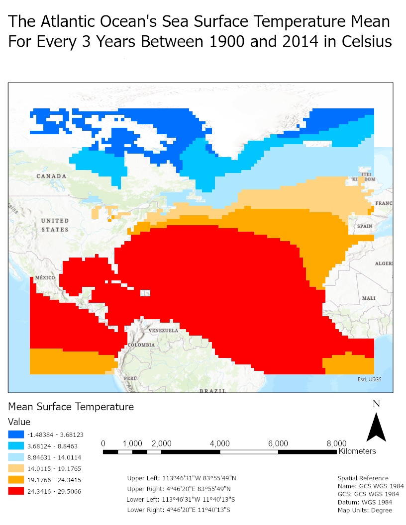
First, I calculated the mean of the Atlantic Ocean’s Sea Surface Temperature from 1900 to 2014 and then created a map for it in ArcGIS Pro (see Figure 1). Note that every cell on the map is from a grid with a spatial resolution of 1 degree. The mean simply represents the average temperature over time. Hence, high means indicate warmer regions, and lower means indicate a colder regions. The highest mean value was 29.5066 degrees Celsius, and it was in a region with a longitude of -101.5 degrees and latitude of 17.5 degrees.
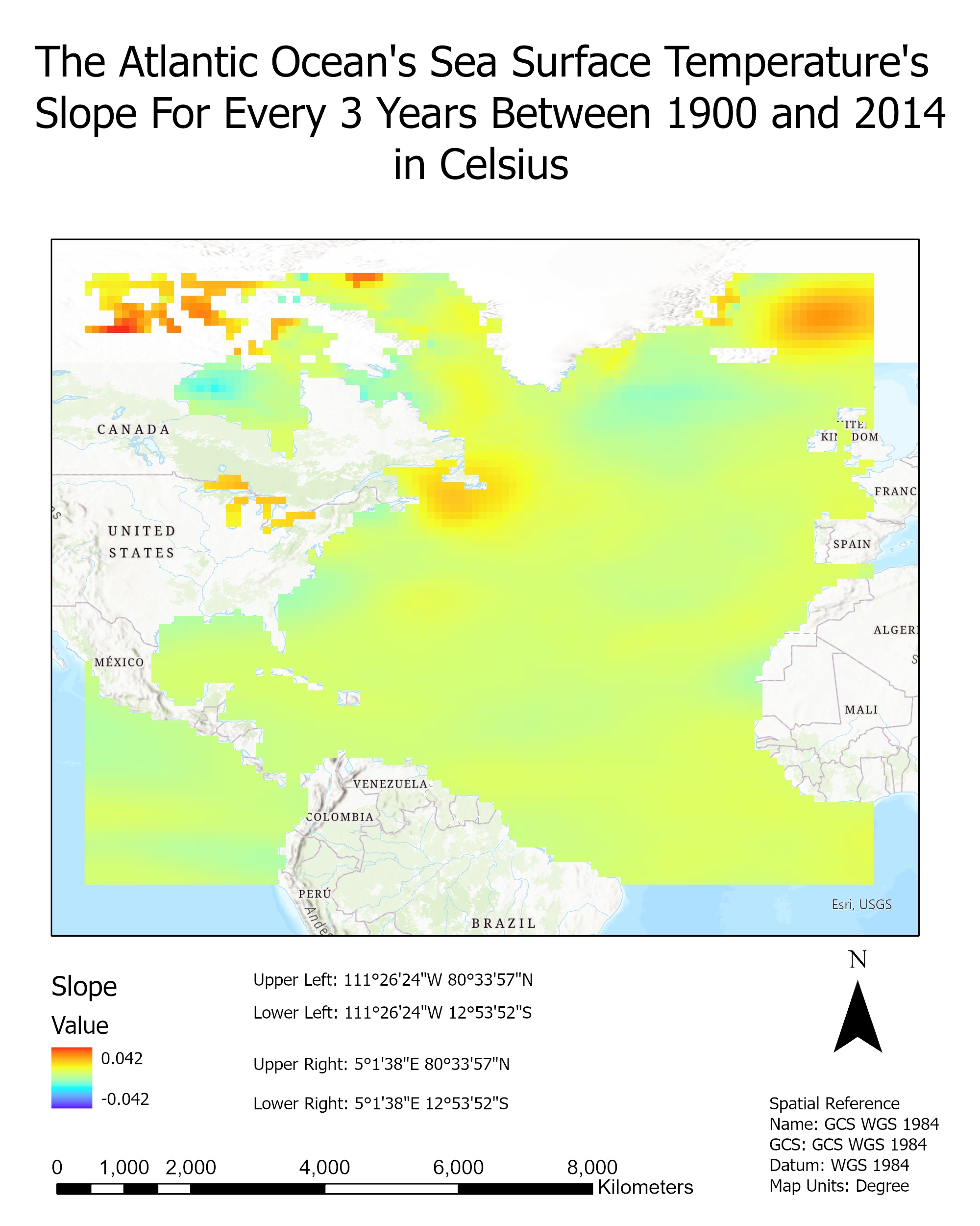
Next, I calculated the slope of the Atlantic Ocean’s Sea Surface Temperature from 1900 to 2014. The slope represents the rate of change of the temperature of each region; thus, a positive slope value in temperature means that the region is getting warmer over time while a negative slope value means that the region is getting colder. Figure 2 shows the map I generated in ArcGIS Pro. The maximum slope value was 0.0421 and it was located in a region with a longitude and latitude values of -101.5 degrees and 68.5 degrees respectively.
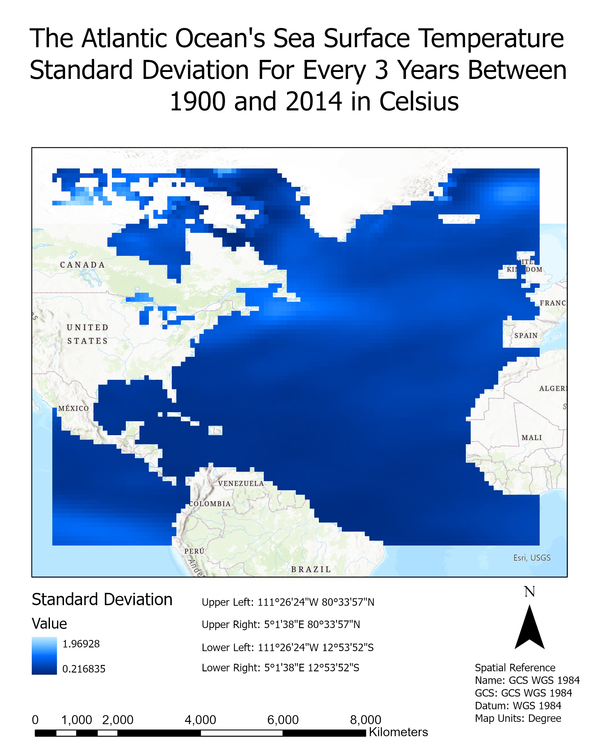
Finally, I calculated the standard deviation of the Atlantic Ocean’s Sea Surface Temperature from 1900 to 2014. The standard deviation shows the temperature variance, or the number of degrees a specific region changed from its mean (see Figure 3). The highest standard deviation value was located at a region with a longitude of -98.5 degrees and latitude of 70.5 degrees, where the standard deviation was 1.969283 degrees Celsius.
In general, we can see from the map that displays the Atlantic Ocean’s Sea Surface Temperature Mean that the areas towards the North of the United Kingdom and Canada are cold and the temperature ranges from -1.48 degrees Celsius to 8.85 degrees Celsius. On the other hand, a very large amount of the Atlantic Ocean, starting from the center in line with the US, to the South, right above Brazil, are in the warm regions where the vast temperature is mainly from 24.34 degrees Celsius to 29.51 degrees Celsius. Also, we see that to the west of Peru, the temperature ranges from 19.18 degrees Celsius to 24.34 degrees Celsius.
As for the Standard Deviation Map of the Atlantic Ocean’s Sea Surface Temperature, we see that most regions to the center (in line with the US and Spain) to the south (right above and to the East of Brazil), have very little temperature variance. In fact, it’s standard deviation is slightly above 0.216 degrees Celsius. We can see a small increase in the temperature variance around 1.969 degrees Celsius to the West of Peru and from US to the United Kingdom as well as slightly above the United Kingdom. As for North of Canada, we see a mixture between high and low-temperature variations but the majority fall close to 0.216 degrees Celsius.
Furthermore, the obvious trend we see is that the temperature of the Atlantic Ocean and many of its regions are getting warmer. From the center of the Atlantic Ocean to the South, the region between the United States and Spain and near Brazil generally have a positive slope. Similarly, we notice that the regions directly North of Canada and North of the United Kingdom are getting increasingly warm. There are very few regions that are slightly getting colder, and those regions are directly in the bay/curves of some countries like the United States, Canada, Mali, and the West of the United Kingdom.
In conclusion, this data analysis of the mean, slope, and standard deviation of the Atlantic Ocean’s Sea Surface Temperature from 1900 to 2014 gives us insight into the general trends of the Atlantic Ocean’s Sea Surface Temperature. In general, we notice that the average temperature is getting warmer throughout the years. The rate of change of the Atlantic Ocean’s Sea Surface Temperature also shows that a high number of regions are getting warmer with very little temperature variance.
Appendix:
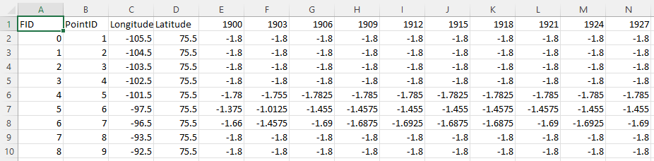
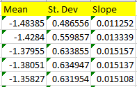
Sample data points and calculations for the mean, slope, and standard deviation can be found below.