
Exploring NDVI using ArcGIS Online
Hi everyone! My name is Nicole and I am a third year GIS major at the University of Toronto. As part of my degree, I get to take many fascinating courses related to GIS. This past semester, I completed GGR337: Environmental Remote Sensing. The course highlighted things such as satellite sensors, digital image processing, and how applications of remote sensing serve our planet. The course was deeply interesting and taught me how sensor data is used as well as collected. As part of my excitement, I wanted to share an interesting application of remote sensing.
To begin, I will summarize some basic concepts needed to understand the data I looked at for this blog post. This data was collected by an Earth observation satellite. It acquired images of reflected visible light (red, green, and blue light), as well as NIR (near-infrared). This is useful for analyzing the Normalized Difference Vegetation Index (NDVI), which is used as a measure of vegetation health and production. NDVI values range from -1 to 1, with low values being unhealthy or non-vegetated, and high values being very healthy or densely vegetated areas. We are able to determine it using how much red and NIR light a remote sensor (e.g., from a satellite) receives from a surface, and applying the following calculation:
NDVI = (NIR – Red) / (NIR + Red)
With this formula, the values calculated for areas covered by full and healthy crops or dense vegetation will produce values close to 1. This is because healthy green vegetation will reflect low amounts of red light and high NIR. This index can be used to monitor the effects of phenomena such as climate change, urban sprawl, and natural disasters. Specific ranges of NDVI values can be attributed to different characteristics of vegetation and land cover (e.g., https://www.agricolus.com/en/indici-vegetazione-ndvi-ndmi-istruzioni-luso/).
In my exploration of ArcGIS Online data, I found a recent (May 2020) application of NDVI used in Jonesboro, Arizona. The layer includes data measuring winter NDVI decline post-tornado.
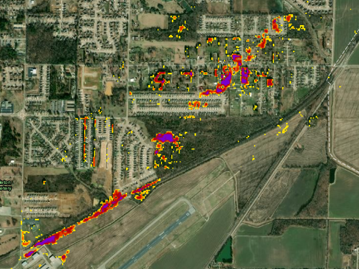
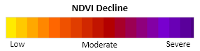
The colour ramp above is used to display absolute negative change in NDVI values. The areas with NDVI values that have declined the most (colours towards the purple end of the colour range) correspond with areas where vegetation has declined. In the example shown in Figure 1, the decline in NDVI corresponds with damaged vegetation along the path of a recent tornado.
These sample data are interesting for many reasons, and because of how easily accessible it is in ArcGIS Online. A fairly large amount of innovation has made it possible for students to learn about satellites and their data over a semester and draw conclusions from them. Additionally, very little searching was needed to find recent NDVI data over ArcGIS Online! It is exciting to see how scientific literacy becomes more accessible and I cannot wait to see how it progresses.