Team McRaster: Looking Back on the 2021 ECCE App Challenge
This is a collective look back on the 2021 ECCE App Challenge, co-authored by all three members of our team. In this competition, we produced an app that presents a Neighbourhood Equity Index for the City of Toronto, and ultimately tied as first runners-up. The app we created is called Equapolis.
Approaching an Unfamiliar Challenge (Angelina’s Perspective)
Our team, McRaster, includes myself (Angelina Abi Daoud) and two other undergraduate students at McMaster University, Olivia Maddigan and Madinakhon (Madina) Sulaymonova. Prior to this year, none of us had any experience competing in the ECCE App Challenge, so we had no idea what to expect. Frankly, we felt quite intimidated going up against veteran competitors from different levels of academic experience. In fact, a member of the winning team was my TA for a few GIS-related courses! We were nervous and excited to start competing and to bring fresh ideas to the table.
The premise of the ECCE App Challenge is to create a new and unique app using Esri technology and open spatial data, as well as the appropriate documentation and video demonstration to go along with the app. A theme is supplied by the ECCE and the competing teams have exactly one week to create their app and all accompanying materials.
To prepare for the competition, we all brushed up on the existing tutorials for Esri technology like Web AppBuilder, which is what we ultimately ended up using for our application. We also roughly knew what would be expected of us from looking at past competitor’s finished products, so we split up the responsibilities that we knew were in front of us. We all chose our roles based on what skills we wanted to learn or improve upon. I wanted to get as much experience working with different aspects of GIS technology as possible, so I took on the challenge of learning Esri’s Web AppBuilder from scratch as well as working with the data and doing all the math using ArcGIS Pro and ArcGIS Online. Olivia’s main role was the making of our lovely website and everything GitHub, and Madina scripted, created, and edited our winning submission video. We were all equally involved in defining the concept and working hard on cohesive branding and mission statements. We were truly a dream team.
Identifying Our Mission (Madina’s Perspective)
When we received the theme for the challenge, which was Reducing Inequality, we were thrilled. The theme drew upon the United Nations Sustainable Development Goal #10. Our first order of business was to hold a group meeting and decide on which inequality within Canada we wanted to focus on. Once we knew that we wanted to tackle the socioeconomic inequities within Toronto, it was research time to help back up our idea. Toronto is unique in that it is often described as a ‘salad bowl’ of cultures and ethnicities; it is an exceptionally diverse city. Unfortunately, Toronto (just like the rest of Canada) is affected by institutional racism which manifests in the socioeconomic distribution of the city. Reports like the 2019 Vital Signs of Toronto found that a disproportionate amount of visible minorities reside in neighbourhoods with the lowest socioeconomic statuses.
We all took part in finding valuable information through credible sources. To be completely honest, some of the news was completely shocking. I personally wasn’t aware of this issue, and it felt like everything was happening right under our noses, making it an even greater idea to bring exposure to. It is through that research where the Neighborhood Equity Index (NEI) came into play. Our first plan was to make a racial equity index that would have been used to identify communities within Toronto that need priority in terms of fighting for racial equity with a goal of closing racial gaps. But the NEI seemed to fit better with regards to the index being based on overall neighbourhood outcome, so users could effectively use the app to identify disparity between neighbourhoods. Viewing the proportion of visible minorities as a separate layer to the NEI in the app would support our goal in understanding racial inequality and move towards addressing these issues in the community.
I wanted to capture the judges’ attention by giving our video a cinematic look with each short clip representing the mission we are trying to convey. The script was an echo of the mission statement since it summarized everything discussed within that section. Aside from the video clips, I wanted my voiceover to also aid in expressing the message. It took multiple takes and recordings to finally get a clear tone for each section. When watching the video, you will notice my tone rise and fall when I’m discussing particular subjects. After Angie created the app’s demo and added captions for accessibility, I put everything together and the video submission was done.
Putting Together Our Submission (Olivia’s Perspective)
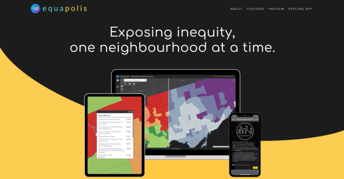
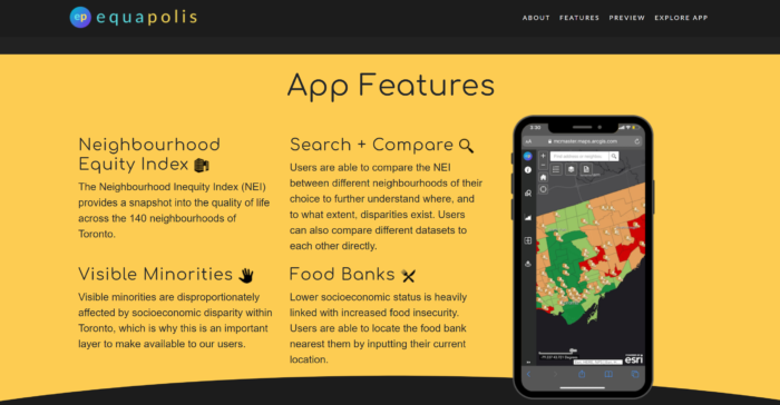
One of the first things we did when starting to tackle the challenge was split up responsibilities, while would all collaborate on deciding the general direction of the app, the app’s features, and our goals. Personally, my greatest challenge was being responsible for the custom landing page we wanted to create. Prior to the challenge, I had some experience with web page styling, though not a ton. Our team wanted to make sure we had an attractive and informative landing page for our app, some of which can be seen below in Figures 1 and 2. Creating the landing page was a great exercise for me to hone my HTML and CSS skills.
Another particularly challenging aspect to the creation of our app was deciding what features to include. We wanted to make the connection between the concentration of visible minorities and socioeconomic status clear to our audience. This is why we included the Compare Layers feature so that users can swipe between the two layers and visually compare different datasets in two layers. We also included the Search by Neighbourhood and Compare Neighbourhood tools, to make it easy to discover and understand the relative characteristics of each neighbourhood in Toronto.
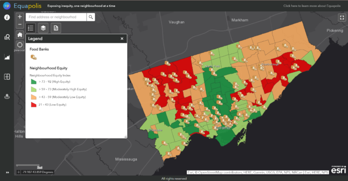
Another quality we wanted to include in our app was the ability to help Torontonians facing inequity. That’s why we included the ability to search for nearby food banks. Additionally, it was interesting to see which neighbourhoods had the most food banks located within them. A preview of the app can be seen in Figure 3. I encourage all readers to check out our website and app, linked at the beginning of the article.
Putting together the submission required coordination from all of our members, and checking things off along the way. Once everything was done the day before the submission was due, we spent hours putting things together and getting organized. We all felt a huge onset of relief after sending the submission email, and a strong sense of accomplishment.


Challenges and Takeaways (Angelina’s perspective)
The hardest part was coming up with an idea and sticking to it. The first few days were an idea storm, trying to figure out which ideas were good, concise, and, most importantly, achievable with the available open data. That last criteria was the most tricky. After a few days of debating topics and feasibility, we chose one and ran with it until the end. It was hard, especially because I had never worked with Esri’s Web AppBuilder before. But it was a topic all three of us were passionate about, so we truly wanted the result to be aesthetically well-done, useful, and successful. Being the first runner-up while being an undergraduate team with no prior experience in a GIS-related competition is an honour. Special shoutout to Pat Deluca from McMaster and Michael Leahy from Esri for helping us along the way with lightning fast responses. While the time crunch was challenging and there were definitely set-backs along the way, I can confidently say that all three of us are extremely glad we did it. It was a rewarding experience and we hope to participate again next year.
