A behind-the-scenes look at one participant’s ECCE App Challenge week.
BEFORE THE START
I’d never participated in the ECCE App Challenge before, so I was a little nervous going into it. I’d watched several videos from past winners and looked at their apps. They all seemed so creative and complex! I didn’t know all the steps involved in getting to the end of the challenge, so I figured it would be good to ask some people who had. Luckily, my teammates, Raj and Sherry, had both participated before, and I could ask them questions about their experiences. I’d also never met my teammates before, so our first Zoom call was a good time to get to know each other – where our strengths and backgrounds were and how we worked best.
FIGURING OUT THE FOCUS OF OUR APP
Once the topic arrived in our inboxes, our strategy was to individually brainstorm and then come together to share our ideas and build on them to decide on one. I immediately got to work, reading all about the theme of “Reducing Inequalities,” especially the links they gave from the UN Sustainable Development Goals website. I looked through the website, thinking about the different goals and how they relate to Canadian open data.

Immediately, I knew that census data would probably play a big part in our project. I was also thinking about what would play to our strengths. I’d taken some courses that discussed environmental racism, and given the importance of that issue and the environmental background of our team members, it seemed like a good fit. I’d also thought of some other ideas, like looking at polling places, access to gender-neutral bathrooms, something COVID-related, or looking at census data over time. Meanwhile, my teammates were brainstorming ideas of their own.
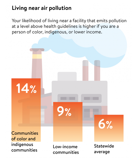
My teammates liked the environmental racism idea when we met, but we knew we had to narrow it down further. The app we were going to make couldn’t take on too wide of an issue. Did we want to look at access to greenspace? Proximity to landfills? Pollution? There were many options. We each took one of those ideas and did further research, looking for scientific papers with relevant facts along with sources of open data. In the end, we determined that data availability was best for the pollution concept, specifically air pollution. The National Pollutant Release Inventory was an excellent source of Canadian open data. It contains information about locations that emit Criteria Air Contaminants (CACs), which include seven different air pollutants: oxides of nitrogen, sulphur dioxide, carbon monoxide, volatile organic compounds, and three types of particulate matter.
PLANNING OUR APP
We looked at several different options where we’d create our app. For a while, we considered Experience Builder, which seems super cool, but in the end, we decided that an ArcGIS Hub website hosting multiple web apps would best fit the vision we had. We also had to figure out how to collaborate on the app and other parts of the challenge remotely. We divided tasks, but throughout the week frequent virtual meetings were a must. We also used OneNote on Microsoft Teams to share our research and collaborate on text. We all did additional research and worked together to review and improve each section of the project to a high standard.
THE MAIN EFFORT
We split up tasks based on our expertise. I’d worked with census data before, so my first task was to find, download, and wrangle the census data into something workable. I was also figuring out which particular demographic data would be useful. We decided that since the data were available for all the main population centres across Canada, we could cover all those areas and use bookmarks to zoom into particular ones of interest in the app. Meanwhile, Raj started to set up our Web apps, deciding on which widgets to use. For a while, we were considering going with the infographic widget, but in the end, it didn’t do quite what we wanted. Raj was also doing LOTS of research, specifically figuring out which demographics we wanted to focus on. He determined that socio-economic factors and race/ethnicity were the most closely linked with air pollution, so we ended up choosing two census variables for each of those. At the same time, Sherry was busy setting up the Hub, with its different pages and text information and explanations.
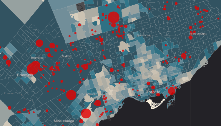
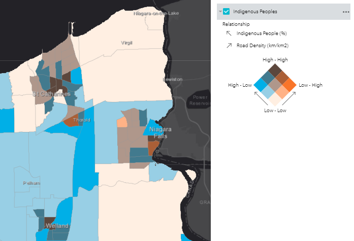
Through our research, we also realized that emissions from vehicles were pretty important factors on air quality that would not be included in the NPIR. Sherry and Raj were able to find some road data, and I converted that into road density by census track through a series of steps in ArcGIS Pro. To add to the pop-ups, I also divided the data by quantile into low, medium, and high for road density, along with similar quantiles for CACs based on annual tonnes of emissions apportioned to a 2km radius buffer.
VIDEO
While Raj and Sherry continued working on the Hub site (including the Web apps) and the documentation, I got to work on scripting and filming the video. I thought that it would be cool to go out to one of the pollution-emitting facilities from the NPIR database to get impactful shots with pipes in the background spewing something into the air. The visual aims to emphasize pollutants being emitted, though I think the candy factory I chose emits mainly water vapour. The video was challenging to film as I had to do it on my own due to the tight timeline and to ensure it was COVID-safe. I ended up using my phone in selfie mode to film while it was balanced on various random objects (like lamp pole bases, bushes, and bags of dirt). It took a few takes, but in the end, I got something I was happy with.
After looking over the whole app as a group to make sure there were no mistakes or changes we wanted to make, Raj recorded a great voiceover going through all the different parts of the Hub. He used PowerPoint to do the screen recording, which was not something I had known you could use it for, but that worked great!
The last step was stitching everything together and doing all the video editing. I didn’t have much experience with this, but neither did anyone else on my team, so I figured I could give it a go since I had the ideas of what I wanted it to look like in my head. The editing process was a big learning experience for me, with lots of time spent Googling how to do various tasks in Premiere Pro, like reducing background noises in the video, adding text, and flipping or speeding up clips. The last thing was exporting the video, which was surprisingly tricky, but we managed to get everything done and submitted before the deadline.
TAKEAWAYS
Overall, I learned a lot about the different options for creating web apps with ArcGIS Online, video editing, and pollution and inequality through this experience. My team was great to work with: figuring out ideas together, problem-solving, and encouraging each other through all hours of the night. I’m really grateful for the experience and very proud of the huge amount of time and effort that my team and I put into this in order to win the challenge!