The Esri Toronto User Conference: Day 2’s ArcGIS StoryMaps
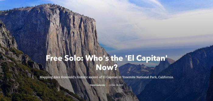
When I attended the second day of the Esri User’s Conference on October 9, I was excited for the day full of workshops and breakout sessions. While every session I walked away from had something that was useful, the session that I enjoyed and learned from the most was a walk-through of the updated ArcGIS Online StoryMaps. Following this, I wrote one up about a documentary I just watched – Free Solo. Follow along with it here; and see how I incorporated all of these into that map. And learn about rock climbing!
Story Maps
From my current perception of story maps, they were a super useful way of visualizing information outside just maps – using maps to augment a story, and allow user input through apps and interactive features. The session, led by Sumaiya Siddiqi, was focussed not only on the new changes that came to StoryMaps but on the ways to make them more powerful, more effective, and a better tool for weaving a narrative. Treating them beyond a way to haste information, but to act as a novel, engaging readers and leaving them with something beyond the story.
The talk brought up a lot of great tips regarding the composition, pacing, and things to take into account in story maps. A few that really stuck out to me as being particularly powerful:
Unified Branding
The branding and font are like a glue that holds the entire story map together. The new sectioning in ArcGIS StoryMaps allows for preset combinations of fonts and sizes, creating a uniting feature through different sections. Further, I learned about different resources for picking colour palettes; coolers.co, introduced in the session, can take an uploaded photo and select representative pixels that create an overarching colour theme, exporting RGB or hex values.
Mobile First
The new StoryMaps prioritize mobile viewers. Aside from loading faster, you can visualize how they appear on different devices and screen resolutions in the same fashion as the Web App Builder. I think the pivot to mobile is incredibly important, especially when taking the perspective beyond a GIS user and as a casual reader or viewer. The most important takeaway was to focus on more of the ArcGIS Online products as tailored for spreading information, and in the case of story maps, telling stories. So many more people are interested in viewing information as easily as possible, and mobile is a much greater audience than anything else nowadays. Having story maps be designed to serve more mobile than before means that they can be read by more people than before, too.
Add a hero
Story maps are a special type of map beyond sharing information. Web apps and web maps exist in a space to share information, too, but story maps are designed to have a flow and a narrative. To that end, an important step to making an effective story map is to treat it like an actual story. A plot is obvious, but a more important step is to add characters. Having a central hero in the story engages readers in a way beyond telling just a narrative, and having a real life character that readers can look up afterward, or reach out to and read more, leaves an impact beyond your story map.
Active vs Passive maps and rhythm
Of what I learned, I think this was the most important thing. The distinction between active and passive maps is not exactly what I expected; I think that I considered interactive features of a story map, like web apps or dashboards, to be active, while static images were passive. However, the distinction lies more in their reception by the reader. A map showing simply locations, whether interactive or not, is passive. An active map is one showing relationships, trends, or conveying information beyond location.
In the same vein, varying maps of different scales is critical to keeping a reader’s attention. Having maps shift, or zoom in, is a powerful tool; setting the scene for a reader and bringing them to that scene is a good post-introduction, pre-content step.
Spacing these maps – active and passive, small and large scale – throughout the map paces the reader, creating the idea of rhythm. Digesting three active maps in a row without media between, can reduce the impact of each map. Again, this brings up the overarching concept of thinking of story maps less as maps and more as storytelling tools or books!
The Story Map
On the whole, story maps occupy a space in the ArcGIS ecosystem that gives them a unique ability to create more than anything else. Story maps are, when written outside the perspective of GIS, the most accessible and most easily digestible way of sharing GIS information and letting others see what you see. Written well and engagingly, they can be the most effective way of disseminating information and engaging more people than ever before.

