
GIS Summary of SNAP 2019 (Part 1): Null landscape Settlement Patterns using ArcGIS Pro and R
Over the summer, I spent six weeks on the island of Naxos, the largest island belonging to the Cycladic sister islands. From the end of May to the beginning of July I acted as the GIS specialist in a team combining undergrads and grad students from Canada, Greece, and the UK, making up a large team on a project known as SNAP, or the Stelida Naxos Archaeological Project. My job on the project was to shoot in corners for new tranches using a Sokkia total station, work on a joint project with Dr. Tristan Carter on settlement patterns of early bronze age sites, and later, when new discoveries came into play, perform a viewshed analysis.
The Island of Naxos is the largest of the Cyclades islands. The island’s landscape contains a small plain region to the south east, while a large mountainous region splits the island into east and west. Early Bronze Age sites are scattered in various locations on the island. This report will briefly describe general spatial analogies along a null landscape (flat and uncomplex) to determine spatial patterns of the island using spatial analysis tools provided in ArcMap, ArcGIS Pro, and R.
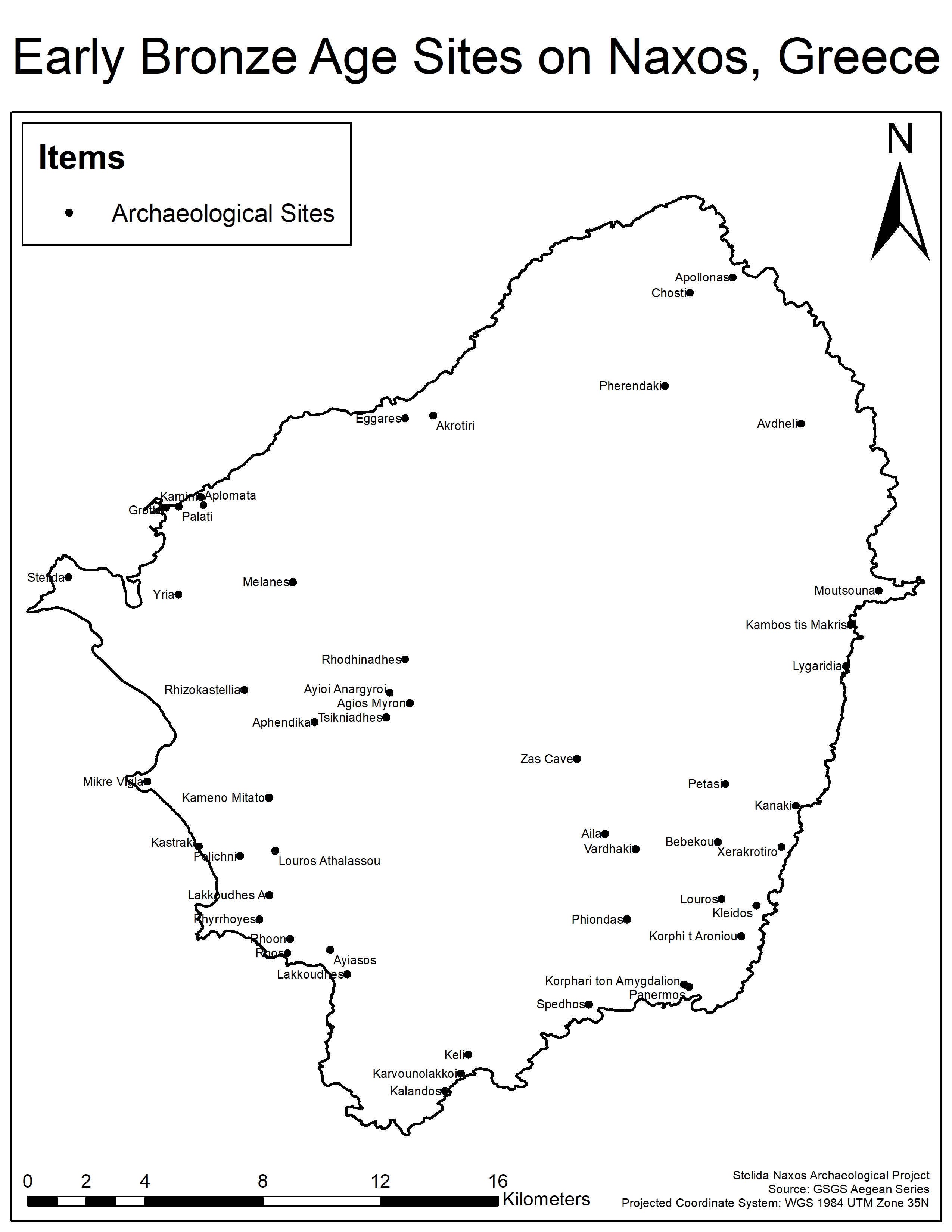
The main goal as the GIS specialist was to collaborate with different archaeological professionals from Canada, Greece, and the United States to formulate a paper on settlement patterns of early bronze age sites. In preparation for the trip, a total of 50 sites were designated into our study. A majority of our sites used a dated British Naval coordinate system of the Aegean, which we will refer to as the GSGS series. Two maps from the series were acquired and scanned from a library at the University of Edinburgh in Scotland. The maps were of high quality and were georeferenced using a boundary file of Naxos, and then points were then placed at the proper coordinates that were referenced in our database. The remaining sites without coordinates were located by scanned maps from academic papers and georeferencing accordingly. A sample of 10 sites were selected for ground-truthing using a handheld GPS unit with 3-meter accuracy. Coordinates were then given x and y attributes within WGS 1984 UTM Zone 35N using the Calculate Geometry tool in ArcGIS Pro. The result of this was a site distribution map (Figure 1).
Now that all the sites that were desired were placed, identified, and located with enough confidence, the next step was to perform different null landscape analysis such as standard deviation ellipses through ArcGIS Pro. The 50 sites were classified by site type under 4 subtypes, settlements (1), cemetery (2), both (3), Quarry (4). The quarry subtype was excluded from this test as their is only one quarry site within our study group. The Directional Distribution (Standard Deviational Ellipse) tool in ArcGIS Pro allowed us to create a visual distribution of site types (Figure 2). The results would show us where most of the site types were concentrated within the boundary of Naxos, along with any additional directional information that can be interpreted from the visual. The Center Mean tool was also used to determine where the most of the site types were located.
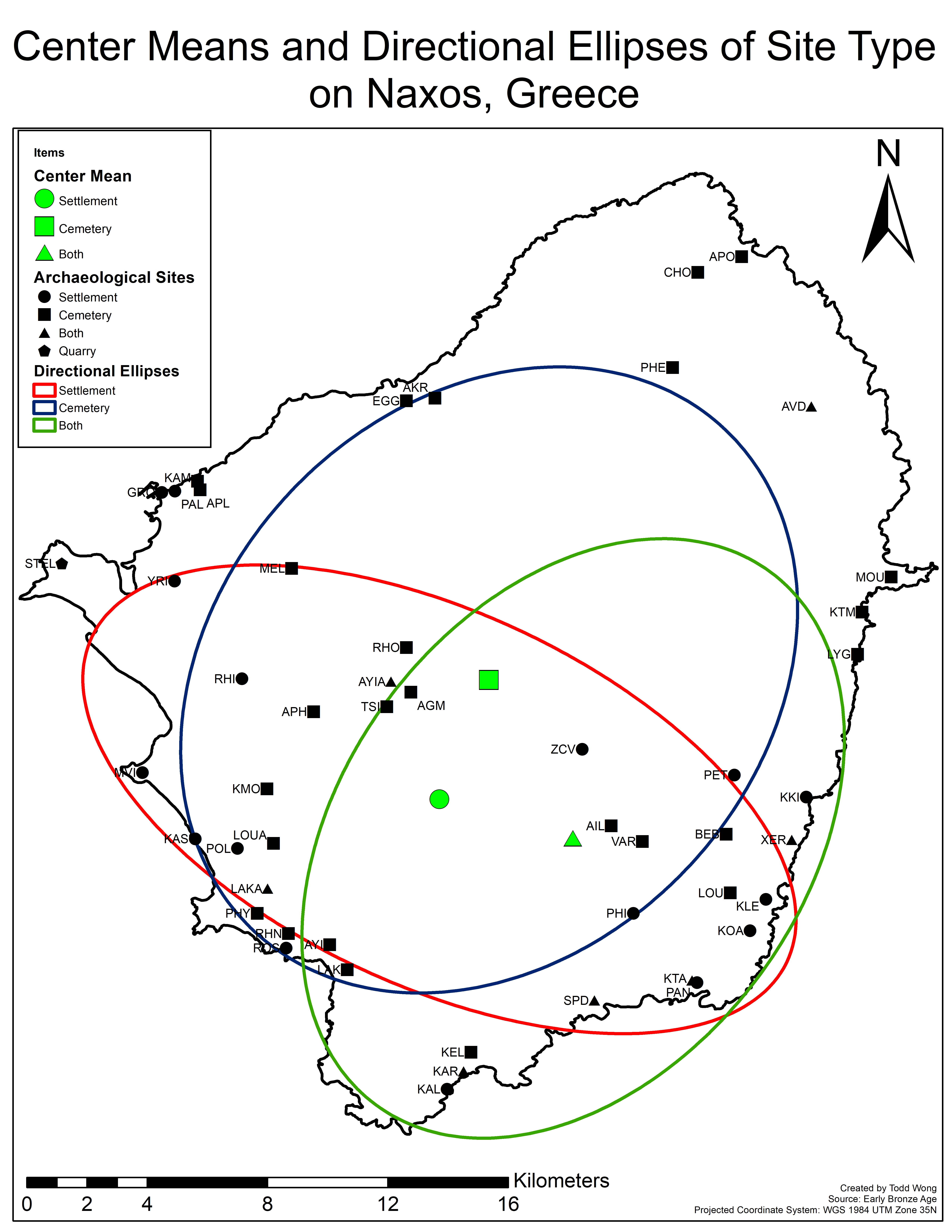
The above result show us that there is a distinct pattern to site location and site type. The most prominent pattern is that of settlements. The directional ellipse of the settlement subtypes is perpendicular to the two other ellipses that appear to follow the islands arrowhead-like appearance. The visual is also more concentrated to the southern regions of the island. What this indicates is that a large majority of the settlement sites on Naxos are located in the southern portion of the island. Our interpretation of this comes down to the island’s geography. The island of Naxos is a mountainous region with only the southwestern portion of the island being classified as a plain region (Figure 3). It is believed that this plain region would have been ideal for an agricultural setting allowing for early peoples to become subsistence farmers and develop large settlements.
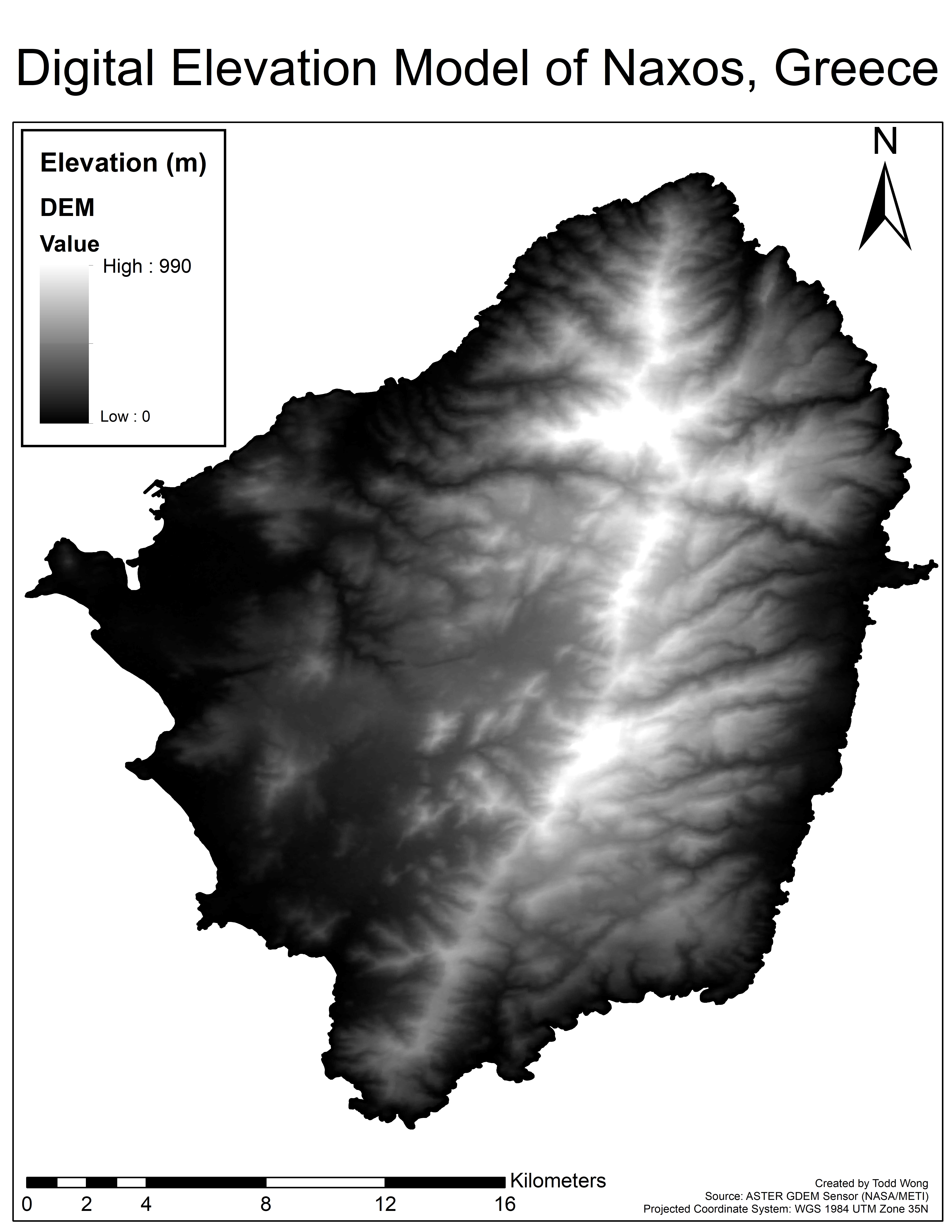
The second pattern to make note of in figure 2 is with the sites that were labelled as both cemetery and settlement sites. This ellipse runs from the the south tip of the island to the northern tip, with a small shift to the eastern part of the island. This visual tells us that the eastern portion of the island might of had a slightly different cultural practices than that of their western neighbors. in Figure 3, we can visualize that a large mountain nearly a kilometer in elevation cuts the island in half, making communication and contact between east and west very difficult, therefore it is safe to hypothesize that the handling of the dead was very different on either side of the larger mountains. On the western portion we can say that once a person has passed on that they were buried in a different location away from the settlement. While on the eastern portion of the the dead were buried along side the settlement in which they lived.
The final pattern is that of the cemetery sites. The center mean of the cemetery sites comes close to the center portion of the island, with the ellipse being the widest of the three. This can indicate that cemetery sites are widespread throughout the island whether it is in the north, south, east, or west, and that there are no distinct patterns that can be identified using this method.
The next steps in analysis used the G and K functions. These were done in R using the SpatStat and arcgisbinding packages to integrate shapefiles into the R universe and connect R to ArcGIS Pro. The coordinates of the shapefile were input into the application and converted to PPP files (Figure 4). This process allows the use of the G and K functions in R. The G-function acts as an event to event function, which measures the distances between one event (in this case, an archaeological site) to the next closest event and then adds the distance to a distribution that displays the proportion of sites within a given distance (Unwin 1996; 543-544). The K function in R considers the distance of all events from one event and calculates the count/density of events within a certain buffer distance away from this event, which might cause variations in line curvature (Dixon 2001; 1-3). This cycle of counting points occurs for all events in the dataset and produces a graph with a theoretical line that is easily interpreted for the results.
Naxos.Boundary <- st_read('D:/SNAP2019/RFiles/NaxosBoundary.shp')
Sites <- st_read('D:/SNAP2019/RFiles/Sites.shp')
ggplot() +
  geom_sf(data = Naxos.Boundary, size = 1, color = "black", fill = NA) +
  geom_sf(data = Sites) +
  coord_sf()
xrange <- range(Sites_select_df$X_COORD)
yrange <- range(Sites_select_df$Y_COORD
Sites.ppp <- ppp(Sites_select_df[,1], Sites_select_df[,2], + xrange, yrange)
plot(Sites.ppp)

For the G function (Figure 5), an envelope of 1000 simulations was produced in order to determine randomness. The x-axis is an indicator of distance to the nearest points in meters, while the y-axis indicates the proportion of the sites that have a nearest neighbor within the given distance on the x-axis. The red line indicates theoretical randomness, with the grey envelope representing a degree of confidence that these events are random. Clustering is indicated by the observational line being above the theoretical while, uniformity is below the line. The results indicate that the series of events (that is, the locations of sites) are in fact random. This is decided by both the theoretical line and the envelope. The observation line (black) follows the same pattern as the theoretical (red) with a slight indication of clustering around 1000 to 1700 meters while still remaining within the envelope. Overall 50% of all sites fall within 1 kilometer, and 80% within an additional 1 kilometer, with the remaining percentage within 2 to 7 kilometers, which is most likely the northern sites.
Sites.gest <- envelope(Sites.ppp, Gest, nsim = 1000, correction = "none")
plot(Sites.gest, xlab = "Distance (m)")

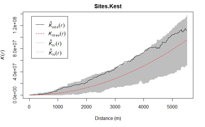
Next the K function was performed (Figure 6). This function in R considers the distance of all events from one event and calculates the count of events within a certain buffer distance away from this event, which might cause variations in line curvature. This cycle of counting points occurs for all events in the dataset and produces a graph with a theoretical line that is easily interpreted for the results, with the same inputs as the previous function plus an added border function that helps eliminate edge effects. As with the G function the black observation line was produced, with a theoretical line also being produced. For a K function, if the observation is above the theoretical line, this is an indicator of clustering while the distance between the theoretical and observed line determines the intensity of clustering within that distance. Application of this function produced many of the same results, with a higher indication of clustering at different levels. The data-based line is above the theoretical line for the entire plot, but still remains within the envelope. This indicates some clustering of sites while still remaining fairly random. Zones from 2000 to around 4500 meters are the most clustered as they have the largest gap between the theoretical and the observed line.
Sites.Kest <- envelope(Sites.ppp, Kest, nsim =1000, correction = 'border')
plot(Sites.Kest, xlab = "Distance (m)")
For the island-wide site distribution analysis in ArcMap and ArcGIS Pro, three different analyses were performed to create two results. The first test is the Clark-Evans Test, also known as the Average Nearest Neighbour Tool. This tool is also a point aggregation test like the G and K functions in R, but generates area and p-values to produce an informative infographic on clustering, dispersion, and random patterns (Figure 7).
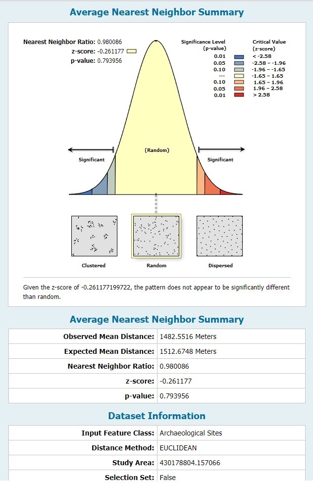
This test is identical to the G-Function but with the added study area factor which helps determine some of the values that eventually lead to the result. Like the result in R, the test indicates that the dataset is random, evidenced by a large p-value that determines that there is no statistically significant spatial clustering or dispersion in site distribution. The infographic also provides other statistics such as average distance from the sites and the expected distance, which ultimately determine the Z-score and P-Value.
Overall, initial analyses of spatial distribution of bronze age sites across the island of Naxos both prove and disprove early visual predictions in the project that assumed that sites are focused in the southern region of the island, potentially due to the lack of sites that in turn increases our standard error and confidence in randomness. These results should be taken lightly, because these analyses only consider a “null landscape”, and do not consider more complex environments such as elevation and slope. Nevertheless, in my next post I will be using GIS tools and models to analyze different factors such as slope, elevation, and distance from water bodies, in order to bring to life different commonalities about the landscape that surrounds our sites.
References:
Dixon, P.M. (2001). “Ripley’s K-Function”. Statistic Preprints 52; 1-16.
Unwin D.J. (1996). “GIS, Spatial Analysis and Spatial Statistics”. Progress in Human Geography 20, 4; 540-551