Geovisualization of Health Data: Some examples from COVID-19 maps.
One of the most popular uses for maps is for navigation purposes, evolving from paper maps to increasingly being utilized in applications on mobile devices. However, in 2020, viewing maps has become part of many people’s daily routine for another reason. The global spread of COVID-19 has had a profound impact on the lives of nearly ever person on our planet. With the illness spreading and intervention strategies demanding dramatic alterations in our day-to-day lives, maps of COVID-19 cases have become commonplace in mainstream media, government discourse, social media, and even in text messages sent between friends and family. With the democratization of map-making and with maps becoming commonplace for many users (with a wide range of skills and training), what has become apparent is that the geovisualization of COVID-19 incidence via maps demands scrutiny.
Boundary Issues
With the proliferation of COVID-19 geovisualization, that are many fundamental problems that can affect how maps present information to viewers. COVID-19 maps are used as media to deliver important information about the proliferation of the disease to the population. However, discrepancies in the effectiveness of these products and the takeaways they provide may be due to inexperience of the map creators or accidental omission. The ramifications of misrepresented data in these maps are important. While it has become virtually effortless for anyone to plug some data into a geographic boundary and create a map from it, what is often critical, but omitted, is the consideration for who you are presenting the data to, what data you are presenting, and how you are displaying these data. Those well-versed in geovisualization may understand the manner in which data is being displayed, however the target audience are often non-experts, that may infer a narrative from the map that was different from it’s intended purpose.
Over the past year I have come across near countless COVID-19 related maps, many that are potentially problematic. While the maps themselves are not necessarily false, the manner in which the data are presented should be scrutinized and critiqued. One such popular product that deserves a deeper look is a map published by Johns Hopkins University. The map can be found at: https://bit.ly/38XT9kf
The website became rather popular in the mainstream media, and has been shared frequently on social media. This online mapping application is particularly powerful as it includes data from multiple countries updated several times per day. Further, it has several additional statistical overlays, and is relatively easy to navigate for the expected user. However, there is one glaring problem that can significantly alter the narrative of this map service for any country outside of the USA: differing geographic units. As an example, consider the screengrab from the map from today (January 1st 2021, updated at 1/1/2021, 2:22pm MST).
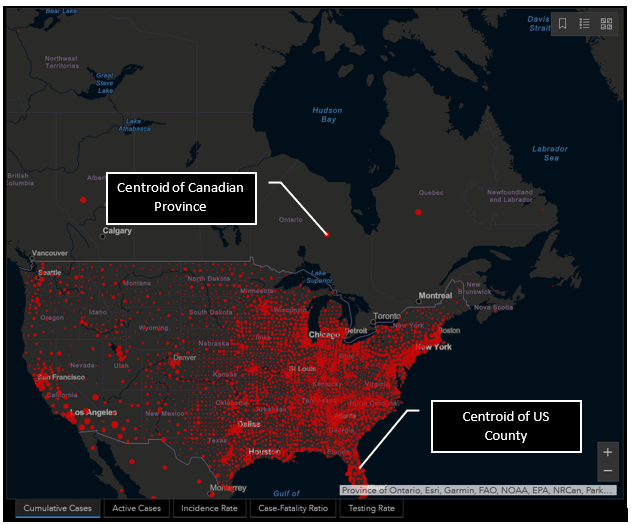
Upon first glance at the USA, nothing seems overly problematic. The data are being presented with proportional symbols that represent incidence counts. Now examine the symbols in Canada. If we were to take this map at face value, not knowing the administrative units used to aggregate and visualize the data, it can appear that here in Canada, major population centres are essentially free of cases. But checking the local news or government websites would easily prove that this is simply not the case. So, why the discrepancy?
Simply put, the area units (the boundaries) being used to aggregate and visualize the data have very different scales for the two neighbouring countries. In the case of the USA, the graduated symbol is placed within each county boundary at the centroid location. Within Canada, centroid locations are likewise being used, however rather than using the much more granular county as an area of analysis, the data are being presented at a provincial level. There are two issues that can be gleaned from this discrepancy:
- Within Canada, the map does not show where in each province the cases are located, and
- It appears that the cases in Canada are located a considerable distance from population centres.
Examine Ontario or Quebec. A quick glance may suggest that there are no cases whatsoever in the primary population centres. If the cases in Canada were presented alone, it may be evident to the viewer that this is not the case. But when the data for the USA is presented alongside Canada, this delivery can lead to a confused narrative for the viewer.
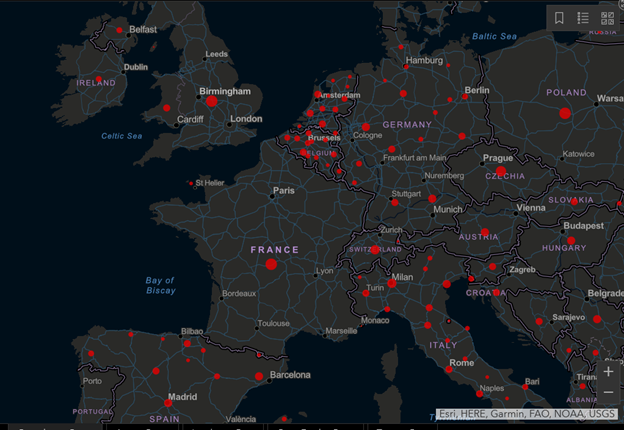
Now examine other regions beyond North America (e.g., a portion of Europe in the following image). In this example there are several different boundary scales used to aggregate and visualize COVID-19 cases. Note some countries such as France, Ireland, and Poland have a single centroid location for the entire country, while others, such as Germany, Belgium, and Italy have multiple points. This differing representation may lead a viewer to think that cases are more widespread or higher overall in a country like Belgium, than England, due simply to the manner in which the data are presented in the map.
Why does this matter? While spatial a analyst is likely to recognize the simple a limitation of the administrative boundaries being used, this mapping application circulates to the households of millions of individuals globally. These users are less likely to understand the nuances of geovisualization of health data. What can result for these users is a skewed narrative. It could be argued that the reality that the user takes away from the map may have dangerous ramifications in the behaviour of the viewers who take this map at face value. Areas that may appear to be free of cases due to the map presentation may result in the population taking a relaxed stance on intervention, as they are under the assumption that they are case free. Similarly, taking the map at face value, intervention strategies of some countries (that appear to have more prolific case numbers) may be deemed less effective than countries with a single point to represent the entire country’s counts. Such a narrative could have dangerous, or even deadly outcomes.
Data Standardization Issues
I am currently residing in Calgary, Alberta as my partner has moved here to continue her education. Coming from Nova Scotia I was particularly concerned about differences in COVID-19 rates between provinces. Being new to the city, I was entirely unaware of where cases may be higher, thus which areas to avoid if possible. So, I took to the Internet to find some information.
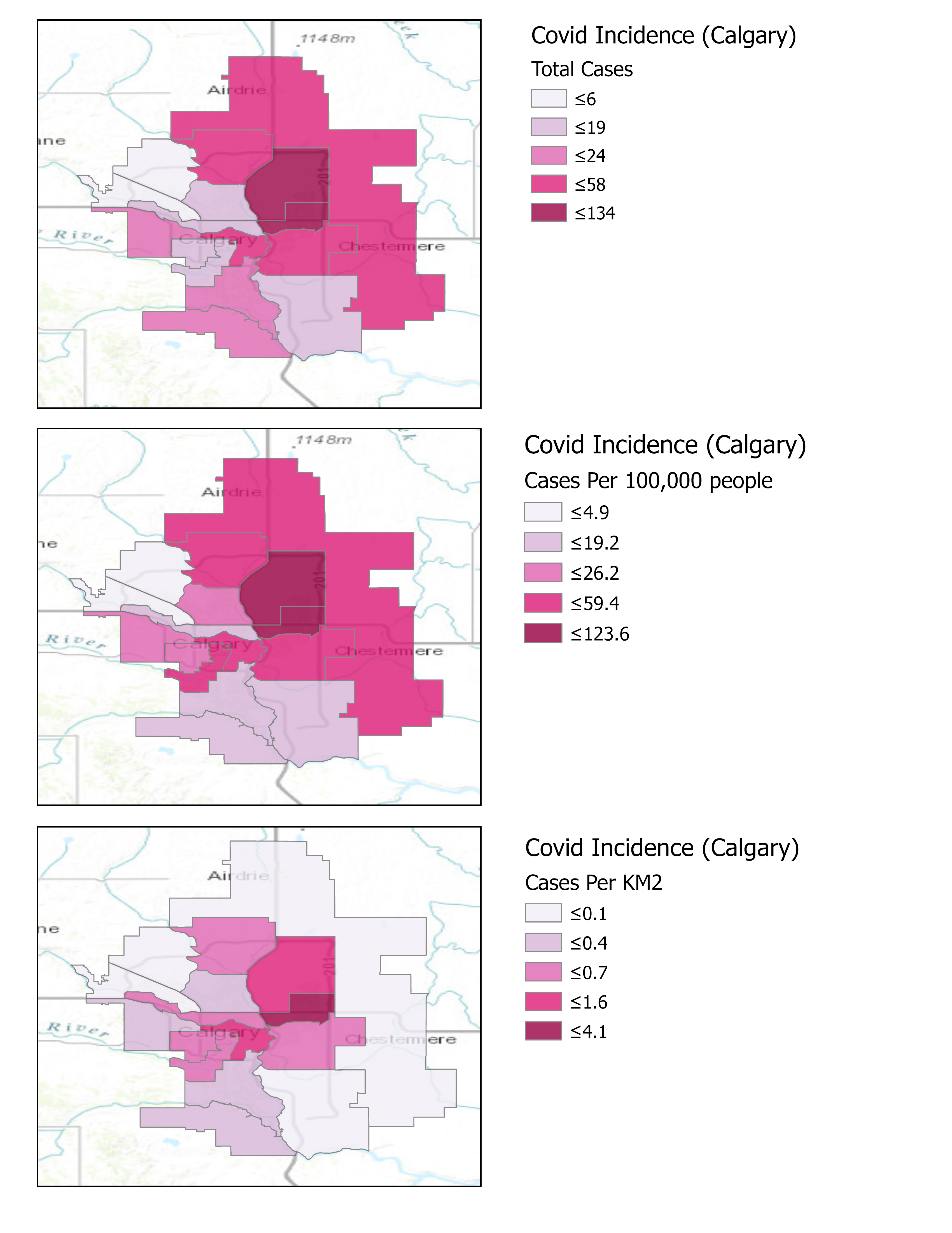
What I encountered was a user on the Calgary Reddit page who posts weekly map updates of COVID-19 incidence within the city of Calgary. What became immediately apparent was that this user was not standardizing their data. The maps they created initially pulled raw counts from a government web source, they then aggregated to their corresponding geography and presented as an incidence map. While an impressive application of data scraping, geocoding and visualization, what became evident by reading commentary on the maps was that misinformation was spreading as a direct result of the publication of these maps. The maps presented the incidence as raw case counts rather than as a standardized variable (such as rates). In suburban or rural areas, with relatively fewer people and larger geographic areas, cases appeared to be respectively lower than in smaller, more densely urban areas. While these areas may certainly have fewer overall cases, they also are much less densely populated. The manner in which these data were being presented is referred to as a spatially extensive measure.
The resulting commentary stemming from this presentation was that whatever preventative measures that were being carried out in these high case areas were inferior and non-effective when compared to those in the lower density, more suburban areas. This commentary ultimately led to a degree of public on-line shaming of those who reside in those areas with higher case counts.
I decided to examine the data more closely, and to see what would happen if I made the data spatially intensive. (For a through overview of standardizing variables, including a discussion of spatially intensive versus spatially extensive, review the article Understanding Statistical Data for Mapping Purposes by Aileen Buckley).
In a late-night, caffeine-fueled fit of curiosity (and, if I am being candid, influenced by the persistent annoyance at the on-line shaming of people), I decided to recreate one of the maps created by this user, alongside this I would also present the counts standardized to area (cases per km2) and also as cases per 100,000 individuals (common in epidemiology and health geography). I located the data source for the maps (found here: https://www.alberta.ca/maps/covid-19-status-map.htm), a boundary file, and set to creating some quick maps. For consistency, the cartography of these maps have been adopted from the original map format. The image below was the outcome of this adventure. I then took to the same forum to post the results and to try to spark some discussion. The goals were twofold: 1) Persuade the map creators (who generously sacrifice their time each week to make the map) to standardize their data; and 2) To explain to the user base that the way in which data is presented can have a considerable impact on the narrative (and also to encourage users to be kind to each other).

These are not fancy maps by any means, but that was not the purpose of creating and comparing them. Rather the purpose of these maps was to demonstrate the impact the standardizing your data can have on map visuals. In the case of COVID-19 rates, the differences between the first two maps are perhaps the most important. Lets first look at the topmost panel, representing raw COVID-19 counts. Here it can been seen that the most southwestern two boundary areas have been allocated to the middle class (based on the orange colour in the legend), with the two areas directly north of them them in the second lowest class (based on the tan colour). Next if we look at the second panel in the figure, with the data standardized to cases per 100,000 people, it can be seen that categories are essentially flipped between these same areas from the previous map. The third panel in this figure was created to demonstrate the effect of standardizing these COVID-19 counts based on the area of their respective boundaries. Essentially what this map is presenting is more reflective of population density. While not necessarily appropriate for the purpose of the COVID-19 maps, I decided to include it as well to help get viewers thinking about how the distribution of cases may influence the presentation of data, especially when are utilizing units of analysis that are unequal in both their area and population.
What resulted from this image being posted was interesting to me. Firstly, the map makers recognized the important differences in presenting raw counts versus standardized data. Secondly, there was an immediate shift in the discussion narrative in the forum. Where certain areas were initially being heavily critiqued for their case numbers, it now became evident that the reality is far more nuanced, where variables such as population density and cases per population are important to consider. The overall trend may have not shift dramatically depending on how the data were being visualized, but what became evident is that the creation and presentation of spatial data in a map is a complex and nuanced process. While this was a tiny corner of the Internet, I am happy to see that since this post, the maps have become standardized more frequently. It also has been good to see the discussion become less about blame and public shaming, and more about understanding.
What can we, as spatial analysts and cartographers take from this story? First of all, I am not suggesting that we should never present raw counts; there are many cases where visualizing raw counts of a phenomenon is perfectly suitable. What I hope some of us can take away is that map making is something much more than simply plugging data into a boundary. We need to consider:
- Our intended audience. Are they versed in GIS, Spatial analysis, cartography, and the subfield in question? Or are they a r are they an average person just looking to understand a spatial phenomenon a little better?
- What is the narrative we are pushing with our map? Yes, it is okay to have a narrative, as that is truly the point of a map. But what needs considering is whether this may lead to the spread of misinformation.
- Is there a better way to display the data? GIS is becoming increasingly commonplace in various professional and academic environments. Cartography is a science and an artform that may be underdeveloped in some mapmakers. I encourage everyone (even seasoned cartographers) to explore best practices of geovisualization, whether that is in the boundary being used, the colour palette of choice, or the classification technique being applied to categorical data.
As a final note: I also created a colourblind safe version of the maps to present the same data on the forum. That was another sidenote that I brought up during discussion, as the chosen colour scheme could make it difficult for people with colourblindness to distinguish the different classes. Below are the same maps, using a monochromatic colour gradient to represent same data: