
Transforming COVID-19 Data into Web Mapping Applications.
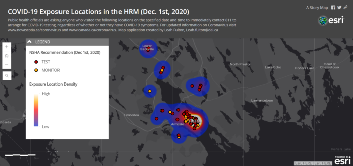
Geography has played a significant role throughout the COVID-19 pandemic, both locally and globally. With a second wave on the rise, understanding where COVID-19 exposure sites are is essential reducing community spread. Governments have been providing updated information regarding COVID exposure sites to increase public awareness. In Nova Scotia, such data includes the date, time, location, and recommendations for each exposure site (Potential COVID Exposures | Nova Scotia Health Authority (nshealth.ca)). While this information proves to be crucial, placing this information on an map can be a visual aid to help capture people’s attention more effectively.
Fortunately, these data can be easily transferred into geographic information systems. Addresses can be geocoded, while cartographic displays can depict the density of exposure sites. The web mapping application below uses the NS government exposure site data and provides an example in capturing COVID-19 exposure sites (COVID-19 Exposure Locations in the HRM (Dec. 1st, 2020) (arcgis.com)).
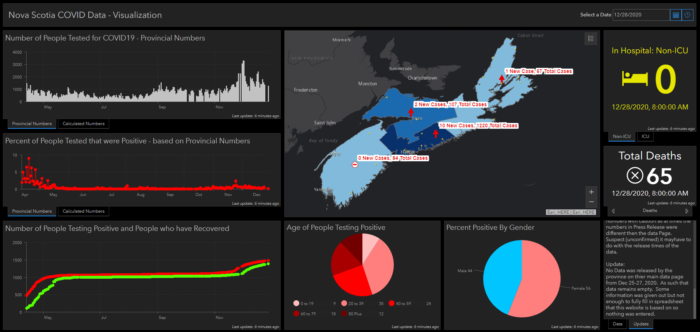
These kinds of data can also be best represented using Operation Dashboards. Also retrieved from the Government of NS website, this up-to-date web mapping application featured below visualizes COVID-19 data through graphs, charts, and maps (Nova Scotia COVID 19 Data (arcgis.com)). Whether it be through web mapping applications, StoryMaps, or Dashboard, there are a variety of ways when looking at data, each telling a different story.
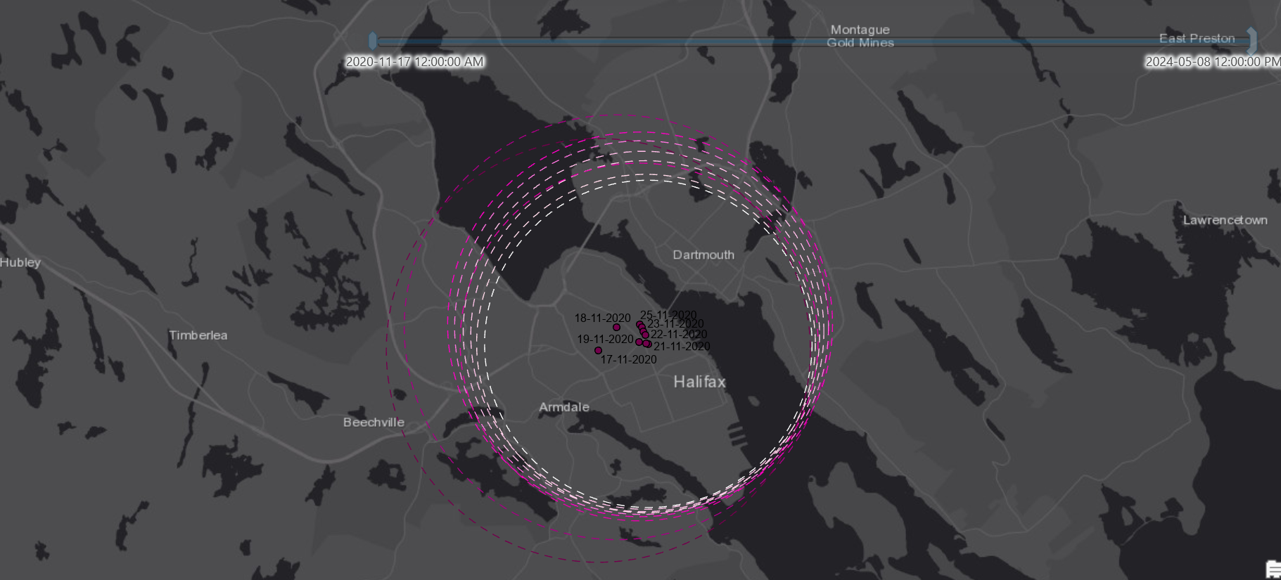
Looking more deeply into COVID-19 exposure data, additional methods of spatial analysis can be explored. This includes looking at the mean center, which essentially takes the average of the x and y coordinates to identify the center of concentration. As more COVID-19 exposure sites are identified, the center of concentration moves (see the points for dates ranging from 17/11/2020 to 25/11/2020). Moreover, standard distance measures the degree of concentration around the mean center. The lighter dashed lines represent the standard distance for the most recent dates. Their smaller size indicates a more concentrated radius of COVID-19 exposure sites than the larger, darker dashed lines from earlier dates.
Visualization tools such as Time Series can also be helpful for identifying trends and visualizing spatiotemporal patterns.
Data visualization and cartographic mapping play an essential role in communicating health and safety measures to the public. Utilizing publicly available data can inform researchers and decision-makers about ideal testing sites, and potential rapid testing locations.
As always, please consult public health officials regarding COVID-19 updates, and to follow appropriate measures and guidelines if you have been exposed to the virus.
Stay safe everyone!