
Orientation Analysis of Iceberg Scours and Pits on the Grand Banks of Newfoundland Using ArcGIS Pro and Online
While studying for my final exams, I decided to try out some of the ArcGIS techniques that I learned this past term. I am in my first term of the Advanced Certificate program in GIS at COGS and have learned many new skills over the semester that I will have to understand well to apply to my future career. I decided to pick a dataset that we had not previously used in classes so that I could learn new information.
The dataset I chose was an open dataset from Natural Resources Canada. This dataset is called the Grand Banks Scour Catalogue (GBSC) GeoDatabase and is from the Geological Survey of Canada Open File 7420 (revised). This dataset was originally published in 2014. The reason I chose to work with iceberg data is because I think iceberg movement is an extremely interesting topic. Especially with respect to glacier melting and climate change. This dataset includes information about iceberg furrows, furrows with known termination pits, and pits found on the Grand Banks offshore Newfoundland. Also included is bathymetry, site surveys, and survey extents as well as well locations. I decided to work with the scour, pit, and bathymetry data only as those were what I was most interested in.
I began by connecting a folder with a copy of the data in geodatabase format to my project in ArcGIS Pro, and added all of the feature classes I was interested in to a map (Bathymetry, GSBC_Furrows, GSBC_Furrows_with_Pits, and GSBC_Pits). Then, I decided that I wanted to know more about the data so I used the summary statistics tool. The fields I chose to calculate were frequency, mean orientation, mean shape, and mean width as I believed this would be the most relevant to understand for analysis. I used the statistics tool for all the feature classes except bathymetry. The results are shown below (Figure 1, Figure 2, and Figure 3).
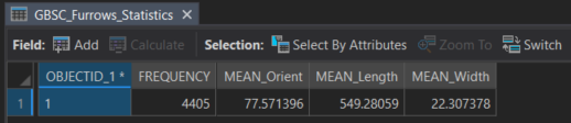
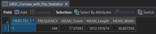
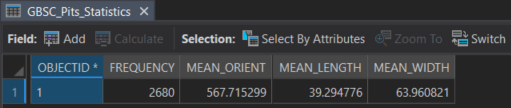
These tables revealed that the mean orientation of the furrows is around 77 degrees and the mean width is around 20 to 30 m. There were fewer furrows that had associated termination pits and the mean shape length was overall much higher at 1072 m vs 40 m in the furrows without pits. This is likely due to the length of the furrows with pits being calculated by combining the length of the furrow and the length of the associated termination pit. The pits have a mean length of about 40 m and a mean width of 63.9 m, and they have a much wider width than the furrows. According to the report GBSC, the pit length represents the longest axis of a pit(Campbell et al., 2014). I was unsure why the mean orientation for the pits is 567.7 degrees. That value did not make sense for orientations so I opened the attribute table. It appeared that in the case where orientation was not recorded, a number of 999 was input. This likely is the reason for the high mean and so that number can be ignored. If this was a real analysis, I would have gone through and removed all erroneous data and then recalculated mean orientation.
Next, I decided that I wanted a visual representation of the orientations of the furrows. To do that, I choose the Linear Directional Mean geoprocessing tool. I chose to select orientation only in the options for this tool, as I was not sure how the direction was originally input into the shapefiles and because the point of this project was just experiment and learn how different functions and tools work. The Linear Directional Mean geoprocessing tool identifies the mean direction, length, and geographic center of lines, and produces a feature class with those results that can be added to a map.
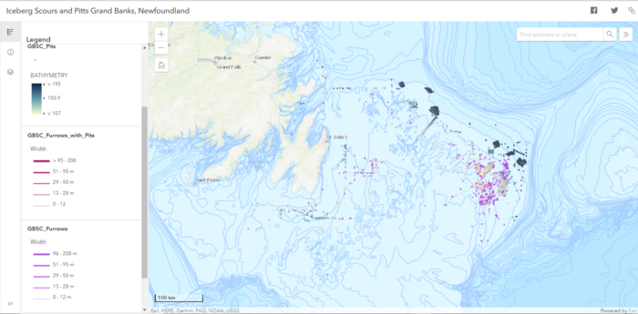
After that, I wanted to work with symbology and the smart mapping tools that ArcGIS online has to offer. I shared all of my feature classes to my ArcGIS Online account and created a new map. I used smart mapping suggestions and differentiated the different furrow types by colour. Then I used the width attribute and graduated symbols. For the pits, I choose to differentiate based on depth by using the bathymetry field, and used the Counts and Amounts drawing style with deeper depths being a darker blue colour. Finally I coloured the directional mean feature classes with different colours. My directional mean layer has very small features that are hard to see when zoomed-out at smaller scales. I learned that because the linear directional mean output shows the mean length using an actual line geometry, so you can only increase size by adjusting the width of the line used to display it. Thus the outputs from that tool are better for larger scale map visualizations. I also played with scale dependency for the layers, making it so that only the pits are visible when zoomed out to smaller scales.
Finally, I remembered that we had worked with learning how to use instant apps this past semester. So I decided to to turn the online map into a basic app showing a scale bar, legend, and layer list. While an overall view of this data is great, to really interpret the data, it is best to zoom in to get a closer look at larger scales. The web app shown in the preview below is accessible online for you to explore.
In conclusion, ArcGIS Pro and ArcGIS Online tools can work together to perform interesting analyses on datasets. Summary statistics can be used to get an idea of certain analysis questions to ask, especially during the exploratory data analysis phase of working with data. The Linear Directional Mean tool quickly creates feature classes that allow visualization of mean direction, orientation, shape length and position of line datasets instead of just computing values. Smart mapping in ArcGIS online makes symbology selection for effective visualization easy, and instant web apps are are an easy way to create and share interesting maps. While this project was just for fun and the data had already been mostly analyzed by the report attached to the dataset, the techniques I outlined in this post could be used and adapted for future work with unexplored iceberg datasets across the world.
Credits:
All data provided for this dataset was open data provided by the Geological Survey of Canada:
https://geoscan.nrcan.gc.ca/starweb/geoscan/servlet.starweb?path=geoscan/fulle.web&search1=R=293973
Campbell, P., Burke, E., and Sonnichsen, G.V., 2014. Grand Banks Scour Catalogue (GBSC) GeoDatabase; Geological Survey of Canada, Open File 7420 (revised). doi:10.4095/293973