
Assessing fish passage in Nova Scotia
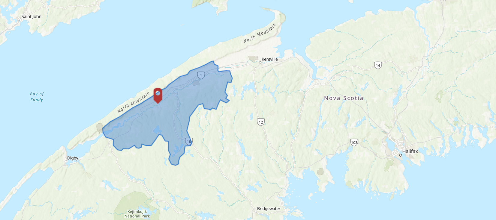
While exploring different options for my capstone project, I was approached by the Department of Fisheries and Oceans to assess fish passage or the ease of migration for saltwater to freshwater migratory fish species in Nova Scotia. Due to time constraints on the project, the spatial extent of the analysis was constrained to the Annapolis River secondary watershed, located in the western region of Nova Scotia.
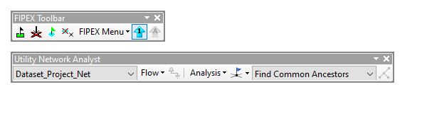
This project piqued my interest with the opportunity to use python programming in geoprocessing and to explore a new tool (to me), the FIPEX toolbar. If you are looking to analyze the quality and quantity of a watercourse network for ease of fish species migration beyond dams, you may find this tool is easy and useful for that purpose.
Downloadable for ArcMap version 10.4+ with standard and above licenses, you can build a network, flag the most upstream or downstream location in that network, and calculate the amount of stream length available using previously assigned barriers. This tool gets its functionality from the Utility Network capabilities in ArcMap.
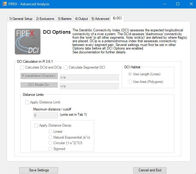
The calculations conducted using this tool result in the immediate stream lengths up to a barrier, or the total amount for a specified network section, regardless of barriers. You can also use a Dendritic Connectivity Index (DCI) with R software incorporated to measure the probability of movement from one area in the network to another (i.e. ocean to river). Although I did not use the DCI for my project, I think the resulting measures from this option are critical for assessing the overall fish habitat in a specified extent.
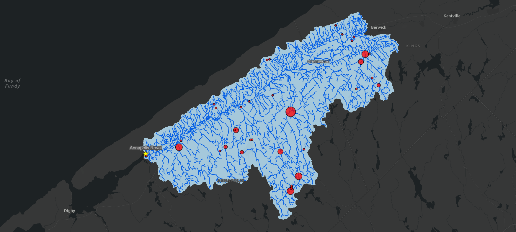
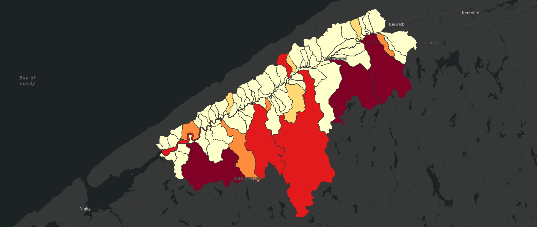
The resulting maps below, provide an overall picture by dams and tertiary watersheds, respectively. In the first map, each dam is showcased by the amount of total stream length in kilometres. The second map shows dam density in tertiary watersheds, ranging from no dams (light polygons) to the highest density (dark maroon polygons). The orange polygons have a lower density. However, they may still be problematic areas for fish migration due to potential low quality habitat. These areas should still be considered when assessing fish habitat based on other factors for fish migratory behaviours.
This project was a wonderful opportunity to learn about applications of FIPEX, visualization techniques, and work with a contact from an organization. To reiterate the importance of this work, fish habitat are progressively threatened by habitat fragmentation as well as the quality of habitat. This means that this project and similar ones like it can really help make decisions on how to support fish migration through watercourse systems.
To learn more about my project, you can check out my StoryMap here, and read my next blog post discussing the steps I needed to take to clean the data used in my analysis.