
Using ArcMap for different mapping techniques
Here I would like to discuss creation of maps in ArcMap using different mapping techniques. In particular I was able to easily create the following maps as a part of an assignment for GEOM3007 course: dot density map (shown in Figure 1), proportional symbol map (shown in Figure 2), and choropleth map (shown in Figure 3). Canadian Census data for Ottawa-Gatineau were used for the maps.
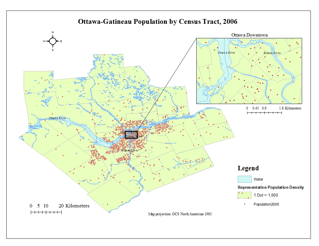
Dot density map was chosen for representation of Ottawa total population distribution in 2006 (shown in Figure 1). According to Dent et al. (2009), this technique is suitable to show distribution pattern for the total data instead of derived data which is consistent with a requirement for the map shown in Figure 1. The following two parameters were adjusted in Arc Map to better represent population data: dot value and dot size. The adjustments were made in order to avoid uniformly distributed dots and significant dots overlapping on the map. Therefore, optimum (in my opinion) parameters of dot value of 1000 and dot size of 2 were chosen for the best possible representation of data shown in Figure 1. Water masking was also easily conducted in Arc Map in order to avoid dots on the water surface.
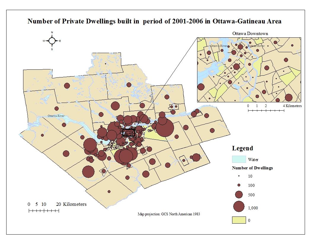
Proportional symbol mapping technique was chosen to map the total number of private dwellings built between the period 2001-2006 for Ottawa-Gatineau shown in Figure 2. The total number could be represented using appropriate proportional symbol map (Dent et al., 2009). For my map I decided to use two-dimensional symbols with Appearance Compensation (Flannery) in order to improve data perception. Classification of data was easily conducted in ArcMap. I also decided to exclude from my classification zero values and assign a yellow “0” symbol to them in order to explicitly represent areas with 0 values. I decide to use 5 classes (including 0), because the optimum number is 4-6 classes (Dent et al., 2009).

The map shown in Fugure 3 uses choropleth map technique which is appropriate for derived data representation according to Dent et al. (2009). The population change was easily calculated in ArcMap tables. Several polygons had zero values for population data, required for calculations. As a result, the polygons with zero values for population were assigned with a grey “No data” Symbol in my classification scheme. It was quite challenging to decide on the classification method. According to Dent et al. (2009), a natural break method is the most recommended, because it provides great class homogeneity. However, this method in my case produced an almost homogeneous map where almost all tracts had the same colour. The obtained map was not representative and used classes with negative and positive values for the same bin. Therefore, I decided to choose Quantiles method which divides data based on equal frequencies. This method, in my opinion, produced the best representation of data shown in Figure 2. I also choose to use cold and warm colours in order to represent negative and positive population changes respectively.
Therefore, ArcMaps provides effective, user-friendly tools to map data.
References:
Dent, B., Torguson, J., & Hodler, T. (2009). Cartography: Thematic Map Design (6 edition). New York: McGraw-Hill Education.