
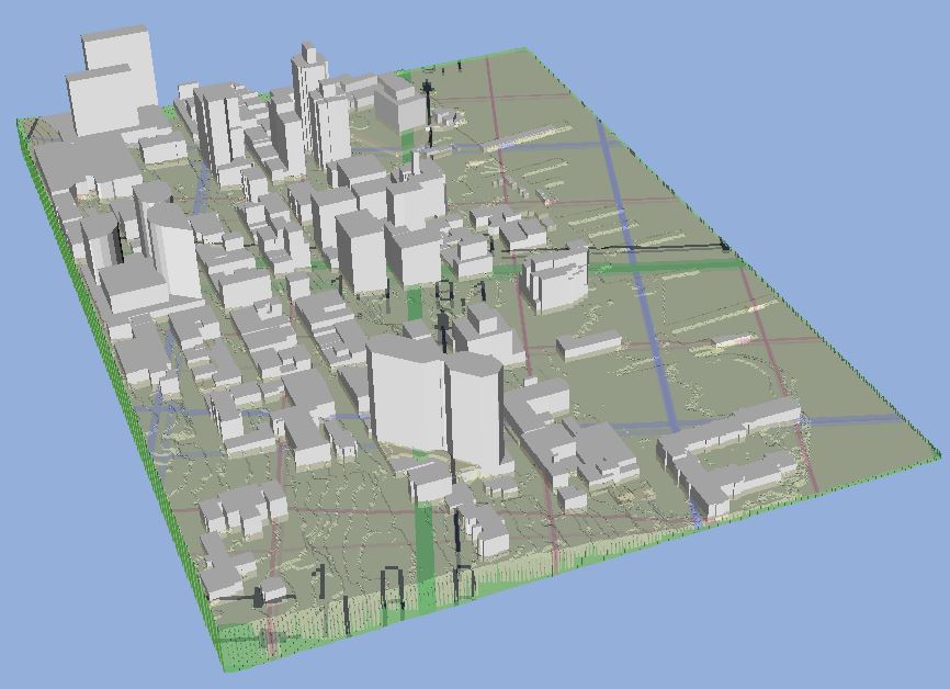
3D model of the Halifax Harbour Waterfront
This project considered what is required to create impactful and representative visualizations as well as how planners can leverage them to explain the effects of SLR and EH. This section reviews principles, guidelines, and observations that have been made when visualizations are created and presented. This section then reviews past research which has been completed regarding climate change, SLR, and storm surge as part of the scenario building process.
Visualization in planning
Over the past 25 years there has been research into the effectiveness of visualizations, completed through literature research and practical experience (Sheppard, et al., 2004; MacEachren & Kraak, 1997; Lovett, et al., 2015). This research has found indicators which suggest that visualizations improve the accessibility of data and information versus text alone (Sheppard, et al, 2004; Evans, et al, 2013). Visualization is a form of communication which can be used to display complex information in simple and impactful ways. As planners work with diverse groups who have various levels of education and understanding, making use of visualizations allows planners to transcend many of the barriers which exist when it comes to communicating, making information accessible to most members of the public. (Al-Kodmany K. , 2002).
In planning, information delivery of land use change is done with the principals of communication theory, where understanding information comes from the extraction and processing of data from a source (Wissen, et al., 2008; MacEachren & Kraak, 1997). GIS maps are a common standard for communication of geo-spatial data (Al-Kodmany K. , 2002; Lovett, et al., 2015; Tobias, Buser, & Buchecker, 2016). GIS often forms the base of visualizations, using Digital Elevation Models, water features, roads, and buildings (Sheppard, et al., 2004). GIS maps are limited in their utility as a communication tool as they suffer from the expectation that members of the community fully understand mapped information, including features such as contours, symbols, and locations (Sheppard, et al., 2004; Al-Kodmany K. , 2002; Wissen, et al., 2008). Community members are expected to translate these features and symbols into real-world context by memory. This creates a limitation to using GIS as a visualization tool as it creates a gap between the public and expert’s ability to associate with maps (Sheppard, et al., 2004). Combining GIS with other tools (models, sketches, projectors) allows for the creation of visualizations which can bridge the gap between public and expert knowledge (Al-Kodmany K. , 1999).
Visualizations enable viewers to recognize and locate a scenario, allowing the viewer to connect with the data, this is called visual literacy (Sheppard S. R., 2012). Effectively leveraging visual literacy can be done by following the principles of engagement, make it local, make it visual, and make it connected (Sheppard S. R., 2012). “Making it local” makes visualizations more impactful by showing the information in a context that a person or community care about (Sheppard S. R., 2012). “Making it visual” focuses on ensuring the visualizations are simple, powerful, and representative of the realities of the scenario (Sheppard S. R., 2012). “Making it connected” is the final principal which focuses connecting the visualizations to the “big picture”, such as global research or related issues (Sheppard S. R., 2012). Climate change data is often presented in the form of tables, charts, or static maps which could be made more accessible through the use of visualization (Sheppard S. , 2015).
By using local, place based, experiences visualizations can play a powerful role in the dissemination of climate change information (Evans, et al., 2013). Making use of identifiable landmarks and locations creates visuals that enable the viewers to associate easily with the information being displayed (Evans, et al., 2013). Easily recognizable visualizations remove the need for viewers to interpret maps or complex models, allowing them to focus on the impacts rather than interpreting data (Evans, et al., 2013). Seeing evidence locally reinforces the knowledge the public already has about climate change, allowing planners to engage the public by providing realistic and impactful visualizations (Sheppard S. , 2015; Evans, et al. 2013).
While the public is beginning to make the connection between extreme weather and climate change, they may not be making the connection with the local vulnerability. This shows a need to test more visualization methods, ones which integrate climate change into defensible, compelling, and credible displays (Sheppard S. , 2015; Lovett, et al., 2015). Visualizations can be leveraged towards “facilitating engagement, developing shared understandings, collaboration, mediation and education” (Lovett, et al., 2015, p. 86). Visualizations can help increase the communication of issues by raising attention, demonstrating the impacts, setting the context, and can help in the stimulation of mental recognition (Wissen, et al., 2008).
Climate Change and Sea Level Rise
As of 2016, approximately 6.5 million Canadians live near a coast which may be impacted by climate change (Government of Canada, 2016). Within Canada, climate change will present many risks to the public, from higher temperatures to sea level rise and more frequent extreme weather (Government of Canada, 2016). For the east coast of Canada, the rate of SLR has been 1.7mm per year from 1900 to 2009, while the global rate of SLR has been 3.2mm per year between 1993 to 2009 (Government of Canada, 2016). Considering the future, IPCC predicts the range of global SLR will be between 26 to 96 cm by the year 2100 (Government of Canada, 2016). Projections for the East Coast of Canada, in a high emission or worst-case scenario, is expected to be between 80 to 100 cm by 2100 (Government of Canada, 2016). If SLR reaches 40 cm by 2050, the interval of storms and high-water events will shift from 1 in 50-year events to 1 in 2-year events (Government of Canada, 2016). With an increase in extreme weather due to climate change the maximum storm surge heights for all of Canada will likely exceed one metre. When Hurricane Juan arrived in Halifax in 2003 the accompanying storm surge was 1.63 metres (Forbes, et al., 2009). When Hurricane Igor arrived in Newfoundland in 2010 it isolated 90 communities due to inland flooding (Government of Canada, 2016).
A 2011 report by Richards & Daigle states the expected SLR for the HRM by 2100 could be 1.06 metres. A more recent report on the values of SLR projections for Canada shows that depending on the climate model used, the amount of high SLR could vary from 0.884 metres to 1.29 metres (James T. S., et al., 2015). One extreme model in the report shows that with a higher level of ice melt from Antarctica, SLR could possibly reach as high as 1.65 metres locally (James T. S., et al., 2015). The models reference the IPCC Representative Concentration Pathway (RCP) scenarios which were created for the IPCC Fifth Assessment Report (James T. S., et al., 2014). These represent different emission scenarios and greenhouse gas concentrations until 2100, with RCP2.6 representing the lowest emissions levels, while RCP8.5 represents the worst-case scenario for emission levels. Each of the RCP scenarios document high, medium, and low SLR predictions until the year 2100.
Climate Change Scenarios
One of the common ways to describe climate change is by using scenarios. There are two types of scenarios, analogue and synthetic. An analogue scenario is built using recorded changes which are extrapolated to predict the future. A synthetic scenario is created using arbitrary elements which can be swapped out for others. Synthetic scenarios are more easily understood by the public (Richards & Daigle, 2011).
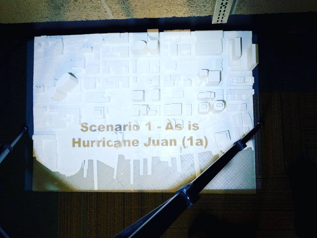
In 2009 Forbes et al. (2009) wrote a report regarding the possible impact SLR could have on HRM. This report developed scenarios demonstrating the possible impacts of SLR in Halifax. These scenarios were a highly conservative scenario, a second highly likely scenario, and finally a high-water scenario was developed. The scenarios developed by Forbes et al. (2009) combined many elements including rising mean sea levels, land subsidence, storm surge, wave setup and runup, and harbour seiche (Forbes, et al., 2009).
For each scenario developed by Forbes et al. (2009), there were three related extremes developed as part of the return rate of various storms, 2-year return, 10-year return, and 50-year return (Forbes, et al., 2009). A 2-year return period represents a 50% likelihood of a storm occurring in a given year, or a one in two-year storm, a 10-year return period amounts to a 10% chance of a storm occurring each year or one in 10-year storm, and finally a 50-year return period means that there is a 2% chance of a storm occurring each year or one in 50-year storm (Forbes, et al., 2009).
Storm Surge
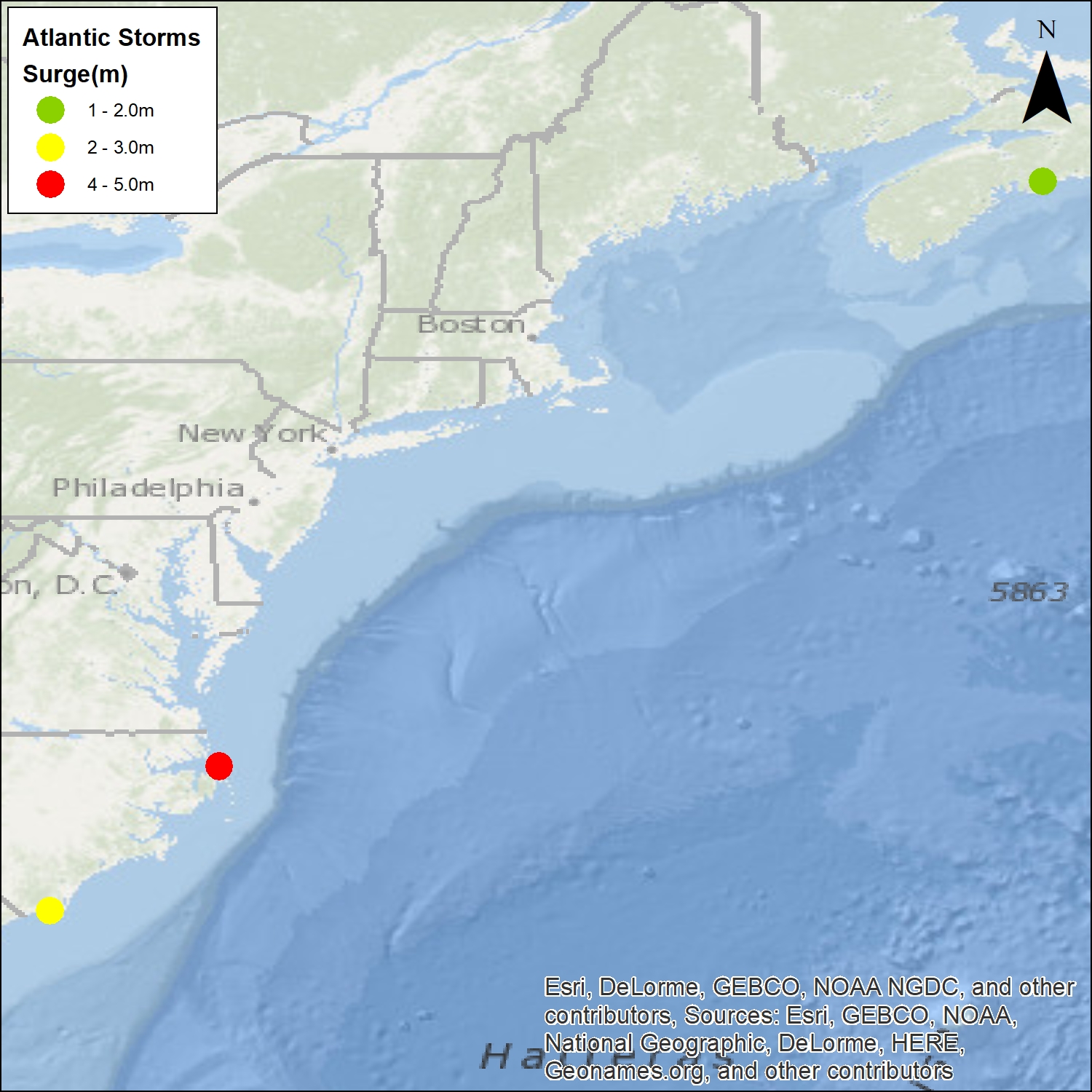
The SURGEDAT database is a global source of standardized storm surges. It identifies storms and their locations as well as the height of the peak surge with records dating back to 1800 (Needham & Keim, 2012). To develop the SURGEDAT database there were two major steps. First was compiling a list for every storm that potentially generated at least a 1.22 metre storm surge (Needham & Keim, 2012). The data was standardized through referencing the local datums and removing tides and waves (Needham & Keim, 2012). With the data standardized there were 111 hurricanes and tropical storms in the Atlantic which could have created a surge of 1.22 metres. The mean surge was 2.0m and the maximum surge 4.9m which occurred in North Carolina in 2003 during Hurricane Isabel (Needham & Keim, 2012).
Choosing the Location for the Visualization
The purpose of my project has been to visualize SLR and EH in the city of Halifax. The city has no lack of sites which will be affected by SLR and EH, with a population of approximately 403 000 (Government of Canada, 2017) and many low-lying areas. A consideration for location selection came from my literature review where both S. Sheppard and Evans et al., among others, identified the need to make visualizations local, with landmarks, to ensure that viewers can quickly identify where they are looking. Using this knowledge, I selected an area which people are familiar, and which has many easily identifiable landmarks (Evans, et al., 2013).
For the choice of location, the biggest considerations I made were impact and ease of identifiability, in keeping with principles of “Make it local” and “Make it visual” (Sheppard S. , 2015). The Halifax Downtown and Waterfront is the business centre of HRM and the province. This area is low lying and a hub for tourism and employment, with many people traveling there. This location has many opportunities for potential visualization. The Historic Properties and Bishops Landing provides a contrast between the age and value of buildings which may be at risk. Additionally, this location has several identifiable landmarks, including the Maritime Centre, ferry terminal, and the Nova Centre
Developing Scenarios
I decided to use synthetic scenarios of SLR at the year 2100 to present the information, as my research has shown the public more easily understands this kind of visualization versus the use of analog scenarios (Richards & Daigle, 2011). I extracted the worst case high, medium, and low water levels from the three IPCC RCP scenarios which could be possible by 2100. The mean and high storm surge values from the SURGEDAT database for the Atlantic coast were combined with the ICPP RCP SLR values and tide data to create my scenarios. For example, one scenario will be the 2100 highest predicted SLR combined with a 4.9m storm surge (Keim, 2017) which accompanied Hurricane Isabel.
I have chosen this approach as connecting local impacts to global events increases the effectiveness of visualizations (Sheppard S. , 2015) as it makes it more relatable for the viewer. Using past destructive storms, identified through the SURGEDAT database, in combination with predicted SLR for 2100, I have created visualizations which are representative of global events. These visualizations will be contextualized locally using the 3D model.
Sea level rise
| Table 2: IPCC Representative Concentration Pathway (RCP) Sea-level rise in metres (James, et al., 2015). | ||
| RCP 2.6 (Low Emission) | RCP 4.5 (Medium Emission) | RCP 8.5 (High Emission) |
| 0.884 | 0.987 | 1.296 |
For my project I decided to use the highest 2100 SLR prediction values from the three emissions scenarios to keep the visualizations engaging (Sheppard, et al., 2004) and demonstrate what could happen in a worst-case scenario. The result of this selection can be seen in Table 2.
Storm Surge
To determine the storm surge which will be applied to my scenarios I accessed the SURGEDAT database and downloaded global storms since the 1800’s. The database gives a latitude and longitude spatial coordinate to each storm peak surge event, this allowed me to map 745 storms in the database. With the data now in a spatial format I was able to select out the storms which occurred along the North American Atlantic Coast. This selection resulted in a total of 111 storms which have occurred since 1846. Of these 111 storms, 60 have a reliable storm surge measurement.
The highest and mean values were taken from these 60 storms. I decided to include a local storm event, Hurricane Juan, in the surge values, to keep a local connection. As noted by Evans et al. (2013) and Sheppard S. (2015), it is important there is a connection with data either through location or landmarks, in this case I decided to associate a storm with each value to make a connection between the numbers and a real event (Figure 1).
Tide levels
The LiDAR Digital Elevation Model (DEM) does not specify the time at which the data was recorded, only the month and year. This makes it impossible to determine the height of the tide at the time the DEM was acquired. This study assumes the LiDAR DEM represents mean sea level (MSL). The high tide level for this report was retrieved from the website tide-forecast, which states the highest tide to date in the Halifax harbour was 2.22m (Meteo365.com Ltd. , 2017).
Scenarios
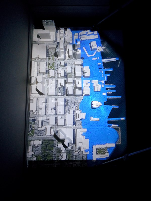
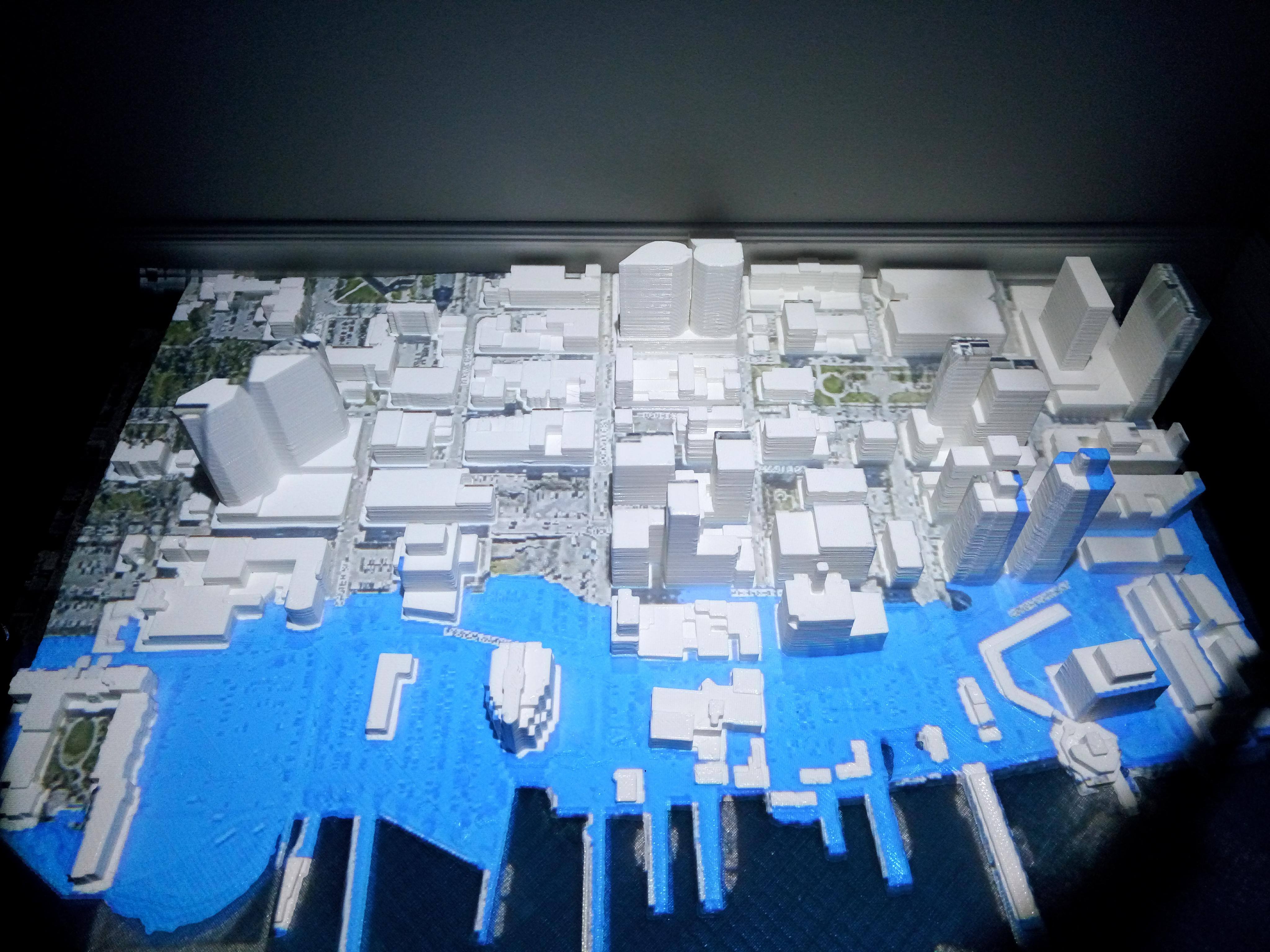
In total there are 4 scenarios, each with 3 associated storm surges, Hurricane Juan will be included in each scenario to keep the connection local as well as the highest and mean surge from the SURGEDAT database. With the scenarios values determined, the GIS visualizations were created using the 1 metre LiDAR Digital Elevation Model (DEM), 2016 aerial photography, HRM road network, and HRM building outlines. The DEM was manipulated to show the flooding extents for the four scenarios which were developed. This was done by setting the values of the DEM below the flooding depth to the colour blue, standard map water colour, and all values above the flooding depth to clear. This was overlaid on the air photo with a transparency applied, allowing the air photo to show through. To ensure the visualizations looked realistic the building outlines were placed on top of the DEM to show flooding going around buildings rather than overtop. Street labels were added to aid the viewer in identification of the locations.
Creating a model from data in ArcGIS
To build the 3D model I first needed to acquire the following data:
- Halifax 1 metre LiDAR Digital Elevation Model (DEM)
- Halifax 1 metre LiDAR Digital Surface Model (DSM)
- Halifax building outline layer
All the data is available freely from the HRM open data website.
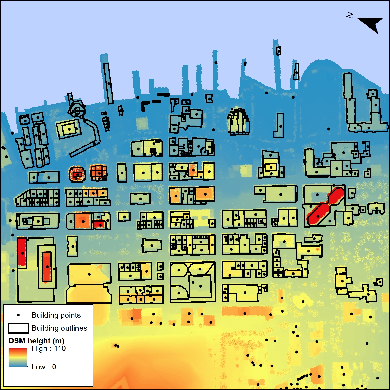
The DEM will make up the base of the model and will be used to show the extent of flooding on the model. Building heights are extracted from the DSM using the building outlines layer (Figure 2). The building outline is converted to a point to ensure that only the building is measured when the heights are extracted. The elevation values from the points were extracted using the same process from the DEM and subtracted from the DSM values to obtain an approximate height of each building. This needs to be done as the height from the DSM also includes the elevation which exists on the DEM, which when applied to the building layer in 3D, the layer would extrude the building height to the sum of the height and elevation, rather than just the height alone.
ArcGIS to ArcScene
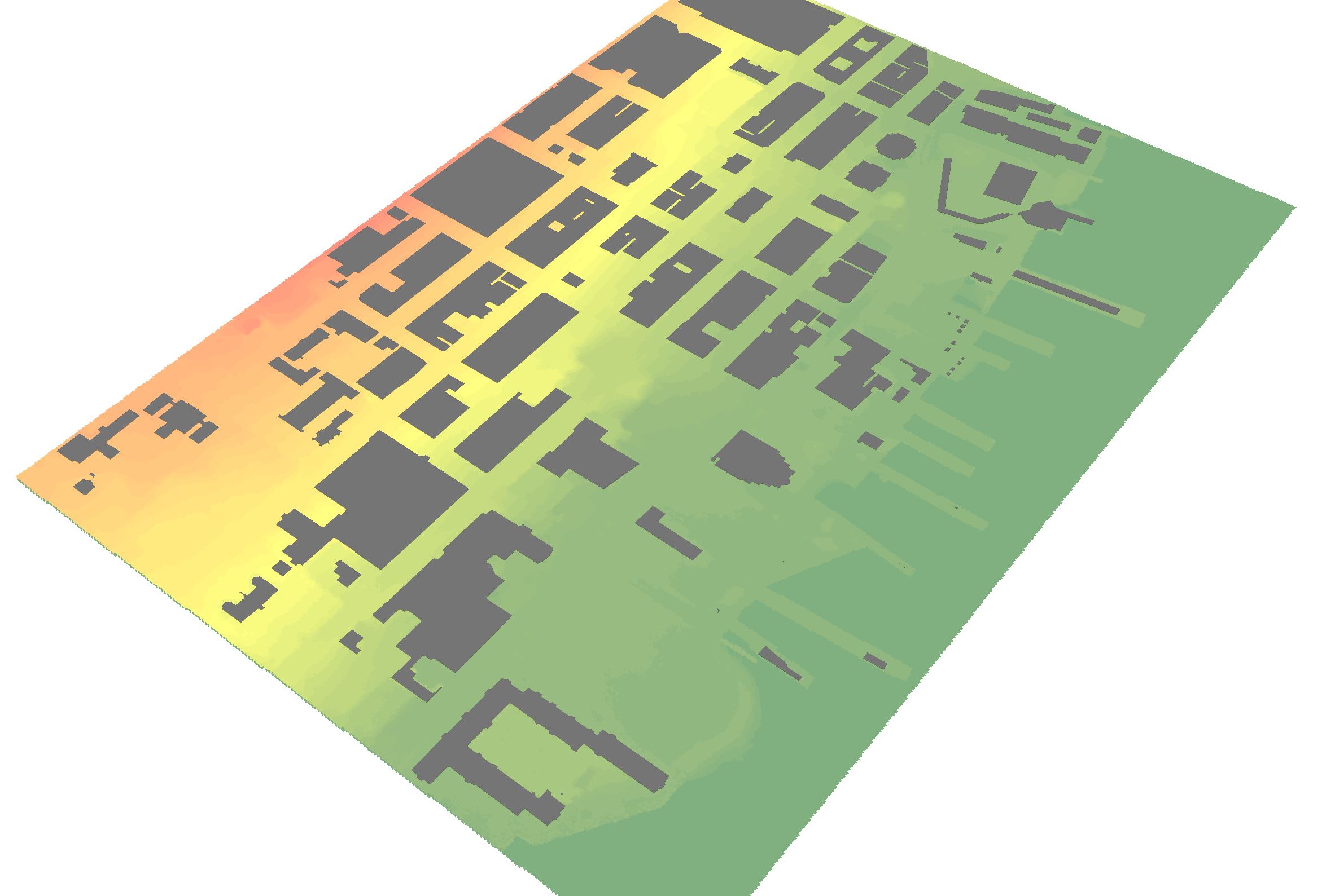
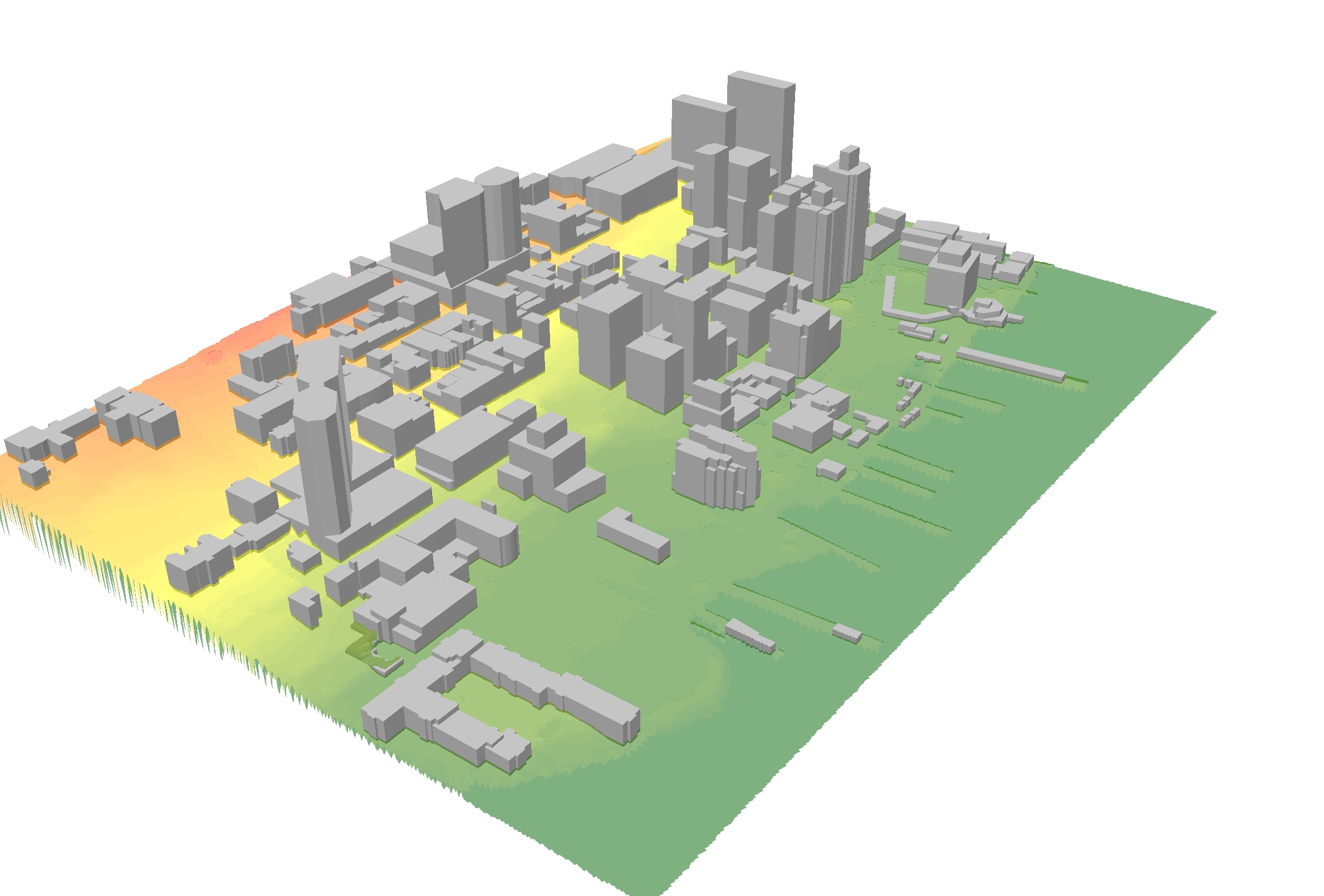
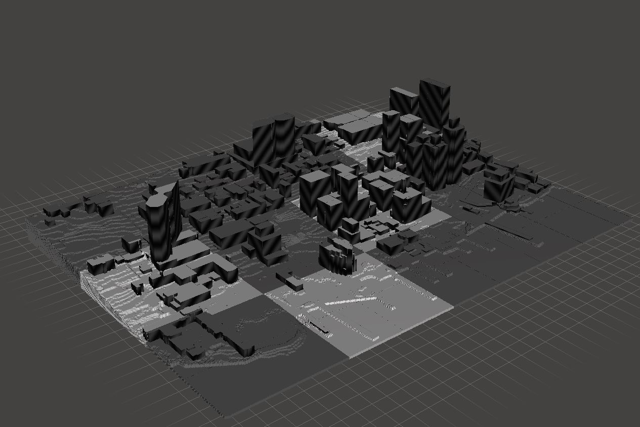
Once the data is prepared in ArcGIS the files can be opened in ArcScene. ArcScene is a tool developed by ESRI which specializes in 3D visualization and analysis (Figure 3). Once imported into ArcScene the data is transformed from a 2D flat image into a 3D visualization, this is done by setting the DEM pixel values as the elevation value. The DEM and Building layers float on top of these values as can be seen in Figure 5. The next step is to set the building heights in ArcScene, using the extracted building heights from section 4.3. The data is now fully 3D, and is ready to be exported into the next format, which is called VRML and is used to store 3D vector data.
ArcScene to Accutrans3D
The software I used to convert from ArcScene to 3D print is called Accutrans3D. This software can import VRML file format, make modifications to the model, and export to the 3D printing standard format STL. While there are other options for translating from VRML to STL, Accutrans3D is free to try software which encourages purchasing the software after testing. The VRML file is imported into the software and rotated by 90 degrees to lay it flat. The next step is to merge the DEM or base layers into one, so the model can be made solid. This is done through the Extrusion tool, which creates a shell with a flat bottom and hollow middle, this can be seen in Figure 5. This needs to be done as the 3D printing software cannot interpret the space between the upper surface and the printer bed, without the flat base the printer would need to build support structure leading to a highly unstable model. The next step is to make sure the model is considered watertight, which means that there are no holes in the model. To elaborate, if the model were to be filled with water it would not leak. With this done the model can be exported into the STL format and is almost ready for printing.
Accutrans3D to Meshmixer
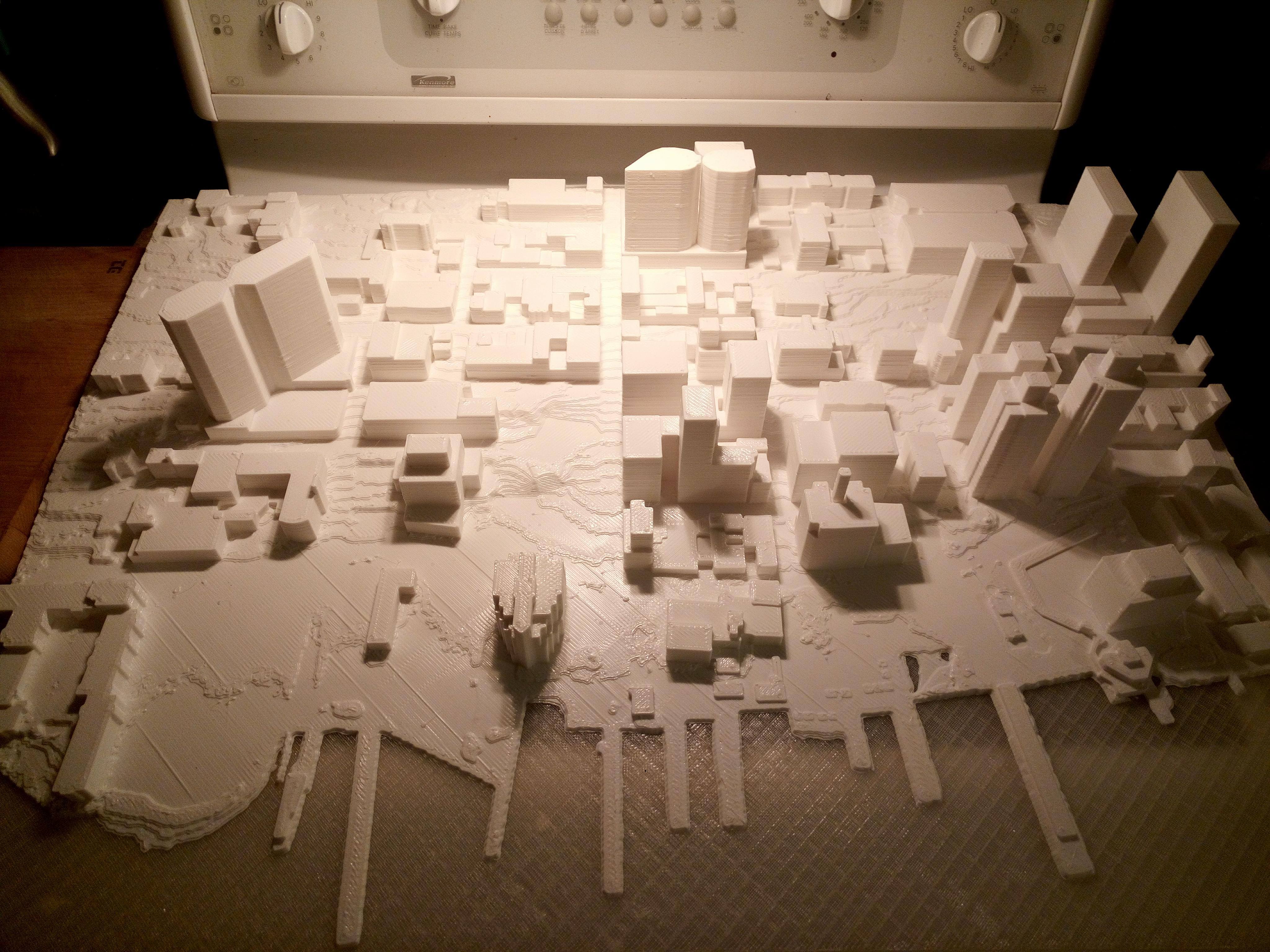
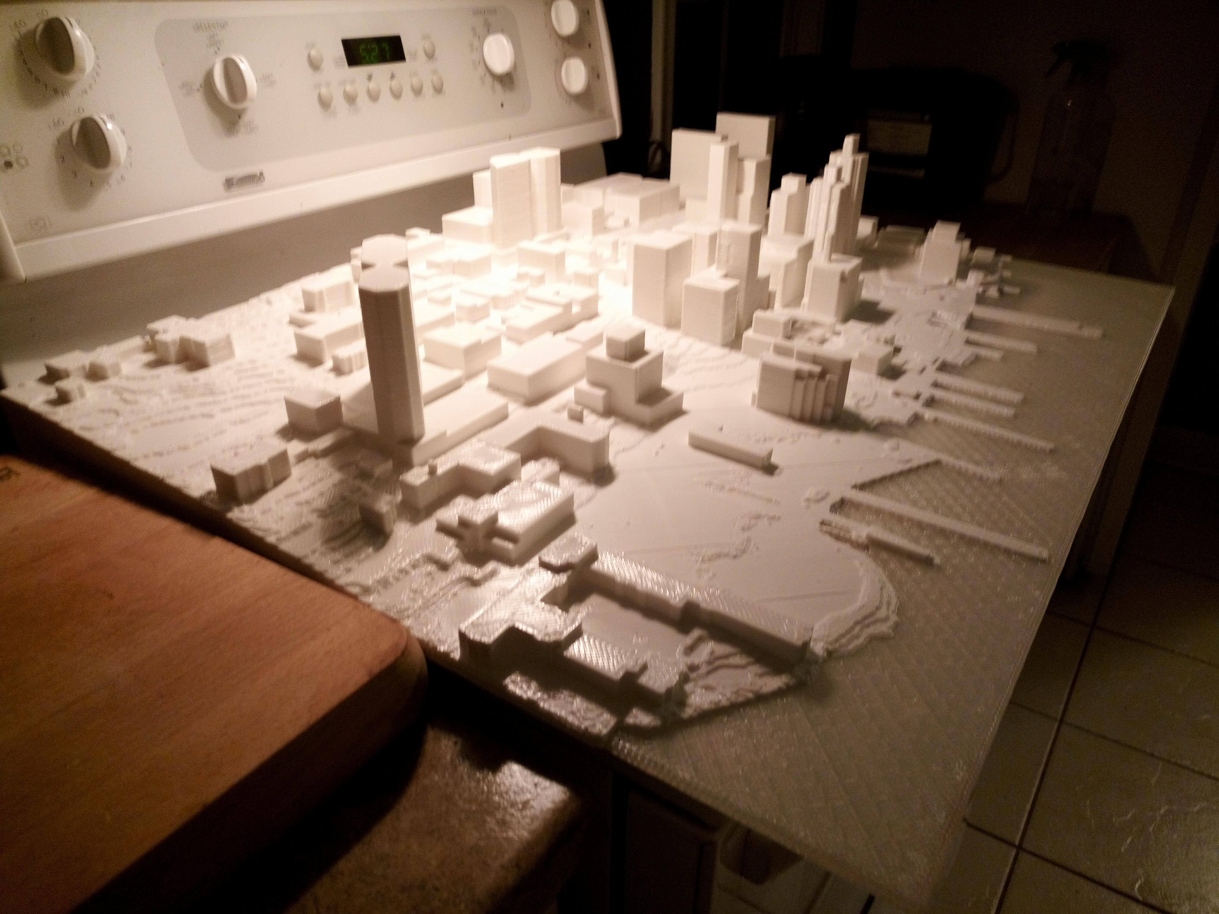
The STL file is imported into Meshmixer, a software designed to quality check and edit 3D files. This needs to be done as 3D printing can take many hours, between 10 and 15 hours for small models or over 60 hours for bigger prints, and some mistakes are not noticeable until the end of the print. Once checked for errors in Meshmixer, the model can be sliced into smaller pieces which can be printed using a desktop 3D printer at 7 by 7-inch size or exported as a complete model which could be printed on a large format printer, as seen in Figure 6.
3D printing the model
The process of 3D printing is known as fused deposition modeling or FDM and has been around since 1980 (Palermo, 2013). The printer takes a spool of plastic filament and heats it to the melting point, this is extruded through a nozzle which draws across a platform using X, Y, and Z locations provided by the STL file (Palermo, 2013). This is done for hundreds or thousands of layers, with each new layer being drawn on top of the previous one.
I was offered the opportunity to partner with NOVACAD 3D, an additive manufacturing company in Dartmouth. NOVACAD 3D has a large format 3D printer called BigRep ONE, which can print within a 1x1x1 metre envelope. In total the model required approximately 70 hours to complete, and can be seen in Figure 7.
Displaying Scenarios
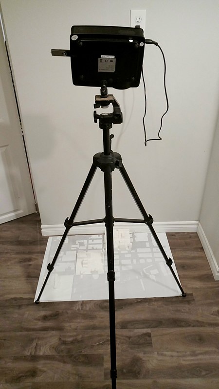
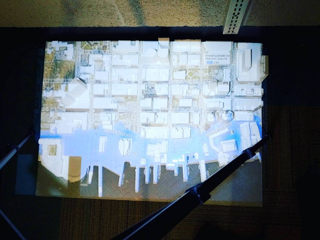
With the model printed, I began setting up the projector to display the visualizations. The first step in setting up the visualizations was to acquire a projector and tripod. I purchased a projector which has a maximum resolution of 800 x 480 pixels (with support for 1920×1080), 2000 to 1 contrast, and a total of 1800 lumen, making this projector an excellent option for projecting on a budget. This projector also came with the ability to be mounted on a tripod. A ball joint needed to be added to the tripod to face the machine towards the model. The final set up can be seen in Figure 8. The next step in displaying the visualizations was to focus the projector to get the extents as true as possible. Many adjustments to the X, Y, and Z axis of the tripod were required before an acceptable display was achieved. Refinements were required to ensure the alignment was correct, the scenarios had to be re-exported from ArcGIS, this time with larger building outlines to account for the angle of the projector. Through adjusting the height and angle, the projection was refined, Figure 9.
Limitations
There were two limitations which were identified completing this project:
- Visual accessibility
- Technological capabilities
Visual Accessibility
While this project aimed to be inclusive to diverse groups, visualisations do suffer from the exclusion of groups with visual impairments. It is the nature of visualizations to require a visual component, meaning that in some cases groups may be excluded. Some visual impairments, such as color blindness, can be easily mitigated using colour blind safe pallets. More severe impairments could be planned for during the creation of the model. As 3D printing is an additive based process, it is possible to design a model to include additional tactile features, such as brail descriptions embedded on the model and raised indicators for SLR and EH extents. Auditory information describing the various components being displayed could also be added as part of the presentation platform.
Technological capabilities
While this project worked with available resources and the technology has become more accessible than it previously has been. The technological capabilities still have a long way to go before leveraging them becomes part of the planning visualization process. While 3D printing has been around for decades, it has only recently become accessible. Meaning there is still much exploratory work to be done to streamline the data migration process. 3D printing is also a prolonged process and the final results are not known until the end of the printing process, meaning any errors not caught in the initial quality control (QC) check will not be seen until the print finishes. 3D print models can also be resource intensive, requiring substantial computer processing power to edit and modify which may not be available to local government or small firms. Working with the data requires specialized software with specific training, which may not be available.
Future Exploration
Considering the future, students and professionals will be able to access my project to gain an understanding of the processes involved in creating a 3D printed SLR EH visualization. Having a detailed method section describing the software used and steps involved will provide a starting point for those who wish to engage in this kind of work in the future. The 3D model will remain accessible at the GIS Centre, I am hopeful the visualisations will continue to raise awareness of the impact of SLR and EH.
As 3D printing and the software becomes more accessible projects such as this will become common place. Future students and researchers should consider expanding on this research by investigating the addition of mitigation processes in the model using interactive augmented reality technology, where additions to the model can dynamically change the visualizations which are displayed. Future work could investigate making these visualizations more inclusive by addressing the limitations in visual accessibility which were identified in this project.
Discussion and Conclusion
SLR is a growing global problem which impacts the HRM and other coastal communities. This exploratory project endeavoured to develop a method of visualization and representation through a combination of 3D printing, projections, and GIS created maps to display SLR and EH. Through this research I have found the creation of impactful, legible, and informative visualizations to be a key component of planning. Having the ability to disseminate information to diverse socioeconomic groups is a valuable component of any holistic and inclusive planning department. Leveraging visualization methods to present information will increase public awareness and help planners make informed decisions for the future. This project developed a visualization method which viewers found engaging, representative, and impactful as identified in the feedback section.
The methods for creating impactful and recognizable visualizations identified and used in this project reflect those identified in past research. Currently, community members are expected to translate features and symbols from plans, maps, or other non-engaging tools into real-world context by memory (Sheppard, et al., 2004; Al-Kodmany K. , 2002). As Evans et al. (2013) found leveraging visual tools with recognizable local features which the public find engaging allows the viewer to quickly associate with what is being presented. This allows the viewer to maintain a connection with the data which will lead to a longer lasting impact and recall of the information, which corresponds to the research of Wissen et al. (2008) and Al-Kodmany (2002). Visualizations remove the need for viewers to interpret maps or complex models, allowing them to focus on the impacts rather than interpreting data. I believe this kind of representation method will become common place in planning as 3D printing allows for development of rapid and replaceable visuals. If done on a larger scale, such as the whole Halifax Peninsula, the area can be broken up into tiles to keep the model up to date as the built landscape changes.
When the model was on display at the Dalhousie GIS Centre it created discussion around the impact SLR and EH may have in the future. As Wissen, et al. (2008) found, the visualizations encouraged conversation about the topic by demonstrating the impacts and setting the context which was directly tied into the viewers memory of the location. Some viewers expressed concern that there is currently as much construction along the waterfront and were curious about the mitigation efforts HRM is currently employing. Other viewers expressed an interest in seeing a model like this done for the whole harbour basin as they are interested in the full extents SLR and EH may have. It was interesting to see the stimulation of conversation that developed as various people viewed the model.
Creating the visualizations required advanced knowledge of DEM manipulation and ArcGIS software, as well as a lot of trial and error. As I do not have access to expensive, high definition, projectors making sure the alignment of the visualizations on the model was accurate was much more difficult then initially expected. Projecting the visualizations also had a level of complexity which I had not expected, including the effects the 3D buildings have on the projection. There is overlap on some buildings, even with adjustments to compensate some can not be fixed without the use of additional projectors. This could be solved by using one or more short throw projectors, which are more suited to this kind of project, as they are designed to work over shorter distances and provide a wider extent (Stobing, 2017). Using either short throw or multiple projectors would compensate for the 3D buildings and provide projections to all sides of the model.
References
Al-Kodmany, K. (1999). Using visualization techniques for enhancing public participation in planning and design: process,implementation, and evaluation. Landscape and Urban Planning 45, 37-45.
Al-Kodmany, K. (2002). Visualization Tools and Methods in Community Planning: From Freehand Sketches to Virtual Reality. Sage Publications.
Brizuela, J. (2014, 11 18). Miami 2100’ exhibit on sea-level rise opens at coral gables museum. Retrieved from FIU Architecture: http://cartanews.fiu.edu/miami-2100-exhibit-on-sea-level-rise-opens-at-coral-gables-museum-2/
CAF. (2017, 11 18). Chicago Model. Retrieved from Chicago architecture foundation: http://www.architecture.org/experience-caf/exhibitions/exhibit/chicago-model/
Dalhousie GIS Centre. (2017). 2016 Airphoto.
Evans, S. Y., Todd, M., Baines, I., Hunt, T., & Morrison, G. (2013). Communicating flood risk through three-dimensional visualisation. Civil Engineering Special Issue, 48-55.
Forbes, D. L., Manson, G. K., Charles, J., Thompson, K. R., & Taylor, R. B. (2009). Halifax Harbour Extreme Water Levels in the Context of Climate Change: Scenarios for a 100-year Planning Horizon. Ottawa: Her Majesty the Queen in Right of Canada.
Goetz, F. (2016). Visualizing Future Extreme Water Levels in Halifax’s Northwest Arm in 2100. Halifax: Dalhousie University.
Government of Canada. (2016). Canada’s Marine Coasts in a Changing Climate. Ottawa: Natural Resources Canada.
Government of Canada. (2017, 10 18). Census Profile, 2016 Census. Retrieved from Stats Can: http://www12.statcan.gc.ca/census-recensement/2016/dp-pd/prof/details/page.cfm?Lang=E&Geo1=CSD&Code1=1209034&Geo2=PR&Code2=01&Data=Count&SearchText=halifax&SearchType=Begins&SearchPR=01&B1=All
Halifax Regional Municipality. (2017). Halifax Open Data. Retrieved from HRM Open Data: http://catalogue-hrm.opendata.arcgis.com/
Hodge, G., & Gordon, D. L. (2008). Planning Canadian Communities. Toronto: Thompson & Nelson.
HRM. (2016). Open Data Dataset Metadata . Halifax: Halifax Regional Municipality.
IPCC. (2015). Climate Change 2014 Synthesis Report. Geneva: Intergovernmental Panel on Climate Change.
James, T. S., Henton, J. A., Leonard, J. L., Darlington , A., Forbes, D. L., & Craymer, M. (2015). Tabulated Values of Relative Sea-level Projections in Canada and the Adjacent Mainland United States. Ottawa: Natural Resources Canada.
James, T. S., Henton, J. A., Leonard, L. J., Darlington, A., Forbes, D. L., & Craymer, M. (2014). Relative Sea-level Projections in Canada and the Adjacent Mainland United States. Ottawa: Natural Resource Canada.
Keim, B. (2017). Global Peak Surge Map. Retrieved from SURGEDAT: The World’s Storm Surge Data Center: http://surge.srcc.lsu.edu/data.html
Lovett, A., Appleton, K., Warren-Kretzschmar, B., & Von Haaren, C. (2015). Using 3D visualization methods in landscape planning: An evaluation of options and practical issues. Landscape and Urban Planning, 85-94.
MacEachren, A. M., & Kraak, M.-J. (1997). Exploratory cartographic visualisation: Advancing the agenda. Computer and Geosciences , 335-343.
Maher, P. (2012). Visualising Sea-level Rise. Halifax.
Meteo365.com Ltd. . (2017, 11). Tide Times for Halifax. Retrieved from Tide-forecast: https://www.tide-forecast.com/locations/Halifax-Nova-Scotia/tides/latest
Needham, H. F., & Keim, B. D. (2012). A storm surge database for the US Gulf Coast. Wiley Online Library.
Nova Scotia Geomatics Centre. (2015). Nova Scotia Topograpic Database. Amherst: Government of Nova Scotia.
Palermo, E. (2013, September 19). Fused Deposition Modeling: Most Common 3D Printing Method. Retrieved from Live Science: https://www.livescience.com/39810-fused-deposition-modeling.html
Province of Nova Scotia. (2009). Sea level rise and Storm Events, the 2009 State of Nova Scotia’s Coast. Government of Nova Scotia.
Richards, W., & Daigle, R. (2011). Scenarios and guidance for adaptation to climate change and sea level rise – ns. Moncton: Natural Resources Canada.
Sheppard, S. (2015). Making climate change visible: A critical role for landscape professionals. Landscape and Urban Planning, 95-105.
Sheppard, S. R. (2012). Visualizing Climate Change. New York: Routledge.
Sheppard, S. R., Lewis, J. L., & Akai, C. (2004). Landscape Visualization: An Extension Guide for First Nations and Rural Communities. Edmonton: Sustainable Forest Management Network.
Stobing, C. (2017, 7 15). Short Throw vs. Long Throw Projectors: What’s the Difference? Retrieved from Gadget Review: http://www.gadgetreview.com/short-throw-vs-long-throw-projectors-whats-the-difference
Tobias, S., Buser, T., & Buchecker, M. (2016). Does real-time visualization support local stakeholders in developing landscape visions? Environment and Planning B: Planning and Design, 184-197.
Wissen, U., Schroth, O., Lange, E., & Schmid, W. A. (2008). Approaches to integrating indicators into 3D landscape visualisations and their benefits for participative planning situations. Journal of Environmental Management, 184-196.