
Hospital and Park Accessibility in Vancouver, BC, Canada: A Geospatial Analysis
For my third-year GIS final project, I decided to develop accessibility maps for two critical variables in selecting an ideal place to live in Vancouver, BC: hospitals and parks, as a young professional or recent graduate.
The significance of these factors lies in their impact on our health and well-being. Why Hospitals and Parks? Hospitals are an essential service for everyone, and parks offer numerous health benefits. An individual who suffers from serious health conditions may need to be located closer to hospitals; they play a crucial role in providing healthcare, especially in emergencies. Better access to hospitals leads to improved care, health outcomes, reduced costs, disease prevention, and shorter wait times, ultimately enhancing the quality of life. Additionally, some individuals may value the benefits of living near parks, they offer health benefits by providing a space for physical activity, relaxation, and community engagement. Accessibility to parks results in healthier communities By analyzing the accessibility of Vancouver’s hospitals and parks, we can provide valuable insights into the ideal neighborhoods in Vancouver.
Project Objectives:
The primary question guiding this project is, “What are the ideal neighborhoods in Vancouver, BC, to live in, considering average 1-bedroom prices and accessibility to hospitals and parks using the 2SFCA method?”
Limitations:
- Data Limitations: The data on average apartment prices was incomplete, with 12 neighbourhoods lacking data. This limited the accuracy of the accessibility results, as they only accounted for neighbourhoods with available apartment price data. Additionally, the use of neighbourhoods for average apartment prices resulted in low spatial resolution; using data per Dissemination Area (DA) would have been ideal for accuracy.
- Hospital Data Limitations: The focus on hospital-to-population accessibility was used, but for a more accurate measure, it would be beneficial to consider the ratio of doctors and healthcare providers available at hospitals to the population. This is important as the timeliness of care depends on the capacity of healthcare providers relative to the number of patients. Due to project constraints, the focus remained on hospital-to-patient accessibility.
- Park Data Limitations: The analysis used park area in square kilometres compared to the population to measure park accessibility. However, this method did not account for natural obstacles like trees and bodies of water within parks, which reduced usable park space. This limitation affected the accuracy of park area accessibility results.
- Service Area Cutoffs: A 5-minute driving cutoff for hospital accessibility was chosen. Vancouver’s high traffic congestion was a limiting factor in this choice. Given the importance of quick healthcare response, a 5-minute cutoff was used to mitigate traffic congestion effects. However, a more flexible approach based on variable traffic conditions could yield more accurate results.
Methodology:
The 2SFCA (Two-Step Floating Catchment Area) was the method used to find the measure of accessibility in hospitals and parks. 2SFCA, or two-step floating catchment area, is a spatial analysis technique used to determine the accessibility of a service to a population; in this project, it is the hospitals to population and park area to population. Step-by-step instructions are stated as follows:
The methodology for the 2SFCA revolving hospitals was the following:
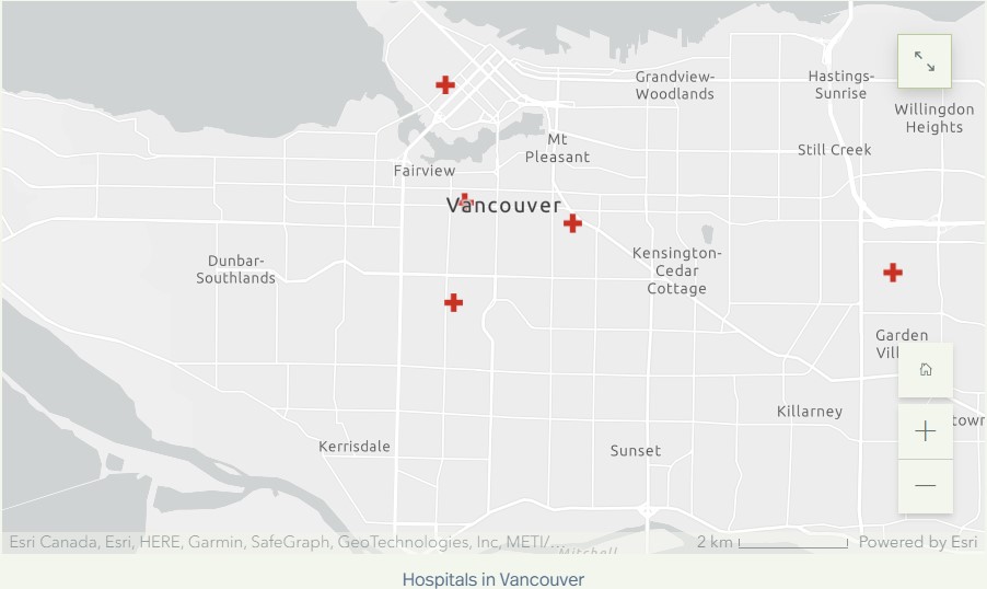
- Obtain service data: Obtain data on the location and number of hospitals in the city. Data collected for these 2SFCA were from Statistics Canada, Open Data Portal from the City of Vancouver, and the BC Data Catalogue.
- Obtain population data: The population data for the DA’s were obtained from within ArcGIS Pro, by using the Enrich tool.
- Add hospital data: Add the hospital data to the project by importing the data into ArcGIS Pro.
- Add population data: Add the population data to the project by importing the data into ArcGIS Pro.
- Join the population data to the DA’s.
- Add fields to the DA layer called X and Y, and then the X-centroid and Y-centroid are calculated using calculate geometry, and the layer is portrayed as points by exporting the layer as a table and then displaying the table as a point layer.
- Delineate a 5 minute driving time catchment area for the hospitals in Vancouver. This was done by using the Network Analyst and creating New Service Area. Facilities were imported from the hospital data layer. Travel settings were also set specifically for this analysis. Mode of travel was driving, with a 5 minute cutoff (see limitations for explanation). Hierarchy was turned off, as this analysis was for short drives, and hierarchy is a tool that helps for long distance routing. Then the service area is calculated, resulting in polygons shown on the map.
- Spatial Join is now used, with target features as the 5 minute catchment area calculated in the previous step, and the join features as the DA centroids. Within the field map of join features, click on the population field, and then select ‘sum’ for that field. Make sure to select the match option as ‘completely contains, to make sure the spatial join will consider DA centroids that are completely included in the hospital’s 5 minute catchment area. This is the first catchment for Vancouver hospitals.
- Do a join from the hospitals layer to the first catchment layer, because the hospital layer has the facilities data, that the first catchment needs.
- Add another field in the first catchment layer, and this will be the facility to population field. Use the field calculator to divide the facility field over the population field.
- Join the first catchment layer back to the hospital layer completing Step 1, being now the hospitals to population layer.
- Delete the facilities from the first service area, and import the DA centroids as the facilities. All the travel settings are the same as for the first step. The resulting service area polygons are the 5 minute catchment areas for DA’s.
- Use Spatial Join with target features as the 5 minute catchment areas for DA’s, and the join features as the final layer from step one. Set the merge rule of Facility to Population field as ‘sum’, and select the match option as completely contains. Call this layer the second catchment.
- Join the total hospital to population ratio of each DA from the second catchment layer to the DA layer that has population data, based on the special DAUID.
- Visualize the data using the symbology, and present the data in a easily interpretable fashion.
The methodology for the 2SFCA revolving parks was the following:
- Obtain service data: Obtain data on the location and number of hospitals in the city. Data collected for these 2SFCA were from Statistics Canada, Open Data Portal from the City of Vancouver, and the BC Data Catalogue.
- Obtain population data: The population data for the DA’s were obtained from within ArcGIS Pro, by using the Enrich tool.
- Add hospital data: Add the hospital data to the project by importing the data into ArcGIS Pro.
- Add population data: Add the population data to the project by importing the data into ArcGIS Pro.
- Join the population data to the DA’s
- Add fields to the DA layer called X and Y, and then the X-centroid and Y-centroid are calculated using calculate geometry, and the layer is portrayed as points by exporting the layer as a table and then displaying the table as a point layer. This method was similarly done to the parks polygon layer to represent the parks as centroids.
- Delineate a 5 minute driving time catchment area for the parks in Vancouver. This was done by using the Network Analyst and creating New Service Area. Facilities were imported from the parks data layer. Travel settings were also set specifically for this analysis. Mode of travel was walking, with a 5 minute cutoff (see limitations for explanation). Hierarchy was turned off, as hierarchy is a tool that helps for long distance routing when the mode of travel is driving. Then the service area is calculated, resulting in polygons shown on the map.
- Spatial Join is now used, with target features as the 5 minute catchment area calculated in the previous step, and the join features as the DA centroids. Within the field map of join features, click on the population field, and then select ‘sum’ for that field. Make sure to select the match option as ‘completely contains, to make sure the spatial join will consider DA centroids that are completely included in the park’s 5 minute catchment area. This is the first catchment for Vancouver parks.
- Do a join from the parks layer to the first catchment layer, because the hospital layer has the facilities data, that the first catchment needs.
- Add another field in the first catchment layer, and this will be the park area to population field. Use the field calculator to divide the park area field over the population field.
- Join the first catchment layer back to the parks layer completing Step 1, being now the park area to population layer.
- Delete the facilities from the first service area, and import the DA centroids as the facilities. All the travel settings are the same as for the first step. The resulting service area polygons are the 5 minute catchment areas for DA’s.
- Use Spatial Join with target features as the 5 minute catchment areas for DA’s, and the join features as the final layer from step one. Set the merge rule of park area to population field as ‘sum’, and select the match option as completely contains. Call this layer the second catchment.
- Join the total park area to population ratio of each DA from the second catchment layer to the DA layer that has population data, based on the special DAUID.
- Visualize the data using the symbology, and present the data in a easily interpretable fashion.
The methodology for the 1-bedroom apartment average prices was the following:
- First, the data was cleaned up and added as a table into ArcGIS Pro.
- The data was then joined to a Vancouver neighbourhood layer so that the output layer had the price data
- Visualize with graduated symbology, to represent the average prices for 1-bedroom apartments in Vancouver, BC.
Results and Findings:
Hospital Accessibility
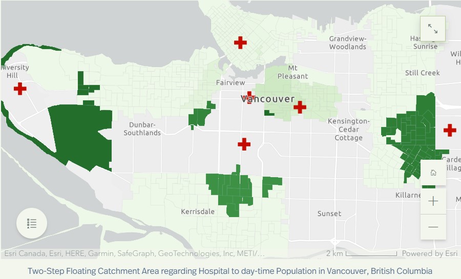
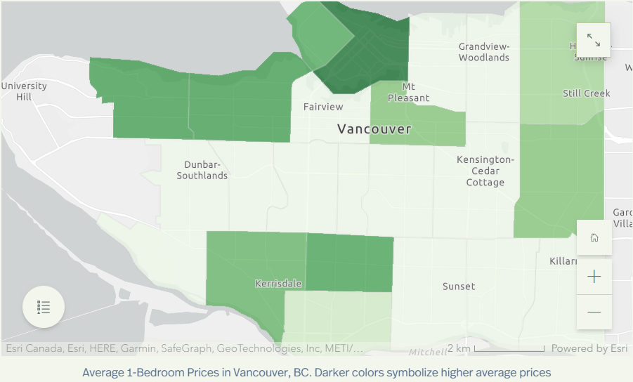
The map shows varying levels of hospital accessibility. Some neighbourhoods, like Kitsilano and West Point Grey, have high 1-bedroom apartment prices but low hospital accessibility. In contrast, Renfrew-Collingwood, with more affordable apartment prices, has better hospital accessibility.
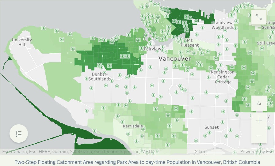
Park Accessibility
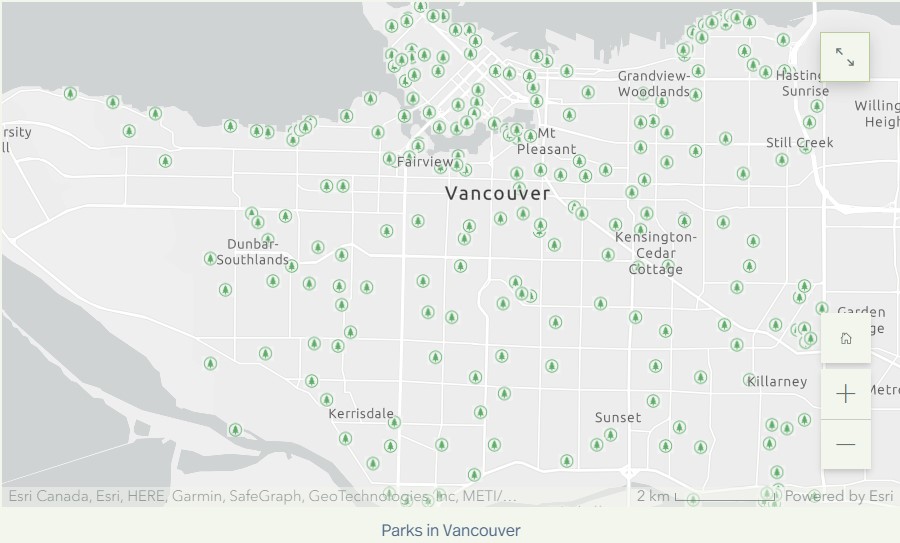
Park accessibility in Vancouver is generally better than hospital accessibility. Kitsilano, though not the cheapest option, offers excellent park accessibility, making it a suitable choice for outdoor enthusiasts.
Ideal Neighborhoods
The most affordable neighbourhood, Marpole, has lower hospital accessibility but slightly better park accessibility. Renfrew-Collingwood is the best choice for those prioritizing hospital access, while Kitsilano is ideal for park enthusiasts.
Conclusion:
Selecting an ideal place to live in Vancouver depends on individual preferences and priorities. Factors like hospital and park accessibility play a significant role in this decision. By considering these variables, young professionals and recent graduates can make informed choices that align with their lifestyle and health needs.
In this geospatial analysis, we’ve shed light on the neighbourhoods that strike the right balance between cost, healthcare access, and recreational opportunities, helping individuals find the perfect place to call home in beautiful Vancouver, BC.
Additional Note:
I strongly encourage viewing the storymap I created for this, that goes into further detail: https://storymaps.arcgis.com/stories/df43fb63cd254d63ae14e9b55cde0376