
Using satellite data to model air pollution in ArcGIS
Modelling urban air quality is becoming increasingly important for understanding the impact that air pollution can have on public health. Air pollution can have a significant impact on human health, and long-term exposure to certain gases, such as NO2, can result in adverse health effects such as bronchitis, respiratory infections, or asthma attacks, among many others, and the World Health Organization has even created both long-term and short-term NO2 exposure limits. Urban environments tend to have a higher concentration of air pollutants in comparison to rural areas due to the higher levels of traffic-related air pollutants, which emit nitrogen oxides (NOx). These emissions are oxidized by atmospheric ozone to become nitrogen dioxide (NO2).
A large part of my research work will involve wrangling and analyzing satellite remote sensing air quality data. These data are increasingly being used to model atmospheric air pollution and are collected on a satellite platform using a spectrometer, which is a nadir-viewing sensor that uses solar radiation to measure atmospheric trace gases and aerosols at different spectral bands.
The focus of my research is to build upon existing methods to model air pollution. More specifically, I will be developing a methodology to downscale satellite remote sensing air quality data; “downscaling” is the process of increasing the spatial resolution of the input data. This is important because although satellite remote sensing air quality data are a helpful supplement to air pollution models, they are often too coarse to sufficiently solve for emission sources and resulting plumes.
For my thesis work, I will be using satellite data from the Tropospheric Monitoring Instrument (TROPOMI) aboard the Sentinel-5P satellite. This satellite was launched by the European Space Agency in 2017 and it measures a wide range of aerosols including ozone, nitrogen dioxide, and carbon monoxide (to name a few). This spectrometer has a temporal range of 1 day and a spatial resolution of 7 km by 3.5 km (although this was updated to 5.5 km by 3.5 km in 2019).
The following article will provide a high-level overview of how I’ve used ArcGIS to create a simple visualization of satellite air quality data from TROPOMI.
Satellite remote sensing data is often provided in a GeoTIFF (.tif) or NetCDF (.nc) file format. For my analysis, I downloaded swaths of TROPOMI data that covered my study area (Toronto, Ontario) as a series of .nc files from the Copernicus Open Access Hub. Then I used R to extract tropospheric NO2 measurements, longitude and latitude from the NetCDF files. Tropospheric NO2 is the concentration of NO2 in the entire tropospheric column above the measurement point. It’s important to know that although this is very different from surface level concentrations, in the case of NO2, the majority of the tropospheric concentration remains within the planetary boundary layer and is primarily the result of anthropogenic activities in urban areas.
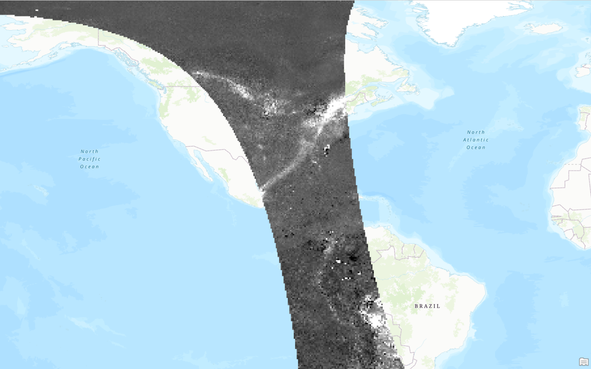
After extracting the data, I created a dataframe in R with the latitude, longitude, and NO2 in mol/m2. Then, in ArcGIS, I used the XY Table to Point tool to import the dataset to data points. This created a feature class enabling visualization of the NO2 data as points (Figure 1).

Next, I used the Point to Raster tool to convert the data into a raster dataset. Visualizing this raster dataset in ArcGIS Pro reveals a swath of image data collected by the TROPOMI satellite (Figure 2). An image like this captured on a near-daily basis.
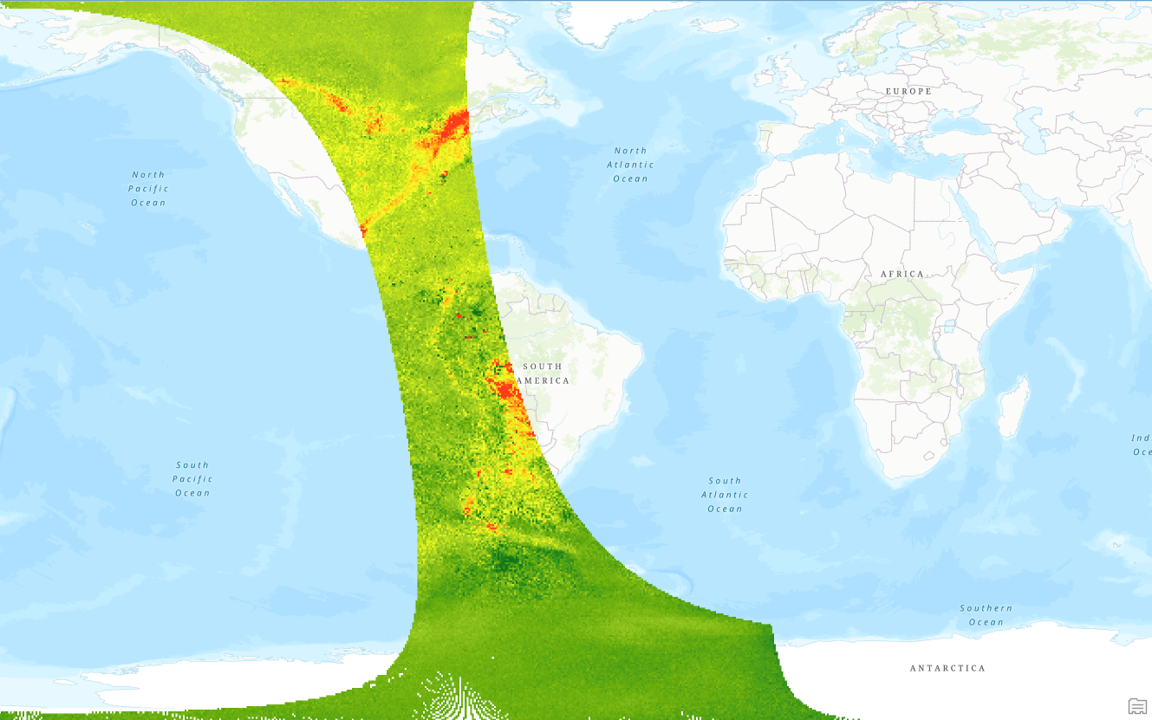
You can see a clear difference in tropospheric NO2 between developed and undeveloped areas, but to better visualize the data, I changed the colour scheme from a green to red range (Figure 3).
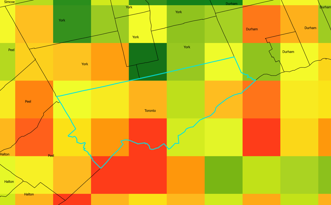
To understand the NO2 concentrations at a more local scale, I downloaded a map of regions within Ontario from Statistics Canada and overlaid it onto the satellite raster map to visualize the NO2 measurements surrounding Toronto, Ontario (Figure 4).
This is a very simple workflow for visualizing satellite air quality data. Although the map is helpful, it can be improved by increasing the resolution. This will be the focus of my work moving forward, and I plan to present the results in a follow-up article when the work is complete.
In addition to this research, I will also be spending the first half of 2021 working on a second project with a team of researchers between the University of Toronto and Ryerson University. The focus of this second project will be to understand how air quality across Toronto has changed with the implementation of COVID-19 lockdowns, and I hope to harness satellite data to complete this research.
Feel free to reach out if you have any questions! My email is prp.patel@mail.utoronto.ca