
A challenge worth tackling: Looking back at this year’s ECCE App Challenge Experience
Being open to new challenges is something to embrace. Despite the learning curve that may come with a new challenge, the opportunity to apply what you know and adapt to the circumstance is an excellent learning opportunity. This is one of the many aspects that drew my team members and I to this year’s Esri Canada ECCE App Challenge. My team and I created an interactive Web App that addresses extreme heat and urban heat island (UHI) effects in the City of Vancouver. In this post I highlight my experience collaborating with fellow classmates to produce this year’s Application for the ECCE App Challenge.
My team’s ECCE App Challenge 2022 submission can be viewed here.
App Challenge Preparation
I had the opportunity of forming a team with Ferdinand Dorado and Mitchell Bailey who are fellow GIS Advanced Diploma classmates here at British Columbia’s Institute of Technology (BCIT). Given that it was BCIT’s first year as an ECCE school participating in the ECCE App Challenge, we thought it would be fitting to name our team BCITeam. With our team name set, we set a game plan for tackling the app challenge prior to the announcement of this year’s theme.
Our game plan was:
- Zero in on a topic;
- Determine what data sources to use or showcase;
- Determine what information we want to represent ;
- Determine how to best represent the information using Esri technology.
This year’s ECCE App Challenge focused on recognizing communities that have been impacted by environmental challenges, emergencies or disasters. Within this context we decided to address the theme from a sustainable cities, and infrastructure approach. As a result we collectively decided to highlight the extreme heat and urban head island phenomenon experienced in the city of Vancouver during the Summer of 2021. With the theme in hand our team was off to the races.
Topic of choice and why?
Given this year’s theme we decided to focus on extreme heat events that affected many individuals throughout Canada during last year’s summer heat wave. For the purposes of this challenge our area of study is confined to the city of Vancouver and it’s surrounding region.
Urban heat islands (UHI) disproportionately impact marginalized populations and lower-income neighbourhoods, which often have fewer trees and access to public green space, and more impervious surfaces due to high density housing and pavement ( Health Canada ). Additionally, these lower-income neighbourhoods often have higher percentages of residents vulnerable to extreme heat, with higher densities, poorer housing quality, older populations, and limited access to social resources like public cooling centres (Health Canada ).
Extreme Heat & Urban Heat Islands Story Map
With that in mind, our intention was to highlight the impacts felt by many throughout the city and region, and the struggle that came with mitigating such extreme heat effects. Moreover, we decided that we would build on top of a health publication that was published by Health Canada in 2020. The publication provides an in-depth look as to how UHI can be reduced in order to protect citizens throughout Canada. In 2014 a research team at SFU, with support from the City of Vancouver’s Sustainability Department and Health Canada, developed maps to visualize heat-health vulnerability characteristics across Vancouver.
Use of Esri Technology and Application Development
Maps are powerful visualization tools that can help support municipalities with advancing UHI actions and protecting vulnerable populations during heat waves. Given the digital age that we live in, making these visualization tools interactive and accessible can inform citizens and decision makers about what areas and individuals are most affected by UHI effects. An ArcGIS story map and Web Application can go hand to hand to display key environmental and demographic information regarding the coverage of UHI’s in cities.
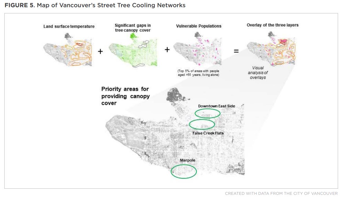
For the ECCE App Challenge we opted to created an ArcGIS Web AppBuilder app and a Story Map that would address extreme heat and UHI effects in Vancouver. For our ArcGIS Web Application we first acquired Landsat 8 imagery to visualise temperature throughout the city of Vancouver. The date this data was collected was August 24 2021 and the historical temperature recorded on that day was 22.2 C°, a min of 9.4 C° and an hourly mean of 16.8 C°. We then collected population data from Census Canada that identified where vulnerable populations to extreme heat may live. To compare the urban conditions where these vulnerable populations lived, data on urban features that impact, contribute or mitigate UHI effects were collected. These data included surfaces impervious surfaces that may contribute to UHIs and areas with trees and other vegetation that mitigate UHIs. Our ArcGIS Story Map provides an overview of these areas that are either vegetated or impervious.

One of the aspects that we wanted to incorporate into the application was the ability to hover over features and have feature information pop up as the user moves their mouse. Luckily we found a custom widget that provides this functionality. It was developed by a user and posted on the Esri community (Feature Layer Hover Widget Version 2.12). However, incorporating this aspect into our application required a learning curve that involved downloading and using ArcGIS Web AppBuilder Developer Edition in order to incorporate the Feature Layer Hover functionality into our Web Application. A step by step process is outlined in our documentation which can be viewed here. A brief demo of the widget can be viewed in the 10 second clip below.
I hope to see this type of widget be incorporated in the standard ArcGIS Web AppBuilder so that users of an application can seamlessly hover over features to generate an informative pop-up. Incorporating this widget into the non developer edition of ArcGIS Web AppBuilder would allow individuals to instantly apply the widget within the application and provide seamless interaction with spatial data.
Team Work and Preparation
Overall the week-long challenge reinforced the value of collaboration and communication. Mitchell, Ferdinand, and myself were balancing lectures and class assignments while completing our web application and story map. I personally feel that this is reflective of any work environment that works on an ad-hoc basis. Our pre-app challenge meeting to decide how to approach the challenge allowed us to anticipate how much work would be required in order to best depict this year’s theme using Esri technology. Being able to manage our time, establish reasonable goals, and set timelines ensured that we were not overwhelmed when he had to submit our application.
Personal Takeaway
In all, this experience provided me with the opportunity to collaborate with like minded individuals. In the process we were able to learn and create an application that can allow others to better prepare for extreme heat weather events. One of the steepest learning curves for me during this challenge was incorporating the Feature Hover Layer Widget into our custom web application. There are several steps which at first seem intimidating and daunting, such as having to edit the application’s source code. However, the time spent reviewing documentation and incorporating the custom widget provided me with knowledge about how to incorporate a custom widget using ArcGIS Developer tools.
By participating in the app challenge I learned about the various Esri applications and software that can be used to deliver a message or tell a story. It was a challenge worth tackling and I would highly recommend it to anyone considering participating in the Esri Canada ECCE App Challenge.