Displaced Seniors and Healthcare Access: The Impact of Rising Housing Costs in Hamilton
Introduction
Affordable housing is a big issue in Canada. Low income senior renters face more challenges because they often have fixed incomes. As housing becomes increasingly unaffordable, many seniors are displaces from their central neighbourhoods, moving to more suburban areas with fewer services and resources. This shift, driven by rising rents and housing instability, creates significant challenges in accessing essential services, such as senior related healthcare facilities. This project studies how rising housing costs and displacement impact seniors in Hamilton.
Background: The Housing Crisis and Its Effects on Seniors
Finding affordable housing is hard for seniors. Many live on fixed incomes. They cannot keep up with rising costs. According to Statistics Canada, nearly half of senior renters face unaffordable housing costs. Analyzing senior population changes (2016 and 2021) and housing price trends (2019 and 2023) in Hamilton shows a clear pattern. Rising rents are pushing seniors out of central neighbourhoods. Moving away from areas with better public transit and healthcare access means fewer resources and longer travel times. This creates barriers for seniors who need regular medical care.
1. Housing Market Trends (2019-2023)
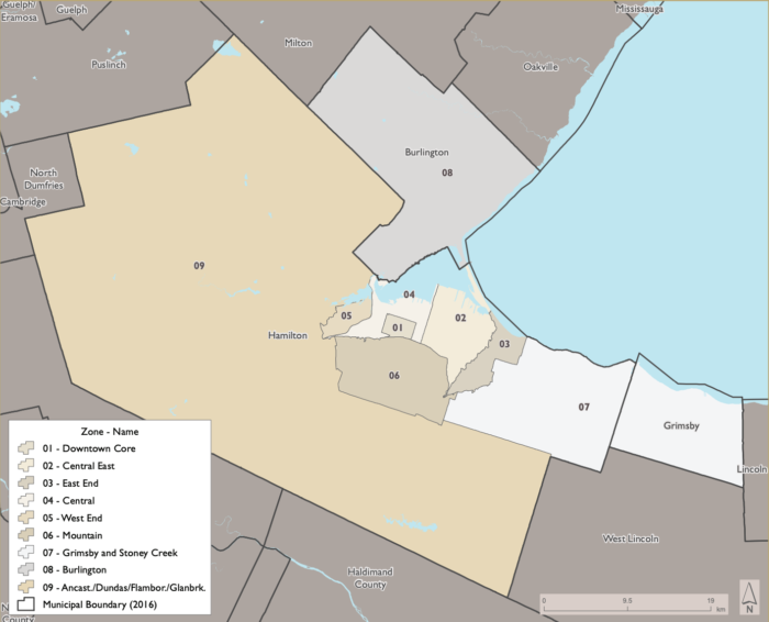
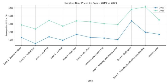
Between 2019 and 2023, Hamilton experienced clear rent increases across its nine zones, as shown in the graph and the zone map. The average rent prices rose significantly, reflecting growing affordability challenges across the city. But for this analysis, I only focus on Hamilton Census Divisions (Zone 01-07, and Zone 09).
- Zones with the Largest Rent Increases:
- Zone 9 (Ancaster/ Dundas / Flamborough / Glanbrook ) had the highest average rent price in 2023, reaching approximately $1800, compared to around $1,200 in 2019.
- Moderate Increases in Central Zones:
- In Zone 04 (Central) and Zone 01 (Downtown Core), average rents climbed about $1,400 in 2023, up from around $1,000 in 2019.
- Affordability in Central East and East End:
- Zone 02 (Central East) and Zone 03 (East End) remained relatively lower in rent price but still increased by nearly $300-$400 on average.
2. Hamilton’s aging population (2016-2021)
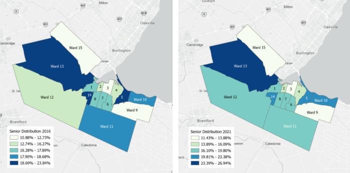
Hamilton has seen an overall increase in its senior population between 2016 and 2021. Figure 2 illustrates senior distribution across the city during this period, showing both growth and slight declines in specific areas. This research analyzes the social patterns by 15 Wards of Hamilton.
- Growth in Peripheral Wards
- Ward 13 experienced the largest increase, with senior population density rising by 31%.
- Ward 10 and Ward 12, both located on the outskirts of Hamilton, also saw growth of 2.0% each.
- Decline in Central Wards
- Ward 1, in the central part of the city, recorded a slight decline of -0.07%in senior population density.
The visualization suggests that seniors are moving from central areas to more affordable peripheral neighbouhoods. This shift may be due to rising rents in central wards, which exceed the financial capacity of seniors living on fixed income. Such displacement aligns with Twigge Molecey’s (2023) concept of “exclusionary displacement.” Seniors are often pushed into areas with fewer services and amenities, impacting their access to essential healthcare, including dementia care facilities.
3. Peripheral accessibility challenges
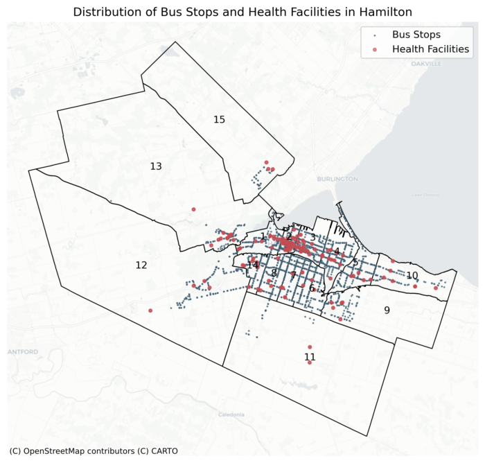
Figure 3: Hamilton Bus Stops and Healthcare facility distribution. (source: City of Hamilton Open Data Portal, HSR Transit Feed, GTFS data 2024; Ontario GeoHub, Ministry of Health service provider locations, 2024)
Figure 3 demonstrates the distribution of Bus stops and senior related Healthcare facilities across hamilton city.
Access to Healthcare Facilities
The distribution of healthcare facilities across Hamilton shows clear gaps between central and peripheral wards. Figure 3 maps the locations of bus stops and senior-related healthcare facilities, revealing patterns of accessibility.
- Better Access in Central Wards:
- Central Wards, such as Wards 1, 2, and 3, have a higher concentration of healthcare facilities, including dementia care centers.
- Seniors in these areas benefit from relatively easy access to essential health services.
- Limited Access in Peripheral Wards:
- Peripheral wards, including Ward 13 (Ancaster/Dundas), Ward 12 (West End), and Ward 15 (Flamborough), have noticeably fewer healthcare facilities.
- Seniors in these wards face challenges accessing healthcare, especially those with mobility limitations or frequent care needs.
- Traveling greater distances for specialized dementia care can be burdensome and costly for seniors living in underserved areas.
Access to Public Transit
The map also highlights significant differences in public transit coverage across Hamilton.
- Better Transit Coverage in Central Wards:
- Wards 1, 2, and 3 have a high density of bus stops, ensuring reliable public transit coverage.
- Seniors in these wards can more easily access healthcare facilities and other essential services.
- Sparse Transit Coverage in Peripheral Wards:
- Peripheral wards, such as Ward 13, 15, and 12, have far fewer bus stops and limited transit routes.
- Many neighborhoods in these areas are located far from the nearest bus stop, leaving seniors underserved.
- For example, Ward 13 has only a handful of bus stops spread across a large area, forcing seniors to rely on private transportation or endure long travel times to reach healthcare services.
Peripheral wards face compounded challenges due to limited access to both healthcare and public transit. Seniors in these areas must navigate long distances and fewer transportation options, making it harder to maintain regular healthcare visits, especially for specialized dementia care. Addressing these gaps requires targeted improvements to healthcare infrastructure and transit networks in underserved areas.
Methodology: Analyzing the Data
1. Data Source
Census Data (2016 and 2021):
This dataset provides information on senior population densities, renter occupancy rates, rent burden, and LIM rate across Hamilton’s wards. It captures historical trends over a five-year period, serving as the foundation for understanding shifts in senior population and vulnerability dynamics.
Housing Price Trends (2019–2023):
Housing price data from the Canada Mortgage and Housing Corporation (CMHC) tracks affordability trends over the past five years. These data are aggregated by CMHC zones rather than wards, highlighting how evolving housing costs have influenced displacement and affordability issues during the recent housing market changes.
Transit and Healthcare Data (2024):
This dataset includes the most up-to-date locations of General Transit Feed Specification (GTFS) bus stops and Ontario healthcare facilities focused on senior-related services in Hamilton and across Ontario. The healthcare facilities are categorized by specific service types to align with the needs of senior populations. The selected facility types are:
- Seniors Active Living Centres
- Retirement Homes
- Mental Health and Addiction Organizations
- Long-Term Care Homes
- Community Support Services
This data provides a detailed and updated view of the transit and healthcare infrastructure that supports seniors in Hamilton and Ontario. By integrating GTFS bus stops and healthcare facility locations, the dataset enables a comprehensive assessment of accessibility challenges faced by displaced seniors.
2. Methods
Based on literature reviewing Hallisey et al. and Tan et al. ‘s articles on facilities accessible related analysis, this study choose to use the population weighted centroid of each ward as the focal point, to analysis the accessibility to bus stops with isochorne (400m, 600m, 800m) (Lindén, 2021), and then calculate the centroid of bus stops in each ward to find their accessible healthcare facilities with isochron (5min, 10 min 15 min)(Dijck, 2024). Combine with the vulnerable score (30% senior ration + 30% Renter occupancy + 20% rent burden + 20% low income measure (LIM)rate) of each ward, and Ward-level rent prices are integrated into the analysis to capture the affordability dimension. Combining rent data with vulnerability and accessibility scores, a final composite score is assigned to each ward, highlighting disparities in housing affordability, healthcare access, and transit connectivity.
Population-Weighted Centroid:
The use of population-weighted centroids in this study reflects a key principle of spatial optimization: balancing demand and proximity to enhance equity and efficiency in resource allocation. Drawing on the methodologies outlined by Hallisey et al. and Tan et al., this approach focuses on public health and senior accessibility, highlighting geographic clusters where seniors face challenges in housing, healthcare, and transit accessibility. By emphasizing housing-related vulnerabilities, the methodology aligns with the study’s goal of understanding and addressing disparities in accessibility for vulnerable senior populations. This method is choosen because:
- Enhanced Accuracy: Unlike geometric centroids, which represent the geometric center of a polygon, population-weighted centroids account for the actual distribution of seniors within each ward. This makes them more relevant for analyses of accessibility and equity.
- Resource Optimization: Inspired by competitive facility location principles, the population-weighted centroid ensures that resources such as healthcare and transit services are positioned closer to high-need populations, improving equity in service delivery.
- Foundation for Isochrone Calculations: These centroids provide the starting points for creating walking and transit isochrones, ensuring that accessibility assessments reflect real-world population clusters rather than abstract geographic centers.
Formula:
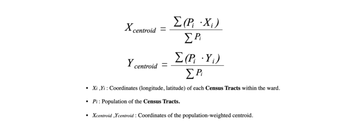
Population-Weighted Centroid Visualization:
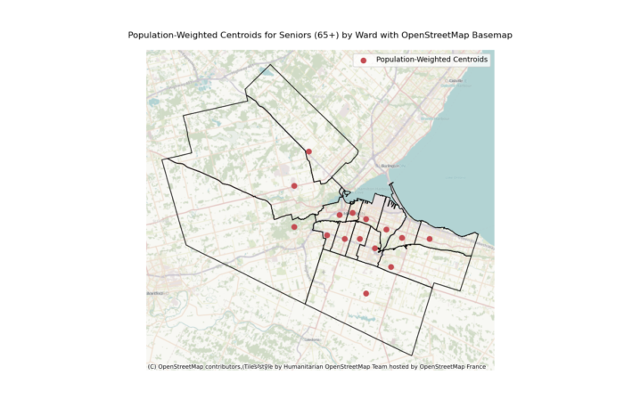
Data Sources:
- Ward Boundaries: Geospatial data containing the boundaries of Hamilton’s wards.
- Population Data: A point-based dataset indicating the spatial distribution of seniors aged 65 and older, with each point linked to a population value.
Vulnerability Score:
The vulnerability score is a composite index developed to evaluate the relative risk of senior displacement and accessibility challenges across Hamilton’s wards. This score combines multiple indicators, each weighted to reflect its contribution to housing vulnerability. The methodology aims to provide a comprehensive measure of vulnerability by accounting for the economic, social, and housing-related pressures faced by seniors. Drawing on insights from Lee and Van Zandt (2019), the inclusion of these indicators highlights the multifaceted risks of displacement and resource inaccessibility, aligning with the study’s goals of identifying and addressing inequities in senior housing and care accessibility.
Indicators and Weights:
- Senior Ratio (30%): Seniors, particularly low-income seniors, are disproportionately vulnerable due to fixed incomes, limited mobility, and dependence on nearby healthcare and transit services. Lee and Van Zandt (2019) emphasize that seniors face heightened risks of displacement because they are less able to relocate in response to rising rents. Including this indicator ensures that wards with high senior populations are appropriately prioritized for assessment.
- Renter Occupancy (30%): Renters are significantly more vulnerable than homeowners in most cases due to:
- Limited Financial Resources: Renters often lack savings or housing stability to cope with rising costs.
- Poor Housing Conditions: Rental units tend to be older and less resilient to economic or environmental shocks.
- Forced Relocation: Renters face higher displacement risks due to eviction, redevelopment, or disaster (Lee & Van Zandt, 2019).
- Rent Burden (20%): Rent burden, defined as households spending over 30% of income on housing, exacerbates vulnerability by forcing renters to make trade-offs in essential expenses such as food, healthcare, and transportation. Severe rent burdens (>50% of income) amplify displacement risks, creating a cascading effect on living standards. Studies on rent affordability highlight its direct link to housing insecurity, justifying a 20% weight in the vulnerability score.
- Low-Income Measure (LIM) Rate (20%): Income remains a fundamental driver of housing vulnerability. Low-income households lack the financial flexibility to absorb rising rents or relocation costs, leaving them at greater risk of displacement. Additionally, these households have fewer resources to advocate for affordable housing policies or adapt to market pressures. Incorporating the Low-Income Measure (LIM) captures the economic challenges faced by this group, supporting its inclusion as a 20% weighted indicator.
Data Sources: Data on senior ratios, renter occupancy, rent burdens, and LIM rates were collected for each ward in 2016 and 2021.
Standardization: Data on senior ratios, renter occupancy, rent burdens, and LIM rates were collected for each ward in 2016 and 2021.
Accessibility Score Methods:
The Accessibility Score is designed to assess how well each ward in Hamilton facilitates seniors’ access to transit and healthcare services. The score is based on a combination of transit accessibility and healthcare accessibility, calculated using spatial analysis and weighted indicators. The following steps outline the methodology:
- Transit Accessibility:
- Isochrone Calculation: Isochrones of 400m, 600m, and 800m were calculated from the population-weighted centroid of each ward using real-world walking distances.
- 400m: Represents a comfortable 5-minute walk.
- 600m: Represents a reasonable 7–8 minute walk.
- 800m: Represents a 10-minute walk for seniors able to walk longer distances.
- Reachable Bus Stops: The number of bus stops within each isochrone was counted for every ward. This count represents the accessibility of transit infrastructure for seniors who may rely heavily on public transport.
- Transit Accessibility Score: For each ward, the transit accessibility score was calculated as the normalized average count of reachable bus stops across the three isochrone distances.
- Isochrone Calculation: Isochrones of 400m, 600m, and 800m were calculated from the population-weighted centroid of each ward using real-world walking distances.
- Healthcare Accessibility:
- Bus Stop Centroid Calculation: The geometric centroid of all bus stops within each ward was calculated, representing the central transit hub for that ward.
- Isochrone Calculation: Isochrones of 5 minutes, 10 minutes, and 15 minutes transit time were generated from each bus stop centroid. These isochrones represent the areas reachable by public transit for seniors dependent on buses.
- Reachable Healthcare Facilities: The number of healthcare facilities (including dementia care homes, pharmacies, and related centers) within each isochrone was counted for every ward.
- Healthcare Accessibility Score: For each ward, the healthcare accessibility score was calculated as the normalized average count of reachable healthcare facilities across the three transit isochrone distances.
- Comprehensive Accessibility Score:
- Normalization: Both transit accessibility and healthcare accessibility scores were normalized to a scale of 0–1 to ensure comparability.
- Weighted Formula: The comprehensive accessibility score was calculated as a weighted average of transit and healthcare accessibility scores:
Synthesizing Trends Methods:
The synthesized trends combine housing price changes, vulnerability scores, and accessibility scores to provide a comprehensive understanding of how these factors interact across Hamilton’s wards. The calculation integrates temporal data from different sources, standardizes the metrics, and visualizes relationships between housing affordability, vulnerability, and accessibility. This approach offers insights into patterns of displacement and service accessibility challenges for seniors.
Formulas for calculating the final Trends:
Correlation Analysis: A scatter plot was created to analyze the relationship between vulnerability and accessibility scores. A linear regression model was fitted to the data to calculate the correlation coefficient (R2)
Data Source:
- Vulnerability Data: Includes vulnerability scores and changes between 2016 and 2021.
- Accessibility Data: Comprehensive accessibility scores based on transit and healthcare availability for each ward.
- Housing Price Data: Changes in rent prices from 2019 to 2023.
- Geospatial Data: Ward boundary shapefiles for mapping and visualization.
Results
1. Senior displacement trends (2016 – 2021)
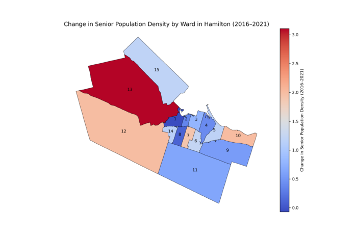
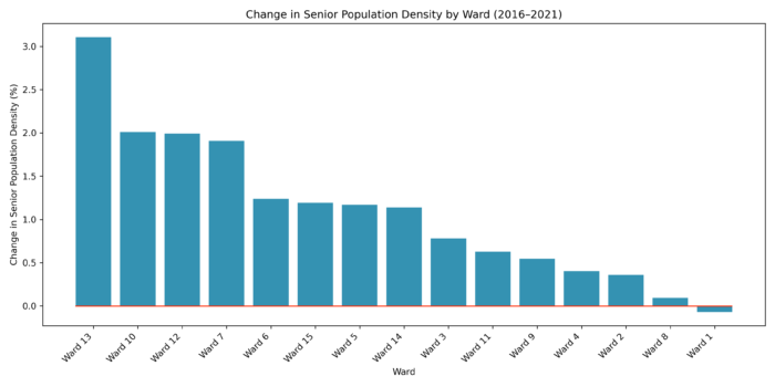
Key Observations with combine Figure 8 and Chart 2:
- Wards with the Highest Increase in Senior Population Density:
- Ward 13 experienced the most significant increase in senior population density, reaching approximately 3.0%. This suggests that the ward has become a preferred location for seniors, potentially due to factors such as affordability, accessibility to healthcare, and availability of senior-friendly housing.
- Other wards with notable increases include Ward 10, Ward 12, and Ward 7, which all saw substantial growth in senior population density. These wards may be benefiting from favorable conditions for aging populations, such as proximity to essential services, transit accessibility, and suitable housing options.
- Wards with Moderate to Minimal Increases:
- Ward 6, Ward 15, and Ward 3 displayed moderate increases in senior population density. These wards may be experiencing incremental growth due to their mixed housing options and moderate affordability.
- Wards 9 and 11 showed smaller increases, indicating a slower rate of senior population growth compared to other areas.
- Wards with the Least Increase or Stability:
- Ward 8, Ward 2, and Ward 1 exhibited the least change in senior population density, reflecting relative stability or stagnation. These areas might face barriers to attracting seniors, such as higher housing costs, lack of specialized facilities, or limited transit access.
- Ward 1, in particular, shows negligible change, which could indicate an established population with minimal inflow or outflow of seniors.
With reading the Chart 2, the wards with higher increases in senior population density, such as Ward 13 and Ward 10, are primarily located in suburban areas, suggesting a trend of suburbanization among seniors. This may be driven by rising housing costs in central wards and the availability of more spacious or affordable housing in suburban locations. Wards closer to the urban core (e.g., Ward 1 and Ward 2) show less growth. This change trends suggest a displacement of seniors from central wards to suburban and peripheral areas.
2. Vulnerability (2019-2023)
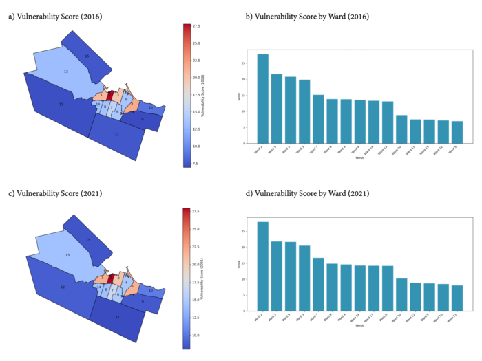
The Vulnerability Score of each Ward is calculated based on the data of senior population ratio, renter occupancy rates, rent burden, and LIM rate. And visualization demonstrates 2016 and 2021, as well as the vulnerability change from 2016 to 2021. Key Observations from Figure 9(a), (b), (c), and (d):
- High Vulnerability Wards:
- 2016: Ward 2, Ward 5, Ward 1, and Ward 3 had the highest vulnerability scores, as indicated by both the bar chart and choropleth map. These wards, located centrally, likely had higher senior populations, higher renter occupancy, and rent burdens.
- 2021: Similar trends continued with Ward 2, Ward 1, and Ward 5 maintaining high vulnerability scores. This consistency highlights persistent challenges in these areas, particularly for low-income seniors.
- Low Vulnerability Wards:
- In both years, Wards 9, 11, and 12 showed the lowest vulnerability scores. These wards, typically peripheral and less dense, may have lower proportions of renters or seniors.
- Geographic Patterns:
- Central Wards (e.g., Wards 1, 2, 3, and 5) demonstrated higher vulnerability, while peripheral Wards (e.g., Wards 12, 13, and 11) showed lower scores. This pattern aligns with urban displacement pressures, where centrally located areas face greater affordability challenges.
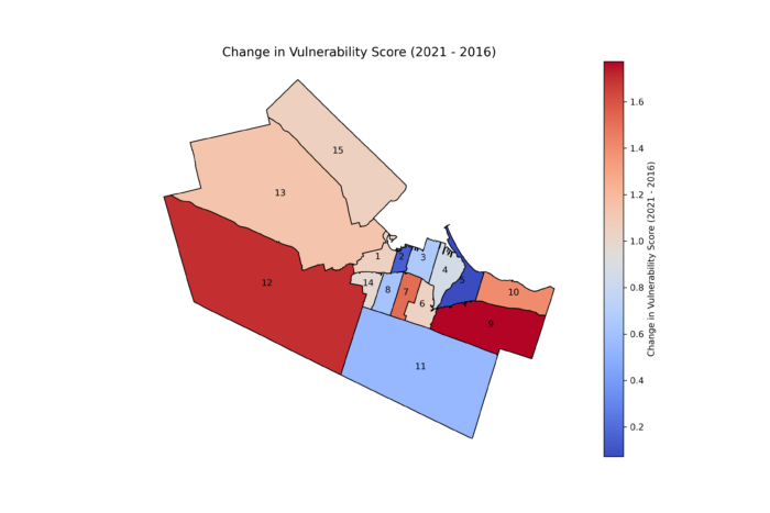
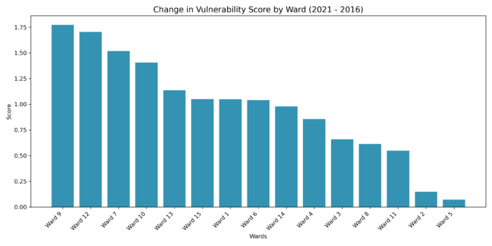
Key Observations of Change in Vulnerability Scores (2016-2021) (Figure 10 and Chart 3)
- Increasing Vulnerability:
- Wards 9, 12, 7, and 10 experienced the largest increases in vulnerability scores. Notably, Ward 9 shifted from being among the least vulnerable to one of the most vulnerable in terms of vulnerability change.
- This trend suggests that previously stable wards are now experiencing rising displacement pressures and worsening conditions for seniors.
- Decreasing or Stable Vulnerability:
- Wards 2 and 5, despite being highly vulnerable in both years, showed minimal changes. This stability may indicate ongoing but relatively consistent conditions rather than worsening vulnerabilities.
- Geographic Trends:
- Peripheral Wards like Wards 9 and 12 show increasing vulnerability, indicating that displacement pressures may be pushing vulnerable populations outward.
- Central Wards, such as Ward 2, remain consistently vulnerable but without major shifts.
3. Accessibility Score
Transit Accessibility:
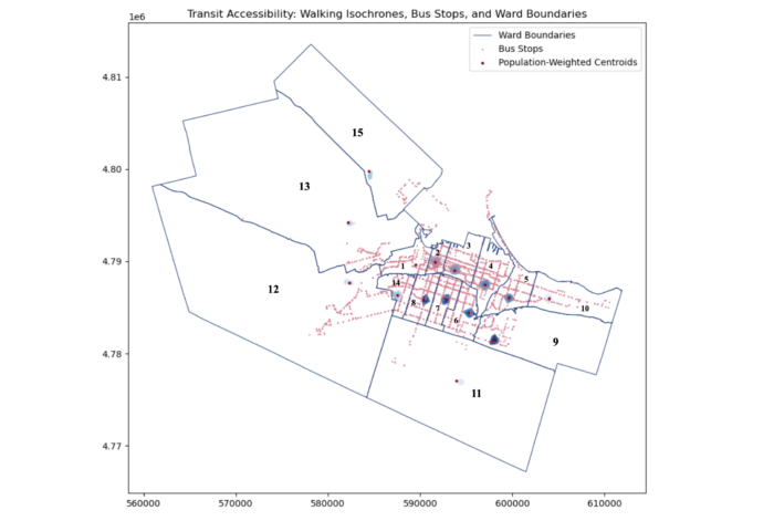
Figure 11: Transit Accessibility: from population-weighted centroids of Ward to reachable Bus Stops with isochrone 400m, 600m, 800m.
The transit accessibility analysis evaluates the number of bus stops reachable within walking distances from each ward’s population-weighted centroid. Isochrones of 400m, 600m, and 800m were used to assess access levels. Figure 6 visualizes these results, showing clear differences in transit availability across Hamilton’s wards.
Observations:
- High Accessibility in Central Wards:
- Wards 2 and 3 have the highest transit accessibility.
- These wards offer greater bus stop density within comfortable walking distances, ensuring better connectivity for seniors.
- Low Accessibility in Peripheral Wards:
- Wards 9, 11, and 15 demonstrate significantly lower transit accessibility.
- Many areas lack bus stops within walking distances, leaving seniors underserved and more dependent on private transportation or long commutes.
The Isochrone map (Figure 6) highlights how central wards benefit from better transit infrastructure, while peripheral wards experience gaps in coverage. This indicates that peripheral wards face critical transit infrastructure challenges that could worsen mobility barriers for vulnerable senior populations. Limited access to bus stops may increase isolation and reduce seniors’ ability to reach essential services, including healthcare facilities.
Healthcare Accessibility:
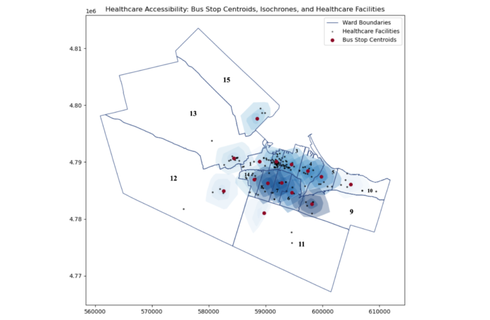
Figure 12: Healthcare Accessibility: from bus stop centroids of Ward to reachable Health care facility with isochrone 5minutes, 10 minutes, and 15 minutes.
Healthcare accessibility was analyzed using transit-based isochrones of 5, 10, and 15 minutes from bus stop centroids in each ward to nearby healthcare facilities.
Observations:
- Better Access in Central Wards:
- Wards 2 and 3 have the highest healthcare accessibility.
- These wards provide more reachable healthcare facilities within short transit times, ensuring better service availability for seniors.
- Limited Access in Peripheral Wards:
- Wards 9, 12, and 15 show minimal to no healthcare accessibility.
- Seniors in these wards face significant barriers due to sparse transit routes and fewer nearby healthcare services.
The isochrone map (Figure 7) illustrates the differences in spatial distribution of healthcare access, highlighting accessibility gaps in peripheral areas. This indicates that peripheral wards face a compounded challenge of poor transit and limited healthcare facilities. Seniors in these areas, who often rely on public transportation, may struggle to access essential medical care, including dementia services. This highlights the urgent need to expand healthcare infrastructure and improve transit links to better serve vulnerable populations.
Comprehensive Accessibility Score:
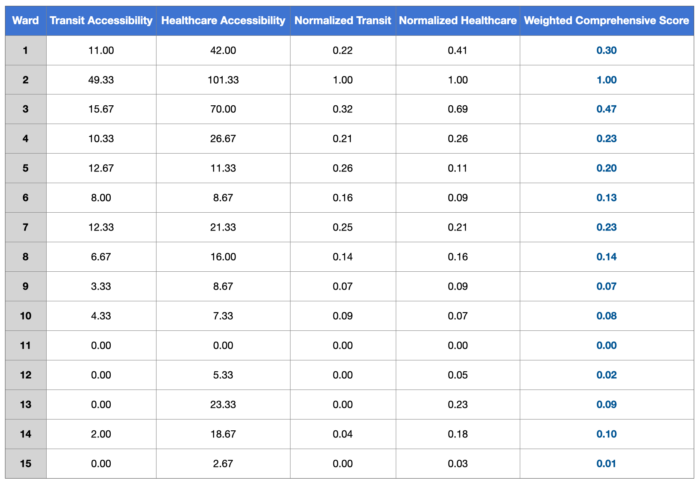
Chart 4: Weighted Comprehensive Score
The comprehensive accessibility score combines transit and healthcare accessibility into a single measure. Transit accessibility accounts for 60% of the weight, while healthcare accessibility accounts for 40%.
Observation:
- Highest Scores in Central Wards:
- Ward 2 (1.00) and Ward 3 (0.47) rank the highest, reflecting their robust transit and healthcare accessibility.
- These wards have well-developed infrastructure, supporting mobility and healthcare access for seniors.
- Lowest Scores in Peripheral Wards:
- Wards 9 (0.07), 11 (0.00), and 15 (0.01) report alarmingly low scores.
- Many peripheral wards show near-zero accessibility, indicating significant gaps in infrastructure.
- Correlation Between Transit and Healthcare Accessibility:
- Wards with high transit accessibility, such as Wards 2 and 3, also have higher healthcare accessibility scores.
- This highlights the role of integrated infrastructure in improving access to essential services for seniors, especially for transit dependent seniors
- Peripheral wards with limited transit options, such as Wards 9, 11, and 15, experience much lower healthcare accessibility.
Based on the visualization of service provision disparities, peripheral wards face severe transit and healthcare accessibility challenges. Sparse transit routes and fewer healthcare facilities leave seniors in these areas isolated and underserved. Seniors may experience delays in accessing healthcare, face higher costs, and suffer from reduced quality of life. Limited infrastructure can further intensify displacement trends, forcing seniors to relocate and disrupting social networks that provide vital social and emotional support. These challenges highlight the urgent need for targeted improvements in peripheral areas to address service gaps and support aging populations.
Central wards, such as Wards 2 and 3, benefit from higher levels of transit and healthcare accessibility due to concentrated infrastructure investments. These areas provide better service availability and mobility for seniors. In contrast, peripheral wards, including Wards 9, 11, and 15, face severe disadvantages due to poor transit networks and fewer healthcare resources. These disparities reflect broader patterns of urban inequality, where peripheral areas remain underserved, leaving vulnerable populations with fewer options and resources.
4. Synthesizing Trends:
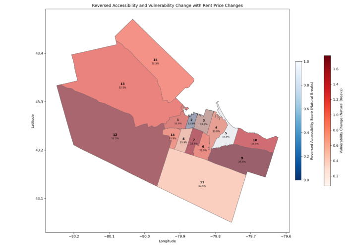
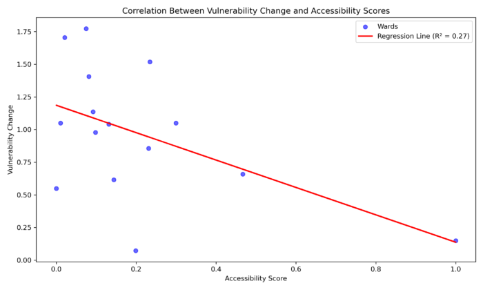
The combined analysis highlights patterns of vulnerability, accessibility, and housing price changes across Hamilton’s wards. The findings emphasize the challenges faced by low-income senior renters who depend on affordable housing and accessible services.
Observation:
- Relationship Between Accessibility and Vulnerability:
- The scatter plot demonstrates a negative correlation (R² = 0.27) between accessibility scores and vulnerability changes.
- Wards with higher accessibility scores, such as Ward 2, show smaller increases in vulnerability.
- This suggests that better transit and healthcare infrastructure can reduce displacement risks by enabling seniors to stay in their communities despite rising rents.
- In contrast, wards with lower accessibility scores tend to experience larger increases in vulnerability. This indicates that limited infrastructure amplifies affordability pressures, especially for seniors who rely heavily on nearby services.
- Peripheral Wards at Risk:
- Peripheral wards, including Wards 12, 13, and 15, report the highest vulnerability increases alongside very low accessibility scores.
- These wards also experience some of the steepest rent price increases, exceeding 50% in some cases.
- This combination of affordability challenges and poor infrastructure places these wards at the highest risk for senior displacement.
- Seniors in these areas face a dual burden—being pushed out of central neighborhoods due to rising rents and finding limited resources to support their needs in the areas they move to. This creates major barriers to accessing transit, healthcare, and other essential services.
- Mixed Results in Central Wards:
- Central wards, such as Ward 2 and Ward 3, show more favourable outcomes.
- These wards benefit from higher accessibility scores, which seem to offset some of the effects of rising housing prices.
- Vulnerability levels in these wards remain relatively stable despite moderate rent increases.
- The presence of accessible bus stops and healthcare facilities likely helps maintain affordability and quality of life for seniors in these areas.
The data highlights that peripheral wards, especially Wards 12, 13, and 15, are particularly vulnerable to the combined effects of rising rents and inadequate infrastructure. These areas face the greatest challenges in ensuring seniors have access to affordable housing, transit, and healthcare services. Addressing these gaps through targeted improvements in transit routes, expanded bus stops, and additional healthcare facilities can significantly reduce the risks faced by low-income senior renters.
Recommendation:
- Improve Transit Connectivity:
- Expand public transit services in peripheral wards, especially in Wards 9, 11, and 15, where transit accessibility is critically low.
- Prioritize the addition of bus stops and routes that connect these wards to healthcare facilities and central areas.
- Conduct transit planning that aligns with senior-specific mobility needs, such as shorter walking distances to stops and frequent services.
- Enhance Healthcare Infrastructure:
- Invest in building dementia care and general healthcare facilities in underserved peripheral wards to address critical healthcare access gaps.
- Develop mobile or community-based healthcare solutions for seniors in wards with sparse healthcare facilities, such as Wards 9, 11, and 15.
- Collaborate with provincial and municipal health agencies to allocate resources for senior-specific healthcare services.
- Increase Affordable Housing Supply:
- Focus on creating affordable rental housing in central and intermediate wards, such as Wards 2, 3, and 6, to prevent displacement.
- Implement inclusionary zoning policies requiring affordable housing in new developments.
- Provide rental assistance programs or subsidies for low-income seniors to mitigate rent burdens and housing insecurity.
Conclusion
This study highlights the challenges that low-income senior renters in Hamilton face poor transit access, and limited healthcare services due to rising housing costs. Many seniors are being displaced from central wards, where services are more accessible, to peripheral wards with fewer resources. The results show large differences between wards. Peripheral areas like Wards 9, 11, and 15 face the most severe challenges, with poor accessibility and high vulnerability. This reveals growing inequality in Hamilton’s infrastructure, which has a strong impact on seniors who rely on nearby services and public transportation.
The findings show how transit and healthcare accessibility are closely linked to reducing displacement risks. Central wards, such as Wards 2 and 3, perform better because of strong transit networks and nearby healthcare services. These areas show lower increases in vulnerability, even with moderate housing price growth. On the other hand, peripheral wards with limited transit and healthcare services face major disadvantages. These challenges increase displacement risks and limit access to essential services for senior residents.
The results stress the need for policies that support vulnerable populations. To reduce displacement and improve quality of life, there must be better access to affordable housing, transit, and healthcare. Policies should focus on building affordable housing near transit hubs, expanding public transit in underserved areas, and providing senior-specific healthcare facilities. These actions can help address the growing disparities between central and peripheral wards.
This study also points to broader lessons for urban planning. Rising housing costs and demographic changes are common in many mid-sized cities. Hamilton’s challenges show how important it is to focus on vulnerable populations in urban development. The use of geospatial analysis in this study highlights its value in identifying inequalities and guiding policy. However, ongoing monitoring and updated data are needed to ensure that policies remain effective and respond to changing needs. Through targeted efforts, Hamilton can create a more inclusive and accessible city for its aging population.
Challenges and Limitations
- Data Year Mismatch:
- The datasets used span different years (2016, 2021, 2024), which may affect the accuracy of trends and correlations. For example, housing price data from 2019–2023 does not align directly with the census data from 2016 and 2021.
- The temporal gap between housing, transit, and healthcare data introduces challenges in drawing precise conclusions about current conditions.
- Spatial Mismatch:
- Housing price data is aggregated by CMHC zones, while other data is ward-specific. This discrepancy complicates the alignment of trends and may dilute localized observations.
- Lack of Senior Renter Data:
- The absence of specific data on senior renters necessitated the use of proxies, such as general senior population and renter occupancy rates. This approach may not fully capture the unique challenges faced by senior renters.
- Limited Accessibility Metrics:
- The accessibility analysis primarily focuses on transit and healthcare facilities but does not include other critical services, such as grocery stores or community centers, that contribute to seniors’ quality of life.
- Exclusion of Qualitative Data:
- The study lacks qualitative insights from seniors about their lived experiences, which could provide a deeper understanding of the challenges they face.
Citations
- Canada Mortgage and Housing Corporation. (2019 & 2023). Rental market survey: Hamilton CMA, private row (townhouse) and apartment average rents ($), by zone and bedroom type.
- Canada Mortgage and Housing Corporation. (2020). Rental market report: Hamilton CMA.
- City of Hamilton. (2016 & 2021). Census data. City of Hamilton Open Data Portal.
- City of Hamilton. (2016 & 2021). Census income data. City of Hamilton Open Data Portal.
- Government of Canada. (2024). HSR bus stops. Open Hamilton.
- Ministry of Health. (2023). Service provider locations. Ontario Geohub.
- Statistics Canada. (2016 & 2021). Census profile, 2021 Census of population: Hamilton, census division (CDR), Ontario. Government of Canada.
- Dijck, A. V. (2024). Public Transit and Health Access in Utrecht’s 10-Minute City Vision (Master’s thesis).
- Hallisey, E., Tai, E., Berens, A., Wilt, G., Peipins, L., Lewis, B., … & Lunsford, N. B. (2017). Transforming geographic scale: A comparison of combined population and areal weighting to other interpolation methods. International Journal of Health Geographics, 16, 1-16.
- Lee, J. Y., & Van Zandt, S. (2019). Housing Tenure and Social Vulnerability to Disasters. Journal of Planning Literature, 34(2), 156–170. https://doi.org/10.1177/0885412218812080
- Lindén, P. (2021). Improving accessibility to the bus service: Building an accessibility measurement tool in QGIS.
- Simard, J. (2020). Gentrification and aging in Montreal, Quebec: Housing insecurity and displacement among older tenants. Gentrification around the World, Volume I: Gentrifiers and the Displaced, 37-59.
- Tan, M. H., Tan, K. W., & Lau, H. C. (2024). A data-driven approach for automated multi-site competitive facility location.
- The Daily — Housing challenges remain for vulnerable populations in 2021. (n.d.). Retrieved December 19, 2024, from https://www150.statcan.gc.ca/n1/daily-quotidien/220721/dq220721b-eng.htm
- Twigge-Molecey, A. (2013). Exploring resident experiences of displacement in a neighbourhood undergoing gentrification and mega-project development: A Montréal case study. Institut National de la Recherche Scientifique (Canada).


