Exploring Mental Well-being for Immigrant & Refugee Families in Peel
I recently took a course called GGR381: Digital Mapping & Principles of Cartography with Professor Matthew Adams, and it completely changed how I view maps. Before, I thought they followed a simple formula, to represent a geographic place, add a title, legend, and other map elements, and call it a day. However, I learned that maps have guiding principles and that every detail the cartographer chooses matters. From the colors and symbology to the size and style of the map elements, the arrangement of map elements, and the typography itself. However, all these choices (and more) are decided by the cartographer, showcasing a map maker’s control and power to influence the reader. This is because the cartographer isn’t simply showing information; they’re shaping how you understand it, not only by design but also by choice of words and representation which can influence a new perspective and drive action.
Research Project Introduction
After learning about different mapping techniques and their importance, I was able to put them into practice in a group-based research project that explored mental health well-being for immigrant and refugee communities in Peel. Don’t get me wrong, I’ve created plenty of maps before, but with this new perspective, the whole experience felt different.
The final product of this project was to deliver an interactive and engaging GIS-based Story Map using ArcGIS online and present our findings and insights to our research partners; Family and Child Health Initiative, Institute for Better Health, Trillium Health Partners. We had five key objectives, each assigned to different members of the group.
1: The historical transformation of the Region of Peel
Provide written and visual narratives, using census data and satellite imagery to illustrate how the Region of Peel evolved from a rural area into a densely populated hub.
This is important because it highlights the progression of urban development and population growth in the Peel region, offering historical context that distinguishes the Story Map from a traditional map.
2: Highlight the Evolution of Immigrant and Refugee Population Patterns:
Showcase the historical and current settlement patterns of immigrant and refugee communities in the Region of Peel by mapping demographic and socioeconomic characteristics (e.g., ethnicity, language, population density) by using dissemination area and census tract data from the years 1981 to 2021.
This will help visually identify areas of high immigrant density and their specific characteristics, illustrate how demographic and socioeconomic conditions have evolved, and reveal where communities are located and how they have changed over time.
3: Illustrate Community-Based Mental Health Programs and Services
Map and geocode the addresses of community-based mental health and emotional well-being programs, using the CSV data provided to highlight services available for immigrant and refugee populations in Peel. This will help visualize where services are abundant (“oases”) and where they are lacking (“deserts”).
The goal is to identify geospatial service availability gaps in the Peel Region, with a focus on high immigrants and refugee community areas that may be in need.
4: Conduct Geo-Spatial Analysis of Program Accessibility
Create maps of immigrant populations and their socioeconomic conditions (e.g., income levels, educational attainment, and employment status) using Ontario Marginalization, CHASS and census tract data.
This will be used to highlight underserved areas that require mental health program enhancements, crucial for supporting the immigrant and refugee community.
5: Incorporate Community Partner and Stakeholder Recommendations
Using community reports and stakeholder documents, provide recommendations for policymakers and stakeholders to improve mental health and well-being programs for immigrant and refugee communities, with a focus on family support.
These recommendations will be emphasized in the Story Map to provide actionable steps for enhancing mental health services in Peel.
Collectively, these objectives enhance the Story Map by offering historical insights, contextual frameworks, relevant maps, and clear data representations, which ensures a better understanding for the reader on the matter in its own way.
Cartography in Action: Visualizing Peel’s Community-Based Mental Health Services and Programs
With only about five minutes to present the entire Story Map, I had roughly 45 seconds to cover my objective (3). This is where effective cartography becomes crucial because, despite the time constraints, a well-designed, informative map can still effectively convey the key information to the audience.
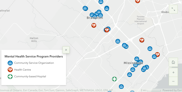
Firstly, to plot the 41 mental health programs and services provided in the CSV file, I had to use the geocoding tool in ArcGIS Pro. The geocoding tool is used to transform the addresses into geographic coordinates (latitude and longitude) by comparing them with a reference dataset, in this case, I used the address provided by the Peel Region data portal. Once the mental health programs and services addresses were converted into coordinates, they’re represented in point form, all ready for map creation.
I decided to classify the data by the different mental health services providers. To effectively represent them, I selected suitable symbology provided in ArcGIS Online.
The map below (figure 1) showcases the final Community-Based Mental Health Programs and Services in Peel, providing a spatial visualization of available resources in the region. This helps identify specific geospatial gaps in services that may need addressing, thereby fulfilling the goal of Objective 3.

Additionally, I created an immigration population density map layer (figure 2) using the CHASS data center and overlaid it with the mental health programs and services in the Peel region layer. This focused the analysis on immigrant and refugee communities, highlighting areas with high immigrant populations that may require more mental health programs and services to meet their needs. By visually identifying these regions, we can conclude on targeted spatial areas where additional support is most needed.

Conclusion
Its clear cartography plays a big role in bringing geodata to life. By thoughtfully designing each step, I ensured the maps effectively showcased the distribution of mental health services in the Peel region, with emphasis on immigrant and refugee communities. The maps not only enhanced clarity but also took advantage of the elements of Story Maps, making the information more engaging and easier to understand.
If you are interested to explore deeper into the analysis of the different objectives or view the final Story Map, you can access it through the following link:
https://storymaps.arcgis.com/stories/cb5a308415e640ce8528ff4e5ce6dd40
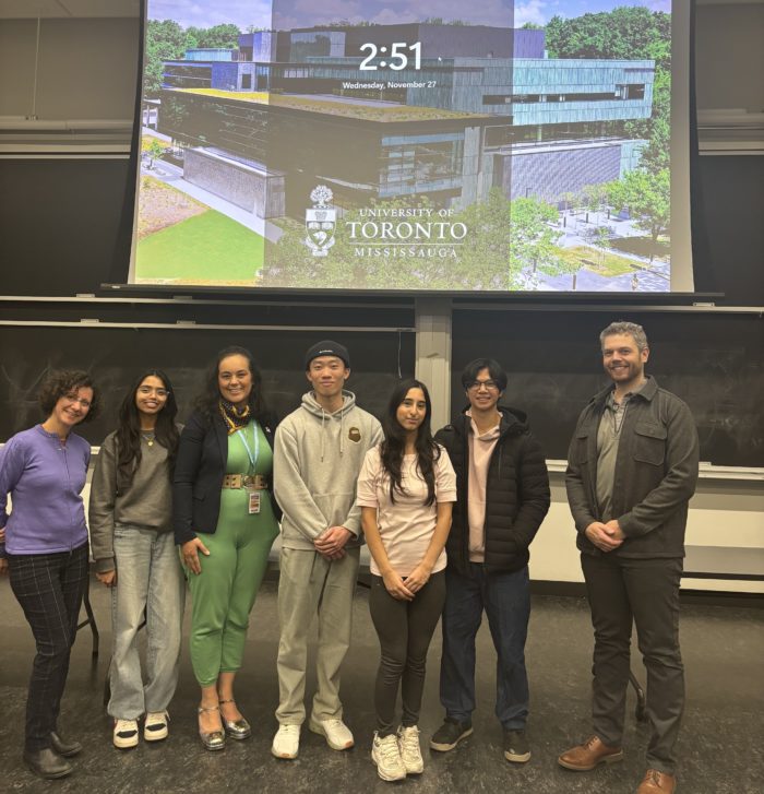
Here’s a photo of my group and I with our research partners and Professor Matthew Adams after presenting our Story Map.

Thanks for reading! I learned a lot during this research project, from the initial stages to the presentation day. I hope you learned something new as well and I look forward to sharing more on other research projects soon.
