
Growing Old In Toronto: A Glance into Toronto’s Aging Population and Long-Term Care Facilities
David Recchia (3rd Year Geomatics Engineering Student)
Daniel Berec (3rd Year Geomatics Engineering Student)
This post is a brief summary of a term project prepared for the GIS course at York University.
Toronto is getting old—roughly 35 percent of the metropolitan’s population is over the age 50 (Statistics Canada, 2018). Recognizing this increasingly important trend, we became intrigued by the consequences. More specifically, we wanted to know if Toronto was prepared to handle this change in dynamics. It was, therefore, the intention of our joint analysis to look at how Toronto’s aging population is distributed among the long-term care (LTC) facilities.
A Growing Problem
While there are a number of long-term care facilities currently operating in Toronto, we suspected that the combined capacity would fall short in the near future. What is concerning is there are signs that this has already started to happen. The National Post stated that the average wait time for a patient on a wait list is now 116 days. This is extremely concerning to us, especially when we considered what could happen in a span of 116 days. Yes, there are other options other than LTC facilities such as family support, at-home care, and retirement living.
Data Acquisition
In order to carry out the objectives of this study, we required a couple different sets of data. First, there were a few assumptions that needed to be made. We defined a senior as someone over the age of 65. In regards to the long-term care facilities, we only considered ones that were registered with the City of Toronto and the Government of Ontario. It is also important to note how cautious we were when collecting the data. We only used data that was provided by the Government of Ontario, StatsCan, and the City of Toronto. Any third-party sites were verified before we used anything.
We could not find any pre-existing maps that were relevant to our focus, so we decided to create a new one using Esri’s ArcMap. First, we required a road network shape file for the city that would allow us to georeference any additional data. Thankfully, we were provided this in one of our previous labs for our GIS course. Next, we required a shape file that contained all 140 neighbourhoods—represented as polygons—within the city. Once we acquired these files, the collection of the applicable data proceeded. Starting with the long-term facilities, we used a website that was operated and funded by the Government of Ontario that outlined every facility in a specified area. It even listed the bed capacity and the type of funding it received. An excel spreadsheet was created from this data and the following columns were included:
- Facility ID
- Address
- City
- Province
- Postal Code
- Number of Beds
- Home Type
Once this excel spreadsheet was created, it was imported into ArcMap. The last and final piece of our analysis was population numbers. More specifically, we would need the population of seniors per neighbourhood as defined by the City of Toronto.
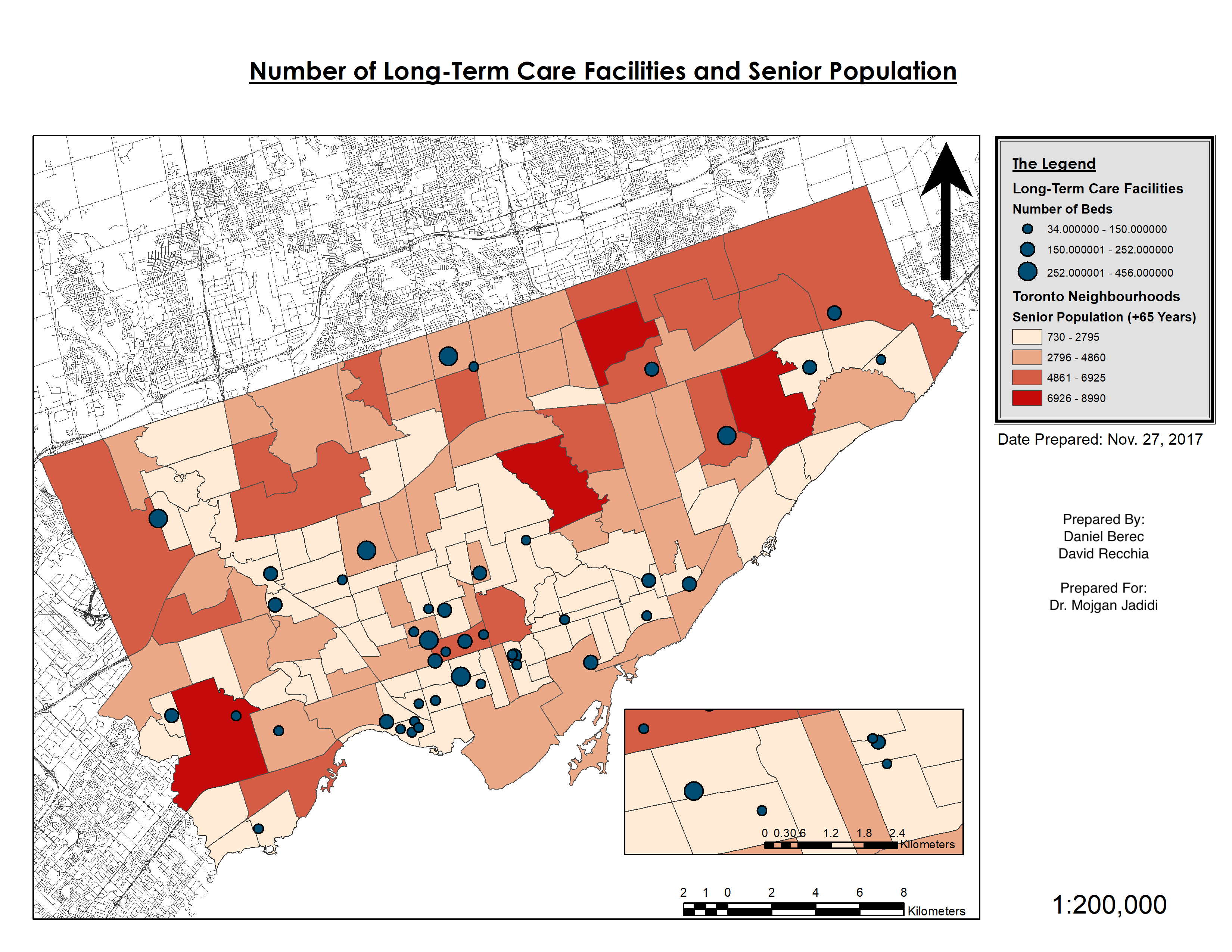
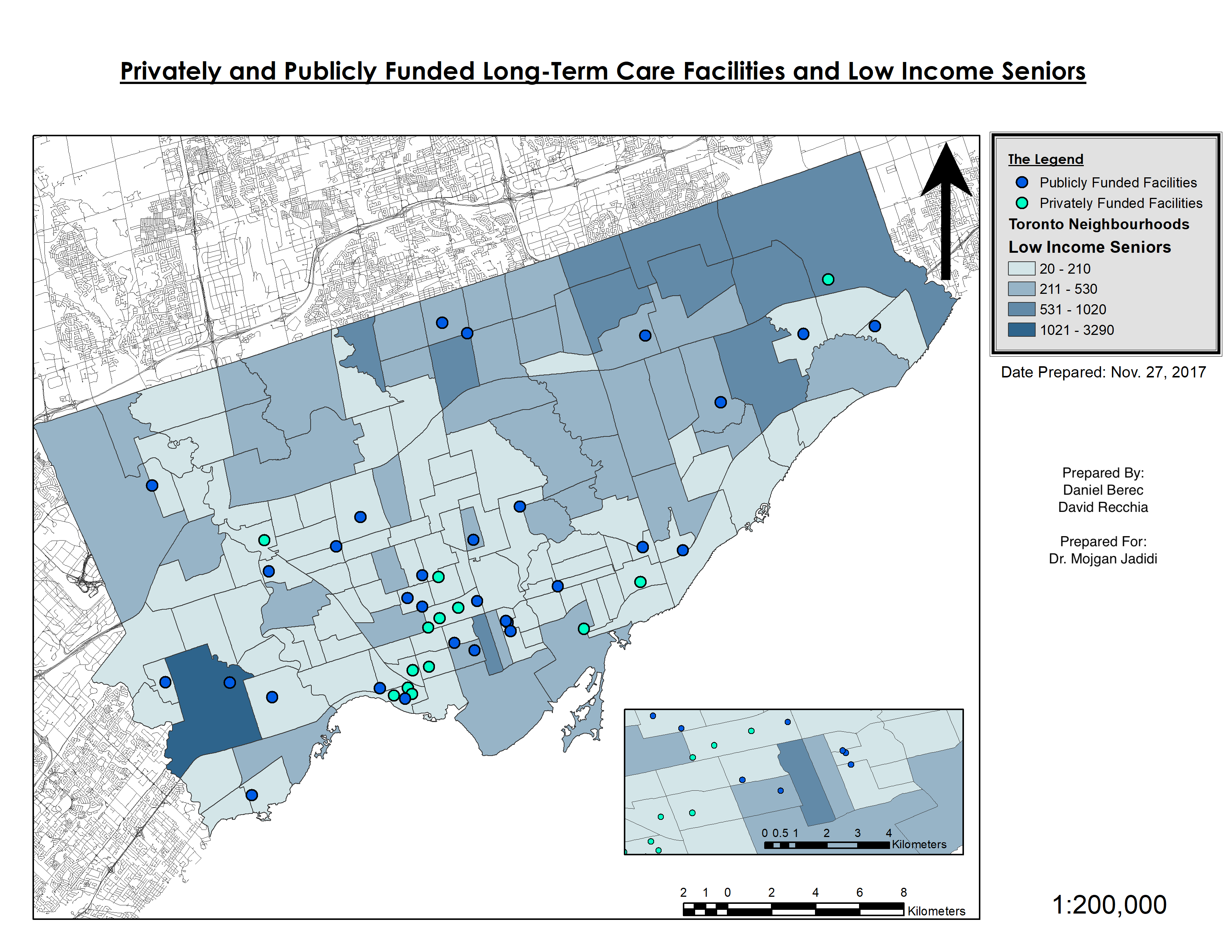
Results
Below are the results of our investigation. The first image depicts the number of LTC facilities and Toronto’s senior population. We also wanted to recognize the importance of income and wondered if we could determine any patterns in relation to it. The second image is the result of this curiosity. Of course there are several limitations to this analysis. One such limitation is the assumption that LTC facilities are the only option for seniors who require care.
Discussion
The most challenging part of our study was data collection. Once we felt comfortable with what we had, the rest of our analysis was simple. This is partly due to how intuitive and accessible ArcMap was for us. It is also important to note some of the shortcomings of our analysis. By no means is the complete story behind Toronto’s aging population and the availability of care facilities. We also made several assumptions in order to keep our project within our resources, which contribute to a bias.