GIS in Education and Research Conference – My Experience
This past Wednesday, October 11th, me and a few of my colleagues got the opportunity to attend the Esri Canada GIS in Education and Research conference at the University of Toronto campus. This conference occurs every two years and attracts educators and students in the field of GIS. It was my first time visiting the University of Toronto actually, so I got that nice bonus experience out of the event. I really liked the buildings with their charming architecture – the event was held in the Hart House, which is now nearly 100 years old.
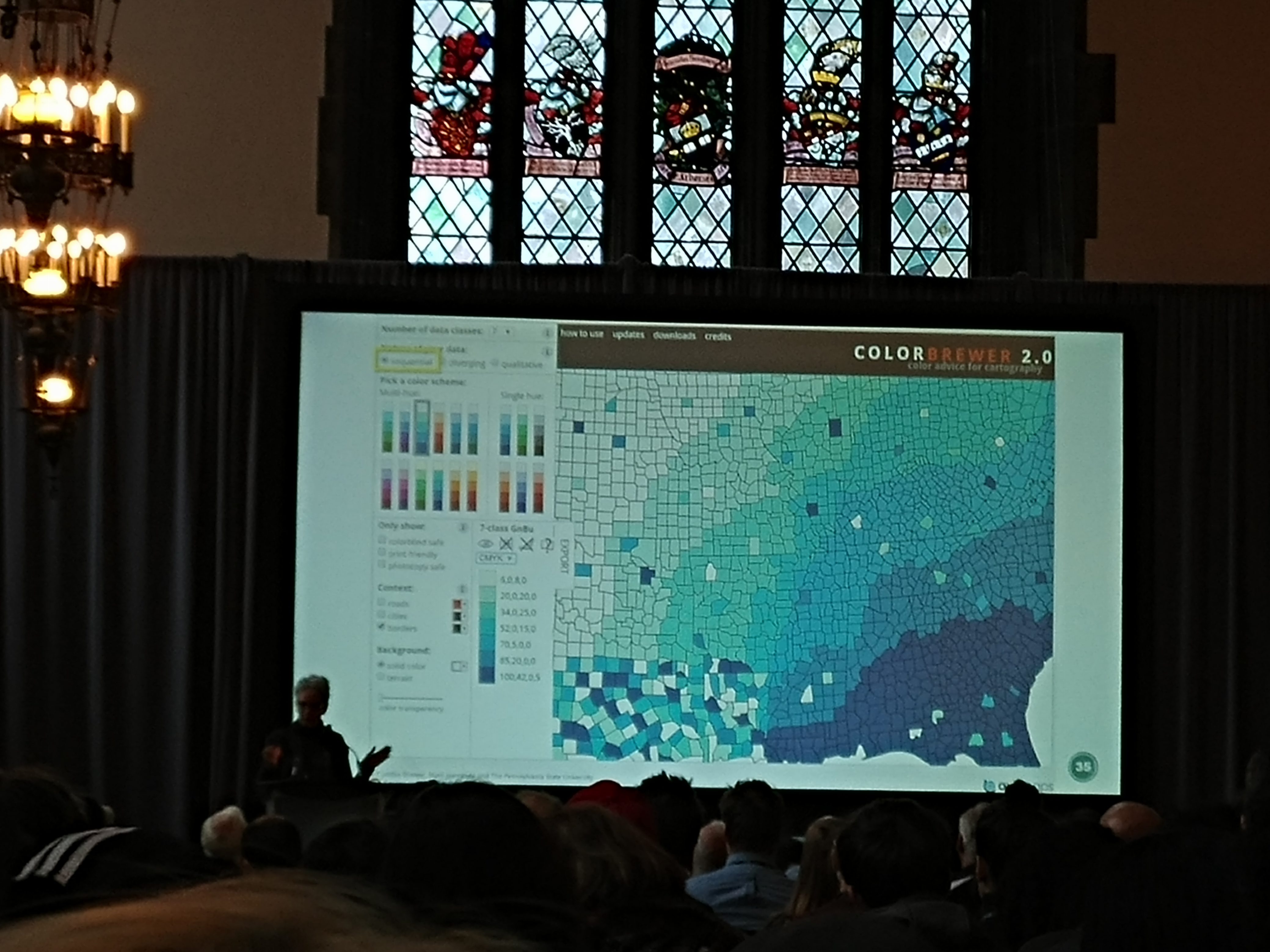
The opening session featured Dr. Cynthia Brewer – creator of ColorBrewer. ColorBrewer is an app that essentially gives you advice on how to symbolize your maps for easy reading. I personally, and I think many others too, have faced the dilemma of what colours to use in our maps. It’s possibly the most important stylistic decision you can make to convey your data, so it’s easy to spend a long time agonizing over what to pick. I had never used the app before this talk, but I have to recommend you all check it out. I have played around with it a little and it is actually extremely useful and a big potential time saver when you’re trying to make your maps look awesome. I also learned that ColorBrewer has been integrated into many different software packages, including MatLab, and more recently ArcGIS Pro. When you have a minute, be sure to check it out!
After the talk, I got the opportunity to present some of my research at the Transit/Transportation seminar. I presented some work I did on simulating the effects of road closure on road criticality (I’ll share more about this work in a future post!). This was my first conference presentation, so needless to say, I was pretty nervous. I think I managed to get my presentation across all right in the end, and I’m happy I was given the opportunity for this experience. Other presentations in this seminar included talks from fellow McMaster App Challenge participants Tasos Dardas and Karl Chastko (info here), and an interesting presentation on visualizing maps using distortion based on the presence of tourist hotspots.
After that, it was lunchtime. After I grabbed a bite to eat I headed off to the “Working with the R-ArcGIS Bridge” workshop, headed by none other than Mike Leahy. This workshop was pretty useful – a lot of great resources were provided by Mike to help learn the R programming language and I learned several things that I didn’t know. Recently, I started delving into the world of R for my graduate coursework. I’ve been shocked by how many people are familiar with this language and just how widely it seems to be used. The ArcGIS bridge for R basically allows you to perform R-based scripting and functions within ArcMap/ArcGIS Pro, much like the existing Python functionality. I think it will be very interesting to follow this tool’s development and I look forward to seeing how people will use it.
After the workshop, I attended the “Physical Processes/Modeling” seminar. Two of my fellow McMaster ECCE student associates Michele Tsang and Sean Leipe presented their research during these seminars too (which they’ve both also written about in previous blog posts – be sure to check them out!). One presentation that I thought was particularly interesting was the work being done by Dr. Kevin Turner (Assistant Professor at Brock University). The work he described was how he is using GIS to monitor land use changes in environmentally sensitive parts of the Yukon. I also thought the 3D render he had of his results using the Unity video game engine was pretty awesome.
All things considered, I had a great time at this year’s Education and Research in GIS conference. I got a lot of new experiences, and learned a lot about new technology and what other researchers are working on in our field. I would suggest anybody who missed out to consider attending the next one in two years time.