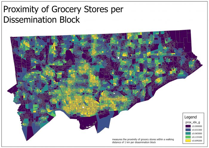
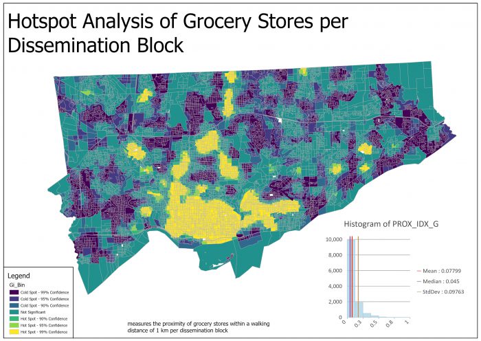
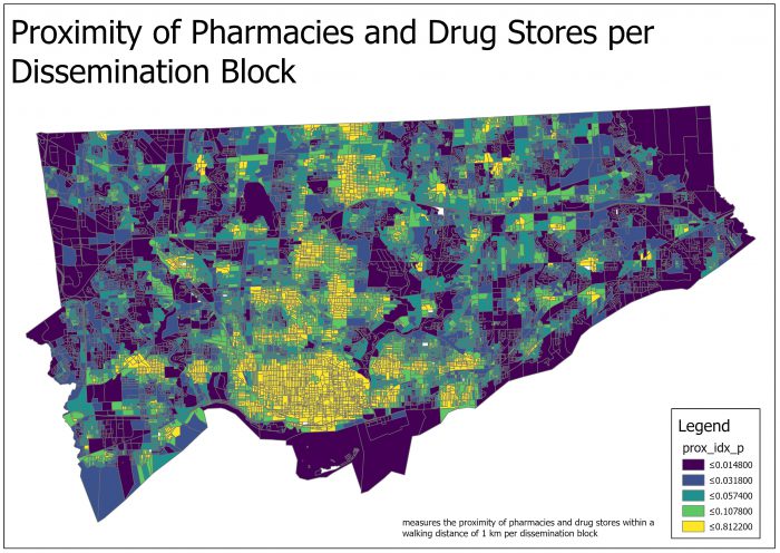
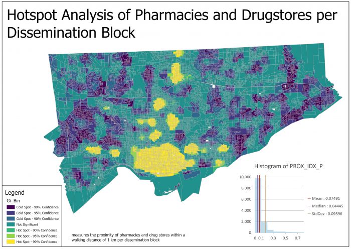
During this time of COVID-19, social distancing has effected our ability to travel and access essential service as we would typically do. For many without a car, active modes of transportation such as walking or biking, are the only alternative, but can these services be reached? On April 17, Statistics Canada, along with the Canada Mortgage and Housing Corporation (CMHC) released a nationwide proximity measure database as part of an initiative to provide the needed information to stakeholders across Canada who are dealing with the COVID-19 pandemic. These proximity measures offer information at the nieghbourhood level of proximity to health facilities, pharmacies, and other essential services/amenities. In this blog, I will be using the optimized hot spot analysis tool to produce a new output feature class identifying areas of Toronto that have high and low values of spatial clustering in terms of these specific essential services. Each result will contain a set of two maps. The first map shows the proximity index of each service normalized on a national scale per dissemination block (closer to 0 being lowest on the national level and 1 being the best). The second map is the optimized hot spot analysis feature class that identifies high and low clusters of the facilities throughout Toronto.
Proximity Measure Database
The proximity measure database contains ten unique services that can be measured at the dissemination block level to provide the highest level of geographic resolution possible. The proximity measures of each service for a dissemination block are created using a gravity model. A gravity model accounts for the network distance between the centroid of an origin dissemination block and the DB’s where the specific service is present within a given range, as well as accounting for the presence of services within its dissemination block. DB’s that have a high value of services within them or nearby will have a high gravity score, while DB’s that only have facilities located very far away or not at all will have low gravity scores. The final measures are computed as a normalized index value between 0 and 1 on a national scale. Values of 0 indicate the lowest level of proximity to a specific service in Canada, and 1 shows the highest level.
In this article, we will be evaluating four essential services:
Grocery Stores – measures the closeness of a dissemination block to any dissemination block with a grocery store within walking distance of 1 km.
Pharmacies – measures the closeness of a dissemination block to any dissemination block with a pharmacy or a drug store within walking distance of 1 km.
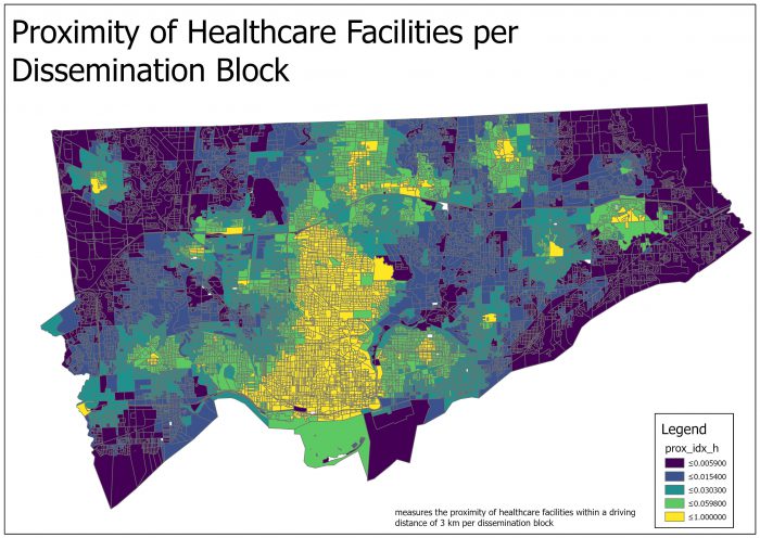
Health Care – measures the proximity of a dissemination block to any dissemination block with a health care facility within a driving distance of 3 km.
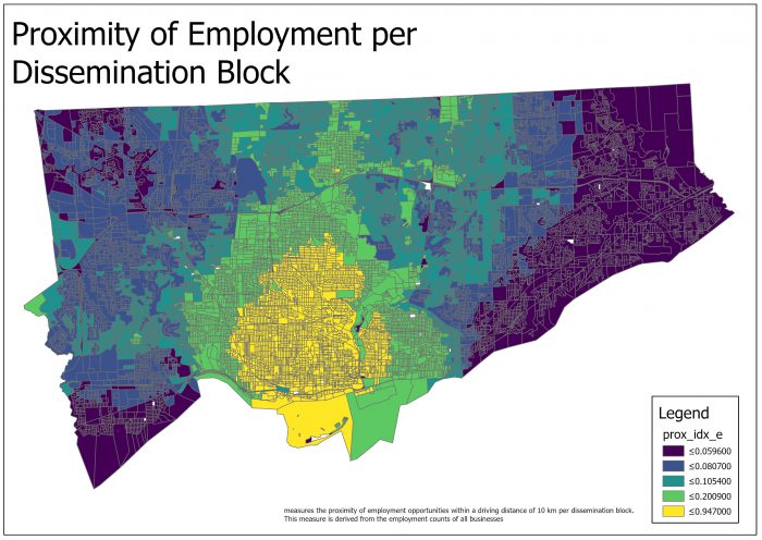
Employment – measures the proximity of a dissemination block to any dissemination block with employment opportunities, based on employment counts of all businesses, within a driving distance of 10 km.
Overview of the Optimized Hot Spot Analysis Tool
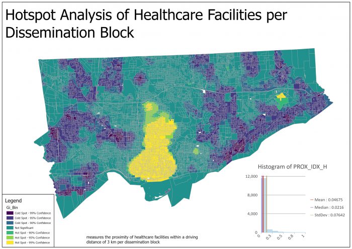
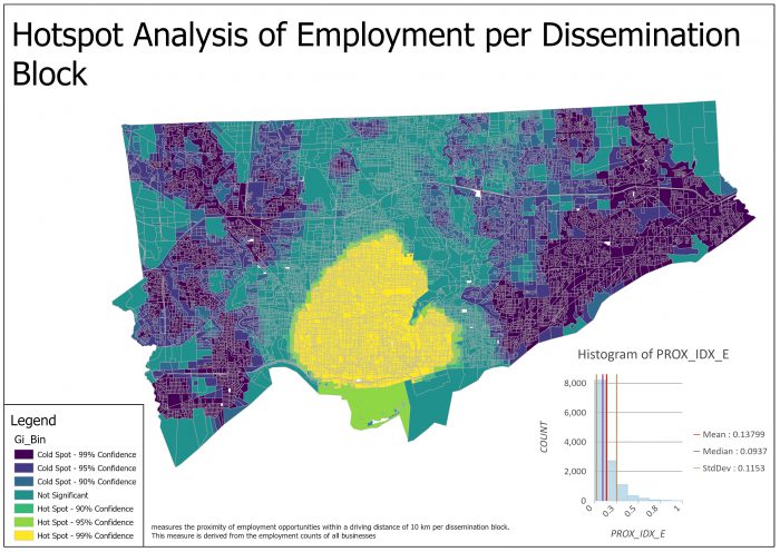
The optimized hot spot analysis tool identifies significant spatial clusters of high and low values. Similar to the way that your camera has an automatic setting to adjust lighting and other factors to get the best picture, the Optimized Hot Spot Analysis tool interrogates your data to obtain the parameters that will yield optimal hot spot results. The results of this tool create a new Output Feature Class with a resulting z-score, p-value, and confidence level bin (Gi_Bin) for each feature. The Gi_Bin identifies and groups statistically significant hot and cold spots. Elements in the +/-3 bins are statistically significant at the 99 percent confidence level; features in the +/-2 bins reflect a 95 percent confidence level; features in the +/-1 bins reflect a 90 percent confidence level, and the clustering for features with 0 for the Gi_Bin field is not statistically significant. If you would like a more in-depth analysis of the methods and algorithms to optimize your hot spot analysis when using this tool, I encourage you to look at the How Optimized Hot Spot Analysis works document referenced below.
Results
Grocery Stores
Pharmacies
Hospitals
Employment Areas
Conclusion
When using optimized hot spot analysis to identify spatial clustering of essential services within the City of Toronto, some consistent patterns start to emerge. Throughout all the maps, we can see significant clustering within Toronto’s downtown core, especially in maps evaluating employment and healthcare. This pattern was expected given that the downtown core is the economic engine of the Greater Golden Horseshoe and has a world-class medical and pharmaceutical cluster downtown as well. For pharmacies and grocery stores specifically, other than the downtown core, significant hot spots were identified traveling along Yonge Street, Toronto’s main north-south arterial road, and Bloor Street, Toronto’s main east-west arterial road. While most of Toronto was identified as not significant, many areas along Toronto’s edges were identified as cold spots, specifically the inner suburbs of Scarborough and Etobicoke. One area of Scarborough had low proximity to all services measured, but most notably for employment and health care facilities was the stretch along Kingston Road, a major arterial road stretching from the east side of downtown to Toronto’s eastern border. For Etobicoke, there were not as many significant clusters when compared to Scarborough but still many smaller pockets that were identified as cold spots throughout the maps. Some areas were Rexdale, in northern Etobicoke, as well as areas along Highway 427 in southern Etobicoke home to areas such as the East and West mall.
Tool Reference
How Optimized Hot Spot Analysis Works: https://pro.arcgis.com/en/pro-app/tool-reference/spatial-statistics/how-optimized-hot-spot-analysis-works.htm
Data
Statistics Canada. (2020). Proximity Measures Database – Early Release [Data set]. Retrieved from: https://www150.statcan.gc.ca/n1/pub/17-26-0002/172600022020001-eng.htm#a1

