Creating a Touchtable Application: An Exploration of Features
I titled this blog post An Exploration of Features because it is exactly that: exploratory. From the outset of this project – which was to completely redesign a once very successful urban planning application for a touchtable, the overall sense among my labmates and I was that it was an exploration: we were about to travel through some unmarked territory and we weren’t sure what we would find. It’s a word that invokes images of discoverers carving their way through a rough landscape, encountering new places, peoples and things. Ok, perhaps our expedition wasn’t as historic as Lewis and Clark’s, but like them our concern was mainly focused on improving our current use of mapping. Regardless of how an exploration turns out, you inherently come away from it having learned something that you didn’t know at the outset. There is no expectation other than to exhaust all resources in order to find out whether something’s possible or not. I believe that’s a part of the fundamental essence of research, and as it turns out my labmates and I ended up learning a lot from the successes and failures.
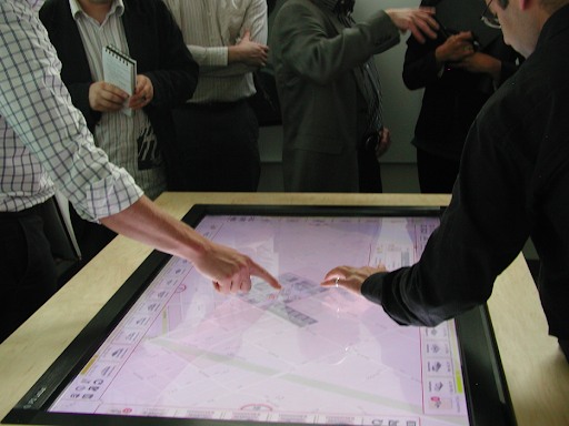
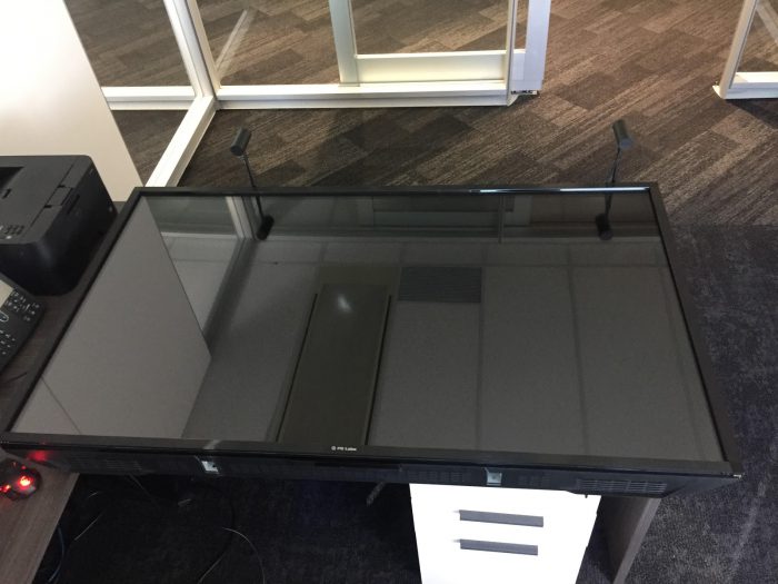
So how is a touchtable different than any other table you can touch? Take any touch screen you may interact with, be it a cellphone, a tablet and the like, and increase its dimensions to the size of your average coffee table.
It has the same functionality potential as any touch device, but due to it’s unusual size the touchtable has a whole new set of user interface (UI) design opportunities. Although bigger is not always better when it comes to technology, the touchtable is an exception: in fact, the more attention it gets for being different the better, because that distinctiveness is part of why it is worth developing an application for it. As AR, MR and VR become more and more accessible to the general public, private companies, municipalities, and stakeholders are becoming more eager to use them. Instead of asking, “Is this the best medium to achieve the goal we set out with?”, the question has become, “What kind of problems can we come up with that can utilize these technologies?” When it comes to bringing the collaborative approach to urban planning into the age of technology, the touchtable is in many ways the best solution.
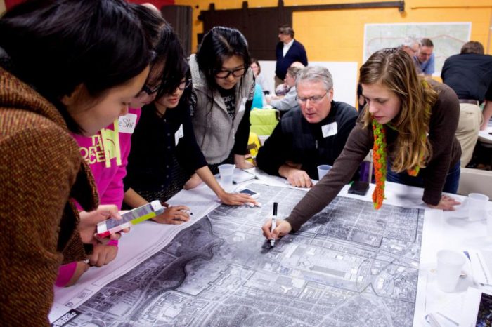
The application aims at improving the age-old practice of an urban planning collaboration using a design charette. These pseudo “jam sessions” were meant to bring together experts from different areas into the same room in order to experiment with potential ideas and developments.
This is why I believe the touchtable to be the best modality for this instance – it takes advantage of the UI capabilities you often see in web and desktop apps while also maintaining the physical energy of being present that makes planning with charrettes so effective. The idea is that people can gather around the table like they would a normal design charrette, only now they have several tools and analytics at their disposal they otherwise wouldn’t.
When my lab partners and I discussed all the features the application would need to have, it seemed like the best way to accomplish them would be through a gaming development engine: we would need an interactive base map layer, a way to easily add 3D objects to that base map(buildings, urban features, etc.), have a UI that would make accessing a wide array of tools easy to understand and use, and a way of displaying relevant data for each individual model or cluster of models added to the map. For starters, anyway. Sophisticated gaming engines are controlled mostly through scripting, meaning computer programs are written ahead of time and are executed when needed.
The first big accomplishment of the project was being able to display a dynamic (loads areas as we need them, and doesn’t load what we can’t see) base map which we could pan, drag, and zoom. As we zoom into smaller and smaller areas, the base map’s resolution increases. Since we’re loading (and seeing) less geographic area than when we are zoomed further out on the map, we can achieve a higher resolution images without compromising speed. We accomplished this by querying the ArcGIS Online Map Server for World Topographic Map raster tiles, and then projecting the tile image on a tile layer within the application.
The end result was a highly interactive base map, on which we now had the potential to add the models that would comprise our example development. We can choose from several styles of Esri Maps, depending on what the specific development situation calls for.
Next, we imported SketchUp models from a previously existing database created by the SALA lab at UBC, known as ElementsDB. Luckily, the gaming engine we’re using imports these .skp files directly, to be used as an object in the application right away and with little to no post-import reconfiguration. Awesome, right? Once the models were imported, we created an easy-to-access menu that allowed you to choose which model you wanted to add to your development. You could then drag that model to the desired location, and in real-world coordinates (thanks to the marvels of modern computer programming) the corresponding 3D model would instantiate at your finger position! Not only that, but buildings can be dragged and rotated to a new position using the same gestures as you use to control the map. This was possibly the most challenging obstacle of the project to date, since the application had to be able to be able to tell whether a finger movement was meant to move the base map or meant to move the model – easier said than done!
With that completed, we were now free to think of tools that would enhance the urban development process: what sorts of features would be particularly useful for urban planners and architects when adding to an already existing area? For this I consulted Dr. Jon Salter, the Associate Director of the Research & Education group at Esri Canada. Dr. Salter was a postdoctoral fellow at the SALA Lab – the same lab that created ElementsDB mentioned earlier, so suffice it to say he knows his stuff.
In order for the application to really add value to the urban planning experience, my labmates and I had to develop a way of collecting data in certain areas of the map, be able to tell which models would obstruct the view of others, program the ability to view the map from a more 3D angle, and even be able to directly modify the size and composition of models within the app.
If you had any sort of “real-life” map and you wanted to circle or highlight an area, how would you do it? You would use a marker or maybe a highlighter in a color that really stands out, and you would roughly circle that area of interest. Like the panning, zooming and rotating gestures I mentioned earlier, the idea behind implementing a feature like this is to keep it as natural and simplistic as possible. This way, people whose only exposure to technology is using their cellphone or tablet will be able to take the app and run with it much more quickly.
It is probably the simplest looking feature, but it certainly has a lot going on under the hood! When the application recognizes you are drawing a shape, it generates vertices every few tenths of a second. Once the shape is closed, I wrote a script to do something known as triangulation. Not quite the same method that Q from the 007 films uses to track down the location of a rogue MI6 agent, triangulation consists of breaking down a polygon into a group of triangles in order to more easily create a material to overlay on the shape.
Everything that collides with that shape has certain values associated with it, and those values are added together to give a better idea of the needs of an area.
Using a similar ‘mesh material’ as the shape creator tool, I also designed a field of view (FOV) tool. If a user wanted to know whether or not that hi-rise next to a housing development was going to block a perfect view of the pacific ocean, the FOV tool can tell them.
It sends out hundreds of things called rays, which are like invisible lasers. If anyone of these lasers collides with an object (like a hi-rise), it does not continue to display the mesh on the other side of that object, leaving a gap where the field of view is blocked.
Sometimes as an urban planner, like with the FOV tool, there may be an instance where it is beneficial to get a different perspective on the scene than you have with the usual top-down view:
With a more oblique viewpoint, users can get more perspective of the size of models in relation to others within a development area!
Let me propose one more situation: say you are an urban planner and you want to build a hi-rise in a developing urban centre, but you don’t know how many floors you would like it to be. Perhaps zoning laws within the area prevent you from using the usual, prefabricated model of a hi-rise since it’s too tall. More specifically, you don’t know what you want the composition of those floors to be, whether they are residential, commercial, etc., and how the composition of this building relates to those around it. In that case, being able to modify the models you bring into the application becomes an essential tool:
The successes of this application, like floors in a building, were built one on top of the other. Once a hurdle was cleared, my labmates and I reassessed and asked ourselves “what else can we implement to improve the capabilities of the application?” Putting it all together, a user has the ability to evaluate and visualize design scenarios for newly developed areas. And most importantly in this particular instance, the touchtable allows for users to come together, discuss, bounce ideas back and forth, and play out different hypothetical situations. There is certainly apprehension among certain people when using the most sophisticated forms of technology. It’s not a stretch to assume that someone who’s gone most of their life without using a computer may be deterred by the learning curve encountered when using an VR/AR headset, or perhaps when learning how to use all the features of a powerful web app. Keeping the features simple, the gestures simple, and keeping the modality closely related to its predecessor (a giant zoning map), are absolute advantages to using a touchtable. It’s not clear what the future holds for this technology, but I am of the opinion that any task that requires a group to collaborate and a highly interactive base map, could benefit from using this or a derivative of this application.
I’ve been extremely lucky that my last four months of work at Esri Canada has been focused on creating an application designed specifically for a touchtable. I’ve been even more lucky that I’ve had the support of team members from Dr. Yvonne Coady’s lab at UVic, The Mod Squad – an eclectic group of kind and humble geniuses. And I’m even more lucky that a lot of the risks taken to make an Esri product as good and better than it was at its previous best, paid off.
Thank you for the support of Esri Canada, in particular Dr. Brent Hall and Dr. Jon Salter for the guidance and ideas during this internship.
The Mod Squad is Dr. Yvonne Coady, Tianming Wei, Xi Sun, and Dr. Derek Jacoby.
If you’d like to try the application yourself, download a copy from the Esri Canada GitHub Repository!


